

TL;DR:
- Choosing art that aligns with your interior style ensures cohesion and visual harmony in your space. Proper assessment of wall size, lighting, and placement helps select artworks that enhance rather than overwhelm rooms. Trust your instincts and personal connection to pieces, as authentic choices create lasting enjoyment and distinctive interiors.
You’ve found what feels like the perfect artwork. The colours are beautiful, the subject matter speaks to you, and you’ve imagined exactly where it will hang. Then you put it up, step back, and something feels wrong. It doesn’t fit. That frustrating experience is far more common than most people realise, and it almost always comes down to a mismatch between the art and the surrounding interior. This guide walks you through a proven process for selecting art that genuinely enhances your space, whether you’re decorating a single room or working across an entire commercial project.
Table of Contents
- Understanding your interior style
- Assessing your space and art requirements
- Selecting art to complement your style
- Tips for framing and displaying art
- Why trusting your instincts is vital in art selection
- Enhance your space with art tailored to your style
- Frequently asked questions
Key Takeaways
| Point | Details |
|---|---|
| Identify your interior style | Pinpoint your dominant decor style as the first step to selecting harmonious artwork. |
| Size and placement matter | The scale and position of art influence the balance and feel of any room. |
| Complement, don’t match | Artwork should enhance your interiors without strictly matching every element. |
| Framing enhances impact | Choosing the right frame and mount strengthens the art’s connection to the space. |
| Trust your instincts | Personal connection is key—choose art that resonates with you for lasting enjoyment. |
Understanding your interior style
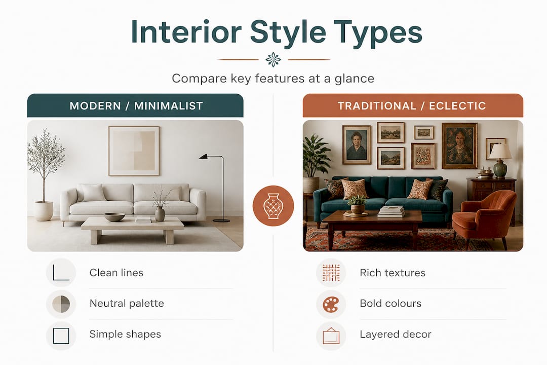
The foundation of every successful art selection is a clear understanding of your interior style. Identifying your interior design style is essential for cohesive art selection, because art that works beautifully in a Scandi minimalist flat can look jarring in a richly decorated Victorian townhouse.
The five most prevalent interior styles you’ll encounter are modern, traditional, minimalist, industrial, and eclectic. Each carries its own visual language. Modern interiors favour clean lines, neutral tones, and geometric forms. Traditional spaces lean into warm woods, rich textiles, and symmetrical arrangements. Minimalist rooms strip everything back to function and negative space. Industrial settings celebrate raw materials like exposed brick, steel, and concrete. Eclectic interiors blend periods and influences intentionally, held together by a confident editorial eye.
Use the table below to quickly identify which style feels most like your own.
| Style | Dominant colours | Key materials | Mood |
|---|---|---|---|
| Modern | White, black, grey | Glass, steel, lacquer | Sharp, refined |
| Traditional | Cream, navy, burgundy | Wood, velvet, brass | Warm, formal |
| Minimalist | Off-white, taupe, sage | Concrete, linen, stone | Calm, restful |
| Industrial | Charcoal, rust, tan | Steel, brick, reclaimed wood | Edgy, urban |
| Eclectic | Anything goes | Mixed | Playful, expressive |
To pin down your dominant style, ask yourself these questions:
- What materials appear most in my furniture and fixtures?
- Is my instinct to add more objects or to clear surfaces?
- Do I prefer rooms that feel curated and formal, or casual and layered?
- When I visit a space I love, what words do I use to describe it?
When you’re working across artworks for interior projects, this exercise is even more important because a consistent style brief will guide every subsequent decision, from scale to subject matter.
Pro Tip: Build a quick mood board using images clipped from magazines or saved on Pinterest. Lay them side by side and look for the common thread. The recurring colours, textures, and tones you’re drawn to will tell you more about your style than any quiz.
Assessing your space and art requirements
With your interior style in mind, it’s essential to evaluate the unique characteristics of your space and how they influence art selection. Wall size, lighting, and wall colour all have a direct impact on which artworks will work and which will disappear or overwhelm.
Lighting deserves particular attention. A north-facing room with cool, diffuse light calls for art with warmth and contrast, because cool-toned prints in a cold light can look flat and lifeless. A south-facing room flooded with direct sunlight can carry bolder, darker works without them feeling heavy.
Wall colour sets the stage. A deep teal wall can make a pale watercolour vanish entirely, while a bright abstract on a white wall sings. Furniture layout matters too, because art needs breathing room. A piece hung above a large sofa should ideally span roughly two-thirds of the sofa’s width to feel grounded rather than floating.
Use the comparison below to understand how different approaches to art selection work in practice.
| Approach | Best for | Considerations |
|---|---|---|
| Size-led | Large empty walls | Measure first; avoid undersizing |
| Colour-led | Rooms with strong palette | Match or contrast intentionally |
| Theme-led | Narrative rooms (studies, nurseries) | Ensure theme feels authentic |
| Placement-led | Awkward or architectural walls | Use the architecture, don’t fight it |
Here’s a straightforward step-by-step process for measuring and positioning art before you buy:
- Measure the wall width and note any furniture below the hanging point.
- Calculate two-thirds of the furniture width as your ideal artwork width target.
- Mark the intended centre point of the artwork on the wall with a piece of low-tack tape.
- Cut paper or card to the exact dimensions of the artwork you’re considering.
- Pin the paper to the wall and live with it for 24 to 48 hours before committing.
- Assess it in both natural daylight and evening artificial light.
- Only then confirm your purchase.
For deeper art matching advice tailored to specific rooms, it’s worth reading around the particular challenges of each space. Living rooms, for instance, bring together more competing visual elements than almost any other room, and you can find specific living room wall tips that go beyond the basics.
Pro Tip: Before spending a penny, tape paper cut-outs to the wall in the exact dimensions of the artwork you’re considering. It sounds simple, but it eliminates the single biggest mistake people make, which is buying art that’s far too small for the wall.
Selecting art to complement your style
Now that you’ve assessed your space, the focus shifts to selecting artworks that genuinely enhance your chosen style. Bold or subtle art choices can reinforce or diversify the overall visual scheme, and knowing which route to take is a skill that comes with practice.
For most interiors, the starting point is colour. Pull two or three of the dominant or accent colours from your room and look for artworks that echo them. This doesn’t mean matching exactly, it means sharing a tonal family. A room with warm terracotta cushions and honey-coloured wood will feel connected to an artwork featuring ochre, burnt sienna, or dusty pink.
Contrast is the other powerful tool. A minimalist white room with sparse furnishings can handle a single large, dramatic piece in deep navy or forest green precisely because everything else is quiet. The art becomes the focal point without competition. Rooms that already carry a lot of pattern or texture often benefit from calmer, more graphic art rather than adding more visual noise.
When personalising with art, remember that the subject matter matters as much as colour. Botanical prints feel at home in relaxed, natural interiors. Architectural photography suits modern urban spaces. Abstract expressionism works in eclectic and contemporary rooms where there’s already an adventurous sensibility.
Avoid these common mistakes:
- Choosing art purely because it matches the sofa cushions. Matched-to-furniture art tends to feel safe rather than considered.
- Buying artwork that is too small. Undersized art looks like an afterthought, especially above furniture.
- Hanging everything at the same height regardless of context. Eye level is a guide, not an absolute rule.
- Ignoring the relationship between multiple pieces. Each artwork should work individually and as part of the overall arrangement.
- Choosing art based solely on a trend. Trends shift; your personal connection to an artwork should come first.
Scale has a measurable effect on room perception. Oversized art in a small room can feel oppressive if the wrong piece is chosen, but the right large-scale work in that same small room can create a sense of depth and drama that makes the space feel bigger. The key variable is the artwork’s tone and complexity, not just its dimensions.
A focal piece should anchor the room’s visual identity, while supporting works add layers of interest without competing for attention. Think of the focal piece as the headline and the supporting works as the body copy.
For those interested in the craft of presentation, the expert guide to framing art is an excellent resource once you’ve shortlisted your artwork choices.
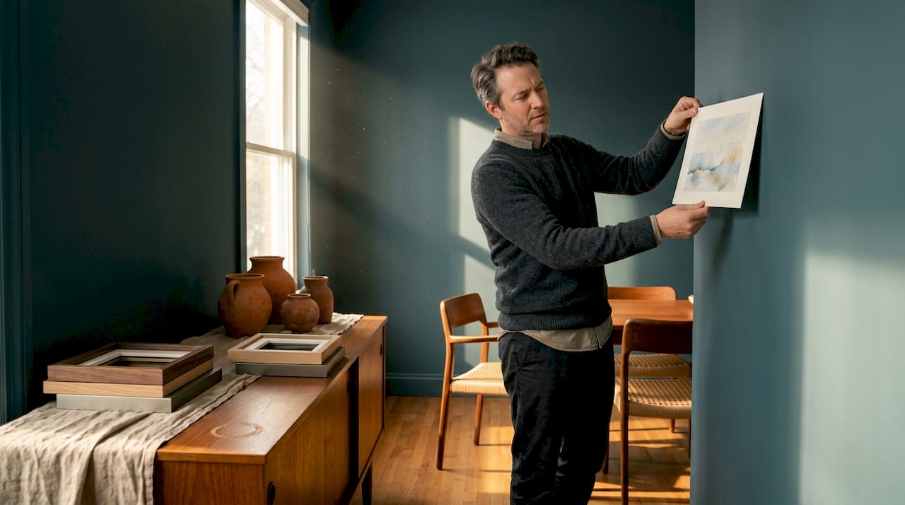
Tips for framing and displaying art
Once the art is chosen, proper framing and installation are the final steps to perfect cohesion. Frame selection can enhance or undermine the overall visual effect of art in a room, even when the artwork itself is perfect.
Modern interiors respond well to thin metal frames in black, brushed steel, or brass. Frameless floating mounts also work beautifully in minimalist and contemporary settings, allowing the artwork to appear as though it’s part of the wall itself.
Traditional interiors suit wider frames in gilded, dark wood, or painted finishes. Ornate mouldings are not out of place here. The frame itself carries decorative weight that complements the formality of the space.
Eclectic and industrial rooms offer more freedom. Mismatched frames in a consistent material (all metal, all wood) or a consistent finish (all black, all natural) create cohesion within variety. Reclaimed wood frames suit industrial settings particularly well.
Follow this numbered sequence for hanging art at the correct height and position:
- Determine the eye-level centre point for the room, typically 145 to 155 centimetres from the floor.
- Mark this point on the wall with a light pencil mark.
- Measure from the top of the artwork to the hanging wire or fixing point.
- Subtract that measurement from half the artwork’s height.
- Add the result to your eye-level mark to find where the nail or fixing should go.
- For gallery walls, map the entire arrangement on paper first, then transfer to the wall using paper templates.
- Step back and assess from the room’s natural entry point before finalising.
Gallery walls deserve special mention. In a living room or hallway, a gallery arrangement can transform a blank wall into a genuine design statement. Mix portrait and landscape orientations, vary frame widths slightly, and anchor the grouping with one larger central piece. In commercial settings such as offices or hotels, gallery walls work best when they tell a coherent story, using subject matter or a restricted colour palette to tie the pieces together.
Pro Tip: Match your frame or mount colour to one of the accent tones already present in the room. If your cushions carry dusty green, a sage or forest green mount will create a subtle thread of continuity that elevates the entire scheme without anyone being able to quite explain why it works so well.
Why trusting your instincts is vital in art selection
Every framework in this guide exists to support good decisions, not to replace your own judgement. Rules about scale, colour, and placement are genuinely useful starting points, but the most memorable interiors are the ones where someone made a choice that broke convention and it worked brilliantly.
Consider the designer who places a vivid expressionist painting in an otherwise strictly minimal white room. On paper, it should jar. In reality, the contrast makes both the room and the painting more interesting. Neither would be as powerful alone. That kind of decision doesn’t come from a checklist. It comes from looking, feeling, and trusting what you see.
Personal connection with artwork creates lasting enjoyment and authenticity in a way that technically correct choices sometimes don’t. A print you bought because it reminded you of a specific trip, a period in your life, or a conversation you had will give you genuine pleasure every time you see it. An artwork selected purely because it matched the paint swatch will stop registering within weeks.
We speak with many clients who apologise for wanting something that “probably doesn’t fit the rules.” Our consistent response is that the rules are a scaffold, not a cage. Use them to build your starting point, then let your instincts take over. The result is almost always better. For additional confidence in that process, exploring expert interior design tips can help you articulate why certain instinctive choices work, so you can replicate them deliberately rather than by accident.
The most important question to ask about any piece of art you’re considering is simply: does this make me want to look at it again? If the answer is yes, the practical details of matching it to the room are almost always solvable.
Enhance your space with art tailored to your style
If you’re feeling inspired to put these principles into practice, Frametheworld.co.uk offers curated collections and tools that make matching art to your interior genuinely straightforward. Browse by style, theme, or colour to find works that slot naturally into your scheme. If you’re drawn to natural textures and organic calm, the Wabi Sabi wall art collection is a strong starting point for minimalist and contemporary spaces. For something bolder and more graphic, the pop art selection brings energy to eclectic and modern interiors. If you have a specific vision that ready-made collections don’t quite meet, the custom print service allows you to request bespoke pieces sized and styled to your exact requirements.
Frequently asked questions
How do I choose art for an open-plan space?
Select art that ties together zones using a consistent colour palette or theme while ensuring each piece holds its own. Following guidelines for picking art prints based on the aesthetic and colour scheme of the overall space is the most reliable approach.
Should the art match my furniture exactly?
The art should complement but not exactly match furniture; coordinated tones or contrasting styles often create the best visual interest. Strategies for integrating multiple pieces of artwork help you achieve a unified look without everything feeling too matchy.
What’s the ideal height to hang art?
Hang the centre of the artwork at eye level, typically 145 to 155 centimetres from the floor for most rooms. Recommendations for selecting frames often include guidance on positioning as part of the overall presentation.
Can I mix different art styles in the same room?
Yes, mixing styles can add genuine interest. Keep a unifying element such as colour, tone, or subject to maintain cohesion. Advice on coordinating wall art with existing decor elements explains how to do this without the room feeling chaotic.
How can I experiment before committing to an artwork?
Use templates or paper mock-ups on walls to test placement and visual impact before buying. Advice on personalising your space with art also covers how to trial different arrangements digitally before making a final decision.


Leave a comment
This site is protected by hCaptcha and the hCaptcha Privacy Policy and Terms of Service apply.