
Choosing wall art that truly enhances your interior feels overwhelming when faced with endless options and conflicting advice. You want pieces that complement your furniture, reflect your personality, and create the right atmosphere, but matching colours, styles, and proportions requires more than guesswork. This guide walks you through a systematic approach to selecting artwork that transforms your space, from assessing your room’s mood and measuring dimensions to applying proven placement rules and avoiding common mistakes that undermine your design efforts.
Table of Contents
- Understanding Your Space And Artistic Preferences
- Practical Steps To Select And Position Art
- Balancing Style, Lighting And Avoiding Common Mistakes
- Enhancing Your Home’s Atmosphere With Art: Expert Insights And Advanced Tips
- Find Unique Wall Art To Complement Your Interior Style
Key takeaways
| Point | Details |
|---|---|
| Assess before buying | Evaluate room mood, style, scale, and colour palette to establish a foundation for art selection |
| Apply proportion rules | Use the 2/3 furniture width guideline and hang art centred at 145-150cm for optimal visual balance |
| Consider lighting impact | Cool and warm lighting temperatures change how colours appear and affect room atmosphere |
| Balance style mixing | Unify eclectic art choices with common themes, frames, or colour palettes whilst maintaining negative space |
| Prioritise personal connection | Emotional resonance with artwork creates lasting satisfaction beyond transient design trends |
Understanding your space and artistic preferences
Before browsing galleries or online collections, you need to understand what your space demands and what truly resonates with you. Start by defining your room’s intended mood. Do you want a calm sanctuary with serene energy, an energising space that stimulates conversation, or a neutral backdrop that adapts to changing seasons? Your answer shapes every subsequent decision about colour, subject matter, and composition.
Measure your furniture dimensions carefully, noting the width of sofas, beds, or console tables where art will hang above. These measurements guide appropriate art scale and prevent the common mistake of choosing pieces too small or overwhelmingly large. Identify your room’s dominant and accent colours by examining upholstery, cushions, rugs, and architectural features. Assessing room mood, scale, colour harmony, and style alignment forms the foundation for successful art selection.
Recognise your interior style honestly. Modern spaces with clean lines and minimal ornamentation call for different artwork than classic interiors featuring ornate mouldings and traditional furniture. Eclectic rooms offer more flexibility but still benefit from intentional choices rather than random accumulation. Understanding whether you lean towards contemporary abstracts, traditional landscapes, or bold statement pieces helps narrow overwhelming options into manageable categories.
Your personal taste matters more than rigid design rules. If a piece speaks to you emotionally, it will bring daily satisfaction regardless of whether it perfectly matches every design principle. Trust your instincts whilst using guidelines as helpful frameworks rather than restrictive mandates. When choosing wall art, consider how each piece makes you feel during extended viewing.
Pro Tip: Walk through your home imagining it as a gallery space, noting which walls feel empty, which areas draw your eye naturally, and where you pause during daily routines. These spots often make ideal locations for meaningful artwork that enhances your lived experience rather than simply filling blank walls.
Practical steps to select and position art
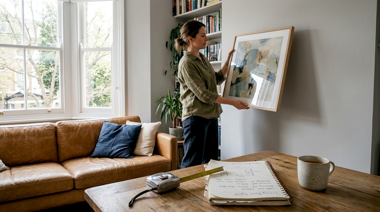
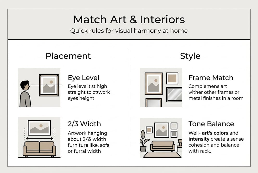
Applying specific measurement and placement rules transforms vague intentions into successful installations. The 2/3 furniture width rule provides reliable guidance: art should span approximately two thirds to three quarters of the furniture width below it. For a 180cm sofa, aim for artwork or a gallery arrangement measuring 120-135cm wide. This proportion creates visual anchoring without overwhelming the furniture or appearing lost on the wall.
Hang art with its centre positioned between 145-150cm from the floor, which aligns with average eye level for standing viewers. In dining rooms where people sit, lower this slightly to 135-140cm for comfortable viewing during meals. When creating gallery walls with multiple frames, maintain consistent 5-10cm spacing between pieces to allow each work breathing room whilst preserving cohesion. Tighter spacing feels cluttered; excessive gaps fragment the arrangement.
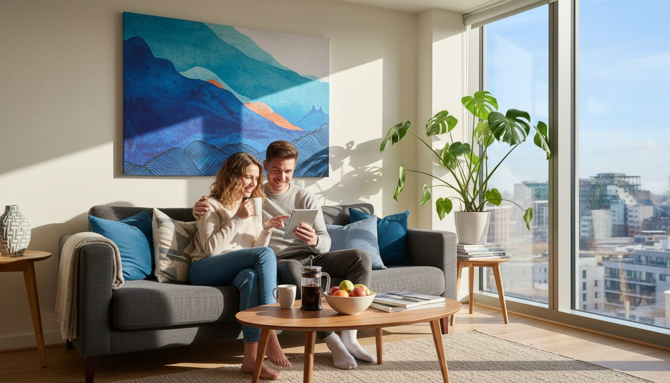
The 60-30-10 colour rule borrowed from interior design applies beautifully to art selection. Your room’s dominant colour should occupy 60% of the space, secondary colours 30%, and accent colours 10%. Choose artwork that either reinforces these proportions or introduces accent colours as focal points. A predominantly neutral room benefits from art featuring bold accent hues that energise without overwhelming. Conversely, colourful interiors often pair well with more subdued artwork that provides visual rest.
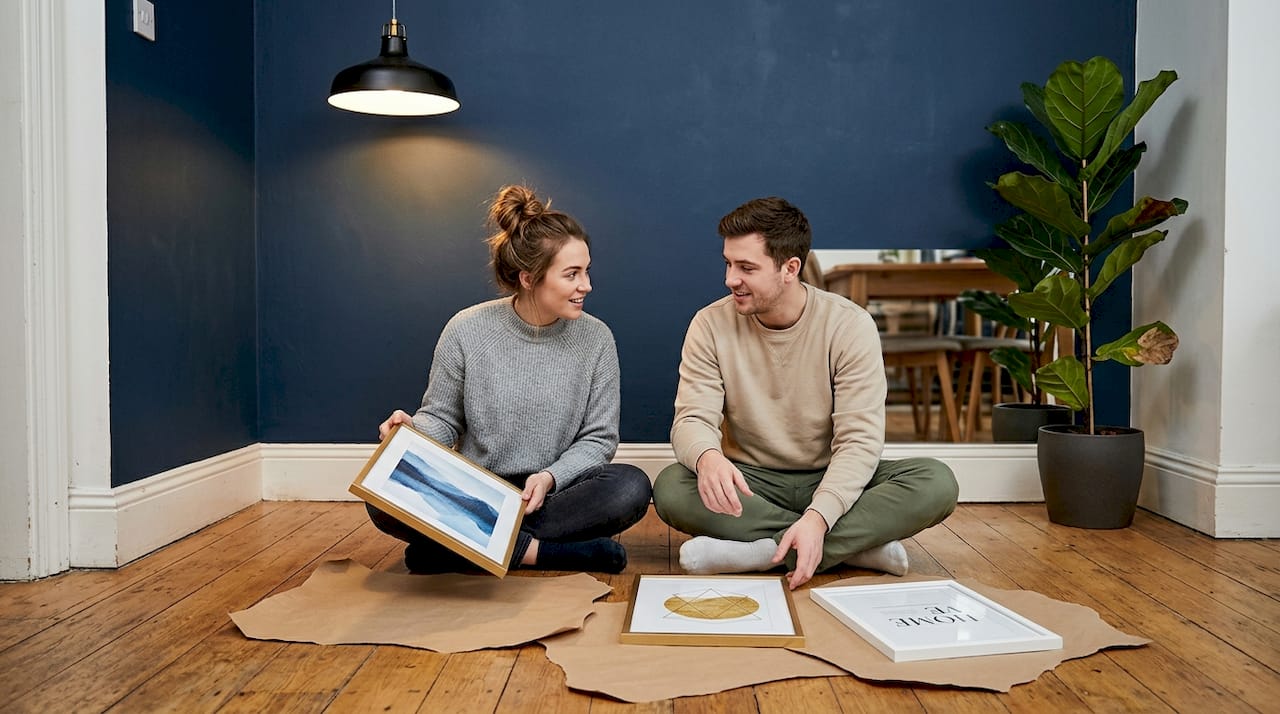
Test different layouts before committing to nail holes. Cut paper templates matching your frame dimensions and use removable painter’s tape to position them on walls. Live with these mockups for several days, observing how natural light changes throughout the day and whether the scale feels right from various viewing angles. This simple step prevents costly mistakes and buyer’s remorse. The wall art selection guide offers additional placement strategies for challenging spaces.
| Room type | Recommended art width | Hanging height | Spacing between frames |
|---|---|---|---|
| Living room (above sofa) | 120-150cm for 180cm sofa | 145-150cm centre | 5-10cm |
| Bedroom (above bed) | 100-130cm for 150cm bed | 140-145cm centre | 5-10cm |
| Dining room | 90-120cm for 150cm table | 135-140cm centre | 5-10cm |
| Hallway gallery | Varies by wall length | 145-150cm centre | 5-8cm |
Pro Tip: Photograph your paper template arrangements with your phone and review images away from the space. This fresh perspective often reveals balance issues invisible when standing directly in front of the wall, helping you refine placement before final installation.
Balancing style, lighting and avoiding common mistakes
Matching art style with your interior style creates harmonious spaces, but strategic contrast adds energy and prevents monotony. Modern interiors accommodate abstract expressionism, geometric prints, and minimalist photography beautifully. Classic rooms pair naturally with traditional landscapes, portraiture, and representational art. However, introducing one unexpected piece, such as contemporary art in a traditional setting, generates visual interest and reveals your personality beyond predictable choices.
Mixing art styles successfully requires unifying elements that tie disparate pieces together. Common frame styles, coordinated colour palettes, or thematic connections allow eclectic collections to feel intentional rather than haphazard. A gallery wall combining black and white photography, colourful abstracts, and vintage prints works when frames share similar finishes and spacing remains consistent. Without these unifying factors, mixed styles create visual chaos that exhausts rather than delights.
Avoid placing two gallery walls on adjacent or facing walls, which creates competing focal points and overwhelming visual clutter. Instead, balance one feature wall with simpler arrangements elsewhere. Small rooms particularly suffer from oversized art that dominates sightlines and makes spaces feel cramped. When uncertain about scale, err slightly smaller and add complementary pieces later rather than starting with overwhelming statement works.
Lighting profoundly affects how colours appear and how comfortable viewers feel. Cool lighting around 50 lux makes cool tones vibrant whilst potentially dulling warm hues. Warm lighting enhances reds, oranges, and yellows but can muddy blues and greens. Consider your room’s primary lighting temperature when selecting art to ensure colours appear as intended. Mix ambient, task, and accent lighting to create depth and prevent flat, institutional appearance.
Personal resonance with artwork matters more than following transient trends. A piece that moves you emotionally will bring lasting satisfaction long after current fashions fade. Purchase art because it speaks to your experiences, values, or aspirations, not because influencers or magazines declare it essential. Authentic choices create homes that feel genuinely yours rather than showrooms replicating someone else’s vision. Understanding the role of art in home style helps you make choices aligned with your unique aesthetic.
Personal resonance over trends deepens emotional engagement and ensures your art collection remains meaningful through changing design fashions and life stages.
Enhancing your home’s atmosphere with art: expert insights and advanced tips
Emerging research reveals how we actually experience art in domestic settings, offering insights beyond traditional design advice. Eye tracking studies show decor modulates attention, with warm colours and complex forms increasing viewer engagement and comfort. Slowly viewing artwork builds stronger emotional and cognitive connections than brief glances, suggesting placement in areas where you naturally pause, such as reading nooks or seating areas, maximises impact.
Complex compositions with varied textures, layered colours, and intricate details hold attention longer and generate greater satisfaction during repeated viewing. Simple, minimalist pieces suit spaces requiring calm focus, whilst elaborate works energise social areas. Understanding these responses helps you match artwork characteristics to room functions. Bedrooms benefit from soothing, less complex pieces that promote relaxation, whereas living rooms accommodate bolder, more intricate works that spark conversation.
Decor elements surrounding artwork affect where eyes look first and how comfortable the overall arrangement feels. Cluttered surfaces and competing visual elements fragment attention, reducing artwork impact. Negative space around pieces allows proper appreciation and prevents sensory overload. When arranging furniture and accessories, consider sightlines to featured artwork and remove distractions that undermine focal points you’ve carefully created.
Vary art scale and shape throughout your home to create visual rhythm and prevent monotony. Alternating large statement pieces with smaller works, mixing portrait and landscape orientations, and incorporating three dimensional elements like sculptural pieces or textured canvases adds depth and interest. This variation guides movement through spaces and creates natural pauses where attention focuses and lingers.
Test placement and lighting through short viewing sessions before finalising arrangements. Sit in your space during different times of day, noting how natural light changes artwork appearance and whether artificial lighting adequately illuminates pieces after dark. Make adjustments based on these observations rather than assuming initial placement will suffice. Exploring current art trends for homeowners can inspire fresh approaches whilst maintaining timeless appeal.
- Assess your emotional response during a five minute viewing session, noting whether the artwork sustains interest or feels repetitive.
- Evaluate visual comfort by checking if your eyes naturally rest on the piece or feel pulled away by competing elements.
- Test different lighting scenarios, adjusting lamp positions and bulb temperatures to find optimal illumination.
- Observe the artwork from various angles and distances within the room to ensure it reads clearly from all typical viewing positions.
- Consider how the piece interacts with surrounding furniture, architectural features, and other decorative elements throughout the day.
Prolonged, attentive viewing deepens emotional and cognitive engagement with art, transforming decorative objects into meaningful components of daily life that shape atmosphere and wellbeing.
Pro Tip: Create a simple lighting plan that includes ambient ceiling fixtures, adjustable table or floor lamps, and dedicated picture lights for featured artwork. This layered approach provides flexibility to adjust atmosphere for different activities whilst ensuring your art always appears at its best.
Find unique wall art to complement your interior style
Transforming design principles into reality requires access to quality artwork that matches your vision and space requirements. Frametheworld offers curated collections spanning diverse styles, from serene minimalism to bold contemporary statements. Explore wabi sabi wall art for textured, imperfect designs that bring organic warmth to modern interiors, celebrating natural beauty and authentic character over sterile perfection.
When standard pieces don’t quite fit your specific dimensions or colour requirements, custom print services allow you to personalise artwork precisely to your space. Upload favourite photographs, adjust sizing to match your furniture proportions exactly, and select frames that coordinate with existing decor. This bespoke approach ensures perfect integration rather than compromise.
Add energy and personality to neutral schemes with colourful paintings featuring vibrant hues and dynamic compositions. These pieces serve as instant focal points that anchor colour palettes and inject life into understated interiors. Combining different styles from various Frametheworld collections enriches your home’s aesthetic, creating layered, collected looks that evolve with your taste and lifestyle.
FAQ
How do I choose art that matches my existing furniture?
Select artwork measuring approximately two thirds to three quarters of your furniture width to create balanced proportions. Choose colours and styles that either harmonise with existing pieces through complementary hues and similar aesthetic approaches, or provide tasteful contrast that energises without clashing. Position art with its centre at 145-150cm from the floor for optimal eye level viewing. The wall art selection guide provides detailed matching strategies for various furniture arrangements.
What are the best colours to use in art for small rooms?
Opt for cooler, muted tones like soft blues, greens, and greys that create calming effects and make spaces feel more expansive. Avoid oversized pieces featuring bright warm colours like intense reds or oranges that can dominate small rooms and create overwhelming sensations. Use accent colours already present in cushions, rugs, or other furnishings to maintain cohesion and prevent introducing too many competing hues. The wall art selection process explains colour coordination in depth.
How can lighting affect the appearance of my wall art?
Lighting temperature and intensity dramatically change how artwork colours appear and the mood they create. Cool lighting around 50 lux makes cool tones like blues and greens vibrant whilst potentially dulling warm hues, whereas warm lighting enhances reds, oranges, and yellows but can muddy cooler colours. Proper illumination prevents colours looking flat, distorted, or unintentionally subdued, ensuring your carefully chosen pieces display as intended throughout the day. Understanding the role of art in interior design includes managing lighting for maximum impact.
What’s the best way to mix different art styles in one room?
Unify eclectic collections with common elements like consistent frame styles, coordinated colour palettes, or thematic connections that tie disparate pieces together intentionally. Maintain adequate negative space around and between artworks to prevent visual clutter and allow each piece proper appreciation. Use contrast in scale and form to create energy and interest, pairing large statement pieces with smaller complementary works whilst ensuring one style or approach dominates to anchor the arrangement. Current art trends for homeowners demonstrate successful style mixing in contemporary interiors.
Leave a comment
This site is protected by hCaptcha and the hCaptcha Privacy Policy and Terms of Service apply.