

TL;DR:
- Choosing bold and appropriately scaled artwork creates impactful and memorable home interiors.
- Matching art to each room’s purpose and maintaining visual cohesion enhances overall harmony.
- Personal photos should be displayed thoughtfully in private spaces using consistent framing and layout.
Choosing art for your home can feel surprisingly stressful. You spot a print you love, bring it home, hang it up, and somehow it looks completely wrong. Too small, too high, or just oddly out of place. The good news is that this is almost never about taste. It is almost always about a handful of practical principles that most people simply were not taught. Whether you are working with a blank wall, a cluttered gallery, or a room that just feels unfinished, the right guidance makes all the difference. These art tips will help you make confident, design-backed decisions that genuinely transform your interiors.
Table of Contents
- Start with the room’s purpose and mood
- Master scale and placement for maximum impact
- Curate a cohesive look with style and colour
- Display family photos and personal art thoughtfully
- Why embracing boldness is the key to stunning art displays
- Find your perfect piece at FrameTheWorld
- Frequently asked questions
Key Takeaways
| Point | Details |
|---|---|
| Room purpose first | Choose art based on the function and feeling of each room for best results. |
| Scale matters most | Bigger art usually looks better than small—use at least two-thirds the width of your furniture. |
| Unify with colour | Mix styles but link artworks using a cohesive colour scheme or similar frames. |
| Personal art, smart display | Showcase family photos and meaningful works in private areas to keep your main spaces polished. |
Start with the room’s purpose and mood
With art’s potential to transform, the first step is always about thoughtful intention. Before you browse a single print, ask yourself what the room is actually for, and how you want to feel when you are in it. That question should drive every art decision you make.
A bedroom is a place for rest and recovery, so calming abstract prints, soft landscapes, or muted botanical illustrations tend to work beautifully there. A dining room, on the other hand, is a social space where energy and conversation flow. Bold, graphic pieces or richly coloured works create exactly the kind of atmosphere that makes a dinner feel like an occasion. A home office benefits from art that inspires focus, whether that is a motivational typographic print or a striking architectural photograph.
As a general rule, art selection for interior spaces works best when you think about function first and aesthetics second. The art that match art with interiors to the room’s purpose will always feel more intentional than a piece chosen purely because it looked good in a shop.
Here is a quick guide to matching art with room function:
- Living room: Statement pieces, bold colour, large-scale prints that invite conversation
- Bedroom: Soft tones, abstract forms, nature-inspired prints for calm and rest
- Kitchen or dining room: Vibrant food art, botanical prints, warm-toned photography
- Home office: Typographic art, architectural prints, anything that sharpens focus
- Hallway: Curated gallery walls, portrait-format prints, personal photography
Understanding the role of art in interiors goes far beyond decoration. Art sets a psychological tone for every room. When you choose art that complements room function, scale it to the wall and furniture, and mix mediums unified by a consistent colour palette or frame style, the result feels genuinely curated.
Pro Tip: Always prioritise personal resonance. An artwork that genuinely moves you will always look more at home than something chosen purely to match the cushions.
Master scale and placement for maximum impact
Once the room’s intent is clear, mastering size and placement ensures your art makes the statement you want. This is where most people go wrong, and it is also where the biggest transformations happen.
The single most important rule: scale trumps all, and too-small art is the most common error. Oversized art almost always creates more visual weight and impact than something undersized. When in doubt, size up.
“The most common design mistake is artwork that is far too small for the wall.”
Here are the key placement rules to follow:
- Above a sofa: Art should span roughly two-thirds the width of the sofa. Leave 4 to 12 inches between the bottom of the frame and the top of the sofa cushions.
- Above a bed: Follow the same two-thirds rule relative to the headboard width. Keep the bottom of the frame 8 to 10 inches above the headboard.
- Above a console table: Art should be no wider than the table and hung close enough to feel connected to the furniture below it.
- Blank walls: Aim for the centre of the artwork to sit at eye level, roughly 145 to 150 centimetres from the floor.
- Gallery walls: Lay out your arrangement on the floor first. Keep consistent spacing of 5 to 8 centimetres between frames.
For more guidance on sizing, the artwork size visual guide and large scale art planning resources are excellent starting points. You can also check these art hanging height tips for room-specific advice.
| Furniture | Recommended art width | Hanging gap |
|---|---|---|
| 3-seat sofa (220 cm) | 140 to 160 cm | 4 to 12 inches |
| Double bed (135 cm) | 90 to 100 cm | 8 to 10 inches above headboard |
| Console table (120 cm) | Up to 110 cm | 15 to 20 cm |
| Blank feature wall | 60 to 80% of wall width | Centred at eye level |
Pro Tip: When you are genuinely unsure between two sizes, always choose the larger one. Under-scaled art disappears into a room rather than defining it.
Curate a cohesive look with style and colour
Proper sizing draws focus, but visual cohesion is what truly pulls a room together. A beautifully scaled piece that clashes with everything around it will still feel wrong. The goal is harmony, not uniformity.
The most effective way to mix different artworks is to establish a common thread. That thread might be a shared colour palette, a consistent frame finish, or a recurring subject matter. Mix mediums for depth but unify with colour palette or frames, and the result will feel considered rather than chaotic. A black-and-white photograph, a watercolour botanical, and a graphic typographic print can absolutely coexist, as long as they share tonal values or sit in matching frames.
When using the art selection guide approach, think about colour temperature. Warm-toned art (ochres, terracottas, warm creams) groups naturally together. Cool-toned pieces (blues, greys, sage greens) form their own cohesive family. Mixing warm and cool tones without a deliberate reason tends to create visual tension.
Common mistakes to avoid:
- Mismatched frame finishes: Mixing gold, black, and natural wood frames without intention creates visual noise
- Clashing colour palettes: Art that fights with your soft furnishings pulls the eye in too many directions
- Inconsistent scale in a gallery wall: One tiny print among large pieces looks like an afterthought
- Over-matching: Buying a set of three identical prints in a row can feel corporate rather than curated
For further inspiration, the essential art selection tips resource covers how to build a choosing cohesive art approach that works across different interior styles.
| Art combination | Why it works |
|---|---|
| Black-and-white photo + line art print | Shared tonal palette, graphic quality |
| Abstract painting + botanical print | Organic shapes, complementary colours |
| Typographic print + landscape photo | Contrast in subject, unified by frame |
| Mixed media gallery wall | Varied textures unified by consistent frame finish |
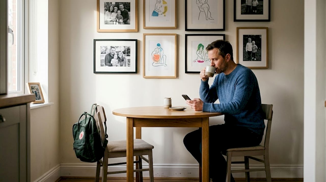
Display family photos and personal art thoughtfully
A unified look does not mean sacrificing what matters to you most. Personal art deserves smart display too. The challenge is integrating meaningful pieces without disrupting the visual flow you have worked hard to create.
The first principle is placement. Avoid family photos in public or high-traffic areas like living rooms and bathrooms. Hallways and bedrooms are far more appropriate settings. They feel intimate rather than exposed, and they allow personal art to exist without competing with the broader design scheme of your main living spaces.
Here is a step-by-step approach to curating a personal art gallery:
- Edit ruthlessly. Select only your favourite images rather than displaying everything. Quality over quantity always applies.
- Choose a consistent treatment. Black-and-white prints, or a single warm colour tone, will unify even very different images.
- Standardise your frames. Matching frame colours or finishes create cohesion regardless of image variety.
- Lay it out before you hang. Arrange frames on the floor to find a balanced composition before making any holes in the wall.
- Consider a dedicated wall. A single hallway gallery wall keeps personal art contained and beautifully presented.
For more ideas on how to personalise with art without compromising your overall scheme, there are some excellent approaches worth exploring. You can also find practical guidance on how to hang personal art with precision and confidence.
Pro Tip: Stick to similar frame colours or a consistent photo treatment (all black-and-white, or all warm-toned) across your personal gallery. This single decision creates unity even when the images themselves are wildly varied.
Why embracing boldness is the key to stunning art displays
Here is something that most interior guides will not tell you plainly: the rooms that genuinely stop you in your tracks are almost never the result of careful, cautious choices. They are the result of someone deciding to go bigger, bolder, and braver than felt comfortable.
Conventional wisdom tells you to play it safe. Choose neutral tones. Keep art small enough not to overwhelm. Match everything carefully. The result of following that advice too rigidly is a room that looks fine but feels forgettable.
We have seen it time and again. A client swaps a modest framed print for an oversized abstract canvas and the entire room shifts. The furniture looks more intentional. The colour scheme makes sense. The space feels finished in a way it simply did not before. That transformation did not require new furniture or a fresh coat of paint. It just required courage.
Breaking the matchy-matchy rule deliberately, pairing an unexpected bold print with a quiet, neutral room, or hanging a single oversized piece where a gallery wall was expected, creates the kind of visual surprise that makes a home genuinely memorable. Explore expert tips for large art to see how scale and confidence work together.
If your art currently feels safe, that is a signal worth listening to.
Find your perfect piece at FrameTheWorld
Feeling inspired to elevate your space? The right artwork is just a click away. At FrameTheWorld, you will find a curated collection of wall art spanning bold colour, texture, and style, all designed to help you put the principles above into practice. Whether you are drawn to the organic calm of wabi sabi wall art or need something made precisely to your dimensions, the options are genuinely flexible. The custom prints service means you are never limited to off-the-shelf sizes. Every wall, every room, and every vision can be matched with something that fits perfectly.
Frequently asked questions
How high should I hang artwork above my sofa or bed?
The ideal height is 4 to 12 inches between the bottom of the art and the top of your sofa or headboard, with the art spanning about two-thirds the width of your furniture.
What’s the biggest mistake people make with wall art?
Too-small art is the most common error. Oversized art almost always creates more visual weight and impact, so when in doubt, choose the larger size.
Where should I display personal or family photos?
Place family photos in more private areas such as hallways and bedrooms, rather than high-traffic spaces like living rooms or bathrooms, for a more considered feel.
How important is matching art styles and frames in one room?
It is best to mix mediums for depth rather than matching everything exactly, as long as you unify the display with a common colour palette or consistent frame finish.


Leave a comment
This site is protected by hCaptcha and the hCaptcha Privacy Policy and Terms of Service apply.