

TL;DR:
- Matching prints involves understanding print types, visual weight, and room context.
- Organize prints with a unifying theme, balanced scale, and cohesive framing for harmony.
- Personal creativity and personality are key, with rules serving as guidelines rather than strict limits.
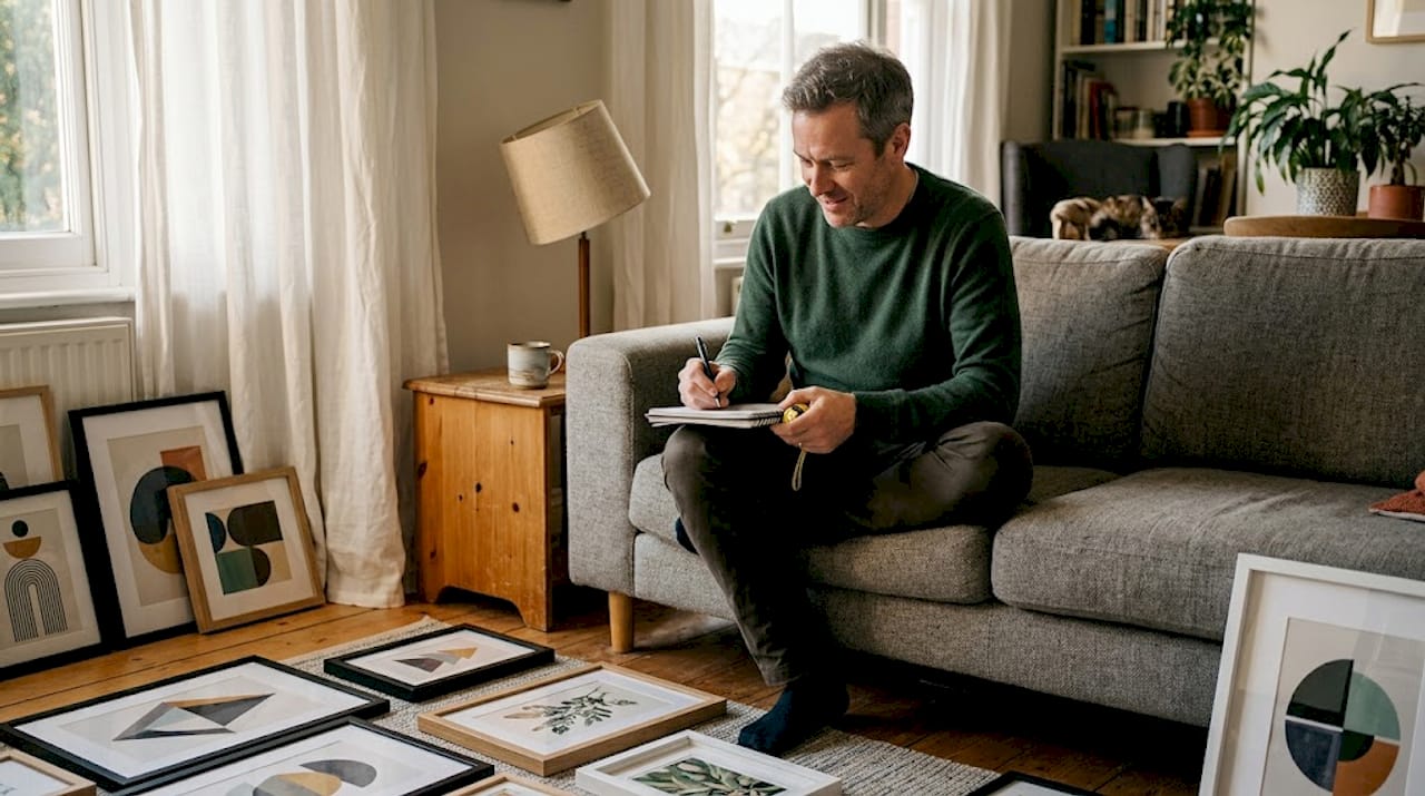
You’ve found two prints you love, but the moment you hang them side by side, something feels off. The colours don’t quite sing together, the scales fight for attention, and the room suddenly looks busier than a charity shop window. This is one of the most common frustrations homeowners and interior designers face. The good news is that matching decorative prints is not guesswork. There is a clear, learnable method behind every beautifully curated wall, and this guide walks you through it step by step, from understanding print types to troubleshooting clashes before they ruin an otherwise perfect room.
Table of Contents
- Understanding print types and their roles
- preparing your space and print selection
- Step-by-step: matching prints like a pro
- troubleshooting: common pitfalls and creative fixes
- Our perspective: why print matching is an art, not a science
- bring your vision to life with custom wall art
- frequently asked questions
Key Takeaways
| Point | Details |
|---|---|
| Know your print types | Understanding print categories helps you plan effective combinations. |
| Plan for your space | Assess colour palette, wall size, and room layout before selecting prints. |
| Mix with intent | Balance scale and motif, limit colour variety, and experiment for a harmonious look. |
| Fix with small tweaks | If the arrangement feels off, adjusting frames or print order often provides a quick improvement. |
Understanding print types and their roles
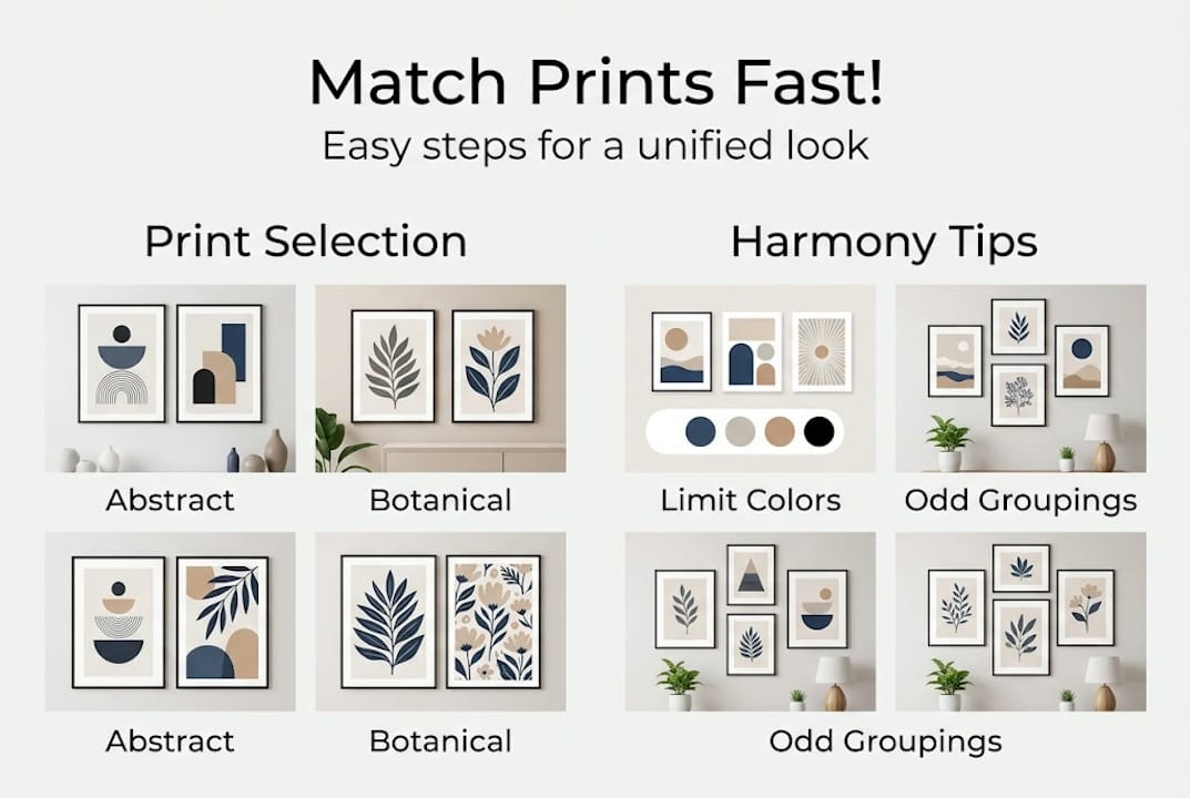
Before you can match prints confidently, you need to know what you’re working with. Abstract, botanical, and geometric prints each carry a distinct visual personality, and defining these categories is the first step toward matching success.
Abstract prints use shape, colour, and texture without depicting recognisable subjects. They bring energy and movement to a space and work particularly well in modern or minimalist rooms. Photography prints anchor a room with realism and storytelling, often acting as a focal point. botanical prints bring nature indoors, adding warmth and organic softness that suits both classic and contemporary settings. geometric prints introduce order and structure, which makes them ideal counterparts to more fluid designs. Finally, text-based prints carry cultural or personal meaning, and when used sparingly, they add a layer of personality without visual noise.
Each print type affects a room’s mood in a measurable way. A large abstract in saturated hues raises energy levels in a living area, while a muted botanical in a bedroom encourages calm. Understanding why art prints matter in terms of mood and atmosphere helps you select pieces with intention rather than impulse.
The real magic happens when you combine contrasting types. A bold geometric next to a delicate botanical creates balance through contrast, much like pairing a statement necklace with a simple dress. The contrast gives each piece room to breathe.
When to use each print type:
- Abstract: statement walls, open-plan living areas, offices
- Photography: hallways, gallery walls, focal feature walls
- botanical: bedrooms, kitchens, bathrooms, any space needing warmth
- geometric: dining rooms, modern interiors, alongside organic prints
- text-based: personal spaces, children’s rooms, reading nooks
| Print type | Visual weight | Best pairing partner | Room mood effect\ |
|---|---|---|---|
| Abstract | High | botanical or photography | Dynamic, expressive\ |
| Photography | Medium | geometric or text | Personal, grounded\ |
| botanical | Low to medium | Abstract or geometric | Fresh, calming\ |
| geometric | Medium to high | botanical or photography | structured, modern\ |
| text-based | Low | Any type | Personal, conversational |
Pro tip: Think of visual weight as the effort required for your eye to process a print. Bold colours and complex patterns carry high visual weight. Use one high-weight print alongside two lower-weight pieces to create depth without chaos.
preparing your space and print selection
Once familiar with print types, you’re ready to plan your selection process based on your room. harmonising prints begins with understanding the space’s function, colour palette, and existing décor, and skipping this step is where most people go wrong.
Start by assessing your wall size and natural lighting. A small wall overwhelmed by an oversized print will feel cramped. A large, bright wall can carry multiple pieces or a single bold statement. North-facing rooms with cooler light tend to benefit from warmer-toned prints, while south-facing rooms can handle cooler, more saturated palettes without feeling cold.
Use this checklist before you begin selecting:
- measure your wall space accurately, noting height and width in centimetres.
- Define your colour palette by pulling three key colours from your existing furniture, textiles, or flooring.
- Note existing patterns in your space, such as cushions, rugs, or curtains. These count as visual patterns too.
- Set your mood intention. Is this room meant to energise or relax?
- Research print types that complement your mood intention before browsing.
- Create a shortlist of five to seven prints, then edit down to three to five.
For wall art selection, the size and feel of your room should guide your choices as much as personal taste does.
| Room type | Space feel | Best print approach | recommended palette\ |
|---|---|---|---|
| Open-plan living room | Open, social | Gallery wall with mixed types | warm neutrals, one accent colour\ |
| Small bedroom | intimate, restful | One or two larger prints | soft tones, muted shades\ |
| Kitchen/diner | functional, lively | Small groupings, botanical or text | Fresh greens, creams, terracotta\ |
| Home office | focused, professional | One statement print, geometric | Cool blues, greys, monochrome |
If you can’t find exactly what you need from ready-made collections, custom print options give you control over colour, scale, and subject to match your space perfectly.
Pro tip: commit to no more than three main colours across all your prints, with neutrals acting as buffers. Four or more competing colours will create visual tension even when the prints are individually beautiful.
Step-by-step: matching prints like a pro
With your shortlist ready, it’s time to organise your prints for maximum effect. layering different scales and motifs avoids monotony and brings dynamic interest to any arrangement.
Follow these steps to match prints confidently:
- Choose a unifying theme. This could be a colour, a subject (nature, architecture, abstraction), or a feeling. Your theme acts as the invisible thread.
- Balance scale and motif size. Never place two large-scale prints side by side. A large print benefits from a smaller neighbour that doesn’t compete.
- unify with colour. Each print should share at least one colour with another in the grouping. It does not have to be the dominant colour, just a presence.
- alternate busier and simpler designs. Place a complex, detailed print next to a quieter, minimal one. This rhythm keeps the eye moving without fatigue.
- Check the arrangement visually before committing. Use paper cutouts on the wall to test placement. Step back at least three metres and squint slightly. If one print jumps out aggressively, it needs rebalancing.
The art selection fundamentals behind this approach are grounded in how human vision processes grouped images, favouring rhythm and repetition over randomness.
“Never pair all large-scale prints. mixing scale is harmony’s secret weapon.”
Groupings work best in odd numbers. Three or five prints feel balanced and deliberate to the eye. Even numbers can work in formal, symmetrical settings, but odd groupings have an organic quality that feels considered rather than rigid. And the impact of framing should not be underestimated, as consistent frame styles bind a grouping together even when the prints themselves differ wildly.
Limiting your palette to three to four tones increases perceived harmony by up to 40%, making colour discipline one of the highest-impact decisions you can make.
troubleshooting: common pitfalls and creative fixes
Even the best plans can go off course. Here’s how to avoid and fix the most frequent problems.
The most common mistake is loading a wall with too many contrasting prints at once. Each print competes for attention, and the result is visual noise rather than visual interest. The second most common error is ignoring scale, placing prints of similar size together without variation. The third is mismatched frames, where a collection of different frame finishes pulls the eye in too many directions. overloading a room with patterns and ignoring frame cohesion are the two mistakes most likely to disrupt the flow of a display.
Signs your print arrangement isn’t working:
- The arrangement feels restless rather than engaging
- One print dominates and draws all attention away from the others
- The grouping looks unfinished or haphazard from across the room
- colours appear to clash rather than converse
- The overall wall feels heavy or visually exhausting
Here are the practical fixes:
Replace one print with a neutral alternative. If contrast is too high, introducing a black-and-white or monochrome print can reset the visual balance. It acts as a full stop between busy passages.
unify frame colours or materials. You don’t need identical frames, but grouping by a shared finish, such as all natural wood tones or all black, creates cohesion. The framing process itself is a design decision, not just a practical one. And if you’re unsure whether to frame yourself or seek help, professional framing offers accuracy and finish quality that makes a real difference.
introduce white space deliberately. Not every centimetre of wall needs a print. leaving breathing room between pieces allows each one to be seen properly.
Pro tip: Before finalising any arrangement, assess it from multiple angles and in different lighting conditions, including evening lamplight. A grouping that looks perfect in daylight can feel very different once the sun goes down.
Our perspective: why print matching is an art, not a science
At Frame the World, we’ve seen rooms transformed by a perfectly matched trio of prints, but we’ve also seen technically flawless arrangements that feel utterly lifeless. The difference is almost always personality.
Rules provide structure, and the steps in this guide genuinely work. But the most memorable homes we encounter tend to bend at least one rule with confidence. Perhaps the frames are all mismatched but share an aged, patinated quality. Perhaps there’s a fourth colour that shouldn’t work but electrifies the entire wall. These combinations emerge not from following instructions but from trusting your instincts.
The homes that stay with you are the ones with a signature look. creative print inspiration is everywhere, but the interpretation is always personal. perfection is less important than authenticity. If a combination excites you when you look at it, that emotional response is data. Trust it. The process of experimenting, making mistakes, and adjusting is where your eye develops, and that development is genuinely one of the most rewarding parts of decorating a home.
bring your vision to life with custom wall art
If you’re inspired to start curating your own gallery or refresh your current style, here’s how to do it effortlessly. At Frame the World, we’ve made it simple to find prints that match your space, mood, and existing décor. Browse curated collections like wabi sabi wall art for understated, organic beauty or explore colourful paintings if you want to make a bold statement. Every piece is available in multiple sizes and formats to suit your wall dimensions. If you have a specific vision, our custom print service lets you commission something completely unique. Your wall deserves more than a last-minute decision.
frequently asked questions
How many prints should I group together for the best effect?
odd-numbered groupings such as three or five prints typically look balanced and intentional, as the eye resolves the arrangement more naturally than with even numbers.
Should all my print frames match exactly?
Frames do not need to be identical. frame cohesion through a shared colour or material finish is enough to tie a display together while still allowing variation and character.
What if my prints clash with my furniture?
Identify a colour that appears in both the print and the furniture, then emphasise it. unifying colours through a neutral print or a shared accent tone is the fastest way to resolve a décor clash.
Can I combine different art styles in one room?
Absolutely. balanced mixing of styles adds visual intrigue, provided you anchor the display with a shared colour palette or a clear thematic thread running through all the pieces.


Leave a comment
This site is protected by hCaptcha and the hCaptcha Privacy Policy and Terms of Service apply.