

TL;DR:
- Customising prints allows for personally tailored wall art that enhances a home’s character.
- Proper image resolution, material selection, and proof review are crucial for high-quality results.
- Proper care and strategic placement extend the longevity and visual impact of custom wall art.
You’ve spent hours browsing online galleries and high-street shops, only to walk away with something that’s almost right but never quite perfect. The colours are slightly off, the size doesn’t suit your wall, or the subject matter simply doesn’t reflect your taste. Off-the-shelf prints are designed to appeal to everyone, which means they rarely speak to anyone in particular. Customising your own prints changes that entirely. This guide walks you through every stage, from understanding your options and preparing your files to ordering, installing, and caring for your finished piece, so you can create wall art that genuinely belongs in your home.
Table of Contents
- Understanding custom print options and requirements
- Preparing your images and selecting the right materials
- Step-by-step: customising and ordering your print
- Quality checks, installation, and care tips
- A designer’s perspective: why personalisation changes everything
- Ready to create your perfect custom print?
- Frequently asked questions
Key Takeaways
| Point | Details |
|---|---|
| Start with the right image | Select high-resolution files and check colour modes for professional results. |
| Match print to décor | Use the 60-30-10 colour rule and consider custom sizes for seamless room integration. |
| Order with proofs | Always request a proof before finalising to avoid unwanted surprises. |
| Care ensures longevity | Keep prints away from direct sunlight and use archival inks for decades of enjoyment. |
Understanding custom print options and requirements
Before you start uploading files and choosing finishes, it pays to understand what types of custom prints exist and which suits your decorating goals. The three most common formats you’ll encounter are giclée prints, archival pigment prints, and direct-to-substrate prints. Each has distinct strengths.
Giclée prints use fine-art inkjet technology to reproduce images with extraordinary colour depth and tonal range. They’re the preferred choice for photographic artwork and detailed illustrations. Archival pigment prints are closely related but emphasise longevity above all else, using fade-resistant inks on acid-free substrates. Direct-to-substrate printing applies ink straight onto materials such as canvas, wood, or aluminium, creating a more tactile, contemporary finish.
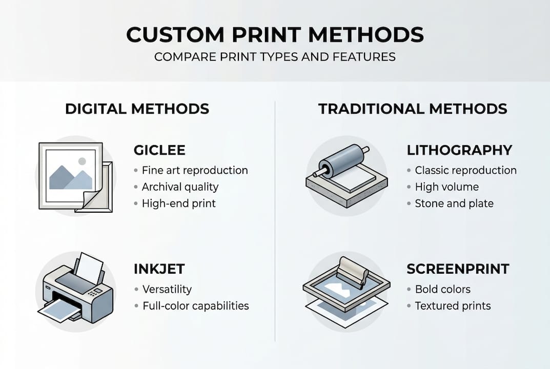
The choice between digital and traditional methods is also worth considering. Mass customisation scales personalisation efficiently via digital tools, but traditionalists value the authenticity of hand-finished or limited-run originals. For most homeowners and designers, digital customisation offers the best balance of quality, speed, and flexibility.
To make an informed decision, here’s a quick comparison of the most popular print types and their suitability for home décor:
| Print type | Best for | Durability | Typical finish |
|---|---|---|---|
| Giclée | Fine art, photography | Very high | Matte or gloss |
| Archival pigment | Long-term display, galleries | Exceptional | Matte |
| Direct-to-canvas | Textured, contemporary looks | High | Textured |
| Direct-to-aluminium | Modern, minimalist spaces | Very high | Gloss or satin |
Before you proceed, there are a few essential technical requirements to keep in mind:
- Image resolution: A minimum of 150 DPI is required, but 200 DPI or above is strongly preferred for larger formats
- Colour mode: Use sRGB for digital proofing and CMYK for final print files wherever possible
- File format: TIFF or high-quality JPEG files are standard; avoid heavily compressed formats
- Bleed and margins: Allow at least 3mm bleed around the edges to prevent unwanted cropping
Exploring personalised wall art customisation in more detail can help you understand which approach suits your project, and reviewing print customisation options gives you a clear picture of what’s available at different price points. It’s also worth being aware of the challenges in print customisation so you can plan around them from the start.
Pro Tip: Always request a physical sample or digital proof before placing a bulk or large-format order. Colours on screen can differ noticeably from printed results, especially when switching between sRGB and CMYK colour spaces.
Preparing your images and selecting the right materials
Once you’ve chosen your print style, the quality of your finished piece depends heavily on how well you prepare your image files and how thoughtfully you select your materials. These two steps are where most mistakes happen, and where the biggest improvements are made.
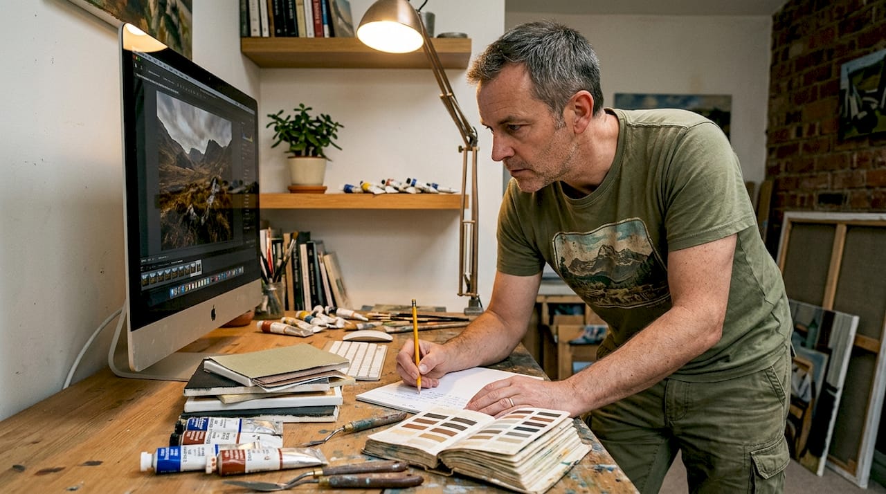
Start with your image file. Low-resolution images risk visible artefacts when enlarged, which is why 150 DPI is the minimum and 200 DPI or higher is ideal for quality prints. Open your file in an image editor and check the resolution at the intended print size. If it falls short, you can use AI-powered upscaling tools to improve it, though results vary depending on the original image quality.
Here’s a quick reference for minimum image specs across common print sizes:
| Print size | Minimum resolution | Recommended resolution | Preferred format |
|---|---|---|---|
| A4 (21 x 29.7 cm) | 150 DPI | 200 DPI | TIFF or JPEG |
| A3 (29.7 x 42 cm) | 150 DPI | 200 DPI | TIFF |
| A2 (42 x 59.4 cm) | 150 DPI | 200 DPI+ | TIFF |
| 60 x 90 cm | 200 DPI | 300 DPI | TIFF |
Material selection is equally important. Canvas suits warm, textured interiors and works beautifully with photographic or painterly images. Fine art paper, particularly choosing archival materials such as cotton rag or baryta paper, delivers the sharpest detail and is the gold standard for illustrative or graphic work. Pigment inks outlast dye-based inks significantly, making them the better choice for any print intended for long-term display.
Bear in mind that custom sizes can increase costs by roughly 10 to 15 percent compared to standard formats, and may also extend production and delivery times. It’s worth choosing the right print size carefully before committing, as scaling up a print that wasn’t designed for a large format can expose resolution issues that weren’t visible at smaller sizes.
Key material considerations at a glance:
- Canvas: Warm, textured feel; suits photographic and painterly subjects
- Fine art paper: Crisp detail; ideal for illustration, typography, and graphic prints
- Aluminium or acrylic: Sleek, contemporary; excellent for high-contrast photography
- Pigment inks: Archival quality, fade-resistant; always preferred over dye-based inks
Pro Tip: Use the 60-30-10 colour rule when matching your print to a room’s palette. Sixty percent should be your dominant wall colour, thirty percent a secondary tone, and ten percent an accent. Your custom print can carry that accent colour to tie the whole scheme together beautifully.
Step-by-step: customising and ordering your print
With your files prepared and your material choices made, the ordering process itself is straightforward if you follow a clear sequence. Rushing this stage is where costly errors creep in.
- Upload your file to the printing platform, ensuring it meets the resolution and format requirements outlined above
- Use the preview tool to check how your image sits within the chosen dimensions, looking carefully for unwanted cropping at the edges
- Select your options: size, substrate, finish (matte, satin, or gloss), and frame style if applicable
- Review the proof carefully, checking colour accuracy, composition, and any text elements for legibility
- Confirm costs including any custom size surcharges, framing, and delivery
- Place your order and save your order confirmation and file details for future reprints
For a more detailed walkthrough, the full step-by-step customisation guide covers every stage with practical examples. When you’re ready, you can submit a custom print order directly through the platform.
Common mistakes to avoid during this stage:
- Skipping the proof review: Even a quick glance can catch cropping errors or colour shifts before they become expensive problems
- Using low-resolution files: A file that looks sharp on screen may print poorly at larger sizes
- Mismatched colour modes: Submitting an sRGB file to a CMYK press without conversion can cause noticeable colour shifts
- Vague file naming: Use descriptive file names so you and your printer can identify the correct version quickly
- Ignoring bleed settings: Forgetting to add bleed can result in white edges or unwanted cropping on the final print
It’s also worth considering how art transforms a home’s atmosphere when planning placement alongside your order.
Pro Tip: Variable data printing can be 10 to 15 percent slower than standard print runs due to custom logistics. If you’re working to a deadline for an event or room reveal, factor in extra lead time for custom or large-format orders.
Quality checks, installation, and care tips
Receiving your custom print is exciting, but taking a few minutes to inspect it properly before hanging it will save you frustration later. Most reputable printers will address issues if you raise them promptly, so a thorough check on delivery is essential.
When your print arrives, inspect it against the following checklist:
- Colour accuracy: Compare the print to your on-screen proof under natural daylight, as artificial lighting can skew your perception
- Material quality: Check for surface blemishes, uneven coating, or any signs of damage during transit
- Finish consistency: Matte finishes should be uniformly flat; gloss finishes should be smooth and free of streaks
- Framing and mounting: If framed, check that the print sits squarely within the frame and that the backing is secure
‘Pigment inks are archival and can maintain vibrancy for decades when cared for properly.’
This matters enormously for long-term display. Pigment inks last decades when prints are kept away from direct sunlight and humidity. Direct sunlight exposure can reduce print vibrancy by up to 40 percent over five years, so placement is a genuine conservation decision, not just an aesthetic one.
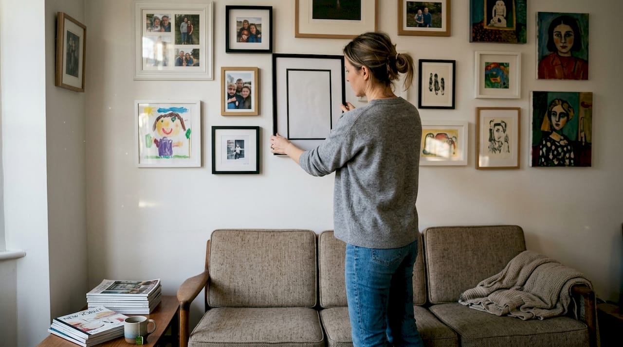
For installation, use the 60-30-10 colour rule again to confirm your print enhances rather than competes with the room’s existing palette. Hang prints at eye level, which is typically around 145 to 150 centimetres from the floor to the centre of the artwork. For gallery walls, lay the arrangement out on the floor first to test spacing before committing to wall fixings.
Care tips to keep your print looking its best:
- Dust lightly with a dry, soft cloth; avoid damp cloths on unframed or unglazed prints
- Keep prints away from direct sunlight, radiators, and areas of high humidity such as bathrooms
- For framed prints, check the fixings annually and re-hang if the frame has shifted
- Store spare or unframed prints rolled in acid-free tissue inside a protective tube
For further inspiration on how to hang wall art stylishly in different room settings, there’s plenty of practical guidance to draw on.
A designer’s perspective: why personalisation changes everything
There’s a tendency to treat custom prints as a premium indulgence, something reserved for art collectors or high-budget interior projects. That view is outdated. Digital customisation offers unparalleled access and flexibility that was simply unavailable a decade ago, meaning anyone can now access genuinely personalised décor.
What designers understand, and what many homeowners are only beginning to realise, is that bespoke art does something that no off-the-shelf piece can replicate. It anchors a space emotionally. A print made from a photograph taken on a meaningful trip, or a piece designed around a specific colour palette, creates what interior designers sometimes call a ‘sense of arrival’, the feeling that a room is finished and intentional rather than assembled.
‘Personalisation isn’t just about looks, it’s about creating spaces that feel genuinely yours.’
Custom prints also allow designers to weave brand storytelling and personal nostalgia into commercial and residential projects alike. The importance of custom wall art extends beyond aesthetics into identity. When a space reflects the people who inhabit it, it becomes more than decoration. It becomes a genuine expression of character.
Ready to create your perfect custom print?
If this guide has sparked ideas for your own space, the next step is simpler than you might think. At Frametheworld, you can order a custom print directly through the platform, with clear options for size, substrate, finish, and framing. Whether you’re working on a single statement piece or a full gallery wall, the process is designed to be straightforward from upload to delivery. You can also browse curated collections, such as Wabi Sabi wall art, for inspiration before you commit to a fully bespoke design. The team is on hand to guide you through any technical questions, so you can focus on the creative decisions that matter most.
Frequently asked questions
What is the ideal image resolution for custom prints?
A minimum of 150 DPI is required, but 200 DPI or higher is recommended for the best quality, particularly at larger print sizes.
How do I avoid fading in my custom wall art?
Keep prints away from direct sunlight and choose archival pigment inks to maximise longevity, as these can maintain vibrancy for decades with proper care.
Are digital custom prints as good as original artwork?
High-quality digital prints using archival materials can rival originals for most home décor purposes, especially when produced using giclée or archival pigment processes.
What typical mistakes should I avoid when customising prints?
Always check your file resolution, review proofs carefully for cropping errors, and ensure your colour mode matches the printing process to avoid unexpected colour shifts in the final piece.
Recommended
- How to customise prints for personalised wall art
- Commission custom prints: a step-by-step guide for unique spaces
- Decorative prints workflow 2026: reduce delays by 33%
- Custom Art Prints: Transforming Urban Interiors
- DIY Custom Window Treatments: Step-by-Step Guide – Fabric Store in Columbia, SC | Drapery Making Services

Leave a comment
This site is protected by hCaptcha and the hCaptcha Privacy Policy and Terms of Service apply.