

TL;DR:
- Choosing art for your home requires matching styles to create visual harmony and reinforce your space’s character.
- Structured approaches like assessing room proportions, using the two-thirds rule, and balancing styles help achieve cohesive and intentional interiors.
Choosing art for your home is rarely as straightforward as pointing at something you like and buying it. Most people approach art selection as a purely personal exercise, picking pieces that catch their eye without considering how those pieces interact with the room around them. That instinct is understandable, but it often leads to spaces that feel slightly off without anyone being able to explain why. Selecting art by style creates visual harmony and cohesion by aligning artwork aesthetics with a room’s overall design language, preventing clashes and making the space feel deliberate. This guide walks you through exactly how to do that.
Table of Contents
- How art style influences interior harmony
- Frameworks for selecting art by style
- Mixing art styles: Finding balance without chaos
- Debunking myths: Art style and property value
- Our perspective: What most guides miss about art selection
- Find artwork that suits your style with Frametheworld
- Frequently asked questions
Key Takeaways
| Point | Details |
|---|---|
| Visual harmony | Choosing art by style ensures your décor is cohesive and intentional, not chaotic. |
| Practical frameworks | Use accent colours, scale rules, and style distribution methods to select with confidence. |
| Balance and unity | Limit mixing styles and unify with palettes or frames to avoid visual confusion. |
| No property value guarantee | While style-matched art boosts perceived appeal, it doesn’t empirically increase property value. |
How art style influences interior harmony
The relationship between art and interior design runs deeper than most homeowners realise. Art is not simply decoration placed on an empty wall. It is a visual anchor that communicates the character, mood, and intention of the entire room. When that anchor is misaligned with everything else in the space, the effect is subtle but persistent. Something always feels wrong, even if visitors cannot name it.
Understanding essential art styles is the first step to making confident choices. Minimalist abstract works carry a very different atmosphere to richly detailed botanical prints, and both sit awkwardly in spaces designed for the other. A contemporary living room with clean lines, muted tones, and geometric furniture benefits from art that mirrors that discipline. Introducing a baroque-style figurative painting into that environment creates a visual argument between the art and the architecture.
The role of art in home style is to reinforce and extend the design story already being told by the furniture, textiles, and architectural details. When it does that effectively, the room achieves what designers call visual cohesion, meaning every element feels like it belongs to the same conversation. When it does not, the art competes rather than contributes.
“Selecting art by style creates visual harmony and cohesion in living spaces by aligning artwork aesthetics with the room’s overall design style, preventing clashes and making the space feel intentional.” — Martha Stewart
Here is what style-matched art consistently achieves in interior spaces:
- Reinforces the room’s atmosphere, whether that is calm and restful, bold and energetic, or warm and inviting
- Creates a sense of intention, signalling that the space was designed rather than assembled
- Reduces visual noise, allowing the eye to move comfortably around the room without jarring contrasts
- Supports the emotional function of the space, so a bedroom feels restful and a studio feels inspiring
If you have ever walked into a beautifully inspiring artistic interior and felt an immediate sense of ease, you have experienced this firsthand. The art did not stand out as separate from the room. It was part of it.
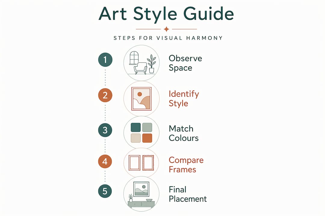
Frameworks for selecting art by style
Understanding why style matters is useful. Having a practical method to apply it is even more useful. Experienced designers do not simply follow their instincts when selecting art. They apply structured approaches that consistently produce harmonious results. You can use the same frameworks at home.
Methodologies for art selection include observing room proportions, natural light, and primary use, as well as pulling accent colours from existing furnishings, applying scale rules such as the two-thirds furniture width guideline, and using the 60-30-10 rule for style distribution across a space.
Here is how to build your selection process step by step:
-
Assess the room’s character first. Before looking at any art, spend ten minutes observing the space. Note the dominant colours, the quality of light at different times of day, the scale of furniture, and the general mood the room already communicates. This gives you a filter before you start browsing.
-
Identify your accent colours. Look at cushions, throws, rugs, and decorative objects. These smaller items often carry colours that the main furniture does not. Art that picks up those accent colours will feel like it belongs rather than like an afterthought.
-
Apply the two-thirds rule for scale. A common mistake is buying art that is too small for the wall or for the furniture below it. A general guideline is that artwork should occupy roughly two-thirds the width of the furniture it sits above. This grounds the piece visually and prevents it from floating awkwardly.
-
Use the 60-30-10 rule for style balance. This is a principle borrowed from broader interior design. In any given room, sixty percent of the visual style should be your dominant aesthetic, thirty percent a complementary style that adds interest, and ten percent an accent style that creates personality without overwhelming. Art selection should reflect this balance rather than introduce a completely foreign fourth voice.
-
Consider matching art with interiors by material as well as image. A canvas print works differently to a framed fine art print, which works differently to a metal print or a textile piece. The physical format of the artwork is part of its style contribution.
| Framework | What it does | Best applied when |
|---|---|---|
| Accent colour matching | Ties art to existing décor | Room has strong existing colour story |
| Two-thirds width rule | Establishes correct scale | Hanging art above furniture |
| 60-30-10 style balance | Prevents visual overload | Decorating a whole room |
| Light assessment | Avoids washed-out or dark art | Planning placement in variable light |
This wall art selection guide approach removes guesswork and replaces it with repeatable, reliable decisions. It also takes the pressure off individual taste, because you are no longer asking “do I like this?” but rather “does this work here?”
Pro Tip: Take a photo of your room on your phone before shopping for art. Comparing the photo to potential pieces gives you an objective reference point that your memory alone cannot provide.
And if you want to see how these principles look in practice, studying innovative design elements used by leading interior designers can give you a strong sense of how frameworks translate into real spaces.
Mixing art styles: Finding balance without chaos
Most rooms benefit from a single dominant art style. But the real world is rarely that simple. You may have inherited a piece that does not quite match your preferred aesthetic. You may simply love two different styles and want both present in your home. Or you might be a designer working with a client whose collection spans multiple periods and movements.
The good news is that mixing art styles can work beautifully, but it requires discipline. Interior designers consistently recommend limiting any single room to a maximum of two or three styles. Beyond that threshold, the space tips from curated eclecticism into visual chaos.
The key strategies for successful mixing are:
- Unify through framing. When styles are disparate, identical frames impose a sense of order that overrides the differences between the images themselves. A gallery wall of very different prints can read as a coherent collection simply because every frame is the same colour and profile.
- Use colour as the binding thread. Even if two pieces belong to entirely different artistic movements, shared colour tones create a visual relationship between them. A bold abstract and a delicate botanical print can coexist if both carry the same warm ochre.
- Balance scale intentionally. Placing a very large piece alongside a very small piece creates hierarchy, not harmony. When mixing styles, keeping pieces at comparable scales prevents one from dominating the other inappropriately.
- Respect the room’s dominant style. Matching art with your interior style means the accent pieces should complement, not challenge, the primary aesthetic.
| Approach | Effect | Risk if overdone |
|---|---|---|
| Identical framing | Creates unity across styles | Can feel uniform if used exclusively |
| Colour palette link | Connects disparate images | Subtle, may need strong colour story |
| Scale balance | Maintains visual order | Matching scales can feel rigid |
| Limiting to 2-3 styles | Prevents chaos | Can feel too restrained without the 10% accent |
Pro Tip: If you are unsure whether two pieces work together, place them on the floor side by side before hanging. The floor test gives you an honest preview of whether the pairing creates harmony or tension.
Getting art styles explained clearly before you start mixing saves considerable time and avoids costly mistakes. When you can name what you are working with, you can make better decisions about what to combine. For further inspiration on building character-rich rooms, it helps to study how others create distinctive interiors with considered art selections.
Debunking myths: Art style and property value
One of the most persistent myths around art selection is the idea that choosing the right style will meaningfully increase your property’s resale value. Estate agents sometimes mention art in staging conversations, and homeowners understandably wonder whether a curated collection is a genuine financial investment in the property itself.
The honest answer is that no empirical data exists to quantify the financial return of style-matched art on property values. There are no reliable benchmarks linking artwork aesthetics to sale prices in any meaningful, measurable way. Art on walls is almost always removed before completion of a sale, which means it rarely forms part of the property transaction itself.
That said, the indirect benefits of style-matched art are genuinely significant, even if they resist simple measurement:
- First impressions matter enormously in property viewings. A home that feels cohesive and intentionally designed creates an emotional response in potential buyers that a bare or chaotic space cannot. Art plays a central role in that impression.
- Perceived quality is influenced by visual context. When a room reads as designed rather than assembled, viewers assign higher quality to everything in it, including the fixtures and finishes that are part of the sale.
- Staging with art works. Art for staging is a recognised tool in property marketing because it helps buyers visualise the lifestyle potential of a space.
The absence of hard data is not the same as the absence of benefit. Presentation shapes perception, and perception shapes decisions, including the decision to make an offer and at what price.
So while you should not select art primarily as a financial strategy, you should absolutely recognise that a thoughtfully styled home performs better on the market and in daily life than one that treats art as an afterthought.
Our perspective: What most guides miss about art selection
Most guides on this subject stop at aesthetics. They give you the colour matching rules, the scale ratios, the style categories, and leave it there. What they rarely address is the emotional dimension of living inside a well-chosen art environment.
When art style aligns with the character of a space, something shifts that goes beyond visual tidiness. Rooms feel more settled. People feel more at ease in them. That is not mysticism. It reflects the well-established principle that human beings respond emotionally to visual consistency and intention. A room that looks like someone thought carefully about every element communicates safety and belonging. A room that feels cobbled together does not, even to people who could not explain why.
The most common mistake we see is not mismatched styles. It is the pursuit of perfection at the expense of personality. Some homeowners become so focused on getting the frameworks right that they select technically correct but personally meaningless art. A room full of perfectly matched but emotionally neutral pieces is still a flat room.
The real goal is to use style selection as a filter, not a cage. The frameworks exist to rule out obvious clashes and guide decisions towards coherence. Within that framework, there is still plenty of space for essential art selection tips rooted in what genuinely moves you. The best interiors are not the ones that follow the rules perfectly. They are the ones that use the rules wisely enough to let personality come through without creating chaos.
Choose art that works with your space. Then choose art that means something to you. Those two things are not mutually exclusive, and the best selections achieve both.
Find artwork that suits your style with Frametheworld
Ready to put these principles into practice? At Frametheworld, you can browse a curated collection of high-quality wall art and decorative prints organised by style, theme, size, and format, making it straightforward to find pieces that genuinely fit your space. Whether you are drawn to clean contemporary abstracts, warm botanical prints, or bold graphic works, the platform gives you the tools to filter by exactly the criteria that matter for your project. For interior designers working across multiple spaces, bespoke and customisation options are also available. Exploring the collection is the most practical next step after developing your selection frameworks.
Frequently asked questions
How do I determine which art style fits my home?
Observe your space’s dominant colours, shapes, and mood, then select art that complements these elements to achieve visual harmony and prevent clashes.
Is it acceptable to mix different art styles?
Yes, but limit mixing to 2-3 styles, unify them through a shared colour palette and consistent framing, and maintain comparable scales for coherence.
Does art style selection increase my property value?
There is no proven empirical link between art style and property value, but style-matched art genuinely improves perceived quality and buyer appeal during viewings.
Are there any style selection rules for professional designers?
Designers frequently apply the 60-30-10 rule to balance dominant, complementary, and accent styles, creating an intentional and cohesive result across a space.


Leave a comment
This site is protected by hCaptcha and the hCaptcha Privacy Policy and Terms of Service apply.