

Art styles can feel like a foreign language at first, full of jargon and movements that seem designed to confuse rather than inspire. But here’s the truth: once you understand the basic visual language of each style, choosing and arranging wall art becomes one of the most enjoyable parts of decorating a home. This guide cuts through the noise and gives you a practical, room-focused understanding of the most important art styles. You’ll learn how to identify them, how they affect the mood of a space, and how to mix them confidently so your walls feel curated rather than cluttered.
Table of Contents
- The foundations of art styles: Key movements made simple
- How art styles shape interior moods
- Mixing art styles like a designer: Rules and expert tricks
- From theory to your walls: Applying art styles at home
- Why most decor guides get art styles wrong
- Ready to curate your perfect art wall?
- Frequently asked questions
Key Takeaways
| Point | Details |
|---|---|
| Understand major styles | Recognising key styles makes it easy to choose art that matches your taste and space. |
| Mix styles with confidence | The 60-30-10 rule helps balance variety and cohesion in any room. |
| Let mood guide selection | Art styles set the tone—bold for energy, minimalist for calm—tailor your choices accordingly. |
| Practical steps matter | Plan placement, palette, and proportions for a polished, professional look. |
The foundations of art styles: Key movements made simple
With the stage set for why art styles matter, let’s untangle the main movements you’ll see in wall art and prints.
Understanding art styles starts with recognising their defining visual traits. You don’t need an art history degree for this. You just need to know what to look for when choosing wall art for your home.
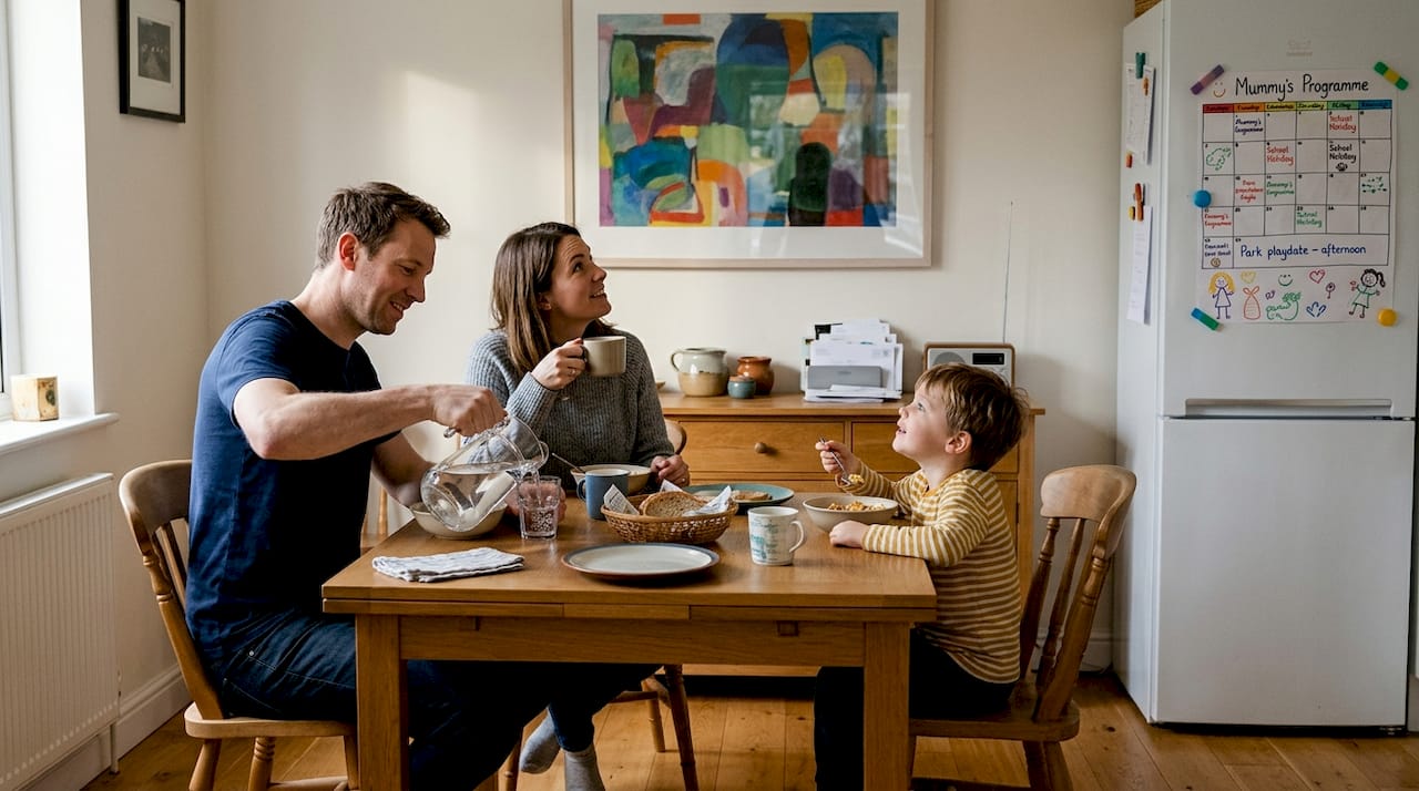
Abstract Expressionism emerged as a bold, emotional movement. Developed in the 1940s and 50s in New York City, it’s characterised by spontaneous, gestural painting that prioritises individual expression and the subconscious. Think large colour fields, dramatic brushwork, and a sense of raw energy. In a home, this style works brilliantly as a statement piece in a living room or hallway.
Cubism takes a completely different approach. Pioneered by Picasso and Braque, it deconstructs subjects into geometric shapes viewed from multiple angles simultaneously. You’ll recognise it by fragmented forms and overlapping planes. It suits eclectic interiors and pairs well with industrial or mid-century modern furniture.
One of the most common points of confusion is the difference between Modern and Contemporary art. They are not the same thing. Modern art and contemporary art refer to entirely different periods, yet decor guides frequently use them interchangeably. Modern art spans roughly the 1860s to the 1970s, while contemporary art describes work made after that. For practical decor purposes, understanding this distinction helps you browse modern wall art concepts with much greater clarity.
Pop Art is instantly recognisable: bold outlines, flat colour, and imagery borrowed from advertising and popular culture. It energises a space and works especially well in kitchens, studios, or playful living areas.
Here’s a quick comparison to help you identify each style at a glance:
| Style | Key visual traits | Best room fit |
|---|---|---|
| Abstract Expressionism | Gestural marks, colour fields | Living room, hallway |
| Cubism | Geometric fragmentation | Study, eclectic spaces |
| Modernism | Clean lines, minimal ornament | Open-plan, minimal rooms |
| Contemporary | Concept-driven, varied media | Any room |
| Pop Art | Bold colour, flat graphic forms | Kitchen, creative studio |
Where might you actually spot these styles in real homes?
- Abstract Expressionism: above a sofa or as a single oversized canvas in a neutral room
- Cubism: in a gallery wall alongside black-and-white photography
- Modernism: framed geometric prints in a minimalist bedroom
- Pop Art: a bold print in a kitchen or home bar area
- Contemporary: mixed media works in a home office or reading nook
Keeping up with wall art trends 2026 also helps you see which styles are gaining momentum in real interiors right now.
How art styles shape interior moods
Now that you know what makes each style unique, it’s time to see how these choices actually shape your home’s look and feel.
Art isn’t just decoration. It’s one of the most powerful tools you have for setting the emotional tone of a room. The style you choose signals something to everyone who enters, including yourself.
Abstract, Pop Art, and expressive contemporary works tend to energise a space. They draw the eye, spark conversation, and create a sense of vitality. These are excellent choices for social areas like living rooms and open-plan kitchens. In contrast, minimalist art, Wabi Sabi-influenced pieces, and soft abstract works with muted palettes tend to calm a space. They’re ideal for bedrooms, bathrooms, and reading corners where you want to feel settled.
Understanding matching art with interiors goes beyond simply matching colours. It’s about emotional alignment between the art and the purpose of the room.
Here’s a practical guide for choosing art style by room:
- Living room: Choose energising styles like Abstract Expressionism or bold contemporary works. This is your home’s social hub, so art that sparks conversation works well here.
- Bedroom: Opt for calming styles such as minimalism, soft abstract, or Wabi Sabi. You want the space to feel restful, not stimulating.
- Home office: Go for structured styles like geometric abstraction or Modernism. These styles support focus without being distracting.
- Kitchen or dining area: Pop Art and graphic contemporary prints add energy and personality without overwhelming a functional space.
- Hallway: A single bold statement piece in any style works beautifully here. It sets the tone for the entire home.
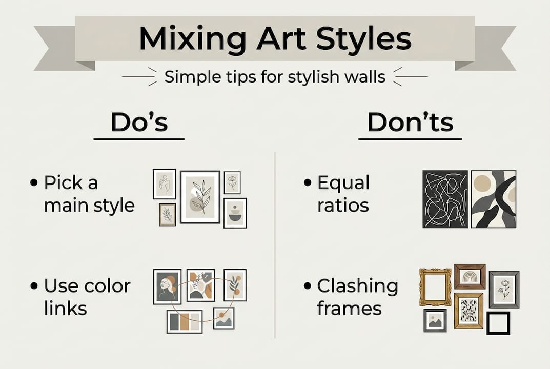
When it comes to mixing styles, the key principle is to avoid equal representation of multiple styles. Equal ratios create visual confusion rather than interest. Instead, use colour palettes and transition pieces as bridges between contrasting styles, such as a geometric abstract and a more realistic landscape.
Pro Tip: If you’re unsure how to connect two different art styles in the same room, look for a shared colour in both pieces. A cushion, rug, or decorative object in that colour acts as a visual bridge and makes the combination feel intentional.
Exploring art’s role in home style further will show you just how much a single well-chosen piece can transform the feeling of an entire room.
Mixing art styles like a designer: Rules and expert tricks
With an understanding of how art styles impact mood, the next step is learning how to combine them effectively, just like a professional.
The most common mistake homeowners make is treating their walls like a museum, where every piece must belong to the same movement. Real interior designers rarely work that way. They mix styles deliberately, using a few key principles to keep things cohesive.
The most useful of these is the 60-30-10 rule. When mixing art styles, use one dominant style for roughly 60% of your wall art, a complementary style for 30%, and a single accent style for the remaining 10%. This creates variety without chaos.
Here’s how to apply it in practice:
- 60% dominant: Choose your main style, perhaps large abstract canvases throughout the living room
- 30% complementary: Add pieces in a related style, such as minimalist line drawings that share a similar colour palette
- 10% accent: Introduce a contrasting piece, perhaps a bold Pop Art print, to create visual interest without overwhelming the room
The most common error is splitting styles 50-50. This creates a visual argument between the pieces rather than a conversation. One style must lead.
Pro Tip: If you’re building a gallery wall with decorating living room walls in mind, use consistent framing across all pieces. Matching frame colours or materials unify very different art styles instantly, even if the images themselves vary widely.
“The most successful rooms don’t follow a single style. They tell a story through carefully chosen contrasts, where each piece earns its place by contributing to the whole.”
Beyond the 60-30-10 rule, consider using size and scale as a unifying element. A collection of small prints in different styles feels cohesive when they share similar dimensions. Similarly, a consistent colour thread running through each piece, even subtly, ties a mixed selection together. Your wall art selection guide can help you think through these decisions before you buy.
From theory to your walls: Applying art styles at home
Equipped with rule-of-thumb guidance, you’re ready to bring theory to life, choosing and hanging art with confidence.
The practical application of art styles depends heavily on the size and character of your room. Small rooms and large rooms call for different approaches.
In a small room, one strong piece in a single style is almost always more effective than several competing prints. A large-format abstract in a small bedroom can make the room feel more spacious rather than cramped, provided the colour palette is light or neutral. Avoid cluttering small walls with too many pieces in different styles.
In a large room, you have the freedom to build a proper narrative across your walls. This is where the 60-30-10 rule really shines. You can anchor the space with a dominant style and layer in complementary and accent pieces across different walls.
Here’s a step-by-step approach to planning your wall art placement:
- Identify the focal wall, usually the one you see first when you enter the room
- Choose your dominant style and place your strongest piece here
- Map out secondary walls and select complementary pieces using the 60-30-10 split
- Consider scale: mix large and small pieces for visual rhythm
- Step back and assess the overall effect before committing to hanging
Before you finalise any selection, ask yourself these questions:
- Does this piece feel right for the mood I want in this room?
- Does it share at least one colour with something else in the space?
- Am I choosing this because I love it, or just because it fills a gap?
- Does it complement or compete with the other art already in the room?
It’s also worth noting that modern and contemporary art are treated interchangeably in many decor guides, which can make browsing feel inconsistent. Trust your eye over the label.
For rooms where you want something expressive and original, pieces like expressive abstract artwork or luxury abstract wall art offer a strong starting point. Browse top art trends for further inspiration tailored to real homes.
Why most decor guides get art styles wrong
Finally, let’s address the standard advice found in many guides and why a fresh approach may serve you even better.
Most decor guides present art styles as a checklist. Pick a style, stick to it, and your room will look polished. This advice is safe, but it produces rooms that feel staged rather than lived in. The most memorable interiors we’ve seen are rarely the ones that follow the rules perfectly. They’re the ones where someone trusted their instincts and introduced an unexpected piece that shouldn’t work but absolutely does.
Blended, experimental arrangements carry a sense of personality that no single-style room can replicate. When you allow yourself to mix a bold abstract with a quiet botanical print, or a graphic Pop Art piece with a delicate minimalist drawing, you create something genuinely yours. Rules are useful starting points, not finishing lines.
Personalising art in the home is ultimately about trusting your own response to a piece. If something moves you, it belongs on your wall. The frameworks in this guide exist to give you confidence, not to constrain your choices.
Ready to curate your perfect art wall?
If you’re now inspired to experiment and elevate your interiors, discovering art that fits your new expertise is the natural next step. At Frametheworld, you can browse collections organised by style, mood, and format, making it straightforward to find pieces that match the vision you’ve built through this guide. Whether you’re drawn to calming Wabi Sabi wall art or want something entirely unique through our custom print service, there’s a ready-to-hang or bespoke option for every room and every taste. You now have the knowledge to choose with confidence.
Frequently asked questions
What is the difference between modern and contemporary art?
Modern art spans the 1860s to 1970s and rejects traditional forms through movements like Cubism, while contemporary art is post-1970s work that often prioritises concept and context over visual aesthetics.
How can I mix different art styles without making my room look busy?
Follow the 60-30-10 rule: assign one dominant style to 60% of your art, a complementary style to 30%, and use a single accent style for the remaining 10% to maintain balance.
What art styles are easiest to use in any room?
Abstract, minimalist, and contemporary styles are the most versatile. Abstract Expressionism in particular, with its emphasis on colour and emotion, adapts well to almost any interior when paired with a unified colour palette.
Should I match my wall art to my room’s colours or furniture?
It’s most effective to let art lead the conversation rather than simply match it. Look for shared colours between the artwork and existing furniture or textiles to create harmony without making the room feel overly coordinated.


Leave a comment
This site is protected by hCaptcha and the hCaptcha Privacy Policy and Terms of Service apply.