
TL;DR:
- Selecting office art strategically enhances professionalism, wellbeing, and employee motivation in the workplace.
- Successful choices depend on purpose-driven criteria, appropriate placement, sizing, and ongoing evaluation.
Selecting art for your office is one of the most underestimated decisions a business owner or office manager will make. Get it right and you create a workplace that communicates professionalism, supports wellbeing, and genuinely lifts people’s spirits every single day. Get it wrong and you’ve spent budget on pieces that feel random, clash with your brand, or simply drain the energy from a room. This guide cuts through the guesswork with a clear, evidence-backed framework for choosing, placing, and evaluating office art that actually works.
Table of Contents
- Establishing your selection criteria for office art
- Best practices for placement, sizing, and harmony
- Maximising employee motivation and wellbeing through art
- Tailoring art choices to company zones and workplace culture
- Measuring success: Applying post-occupancy evaluations to office art
- Rethinking office art: Beyond quick fixes, towards transformative spaces
- Ready to elevate your office? Curated art collections for real impact
- Frequently asked questions
Key Takeaways
| Point | Details |
|---|---|
| Prioritise quality and context | Choose artwork that suits your business ethos and is thoughtfully placed for optimum effect. |
| Strategic placement matters | Hanging at the right height and anchoring to sightlines or furniture boosts both visual and functional impact. |
| Art drives workplace outcomes | Workplace art can improve productivity, morale, and create lasting positive impressions. |
| Adapt art for each zone | Reception, meeting rooms, and workspaces each benefit from tailored styles and themes. |
| Continuously assess success | Post-occupancy evaluations ensure your art continues to meet the office’s evolving needs. |
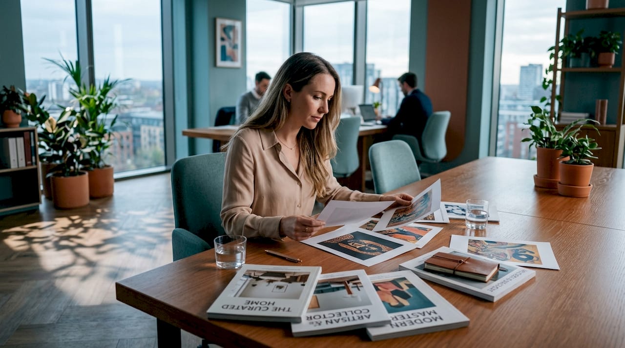
Establishing your selection criteria for office art
With the selection challenge clear, the smartest move is to adopt a purpose-driven framework before you even begin browsing collections. Every art purchase should answer three fundamental questions: Why this piece? Where does it go? What emotion should it evoke?
Start by defining the role your artwork needs to play. Is it reinforcing brand values in a client-facing reception? Building creative energy in a collaborative studio? Providing calm focus near individual workstations? Each purpose calls for a completely different type of artwork. Exploring different art styles for commercial spaces early in the process will save you from costly impulse purchases that look out of place once installed.
A sound selection methodology follows a five-step approach: choose appropriate subject matter for your industry, select calming rather than distracting colours, size the work proportionally to the wall, mix only a small number of art types for variety, and always prioritise quality over quantity. Each step filters out weak choices before they become expensive regrets.
Key criteria to run every candidate artwork through:
- Purpose fit: Does this piece align with the room’s function and the company’s values?
- Mood contribution: Does it calm, energise, or inspire in the way the space requires?
- Visual weight: Is it proportional to the wall and the furniture around it?
- Quality: Is the print resolution, framing, and material finish genuinely high?
- Brand coherence: Does the colour palette and style complement your interiors and identity?
When thinking about colour specifically, consider referencing corporate décor colour guides to ensure your art palette doesn’t fight with your wall treatments. Blues and greens tend to support focus and calm; warmer tones like terracotta or amber add energy and warmth to social areas. Understanding how art transforms client engagement in commercial environments will further sharpen these instincts.
“The biggest selection mistake is choosing art you personally love without considering the audience who will live with it every working day.”
Pro Tip: Always budget 15 to 20 per cent on top of the artwork price for framing and professional installation. Poor framing undermines even exceptional artwork, and a crooked installation will undermine the entire room’s professionalism.
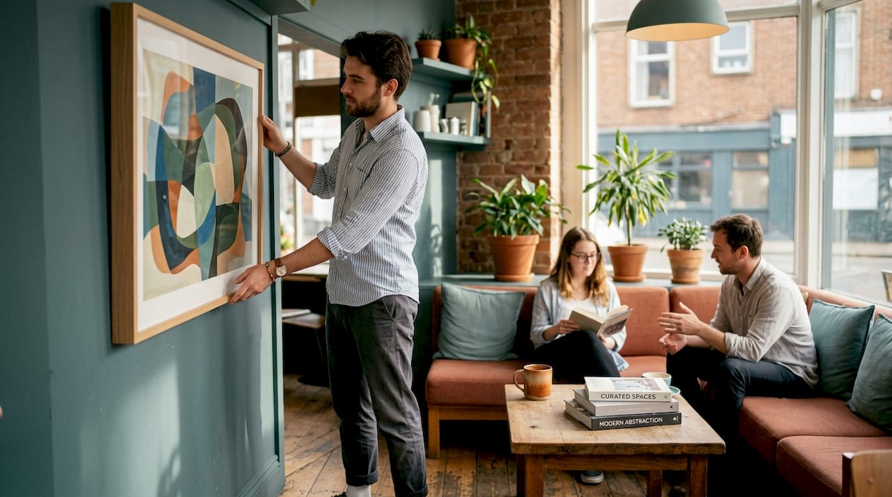
Best practices for placement, sizing, and harmony
Armed with selection criteria, now consider the practicalities of installing art for maximum impact. Placement is where most well-intentioned office art projects fall apart. You can choose a stunning piece and ruin it entirely through incorrect positioning.
Hanging too high or scattering pieces without considering their relationship to furniture and sightlines is one of the most common mechanics mistakes in office interiors. The standard rule is to hang the centre of the artwork at approximately 57 to 60 inches from the floor, which aligns with average eye level whether people are standing or seated nearby.
Follow this numbered checklist before committing to any installation:
- Measure the wall and identify the dominant furniture anchor point (desk, sofa, reception desk).
- Define sightlines by standing at the entry point and noting what a visitor’s eye is naturally drawn to.
- Mark the centre of the wall space you’re filling, not the absolute centre of the wall itself.
- Check proportions: artwork should cover roughly 50 to 75 per cent of the wall width it’s hanging above.
- Plan groupings on paper (or digitally) before putting a single nail in the wall.
- Verify the fixing method is appropriate for the wall type and artwork weight.
One of the most useful decisions you’ll make is whether to use a single statement piece or a grouped arrangement. For guidance on styling large wall art in open-plan environments, single oversized works create bold authority with minimal risk of visual chaos. Grouped pieces work beautifully in corridors and break-out zones but require careful planning.
| Space type | Single statement piece | Grouped arrangement |
|---|---|---|
| Reception or lobby | Excellent: commands authority | Works if curated tightly |
| Open-plan office | Strong anchor for zones | Risk of fragmentation |
| Meeting rooms | Ideal for focal wall | Use for gallery-style inspiration walls |
| Corridor or hallway | Can feel isolated | Highly effective as narrative series |
| Break-out or social area | Good for bold, colourful works | Great for eclectic, employee-inspired curation |
For art solutions in large office spaces, scale is everything. A small print lost on a vast wall looks uncertain and unplanned. When planning your overall wall décor across multiple rooms, create a simple mood board first so that colours and styles carry through coherently from space to space. Consider your wall colours too. Reading guidance on painting interior walls professionally can help you understand how wall tone affects how artwork reads in a room.
Pro Tip: Always anchor art to the furniture beneath it, not just the wall behind it. A piece that floats visually disconnected from the desk or sofa below it will always feel wrong, regardless of how beautiful it is on its own.
Maximising employee motivation and wellbeing through art
Beyond looks and logistics, wall art can meaningfully influence how employees feel, focus, and perform. This is not speculation. The evidence is growing and increasingly hard to ignore.
Strategic workplace art placements are linked to measurable outcomes, with one study reporting 32% higher productivity in workplaces that include thoughtfully chosen artworks, alongside significant improvements in morale and motivation. That figure alone should reframe how you think about art as a business investment rather than an optional aesthetic luxury.
Discover how art in workspace design boosts productivity in practical terms, and the connection between visual environment and cognitive performance becomes even clearer. Environments that feel considered and beautiful signal to employees that their wellbeing matters. That signal has a measurable effect on engagement.
Practical ways to maximise the wellbeing benefits of office art:
- Creative and collaborative zones: Use bold, energising artwork such as abstract pieces or vibrant colour-field works to stimulate lateral thinking and conversation.
- Focus and individual workspaces: Choose calming nature-inspired imagery, soft abstract compositions, or monochromatic prints that do not compete for attention.
- Meeting rooms: Thought-provoking pieces that spark conversation work well here, provided they don’t dominate or distract during presentations.
- Break-out and social areas: This is the right place for more personal, expressive, or even humorous works that help people decompress.
- Corridors and transition spaces: Use art to tell a brand story, celebrate achievements, or showcase company values in a way that feels inspiring rather than corporate.
“Exposure to art in the workplace is associated with reduced stress, greater creative thinking, and a stronger sense of identity and belonging among employees.”
For hybrid working environments, where headcounts fluctuate and spaces need to serve multiple purposes across the week, art strategy becomes more nuanced. Read more about art and workplace wellbeing to understand how flexible space utilisation affects art placement decisions. When a desk area is used by different team members on different days, opt for universally calming, non-divisive pieces. Reserve stronger, more personal works for enclosed rooms where employees have more continuity. Explore how art transforms workplace design at a deeper level to build a strategy that evolves with your team.
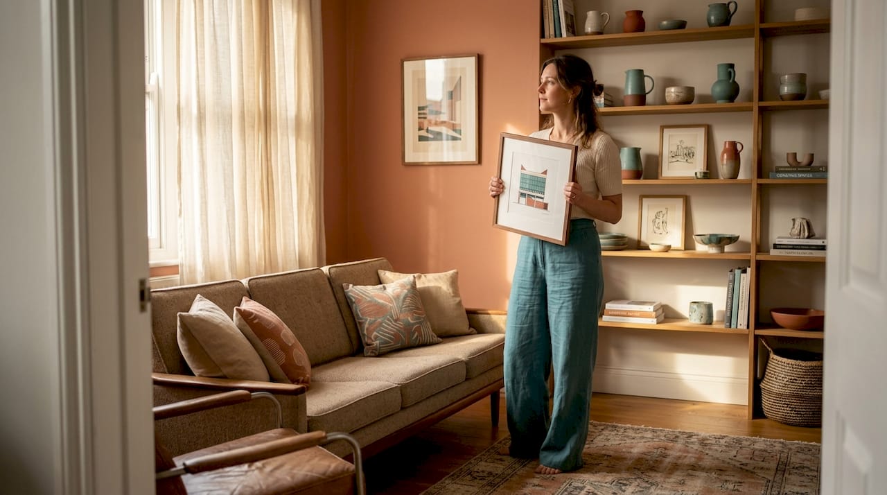
Tailoring art choices to company zones and workplace culture
Finally, connect your art decisions to zone-by-zone workplace needs. Not every wall in your office carries the same function, so not every piece of art should carry the same message.
Reception and client-facing zones call for neutral, professional themes that communicate stability and credibility. Internal spaces, by contrast, can support more expressive, bold, or culturally specific choices that reflect your team’s personality. The key is intentional differentiation rather than a one-size-fits-all approach rolled across every room.
Post-pandemic UK office utilisation has shifted dramatically, with many businesses now operating at 40 to 60 per cent occupancy on any given day. This means that certain areas of the office now carry far more social and functional weight than they did pre-2020, and art selection should reflect that new reality.
Zone-by-zone recommendations:
- Reception: Calm, brand-aligned artwork; consider large-scale photography or elegant abstract prints in neutral tones.
- Meeting rooms: Thought-provoking or visually interesting pieces that encourage discussion without overwhelming the screen wall.
- Collaborative zones: Bold, colourful, energising art that stimulates creativity and signals that ideas are welcome here.
- Individual workstations: Soft, non-distracting works; nature scenes, subtle textures, or minimal line art tend to perform best.
- Break rooms and social spaces: More personal, playful, or culturally rich art that helps people disconnect and recharge.
| Zone | Recommended art type | Themes that work well |
|---|---|---|
| Reception | Large-scale, elegant, neutral | Landscape, abstract, brand-coloured |
| Meeting rooms | Medium, conversation-starting | Geometric, conceptual, bold photography |
| Collaborative zones | Colourful, dynamic | Pop art, abstract, illustrative |
| Individual workspaces | Calm, minimal | Nature, line art, soft abstracts |
| Break rooms | Expressive, playful | Cultural, humorous, personal |
Exploring art for different hospitality zones offers excellent parallel thinking for offices, since hotels face exactly the same challenge of creating distinct emotional environments room by room.
Measuring success: Applying post-occupancy evaluations to office art
Once art is installed, assess its impact rather than assuming it is working. This is where many businesses drop the ball entirely.
Post-occupancy evaluation, or POE, is a structured method for assessing how well a built environment supports the people using it. Applied to office art, it simply means gathering evidence that your choices are actually delivering the mood, productivity, and engagement benefits you intended. The BCO post-occupancy evaluation guide provides a rigorous framework that larger organisations can adapt for their purposes.
For most office managers, a lightweight version is entirely sufficient. Follow these steps:
- Set baseline questions before installation: How do staff describe the current workspace atmosphere? What adjectives come up most often?
- Install art and allow a settling-in period of four to six weeks before gathering feedback.
- Run a short anonymous survey asking staff how the space feels now, whether they notice the art, and whether it improves their experience.
- Observe usage patterns: Are collaborative zones being used more? Do people linger longer in areas with new artwork?
- Compare against your original selection criteria: Is the reception art communicating professionalism? Is the break-room art helping people decompress?
- Document results and set a review date for 12 months’ time.
This cycle of evidence-gathering is precisely what separates organisations that make consistently good art decisions from those that rotate the same uninspiring prints indefinitely.
Pro Tip: After gathering your first round of feedback, involve a small group of employees in the next selection process. People engage more deeply with art they feel some ownership over, which multiplies the wellbeing benefits considerably.
Rethinking office art: Beyond quick fixes, towards transformative spaces
Here is the uncomfortable truth most office art guides won’t tell you: the vast majority of businesses treat art as a tick-box exercise. They buy a few prints during an office refurbishment, hang them at roughly the right height, and never think about them again. That approach extracts perhaps ten per cent of the available value from the investment.
The offices that genuinely benefit from art treat it as a living system. They review it. They gather feedback. They retire pieces that no longer serve the space. They introduce new works when the company evolves, when a team shifts focus, or when employee feedback reveals that a particular zone is underperforming emotionally. This is not precious or impractical. It is simply strategic.
There is also an under-discussed power dynamic in art selection. When leadership chooses art purely based on personal taste without involving employees, the result often feels imposed rather than shared. The most effective workplace art programmes we have seen include staff in the process, whether that means a team vote on a shortlist, a rotating “artist in residence” spot in a break room, or simply a mechanism for employees to flag when something is not working. The transformational art strategies that genuinely shift workplace culture share one characteristic: they are treated as ongoing conversations, not one-time decisions.
Art that transforms a workplace does not arrive fully formed on a single afternoon. It is curated, evaluated, and evolved over time with the same rigour you would apply to any other workplace experience initiative.
Ready to elevate your office? Curated art collections for real impact
For office managers and business owners ready to refresh their workspace, Frametheworld.co.uk offers collections tailored to every zone and mood. If you need something grounded and quietly beautiful, the Wabi Sabi wall art collection delivers exactly that, with pieces suited to reception areas and focus zones. For collaborative spaces that need energy and personality, the Pop Art wall art collection brings bold, conversation-starting impact. And for any office that needs a genuine colour injection across multiple zones, the colourful paintings range offers a curated mix of vibrant works at various sizes. Bespoke and commercial commissions are available for businesses with specific spatial or branding requirements. Browse by style, size, and format to find exactly what your spaces need.
Frequently asked questions
What size should office wall art be?
Aim for the artwork’s centre to sit at 57 to 60 inches from the floor, and size the work so it covers roughly 50 to 75 per cent of the wall width it sits above, ensuring it feels proportional rather than overpowering or lost.
Does office art genuinely improve productivity?
Yes. Research links intentional workplace art with up to 32% higher productivity alongside measurable improvements in employee morale, motivation, and overall workplace satisfaction.
How often should I update the art in my office?
Review office art every one to two years or whenever you remodel, using staff survey feedback and space usage data alongside a structured post-occupancy evaluation approach to guide decisions.
Should all office art match the company’s branding?
Not necessarily. While brand coherence matters in client-facing areas, internal zones benefit from more expressive, employee-inclusive choices that prioritise wellbeing and creative energy over strict brand alignment.

Leave a comment
This site is protected by hCaptcha and the hCaptcha Privacy Policy and Terms of Service apply.