

TL;DR:
- Proper wall art placement is crucial for property appeal, involving consistent criteria like the 57-inch eye level and 6 to 10 inches above furniture. Choosing one high-quality piece per room and aligning gallery layouts around a focal point enhances visual cohesion and staging impact. Avoid common mistakes such as hanging art too high or selecting undersized pieces to ensure balanced, attractive interiors that appeal to buyers.
Wall art placement is one of those things developers routinely underestimate until a finished unit sits on the market longer than expected. The interiors look complete on paper, but buyers walk in and something feels off. In most cases, it comes down to art that floats too high above the sofa, pieces that are too small for the wall, or gallery walls that look chaotic rather than curated. These wall art placement tips for developers exist because the difference between a property that sells quickly and one that lingers often lives in the details of how art relates to furniture, scale, and sightlines.
Table of Contents
- Understanding key placement criteria for wall art
- Selecting and positioning wall art to maximise staging appeal
- Mastering spacing and grouping techniques for gallery walls
- Choosing the right mounting hardware and ensuring secure installation
- Avoiding common placement mistakes and enhancing overall balance
- Rethinking wall art placement: practical wisdom for developers
- Explore curated wall art collections perfect for your developments
- Frequently asked questions
Key Takeaways
| Point | Details |
|---|---|
| Use height standards | Position art centre at about 57 inches from floor, adjusting height above furniture to 6–10 inches gap for visual connection. |
| Anchor art to furniture | Keep artwork size about two-thirds the width of the furniture below to create balanced compositions. |
| Create focal points | Use one large, quality piece per room to maximise staging appeal and avoid visual clutter. |
| Plan gallery walls carefully | Treat grouped art as one piece with consistent spacing (2–3 inches) and a single visual centre for cohesion. |
| Match hardware to wall | Choose mounting hardware based on wall type and artwork weight, using stud finders for heavy pieces and appropriate anchors to ensure safety. |
Understanding key placement criteria for wall art
Before positioning a single frame, you need a consistent set of criteria. Without them, each unit in a development ends up looking subtly different in ways that are difficult to explain but immediately felt by anyone walking through.
The most widely used reference point is the 57-inch rule, which positions the centre of an artwork at average eye level from the floor. It works well in open spaces where art hangs independently, but it requires adjustment the moment furniture enters the picture. When art sits above a sofa, console table, or headboard, the 57-inch centre often places the frame too high relative to the piece beneath it.
The fix is straightforward: keep the bottom edge of the artwork 6 to 10 inches above the top of the furniture. This closes the visual gap and creates the impression that the art and the furniture belong together rather than accidentally occupying the same wall.
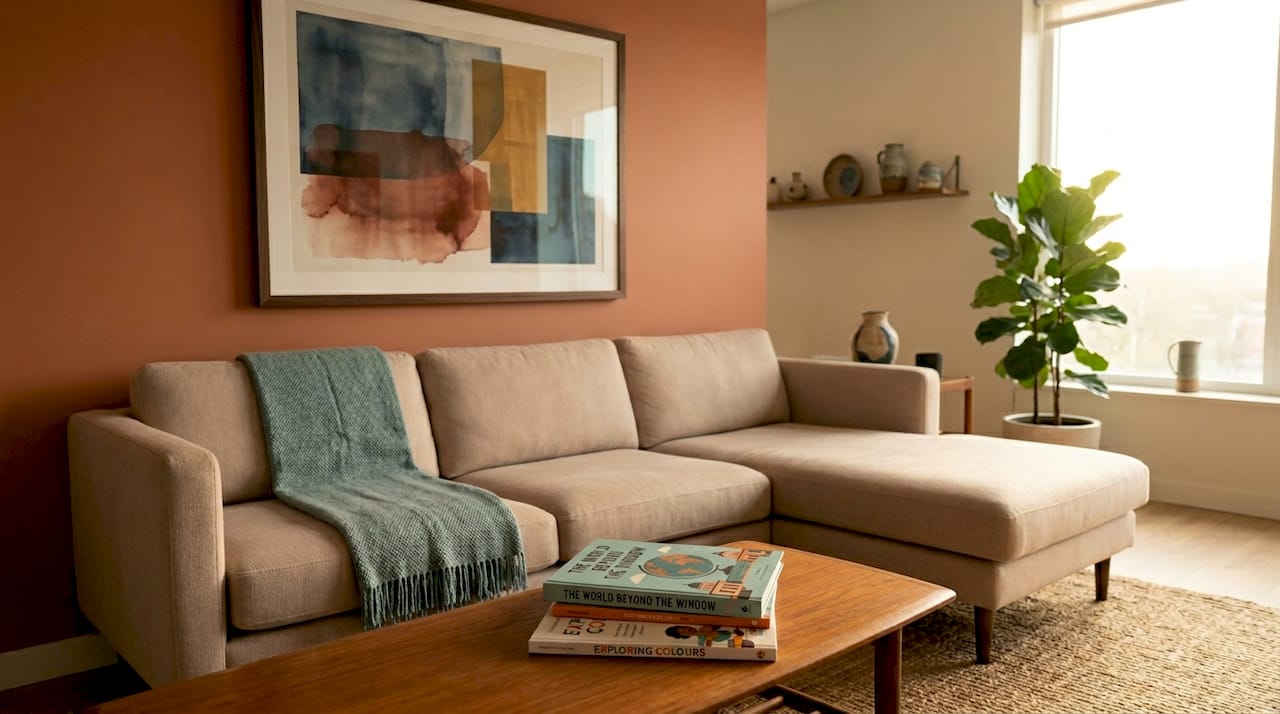
Scale is equally important and frequently overlooked. A general rule for wall art positioning relative to furniture is that the artwork should span roughly two-thirds the width of the piece beneath it. A two-seater sofa measuring 150cm wide works best with art between 90cm and 105cm wide. Going narrower makes the art look lost; going wider overwhelms the furniture.
Key criteria to apply across every unit:
- Centre of art at 57 inches from the floor as a starting point, adjusted per context
- Bottom of artwork 6 to 10 inches above any furniture beneath it
- Art width approximately two-thirds the furniture width below it
- Hardware matched to wall type: drywall, plaster, brick, and concrete each demand different fixings
- Ceiling height considered when scaling art; taller ceilings can support larger, taller pieces without crowding
Selecting and positioning wall art to maximise staging appeal
Staging is not decoration. Decoration is personal. Staging is about making a property feel aspirational to the widest possible audience without alienating anyone. Wall art plays a specific role in that equation, and the selection logic matters as much as the placement.
The most effective art for staging techniques rely on restraint. One strong piece per room or zone consistently outperforms a wall covered in smaller prints. As staging professionals consistently find, one large, high-quality piece per zone signals premium intent in a way that clusters of smaller works cannot.
“A single, well-chosen artwork communicates confidence. Multiple weak pieces communicate indecision.”
Consider what the artwork signals beyond its visual appeal. Abstract prints with warm, muted tones read as sophisticated and calm. Bold graphic art reads as contemporary and energetic. Neither is wrong, but you need to choose intentionally based on the development’s positioning. A riverside apartment targeting young professionals calls for something different than a countryside family home.
Artisanal and handmade works add perceived value in a way that mass-produced prints cannot replicate. Buyers notice texture, brush marks, and material quality even when they cannot articulate why the room feels more expensive. That tactile quality can be the detail that tips a viewing into an offer.
Staging placement principles to follow:
- Limit art to one anchor piece per primary room view
- Position the piece to be visible from the room’s main entry point
- Avoid placing art where natural light creates heavy glare across the surface
- Use types of wall art for developers that complement the finish palette rather than fighting it
- Let art guide the buyer’s eye towards the room’s best feature, whether that is a window, a fireplace, or a well-designed furniture grouping
Mastering spacing and grouping techniques for gallery walls
Gallery walls done well create a sense of personality and depth that single pieces cannot. Done badly, they are the fastest way to make a high-quality development look chaotic. The difference is almost entirely in the planning.
Gallery walls work best when treated as a single visual unit rather than a collection of individual frames. That means identifying the centre point of the entire grouping and aligning that centre to the 57-inch eye-level reference, rather than trying to align each frame independently. The consistent 2 to 3 inch spacing between frames is what creates the impression of unity.
Pro Tip: Before drilling a single hole, lay all frames on the floor and photograph the arrangement from above. This gives you a reliable reference image to work from when transferring positions to the wall.
Use this process when building a gallery wall:
- Lay all frames on the floor and experiment with the arrangement until the grouping feels balanced
- Identify the largest or most visually dominant piece and position it as the anchor, usually slightly left of centre
- Build outward from the anchor, balancing weights and sizes on either side
- Use paper templates or painter’s tape on the wall to mark exact positions before drilling
- Measure the hanging wire drop on each frame and transfer that measurement to your template marks
- Use a laser level rather than a spirit level to align multiple frames simultaneously
The anchor piece guides everything else. A gallery wall without a clear focal point tends to look like a collection that grew over time rather than something designed with intention.
| Approach | Best for | Risk if done poorly |
|---|---|---|
| Symmetrical grid | Modern, minimal interiors | Feels clinical without variety in print content |
| Asymmetrical cluster | Eclectic, artisan, lifestyle staging | Looks cluttered without a dominant anchor piece |
| Single statement piece | High-end, minimal staging | Wall can feel bare if piece is undersized |
| Horizontal row | Hallways and stairwells | Feels flat without variation in frame sizes |
For practical guidance on spacing and alignment, the art placement tips available through our resource section cover room-specific scenarios in detail.
Choosing the right mounting hardware and ensuring secure installation
Layout decisions are only half the job. Getting the hardware wrong means frames that tilt, walls that crack, and in the worst case, artwork that falls. In a development context, that is a liability issue as much as an aesthetic one.
Wall type determines everything. Drywall is the most forgiving and handles standard picture hooks and hollow wall anchors well for medium-weight frames. Plaster requires a gentler approach as aggressive fixings can crack the surface. Brick and concrete demand masonry anchors and the correct drill bit. Use stud-finders for heavy pieces and match anchors to wall type rather than using the same fixings across every surface.
For heavy artworks exceeding around 5kg, a French cleat system distributes weight across a wider wall area and removes the single-point failure risk of a standard nail. Two interlocking bevelled strips, one on the wall and one on the frame back, create a stable connection that is also surprisingly easy to adjust horizontally after installation.
Installation sequence that avoids common errors:
- Confirm wall type and select appropriate fixing
- Locate studs or solid backing with a stud-finder for heavy pieces
- Measure the distance from the top of the frame to the hanging wire at full tension
- Mark the wall at the correct height accounting for that wire drop
- Install fixings and check with a bubble level before hanging
- Hang the frame and recheck alignment before moving to the next piece
Pro Tip: Adhesive strips work well for lightweight frames on delicate or tiled surfaces where drilling is not an option, but they should never be used for works over approximately 2kg. The consequences of adhesive failure are almost always worse than drilling a small hole.
Using a wall art selection guide that accounts for format and weight from the outset prevents many of these installation complications before they arise.
Avoiding common placement mistakes and enhancing overall balance
Even experienced development teams repeat the same placement errors. Knowing them in advance is far cheaper than correcting them after a unit is dressed and photographed.
The most frequent mistake is hanging art too high. It feels instinctively safer to go higher, as though art needs breathing room from furniture. In practice, hanging too high causes visual disconnection and forces viewers to look up uncomfortably. The oft-quoted guidance from interior designers is simple: when in doubt, hang slightly lower rather than higher.
“It’s always better to hang slightly too low than too high to maintain visual connection with the room.”
Scale errors are equally common. Developers sometimes select artwork based on what looks good at the framer or online, without considering the wall dimensions or the furniture beneath. A 40cm print above a 200cm sofa does not fill the visual field, it looks forgotten.
Mistakes that consistently reduce staging impact:
- Art hung more than 60 inches from the floor in standard-height rooms
- Artwork too narrow relative to the furniture below it, making both look awkward
- Inconsistent spacing between frames in grouped arrangements
- Art placed too close to ceiling cornicing or architectural mouldings, which creates a cramped feeling
- Multiple competing focal points in a single view, which dilutes the impact of each
Before signing off on any staged unit, walk the space as a buyer would. Enter each room and note the first thing your eye lands on. If it is not the art or a deliberate design feature, something in the arrangement needs adjusting. The choosing wall art guide covers scale selection in detail for those who want to reduce these errors from the sourcing stage onwards.
Rethinking wall art placement: practical wisdom for developers
Here is the thing about placement rules: they are useful scaffolding, not a finished structure. The 57-inch centreline was developed for gallery spaces where viewers stand upright and move freely. In a kitchen-diner where people sit at a breakfast bar for most of their time in the room, that reference point shifts. In a home cinema where the primary experience is reclined, it shifts further still. Applying a single rule uniformly across an entire development without accounting for how each space is actually used produces technically correct placement that still feels wrong.
What we have consistently found, working with developers across both residential and commercial projects, is that the best results come from treating art and furniture as a single visual system rather than two separate design decisions. The art is not an accessory added after the furniture is placed. It is part of the same composition. When you choose a piece knowing it will sit 8 inches above a specific sofa of a specific width, and when you know the wall it will sit against and the light that will fall on it, the placement decisions become much clearer.
Personalising wall art selection to the specific context of each unit is what separates developers who complete and move on from those who generate referrals and repeat business. Buyers remember how a property made them feel, and a well-placed, well-chosen artwork contributes more to that feeling than almost any other finishing detail.
Pre-planning through floor templates, photography, and iterative trial layouts takes time upfront but removes the costly corrections that come from guessing. Rigid rule-following without that contextual thinking is how you end up with technically correct placements that leave rooms feeling lifeless.
Explore curated wall art collections perfect for your developments
To complement these expert tips, consider these thoughtfully curated wall art collections that enhance your development’s interiors. At Frame the World, we work with property developers on exactly these kinds of staging and finishing decisions, and our collections are built with scale, focal impact, and style harmony in mind.
The Wabi Sabi wall art collection features hand-painted abstract textures that bring warmth and quiet sophistication to modern interiors. These pieces are particularly effective as anchor works above sofas or in open-plan living spaces where a single impactful piece is more effective than a cluster of smaller prints.
For developments with a more contemporary or urban edge, the Pop Art collection delivers bold, graphic works that create instant focal points. Both collections are available in multiple sizes, making it straightforward to match each piece to the furniture scale and designated placement area of your specific units.
Frequently asked questions
What is the best height to hang wall art in residential properties?
The centre of the artwork should generally sit at around 57 inches from the floor, adjusted slightly when placed above furniture so the bottom edge sits 6 to 10 inches above the piece beneath it.
How can developers use wall art to increase property appeal?
By placing one large, high-quality piece per room as a clear focal point, developers signal premium intent and create the kind of aspirational atmosphere that influences buying decisions.
What hardware should be used for hanging heavy artworks?
For heavy pieces, use a stud-finder to locate studs and fix with screws or a French cleat system matched to the wall material for secure, stable installation.
What common mistakes should developers avoid when placing wall art?
Avoid hanging art too high, selecting pieces too small for the furniture beneath them, and using inconsistent spacing between frames. Hanging too high in particular creates visual disconnection that undermines the staging impact of even a well-chosen piece.


Leave a comment
This site is protected by hCaptcha and the hCaptcha Privacy Policy and Terms of Service apply.