

TL;DR:
- Choosing the right wall art involves considering placement, scale, and lighting to create a cohesive and intentional space. Following design principles like the 60-30-10 color rule, asymmetric balance, and proper hanging height helps achieve visual harmony and comfort. Adopting slow decorating and personal curation ensures meaningful, timeless home aesthetics without hurried or impulsive decisions.
Choosing the right wall art sounds simple until you are standing in a half-furnished room wondering why nothing feels right. Home decoration best practices go well beyond picking something you like at a glance. The placement, the scale, the lighting, even the order in which you buy pieces all shape whether your space feels considered or cobbled together. This guide walks you through the principles that professional interior designers use every day, translated into practical steps any homeowner or renter can follow with confidence and without a large budget.
Table of Contents
- Essential criteria for decorating with wall art
- Curating and selecting wall art collections
- Hanging and positioning wall art
- Lighting strategies to enhance wall art and decor
- Renters’ guide: hanging art without damaging walls
- Comparing home decoration best practices for wall art
- Rethinking home decoration: beyond trends and fast fixes
- Explore curated wall art collections to personalise your home
- Frequently asked questions
Essential criteria for decorating with wall art
Every room you decorate has a purpose, and your wall art should serve that purpose rather than fight it. A bedroom calls for calm, restful imagery. A home office benefits from something that energises without distracting. Start by naming the function of the room and letting that guide every art decision you make.
Colour is the most powerful tool at your disposal. The 60-30-10 rule balances colour for cohesive, polished interiors by dividing your palette into three clear bands: 60% dominant tone, 30% secondary shade, and 10% accent. When selecting wall art, look for pieces that contribute to one of these three bands rather than introducing an entirely new colour family. A print that picks up your 10% accent colour can make a room feel deliberately styled rather than accidentally assembled.
Balance does not have to mean symmetry. Asymmetric arrangements often read as more interesting and more human. Pair a large-format print with two smaller pieces off to one side, or hang a single oversized artwork to anchor a wall that carries mismatched furniture. You can learn more about matching art with interiors to develop a sharper eye for what works together.
Key criteria to keep in mind before you buy or hang anything:
- Function first: Establish the mood the room needs before choosing subject matter or style
- Colour alignment: Art should echo, not clash with, your dominant or accent tones
- Scale proportion: Art hung above a sofa should cover 60 to 75% of the sofa’s width
- Texture layering: Mix matte prints with framed canvases to add warmth without adding clutter
- Asymmetric balance: Treat visual weight, not just size, as your guide to arrangement
With design principles in place, let’s explore specific wall art selection methods.
Curating and selecting wall art collections
The most common decorating mistake is buying too fast. You find a print you love, it arrives, you hang it, and six months later you are not sure it belongs there. Slow decorating, a growing movement backed by interior designers and art consultants alike, recommends living in a space for three to six months before committing to major art purchases. That time reveals how light moves through the room, which walls you actually look at, and what feeling the space already has.
Once you are ready to curate, follow this sequence:
- Identify one anchor piece that sets the tone for the room. This is the art you feel strongly about, not just something that fills a gap.
- Build around the anchor by selecting secondary pieces in a complementary scale and palette, using your wall art selection guide for practical direction.
- Edit before you add. Store half of what you own rather than displaying everything at once. Rotation keeps displays feeling fresh.
- Rotate seasonally. Swapping pieces with the seasons is one of the most effective and affordable home decoration strategies there is. It costs nothing and transforms the mood of a room entirely.
- Prioritise personal meaning. Art that tells your story will always outlast a trending aesthetic.
Pro Tip: Before hanging anything, do a paper template test. Cut paper to the exact dimensions of your frames and tape them to the wall. Live with the arrangement for a day before committing a single nail.
Having chosen your art, next is focusing on how to place and hang it expertly.
Hanging and positioning wall art
Height is the detail most people get wrong. The 57-inch standard places the vertical centre of your artwork at eye level, aligning with how galleries hang their pieces for comfortable, natural viewing. Measure 57 inches up from the floor and mark it. That mark is where the midpoint of your frame should land, not the top, not the hook.
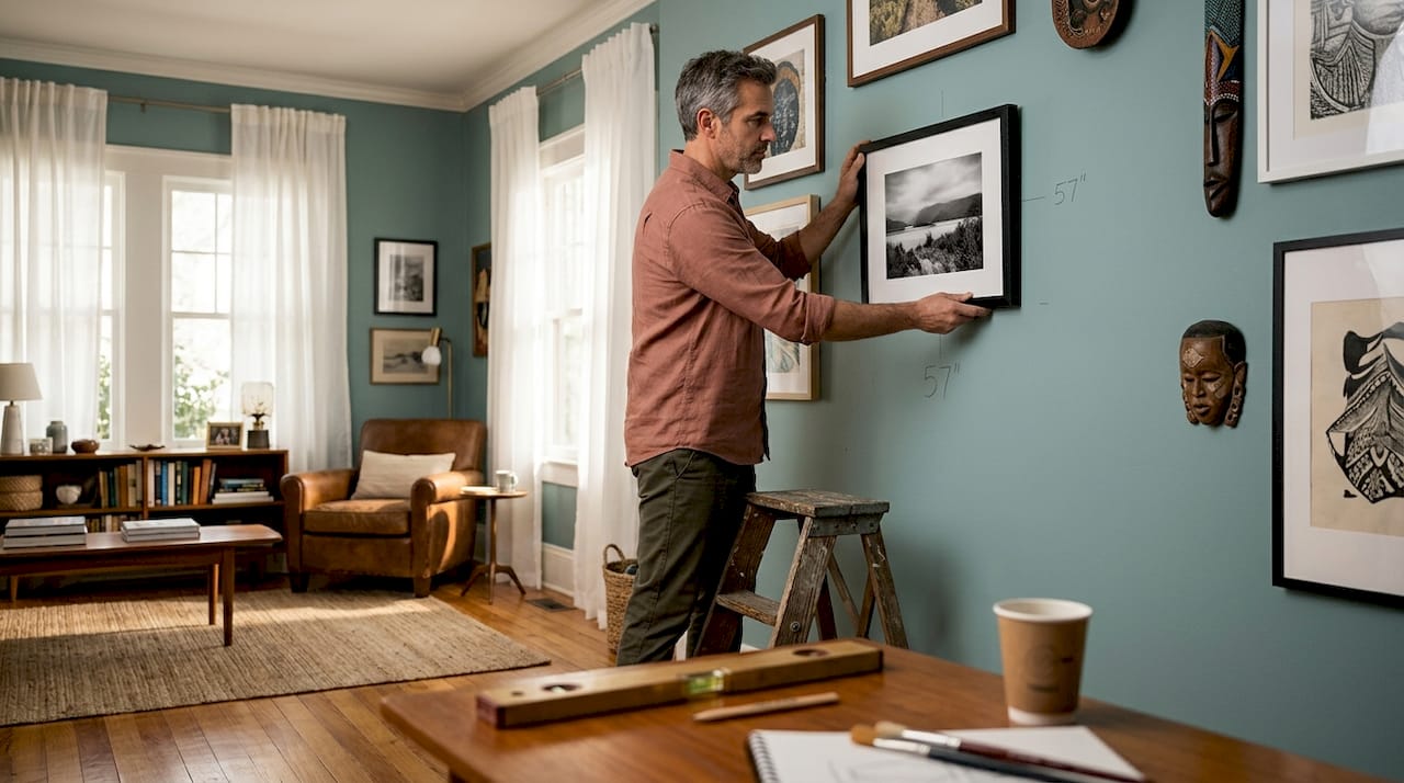
When hanging art above furniture, keep 6 to 8 inches of breathing room between the top of the piece and the bottom of the frame. Less than that and art looks like it is resting on the furniture. More than that and the visual connection between the two breaks entirely.
Gallery walls follow their own internal logic. Treat the group of frames as a single unit with a clear outer boundary. Maintain 2 to 3 inches of consistent spacing between frames to hold the arrangement together. Start from the centre and work outward rather than starting from a corner.
Key positioning principles at a glance:
- Eye-level centre: Hang the midpoint of each piece at 57 inches from the floor
- Furniture clearance: Leave 6 to 8 inches between furniture and frame base
- Frame spacing: Keep 2 to 3 inches between frames in multi-piece arrangements
- Width proportion: Art should span 60 to 75% of the furniture width below it
- Gallery cohesion: Map the full arrangement on the floor before touching a wall
Pro Tip: For gallery walls, photograph your floor arrangement before you start hanging. It gives you a reference point and stops you second-guessing mid-installation.
| Scenario | Recommended approach | Common mistake |
|---|---|---|
| Single piece above sofa | Centre at 57 inches, span 60 to 75% of sofa width | Hanging too high, breaking visual link |
| Gallery wall of five frames | Plan on floor first, 2 to 3 inches between frames | Random spacing that feels chaotic |
| Art in a hallway | Centre at 57 inches, consider viewing angle while walking | Hanging flat as if it were a static room |
| Large print in an alcove | Fill the alcove width, allow 6 inches clearance at top | Choosing art too small, leaving awkward gaps |
Understand how to decorate living room walls effectively and your most-used room will reward you every single day.
Placement sets the stage; let’s consider how lighting enhances your wall art’s impact.
Lighting strategies to enhance wall art and decor
Lighting is where good decoration becomes great decoration. Most rooms rely too heavily on a single overhead light source, which flattens everything it touches including your carefully chosen wall art. Layered lighting changes that entirely.
Swapping standard bulbs for warm LED bulbs under £50 is one of the simplest ways to make a room feel expensive and to bring decorative prints to life with flattering, gallery-quality glow.
The three layers that matter are ambient (general room light), task (focused functional light), and accent (directed light that highlights specific features). Art benefits most from accent lighting, specifically from directional spotlights or picture lights mounted above the frame.
Here is a practical lighting checklist for decorated spaces:
- Layer your sources: Combine ceiling, table, and wall-mounted lights rather than relying on one
- Direct at art: Use adjustable spotlights or clip-on picture lights to draw the eye to key pieces
- Warm tones only: Bulbs in the 2700 to 3000 Kelvin range make colours in prints look richer
- Add dimmers: A dimmer switch costs under £15 and changes the entire atmosphere of a room
- Light plants too: A backlit large houseplant beside a print creates layered depth that feels designed
For more detail on how light and art work together, the interior design art tips resource covers the relationship between light quality and print visibility in useful depth.
Good lighting brings your carefully placed art to life. Next, renters must consider damage-free hanging solutions.
Renters’ guide: hanging art without damaging walls
Renting does not mean living with bare walls. Modern adhesive solutions have improved significantly, and Command picture hanging strips can hold up to 16 lbs per pair on smooth painted walls when applied correctly. That is enough for most standard framed prints.
The technique matters as much as the product. Follow these steps every time:
- Clean the wall first: Wipe the surface with rubbing alcohol on a cloth and allow it to dry fully before applying strips
- Press firmly: Hold each strip against the wall for a full 30 seconds, applying even pressure across the entire surface
- Wait before loading: Leave the strips for at least one hour before hanging anything. Rushing this step is the most common cause of failure
- Remove slowly: When it is time to move on, pull the removal tab straight down in a slow, steady motion. Never pull outward. That slow downward pull stretches the adhesive away from the wall cleanly
- Test first: Apply a strip in an inconspicuous spot and remove it after 24 hours to check the wall finish before committing to visible areas
Pro Tip: Frame heavier pieces in lightweight frames. A timber frame with a thin profile and light glass can bring the overall weight down considerably, opening up more adhesive options for renters.
Explore ideas for personalising wall art in ways that suit your rental space without requiring permanent changes.
Now that hanging is safe and effective for renters, let’s compare and decide which practices suit your home best.
Comparing home decoration best practices for wall art
| Practice | Best for | Key benefit | Watch out for |
|---|---|---|---|
| Slow decorating | New spaces, first-time buyers | Prevents regret, builds meaningful collections | Patience required, resisting impulse buys |
| 60-30-10 colour rule | Any room, any style | Creates instant visual harmony | Over-rigidity can stifle personality |
| 57-inch hanging height | All wall art in standard rooms | Comfortable, gallery-standard viewing | Adjusting for very high or low ceilings |
| Layered lighting | Lounge, bedroom, dining room | Enhances art visibility, sets mood | Higher upfront cost for quality fixtures |
| Command strips | Renters, temporary displays | Zero wall damage, fully reversible | Weight limits, unsuitable for textured walls |
Browse essential art selection tips to match the right practice to your specific space and situation.
With this overview, you can confidently select and apply practices suited to your home.
Rethinking home decoration: beyond trends and fast fixes
Here is an opinion you will not read in most decorating guides: the urge to fill your walls quickly is the single biggest obstacle to a home that genuinely feels like yours.
The interiors industry profits from turnover. New collections, new trends, new reasons to replace what you already have. And most people comply, buying prints because they are on offer or because a shade is fashionable right now. Then they live with pieces they feel indifferent about, which is exactly what art consultant Emily Santangelo warns against. Intentional slow decorating prevents resentment toward ambivalent purchases and allows collections to evolve with genuine meaning rather than trend cycles.
The rooms that feel most alive are rarely the most fully decorated. They tend to have one or two pieces of art that carry real weight, surrounded by space. That space is not emptiness. It is confidence. It says the pieces here were chosen, not accumulated.
Rotating your collection rather than expanding it is one of the most underrated home styling ideas available to you. Store pieces for three months and bring them back out. They will look new to you. Your eye resets, your appreciation returns, and you have not spent a penny.
Texture and personal objects matter more than more art. A single print that means something, placed beside a plant, a ceramic, or a book that tells your story, will outperform a wall covered in well-matched but ultimately anonymous prints. This is what personalising wall art actually means in practice. Not customisation for its own sake, but curation that reflects a life actually lived in a space.
Explore curated wall art collections to personalise your home
The principles covered here only work when the art itself is worth displaying. At Frametheworld, every collection is built around quality, character, and the kind of pieces that reward a long look. If you are drawn to imperfection and warmth, the Wabi Sabi wall art collection brings texture and quiet personality to any room without overwhelming it. For something bolder, the Pop Art collection delivers the colour punch your accent wall or 10% tonal band has been waiting for. You can browse by style, size, and format, making it straightforward to find pieces that fit both your space and the practices you have just learned.
Frequently asked questions
What is the ideal height to hang wall art?
Centre your artwork’s vertical midpoint about 57 inches from the floor for comfortable, average eye-level viewing that matches gallery standards.
How can renters hang art without damaging walls?
Use Command picture hanging strips with proper wall cleaning using rubbing alcohol, firm 30-second pressing, a one-hour wait, and a slow downward tab pull to avoid paint damage.
What is the 60-30-10 rule in home decoration?
It is a colour distribution guideline that allocates 60% to your dominant tone, 30% to a secondary shade, and 10% to an accent colour, creating balanced and visually harmonious rooms.
Why is slow decorating recommended?
Slow decorating helps you understand how you actually use a space and what truly resonates with you, preventing regret and producing a collection of art with lasting personal meaning.


Leave a comment
This site is protected by hCaptcha and the hCaptcha Privacy Policy and Terms of Service apply.