

TL;DR:
- Proper artwork size creates visual balance and enhances room impact.
- Using the 60–75% rule ensures artwork complements furniture and space proportionally.
- Larger, confident pieces often transform spaces more effectively than smaller, timid artwork.
Choosing the wrong size artwork is one of the most common and costly mistakes in interior design. A piece that looks stunning in a shop or online can appear lost on a large wall, shrinking the whole room’s impact. Artwork should span 60–75% of the furniture width beneath it to achieve proper visual balance and avoid the dreaded ‘postage stamp’ effect. Get the size right, and a single print can transform an entire room. Get it wrong, and even the most beautiful artwork will fall flat. This guide gives you the practical tools to choose the correct size every time.
Table of Contents
- Why artwork size matters: Visual balance and the 60–75% rule
- Common mistakes in artwork sizing and how to avoid them
- How to choose artwork size for different spaces
- Artwork scale as a design tool: Opening up spaces and making statements
- The uncomfortable truth about artwork size: Why most get it wrong
- Ready to transform your walls? Choose the art that fits your space
- Frequently asked questions
Key Takeaways
| Point | Details |
|---|---|
| Follow the sizing rule | Choose artwork that spans 60–75% of the space or furniture width for best results. |
| Avoid common pitfalls | Hanging art that’s too small or too high ruins balance—go bigger and use tape to test. |
| Use scale to design | Large or well-placed art can make rooms feel bigger and more intentional. |
| Tailor to each space | Measure and test for every room—what works in one area may not fit another. |
Why artwork size matters: Visual balance and the 60–75% rule
Visual balance in interior design means that every element in a room feels proportionate and intentional. When artwork is too small for its setting, the eye notices the imbalance immediately, even if the viewer cannot quite explain why. The room simply feels unfinished. Scale is one of the most powerful tools a designer has, and artwork is often the element that either pulls a space together or quietly undermines it.
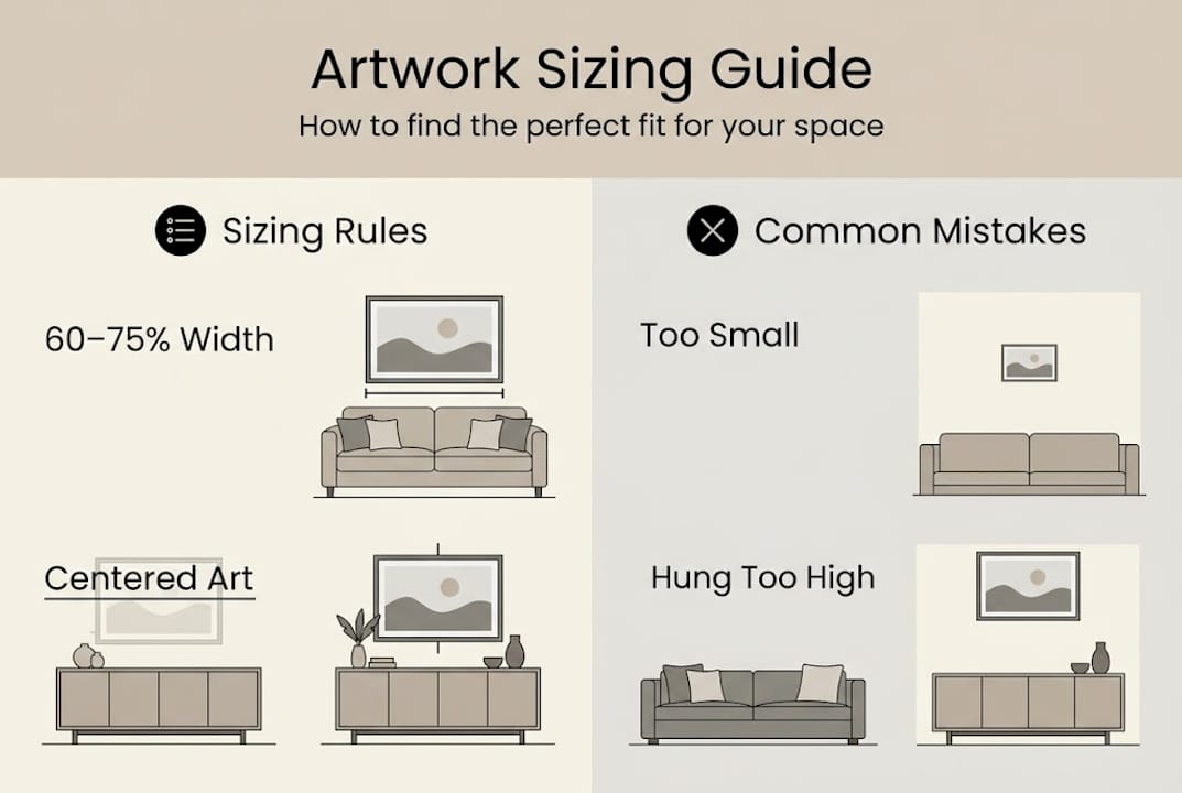
The ‘postage stamp’ effect is the term designers use when a small piece of art hangs alone on a large, bare wall. It creates a sense of emptiness around the artwork rather than framing it with purpose. This is by far the most common sizing mistake, and it happens because most people underestimate how much wall space they actually have.
The golden rule is straightforward: artwork should cover 60–75% of the width of the furniture below it or the wall space available. To apply this, measure the width of your sofa, bed, or sideboard, then multiply by 0.6 and 0.75 to get your ideal size range. For a bare wall with no furniture, measure the full wall width and apply the same calculation.
Here is a quick reference to make it easier:
| Furniture width | Minimum art width (60%) | Maximum art width (75%) |
|---|---|---|
| 150 cm | 90 cm | 112 cm |
| 180 cm | 108 cm | 135 cm |
| 200 cm | 120 cm | 150 cm |
| 240 cm | 144 cm | 180 cm |
When selecting artwork, consider these key measurements:
- Furniture width: Always measure the full width of the piece below the wall.
- Wall width: For art without furniture, measure the full usable wall space.
- Height placement: The centre of the artwork should sit roughly 145–152 cm from the floor.
- Viewing distance: The further away you view art, the larger it should be.
Pro Tip: When you are torn between two sizes, always choose the larger one. Bold scale reads as confident and intentional, while undersized art tends to look like an afterthought. Our wall art selection guide has further advice on matching art to your space with confidence.
Common mistakes in artwork sizing and how to avoid them
Understanding the rule is one thing, but applying it consistently is where most people stumble. The four most frequent sizing errors are surprisingly easy to make and just as easy to fix once you know what to look for.
1. Choosing artwork that is too small This is the number one offender. A single small canvas above a large sofa looks timid and disconnected. The fix is simple: follow the 60–75% rule and resist the urge to play it safe with smaller pieces.
2. Hanging art too high Many people hang artwork at eye level when standing, but the correct position is eye level when seated in the room. In most homes, this means the centre of the artwork should sit around 145–152 cm from the floor. Hanging too high creates a visual disconnect between the art and the furniture below it.
3. Ignoring furniture proportions A wide, low sideboard needs wide, horizontal artwork. A tall, narrow bookcase calls for a portrait-format piece. Mismatching the orientation of art with the furniture it sits above is a subtle but significant error.
4. Matching furniture width exactly Counterintuitively, art that is exactly the same width as the furniture below looks rigid and awkward. Aim for 60–75%, not 100%. The slight visual breathing room makes the arrangement feel curated rather than forced.
“Common pitfalls include artwork that’s too small, too high, or ignoring furniture proportions.” These mistakes affect not just aesthetics but the entire perception of a room’s scale and sophistication.
When smaller is genuinely not better: oversized art has become a hallmark of modern, confident interior design. A single large-format print can do the work of an entire gallery wall, creating a focal point that anchors the room without visual clutter. If you are working with limited space, our guide on art in small spaces shows how scale can actually make compact rooms feel more generous.
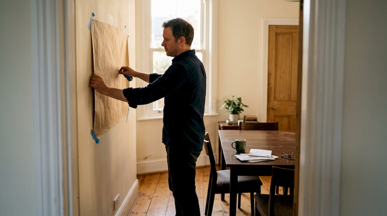
Pro Tip: Before buying, cut newspaper or brown paper to the exact dimensions of the artwork you are considering and tape it to your wall. Live with it for a day. You will quickly see whether the size works or whether you need to go bigger.
How to choose artwork size for different spaces
With the most common errors covered, let us look at how sizing works room by room. Each space has its own logic, and a one-size-fits-all approach will not serve you well.
| Room | Recommended artwork width | Key consideration |
|---|---|---|
| Living room | 90–150 cm | Match to sofa width using 60–75% rule |
| Bedroom | 80–130 cm | Centre above headboard, not full bed width |
| Dining room | 70–120 cm | Complement table length, not wall width |
| Home office | 50–90 cm | Avoid distraction; choose calming formats |
| Commercial reception | 120–200 cm+ | Scale to ceiling height and viewing distance |
Here is a practical process for getting the size right in any room:
- Measure the anchor furniture (sofa, bed, table, or desk) and note the width.
- Calculate your range by multiplying the width by 0.6 and 0.75.
- Mark the wall using painter’s tape to outline the artwork dimensions.
- Step back and assess from the main viewing distance in the room.
- Adjust for height and confirm the centre point sits at 145–152 cm from the floor.
- Consider room volume: High ceilings and large rooms demand larger art to avoid the postage stamp effect.
Testing with tape and considering viewing distance helps perfect the fit before you commit to a purchase. This step alone can save you from costly returns and disappointment.
For commercial spaces such as hotel lobbies, offices, and retail environments, standard sizing rules still apply but scale up significantly. A reception area with 3-metre ceilings needs artwork that commands the vertical space, not a modest print that disappears against the wall. Our guides on styling large wall art and planning large scale art are especially useful for these projects.
Artwork scale as a design tool: Opening up spaces and making statements
Once you understand correct sizing, you can start using scale deliberately to shape how a room feels. This is where interior design becomes genuinely exciting.
Large artwork does something remarkable to a room’s energy. It draws the eye immediately, establishes a mood, and signals that the space has been designed with intention. A single oversized landscape print in a neutral living room can make the walls feel further apart and the ceiling feel higher. That is not an illusion. It is a well-understood principle of spatial perception.
Here is how to use scale as a creative tool:
- Expand a small room: Hang a large, light-toned artwork on the main wall of a compact room. The eye travels into the image rather than stopping at the wall, creating a sense of depth.
- Create a focal point: In an open-plan space, a single oversized piece can define a zone without any physical dividers.
- Add drama to a neutral scheme: A bold, large-format print introduces personality without requiring a complete redecoration.
- Raise the perceived ceiling: Tall, vertical artwork draws the eye upward and makes low ceilings feel more generous.
- Balance architectural features: A large artwork opposite a window or fireplace creates symmetry and visual weight on an otherwise empty wall.
Scaling up in small rooms can expand perceived space, and this is a principle that expert designers return to again and again. The instinct to use smaller art in smaller rooms is almost always wrong. Explore how making rooms feel bigger with art works in practice, or see the full impact of large scale art transformation in real interiors.
Breaking the rules deliberately can also be powerful. A single enormous print in an unexpected location, such as a bathroom or hallway, creates a moment of surprise that elevates the whole home.
The uncomfortable truth about artwork size: Why most get it wrong
Here is something the design industry rarely says plainly: most people choose artwork that is too small because they are afraid of commitment. A large piece feels like a bigger risk. What if it is too much? What if it overwhelms the room? These fears are understandable, but they lead to timid choices that consistently disappoint.
The truth is that undersized art almost always looks worse than oversized art. A piece that is slightly too large for a wall reads as bold and deliberate. A piece that is slightly too small reads as an afterthought. When in doubt, go larger, because oversized looks intentional and modern. Industry professionals know this, which is why they almost universally recommend upsizing when clients are undecided.
Choosing a large, confident piece of artwork also signals something about the space itself. It says the room has been considered. It adds presence and a sense of luxury that smaller art simply cannot replicate. If you take one thing from this guide, let it be this: size up. See how styling statement pieces can redefine a room entirely.
Ready to transform your walls? Choose the art that fits your space
Getting the size right is the single most impactful decision you can make when choosing wall art. It determines whether a piece feels considered or careless, bold or timid, designed or accidental. Now that you have the tools to measure, plan, and choose with confidence, the next step is finding artwork that genuinely fits your space and your style.
At Frametheworld, we make it easy to find art in the right dimensions for any room. Browse our wabi sabi wall art collection for beautifully proportioned pieces that suit a wide range of interiors. If you need a specific size that is not available off the shelf, our custom size prints service lets you order artwork to your exact measurements, so you never have to compromise on fit again.
Frequently asked questions
What is the ideal size for artwork above a sofa or bed?
Artwork should cover 60–75% of the width of the furniture below it for the best visual balance. For a 180 cm sofa, this means choosing a piece between 108 cm and 135 cm wide.
How do I test how artwork size will look before buying?
Use painter’s tape or cut paper templates to mark the exact dimensions on your wall. Testing with tape and considering viewing distance gives you a reliable preview before you commit to a purchase.
Does bigger artwork always look better?
Larger art generally appears more intentional and modern, particularly when it follows the 60–75% rule. When in doubt, go larger, as oversized pieces read as confident and designed rather than accidental.
Can I use multiple smaller pieces if one large artwork is not possible?
Yes. Arrange smaller pieces as a group so the combined area spans 60–75% of the furniture or wall space. Treat the collection as a single visual unit when measuring and placing.

Leave a comment
This site is protected by hCaptcha and the hCaptcha Privacy Policy and Terms of Service apply.