
Colour gets all the attention in home decoration, yet it is texture that truly determines whether a room feels alive or flat. You can have the most considered colour palette in the world, but without variation in surface quality, a space will still feel one-dimensional. Textured minimalism is preferred over sterile all-white looks precisely because texture does what colour alone cannot. In this guide, you will learn what texture really means, why it matters psychologically and practically, how to layer it with confidence, and how to adapt it for any room in your home.
Table of Contents
- What is texture in decoration?
- Why texture matters: the impact on space and mood
- Visual vs tactile: types of texture and how to use them
- Layering textures: methods for stylish, balanced rooms
- Texture choices for different spaces: small rooms, neutrals, and modern looks
- How wall finishes and material choices affect perception
- Bring texture home with hand-crafted art
- Frequently asked questions
Key Takeaways
| Point | Details |
|---|---|
| Texture adds depth | Using texture prevents rooms from feeling flat and creates inviting dimension in any style. |
| Balance is essential | Mix three to six textures in each space, combining soft, hard, and smooth without over-complicating. |
| Small spaces need finesse | Finer, smoother textures help open up smaller rooms and prevent clutter. |
| Visual and tactile matter | Both the look and feel of surfaces impact the overall atmosphere and comfort of your home. |
What is texture in decoration?
Many homeowners pour hours into choosing paint colours and overlook the surfaces those colours sit on. That is a missed opportunity. Texture in decoration refers to the surface quality of materials, experienced through both sight and touch, adding depth, interest, and sensory appeal to any space.
There are two distinct types to understand:
- Visual texture: What your eye perceives as surface variation, even when the surface itself is flat. A printed wallpaper with a stone effect, a photograph of rough bark, or a canvas with visible brushwork all create visual texture.
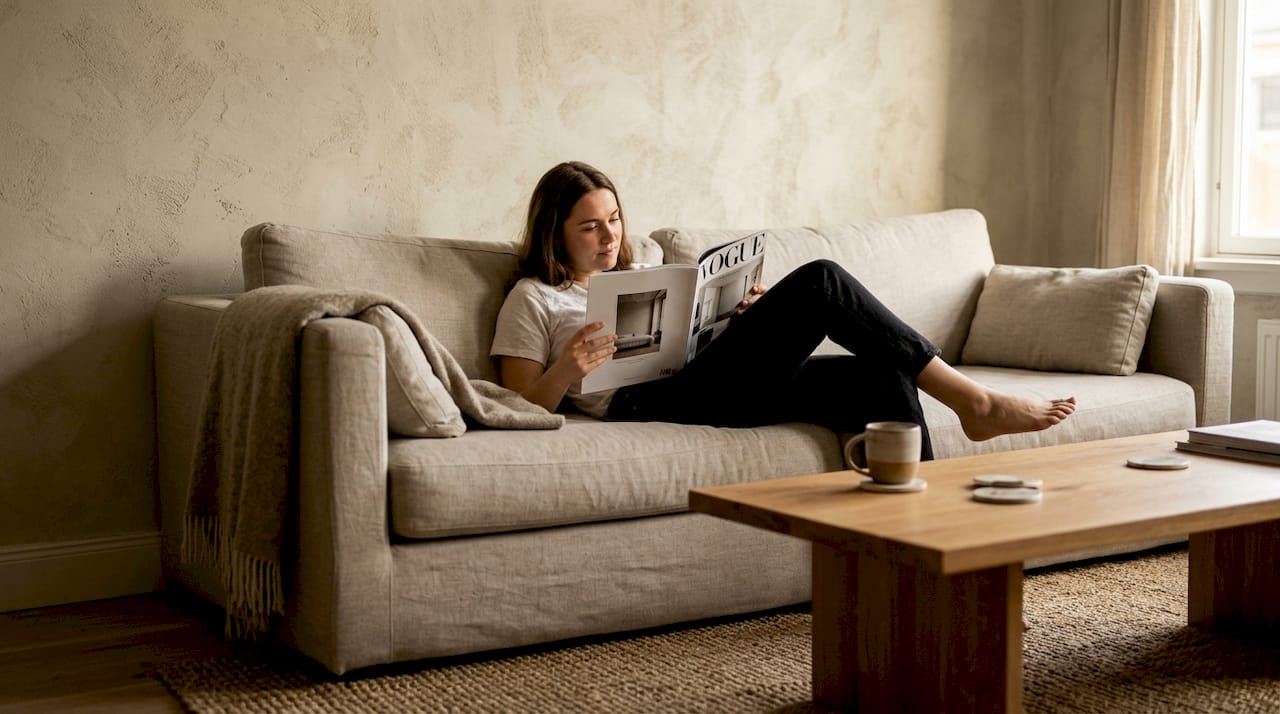
- Tactile texture: What you can physically feel. Carved wood panels, woven throws, a rough plaster wall, or a velvet cushion all deliver tactile texture.
The emotional effect of each is significant. Soft, matte textures such as wool or linen signal cosiness and warmth. Glossy, smooth surfaces like polished glass or lacquered furniture introduce energy and sharpness. Texture engages senses beyond sight, evoking emotion and replacing visual clutter with genuine materiality.
“The best-kept decorating secret is that texture does the heavy lifting in a room. It is what makes a space feel considered rather than assembled.” — StoneGable Blog
If you are drawn to the idea of art that delivers real tactile presence, plaster art texture painting is a compelling starting point for any wall.
Why texture matters: the impact on space and mood
Understanding texture’s definition sets the stage for grasping its influence. A room without texture is like a meal without seasoning: technically complete, but deeply unsatisfying.
Texture creates depth and prevents rooms from feeling flat. It balances colour, improves acoustics, engages the senses, defines style, adds comfort, and increases perceived value. That is a remarkable list of functions for something most people never consciously consider.
Here is what texture practically achieves in a room:
- Depth and dimension: Layered surfaces catch light differently, creating shadows and highlights that make a room feel three-dimensional.
- Acoustic comfort: Soft, porous textures such as rugs, curtains, and upholstered furniture absorb sound, reducing echo and making a room feel calmer.
- Perceived warmth: Rough, natural textures like stone, wood, and woven fabric make a space feel grounded and inviting.
- Elevated value: Rooms with considered texture read as more expensive and intentional, even when the budget is modest.
The market reflects this shift in priorities. An industry survey shows a 40% jump in the use of textured materials in home decoration, confirming that texture is no longer a niche concern but a mainstream design priority.
“Texture is the element that separates a decorated room from a designed one.”
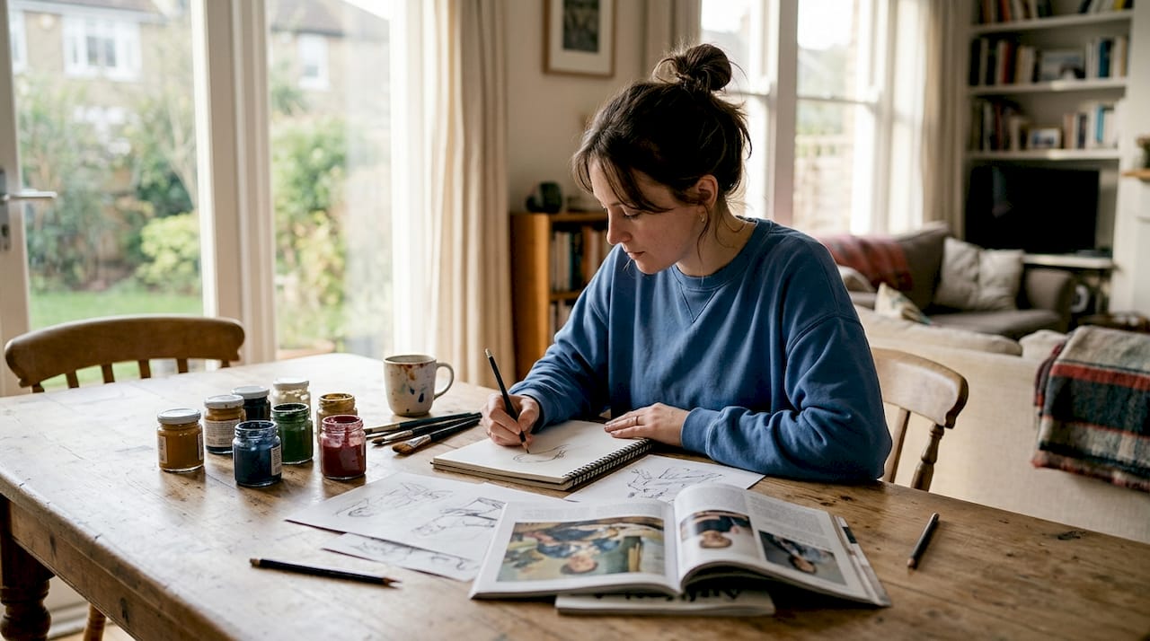
Understanding how art shapes the mood of a room is closely tied to texture. A smooth, glossy print reads differently from a heavily impastoed canvas, even if the subject matter is identical.
Visual vs tactile: types of texture and how to use them
Knowing why texture is essential, let us get specific about the two categories and how their interplay elevates a home.
| Feature | Visual texture | Tactile texture |
|---|---|---|
| Definition | Perceived surface variation | Physically felt surface variation |
| Examples | Printed wallpaper, photography, flat canvas | Carved wood, woven fabric, plaster, stone |
| Primary effect | Adds depth and interest to the eye | Adds warmth, comfort, and sensory richness |
| Best use cases | Small spaces, feature walls, gallery arrangements | Soft furnishings, statement furniture, accent walls |
| Risk | Can feel flat if used alone | Can feel heavy if overdone |
Visual texture is particularly useful in smaller rooms or where budget limits physical material choices. A large-format photograph of a textured surface, for instance, delivers considerable visual weight without adding bulk. Tactile texture, meanwhile, is irreplaceable for comfort and warmth, particularly in living rooms and bedrooms.
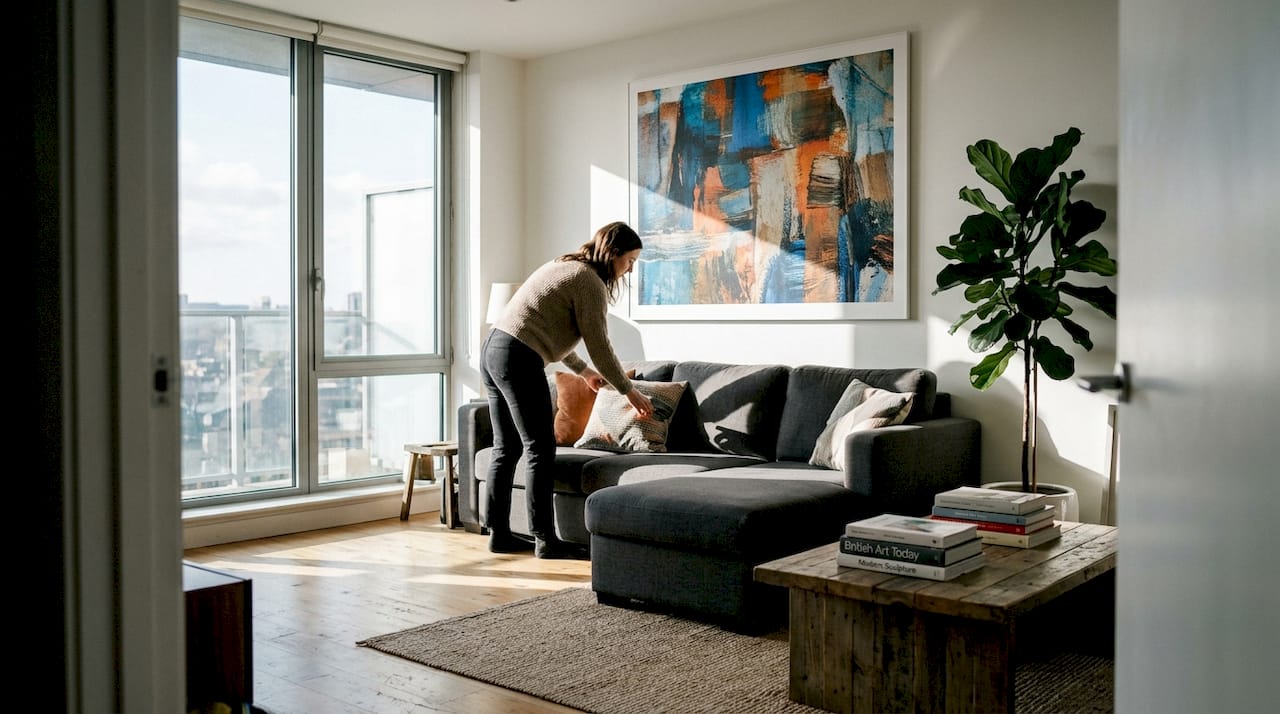
The real magic happens when you combine both. A smooth linen sofa (subtle tactile texture) placed against a rough plaster wall (strong tactile texture) with a framed canvas print featuring visible brushwork (visual texture) creates a layered, professional result.
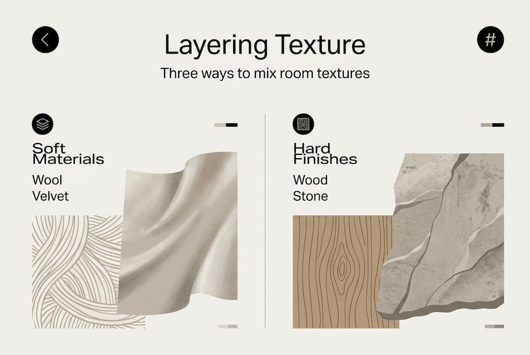
Layering textures effectively means aiming for three to six distinct textures per room, mixing soft and rough (wool, linen), hard and smooth (glass, metal), and natural materials (wood, stone) for contrast and balance.
Pro Tip: When selecting art for a textured scheme, consider how the frame contributes. A raw oak frame adds tactile warmth; a sleek metal frame introduces contrast. Both are valid choices, but they send different signals.
For further inspiration on placement and arrangement, our guide on how to decorate living room walls covers the practical side in detail.
Layering textures: methods for stylish, balanced rooms
With types of texture clear, it is time for hands-on application. Professionals approach texture layering in a deliberate sequence, building from the ground up.
Start layering from the base, working through floors and walls first, then adding furniture and upholstery, and finally introducing accessories. This sequence prevents the common mistake of over-investing in decorative objects while neglecting foundational surfaces.
Step-by-step layering process:
- Base layer (floors and walls): Choose your dominant texture here. A polished concrete floor, a limewash wall, or a natural jute rug sets the tonal and textural foundation for everything that follows.
- Furniture and upholstery: Introduce contrast. If your base is smooth and cool, bring in a velvet sofa or a linen armchair. If your base is rough and warm, a leather sofa or a lacquered cabinet creates balance.
- Soft accessories: Cushions, throws, and curtains add the final layer of softness. These are also the easiest elements to swap seasonally, making them a low-risk way to experiment.
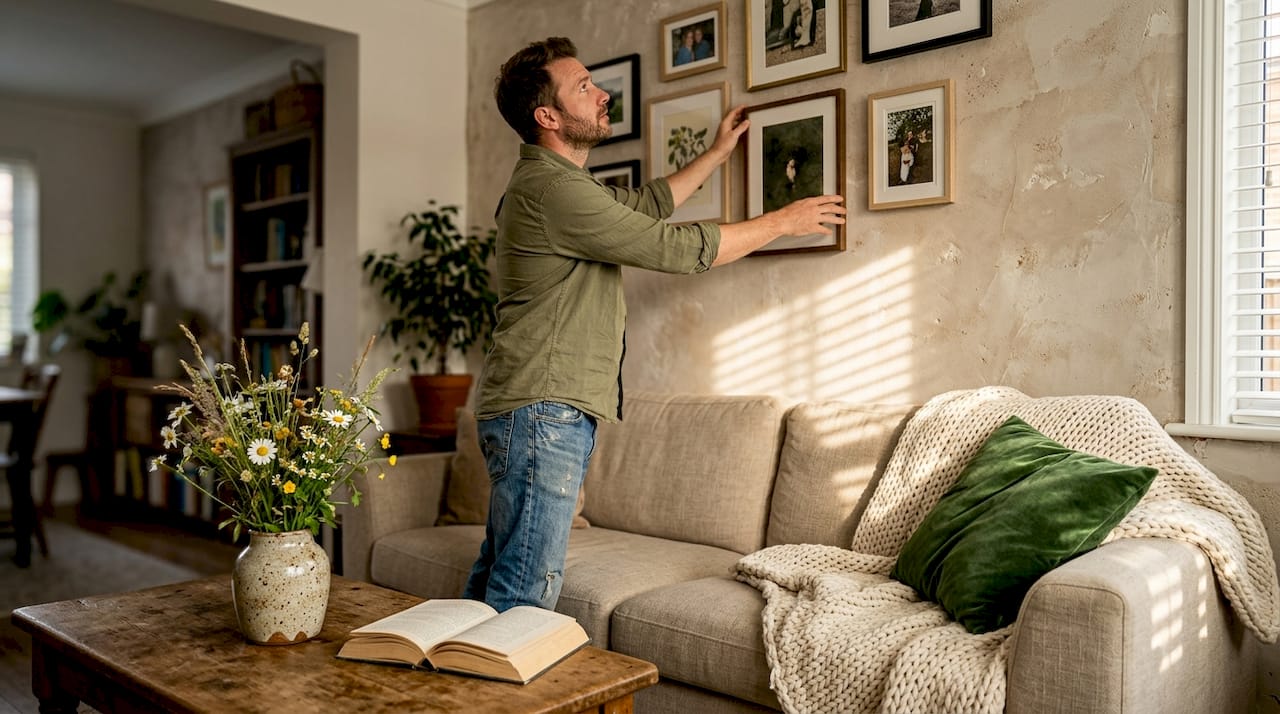
- Hard accessories: Books, ceramics, sculptural objects, and wall art introduce the final textural notes. This is where art becomes particularly powerful.
The rule of three is a useful shorthand: aim to include one soft texture, one hard texture, and one smooth texture in every major grouping or vignette within a room.
| Texture type | Recommended materials | Visual effect |
|---|---|---|
| Soft | Wool, velvet, linen, cotton | Warmth, comfort, approachability |
| Hard | Stone, ceramic, carved wood | Solidity, permanence, grounding |
| Smooth | Glass, lacquer, polished metal | Energy, sharpness, modernity |
| Natural | Rattan, jute, raw timber | Organic warmth, relaxed elegance |
| Layered art | Plaster, impasto, mixed media | Visual depth, artisanal quality |
A practical test: photograph your room in black and white. Without colour as a distraction, you will immediately see whether your textures are balanced or whether one type dominates. If everything reads as a uniform grey, you need more contrast.
Pro Tip: Do not over-layer. Three to six distinct textures is the sweet spot. Beyond six, a room begins to feel restless rather than rich.
For guidance on how to position large pieces within a layered scheme, our article on styling large wall art is worth reading alongside this guide. You can also use our wall art guide to match art choices to your overall textural direction.
Texture choices for different spaces: small rooms, neutrals, and modern looks
Layering is the goal, but the approach shifts depending on your room’s size, colour scheme, and style. A blanket approach will not work here.
In small spaces, finer and smoother textures are your allies. Heavy, rough textures visually advance towards you, making walls feel closer. Smooth plaster, fine linen, and polished surfaces do the opposite, allowing the eye to travel and the room to breathe.
For neutral colour schemes, texture is not optional. It is essential. A room decorated entirely in off-white with no textural variation will feel clinical rather than calm. Texture outperforms colour in creating depth for neutral interiors, which is why designers working with restrained palettes invest heavily in material quality.
Here is how to adapt your approach by room type:
- Small rooms: Prioritise smooth and fine textures. Use visual texture (art, wallpaper) rather than heavy tactile layers. Keep furnishings low-profile.
- Neutral schemes: Treat texture as your colour. Linen, plaster, raw wood, and woven grass all read as distinct tones even within a monochromatic palette.
- Modern and minimalist spaces: One or two bold textural statements (a rough plaster wall, a single large-format textured artwork) are far more effective than multiple competing elements.
- Traditional or maximalist spaces: You have more licence to layer, but coherence still matters. A unifying colour palette prevents textural variety from tipping into chaos.
The most common pitfall is binary thinking: either too much texture, which creates visual noise, or too little, which produces flatness. The goal is considered contrast.
Pro Tip: In a neutral room, use texture as your colour. A raw linen cushion, a plaster-finish artwork, and a woven jute rug each read as a distinct visual tone, giving your palette depth without introducing new colours.
For more on making art work in compact rooms, our guide on art in small spaces offers targeted advice. You can also explore wall decor trends for 2026 to see how texture is shaping contemporary interiors.
How wall finishes and material choices affect perception
To finish, let us consider how the textures you choose for major surfaces, not just furnishings and accessories, physically alter your home’s volume and feel.
Wall texture affects perceptual spaciousness in measurable ways. Rough textures can reduce the perceived size of a room, while smooth finishes make the same space feel larger and more open. This is not a minor effect; it is something worth factoring into every decorating decision.
Key considerations for walls and major surfaces:
- Rough plaster or limewash: Adds warmth and character but visually advances the wall. Best used on a single feature wall rather than all four.
- Smooth emulsion or polished plaster: Recedes visually, making rooms feel airier. Ideal for small rooms or spaces with low ceilings.
- Textured wall art and panels: Introduce surface variation without committing to a permanent wall treatment. Easily changed as your taste evolves.
- Curtains and window treatments: Often underestimated as a textural layer. Heavy velvet curtains add drama and acoustic softness; sheer linen panels keep things light and breezy. Current window treatment texture trends favour natural, tactile fabrics that complement rather than compete with wall finishes.
“The surfaces you choose for your walls and floors are the canvas. Everything else is the painting. Get the canvas wrong and no amount of accessorising will fix it.”
Pairing your wall finish with complementary art and furnishing textures creates overall harmony. A rough limewash wall, for instance, pairs beautifully with smooth ceramic objects and a flat-weave rug, because the contrast is intentional rather than accidental. For ideas on how large-format art interacts with wall texture, our guide on large scale wall art is a useful resource.
Bring texture home with hand-crafted art
Having understood texture’s importance and how to apply it, the next step is finding pieces that genuinely deliver it. At Frametheworld, we offer a range of artworks that bring real textural presence to your walls. Our wabi sabi wall art collection celebrates imperfection and natural materiality, making it ideal for neutral or organic schemes. If you want something entirely your own, our custom print options allow you to commission bespoke pieces tailored to your space. For those who want to introduce texture through colour and energy, our colourful paintings collection offers bold, expressive works that do both simultaneously. Browse by style, size, or theme to find the piece that completes your layered scheme.
Frequently asked questions
What are some affordable ways to add texture to a room?
Layer throws, cushions, natural fibre rugs, or textured wall art to instantly add richness without major expense. These are low-commitment changes that make an immediate visual difference.
Can too much texture make a room look cluttered?
Yes, balance is essential. Over-layering textures creates visual chaos, while thoughtful contrast unified by a consistent colour palette brings harmony.
What textures work best in small spaces?
Finer, smoother textures visually expand small rooms and prevent them from feeling crowded or oppressive. Save rough, heavy textures for a single accent element rather than spreading them throughout.
Is textured wall art suitable for modern or minimalist homes?
Absolutely. Textured minimalism is preferred over sterile all-white looks because texture adds warmth and depth, transforming a cold space into a welcoming one.
How many different textures should I use in one room?
Aim for three to six distinct textures per room for ideal balance and interest. Fewer than three tends to feel flat; more than six risks feeling restless.
Recommended
- Master 2026 interior design art trends for stylish spaces
- Master wall decor trends in 2026 for stylish homes
- Top wall decor themes to transform your home in 2026
- Top trends in wall art 2026 for stylish homes
- Fall Window Treatment Trends 2025: Warmth, Texture Tailored Elegance – Shop Designer Fabrics by the Yard | Curtains & Drapery
- Marble decor tips to elevate luxury homes in 2026– Marmorique
Leave a comment
This site is protected by hCaptcha and the hCaptcha Privacy Policy and Terms of Service apply.