

Turning a blank wall into something meaningful takes more than choosing a pretty picture. You want art that reflects your personality, fits your space perfectly, and tells your story. Yet customising prints can feel overwhelming without the right approach. This guide walks you through the entire process, from understanding essential materials and colour management to executing professional-quality prints and troubleshooting common issues. Whether you’re a homeowner seeking unique decor or a designer creating bespoke pieces for clients, you’ll discover practical techniques to transform ordinary prints into extraordinary personalised wall art that elevates any interior.
Table of Contents
- Key takeaways
- What you need before customising prints
- Step-by-step guide to customising your prints
- Troubleshooting and verifying your custom prints
- Comparison of custom print approaches for wall art
- Explore custom print options with Frametheworld
- Frequently asked questions about customising prints
Key Takeaways
| Point | Details |
|---|---|
| Preparation matters | Thorough preparation including selecting print surfaces, understanding materials and mastering colour management is essential for professional results. |
| Print method choice | Selecting a printing method that matches texture, volume and quality ensures the artwork feels right for the space. |
| Proofing and verification | Proofing and verification minimise colour mismatch and paper warping by testing prints and confirming settings before full runs. |
| Digital and traditional blend | Combining digital and traditional techniques adds unique texture and character to personalised wall art. |
What you need before customising prints
Successful print customisation starts with proper preparation. Your foundation includes understanding print surfaces, acquiring the right tools, and mastering technical aspects that separate amateur attempts from professional results.
First, identify your print medium. Paper type dramatically affects final appearance. Glossy surfaces enhance vibrancy but show fingerprints easily. Matte finishes reduce glare and suit sophisticated interiors. Canvas provides texture and durability for larger statement pieces. Each surface interacts differently with inks, so knowing your substrate guides every subsequent decision.
Essential tools fall into three categories. Digital files form your starting point, requiring proper resolution and colour space. Colour management software ensures what you see on screen matches printed output. Hardware includes either your own printer or access to professional POD services. Print-on-demand services offer museum-grade inks with reliable quality, making them ideal for testing before committing to larger runs.
Colour management separates acceptable prints from exceptional ones. ICC profiles act as translators between your screen and printer, accounting for how different devices interpret colour data. Soft proofing simulates final output on your monitor, revealing potential issues before printing. This preview step saves money and frustration by catching problems early.
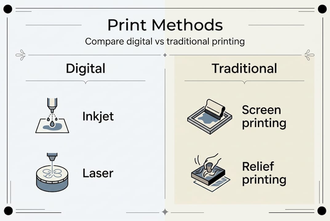
Printing techniques split into two broad approaches. Digital printing uses inkjet or laser technology for quick turnaround and consistent results. Traditional methods like screen printing or relief printing create handcrafted textures impossible to replicate digitally. Your choice depends on desired aesthetic, budget, and production volume.
Testing proves invaluable. Order small samples to evaluate paper weight, colour accuracy, and finish quality. Physical samples reveal details invisible in digital previews. This verification step builds confidence and helps you personalise your space with art that truly matches your vision.
Pro tip: Create a reference folder with successful print samples labelled with exact settings, paper types, and ICC profiles used. This documentation eliminates guesswork for future projects and ensures repeatable results.
Step-by-step guide to customising your prints
Transforming your vision into physical wall art requires methodical execution. Follow these steps to achieve professional results whilst avoiding common pitfalls.
-
Prepare your artwork file. Export at 600 DPI minimum for sharp detail. Use CMYK colour mode for print rather than RGB designed for screens. Save in lossless formats like TIFF or high-quality PDF to preserve image data. Check dimensions match your intended print size at full resolution.
-
Select your printing method. Digital printing suits projects requiring speed, multiple copies, or photographic quality. Traditional printmaking techniques create textured multiples with distinctive character, ideal for artistic statements. Screen printing works brilliantly for bold graphics with limited colours. Relief printing adds dimensional quality perfect for contemporary interiors.
-
Implement colour management. Load the correct ICC profile for your chosen paper and printer combination. Enable soft proofing to preview how colours shift during printing. Adjust saturation and contrast based on proof results. Remember that printers cannot reproduce all screen colours, particularly vibrant blues and greens.
-
Send files to your printer. Whether using home equipment or professional services, verify file specifications match their requirements. Include colour profiles with your submission. Request a proof print for critical projects where colour accuracy matters most. POD services typically provide digital proofs, but physical samples reveal texture and finish.
-
Allow proper drying and finishing. Prints need 24 hours to fully cure, preventing smudging or colour shift. Apply protective varnish for longevity if desired. Mount or frame promptly to prevent curling. Consider the environment where art will hang, as humidity affects paper stability.
Pro tip: Keep a colour checker card in your reference shots when photographing artwork for reproduction. This physical standard helps calibrate colours during editing and ensures accurate translation from original to print.
Your customised prints now need verification to ensure they meet quality standards and transform urban interiors with art that genuinely impresses.
Troubleshooting and verifying your custom prints
Even careful preparation encounters obstacles. Recognising and resolving common issues ensures your final prints meet professional standards.
Colour mismatch ranks as the most frequent complaint. Your screen displays colours using light whilst printers use pigments, creating inherent differences. Achieving DeltaE ≤ 2 ensures accuracy perceptible to trained eyes. Physical proofing remains essential because monitors vary wildly in calibration. Order test prints under identical conditions to your final run, examining them in the actual lighting where art will display.
Blurry images perplex many creators despite high DPI settings. Resolution alone doesn’t guarantee sharpness. Source image quality matters most. Upscaling low-resolution files introduces blur no amount of DPI can fix. AI-generated artwork particularly suffers from this limitation, as algorithms create detail rather than capture it. Verify your source file contains genuine detail at intended print dimensions.
Paper curling frustrates those in humid climates. Moisture causes paper fibres to expand unevenly, creating waves or rolls. Store prints flat in climate-controlled spaces. Use heavier paper stocks for larger prints, as weight provides stability. Frame promptly behind glass to protect from environmental fluctuations.
Common verification steps include:
- Examine prints at intended viewing distance rather than close inspection
- Check colour consistency across the entire print surface
- Verify edge sharpness and detail in shadow areas
- Assess paper flatness and coating uniformity
- Compare against reference samples from successful prints
DeltaE metrics quantify colour accuracy scientifically. Values below 2 indicate excellent matches invisible to most viewers. Values between 2 and 4 show perceptible differences only under direct comparison. Above 4 signals noticeable colour shifts requiring correction. Professional services should consistently achieve DeltaE below 2 for critical colour work.
“Physical proofing remains essential to avoid issues like curling due to humidity. Colour management achieving DeltaE ≤ 2 ensures prints match originals accurately.”
Understanding these troubleshooting principles helps you customise wall art for unique spaces with confidence, knowing you can identify and resolve issues before they become expensive mistakes.
Comparison of custom print approaches for wall art
Choosing the right printing method balances quality, cost, texture, and production needs. Each approach offers distinct advantages suited to different projects and aesthetic goals.
Digital printing dominates contemporary custom print markets. Inkjet technology produces photographic quality with smooth gradients and fine detail. Costs remain low for single prints or small batches. Turnaround times measure in days rather than weeks. However, digital prints lack the tactile dimension of traditional methods. Surface texture stays uniform and predictable, which suits modern minimalist interiors but may feel flat in spaces craving character.
Print-on-demand services democratise professional quality printing. Bay Photo Lab achieves 98% satisfaction for quality and speed, setting industry benchmarks. POD platforms handle production, shipping, and often customer service, freeing designers to focus on creativity. Profit margins stay flexible, allowing price adjustments without inventory risk. Archival warranties guarantee longevity, crucial for selling to discerning clients. These services excel for designers scaling businesses or homeowners wanting gallery-quality results without equipment investment.
Traditional printmaking creates artisanal pieces with unmistakable character. Screen printing builds layers of ink creating dimensional surfaces that catch light beautifully. Relief printing leaves subtle impressions adding texture impossible to replicate digitally. Lithography produces rich, nuanced tones perfect for fine art reproduction. These methods require specialised equipment and expertise, increasing costs and production time. Yet the results justify investment for bespoke projects where uniqueness matters more than efficiency.
| Method | Quality | Cost per print | Texture | Best for |
|---|---|---|---|---|
| Digital inkjet | Excellent detail | Low | Smooth | Photography, multiple copies |
| Print-on-demand | Professional | Medium | Smooth to slight | Scaling sales, testing designs |
| Screen printing | Bold graphics | Medium to high | Dimensional | Limited colours, editions |
| Relief printing | Artistic | High | Highly textured | Bespoke art pieces |
Key considerations when selecting your approach:
- Production volume affects per-unit costs dramatically
- Desired finish determines method suitability
- Turnaround time constraints may eliminate traditional options
- Client expectations for uniqueness versus consistency
- Budget allocation between quality and quantity
Service providers vary significantly in capabilities and reliability. Research customer reviews focusing on colour accuracy, shipping damage rates, and customer service responsiveness. Request sample packs to evaluate paper quality and print fidelity firsthand. Establish relationships with reliable providers to ensure consistent results across projects.
Your choice ultimately reflects project priorities. Digital and POD suit efficiency and scalability. Traditional methods deliver unmatched character for statement pieces. Many successful designers combine approaches, using digital for client proofs and traditional methods for final limited editions. This hybrid strategy offers creative flexibility whilst managing costs effectively.
Now that you understand your options, discover where to find innovative wall art ideas for urban interiors and professional services to execute your vision flawlessly.
Explore custom print options with Frametheworld
Bringing your customised print vision to life requires partnering with specialists who understand both technical excellence and artistic sensibility. Frametheworld offers comprehensive custom print services designed for homeowners and interior designers seeking truly personalised wall art solutions.
Our bespoke printing service transforms your artwork into museum-quality prints that honour your creative vision. Whether you’re working from original photography, digital designs, or traditional artwork, professional colour management ensures accurate reproduction that matches your expectations. High-grade archival inks and premium substrates guarantee longevity, protecting your investment for generations.
Explore curated collections that inspire customisation possibilities. The Wabi Sabi wall art collection celebrates imperfect beauty with organic textures and muted palettes perfect for serene interiors. For bold statements, the Pop Art wall art collection delivers vibrant energy that energises contemporary spaces. These professionally designed pieces also serve as excellent starting points for further personalisation.
Professional services eliminate technical barriers that often frustrate DIY attempts. Colour calibration, paper selection, and finishing options receive expert guidance tailored to your specific project requirements. This support proves invaluable for designers managing client expectations and homeowners seeking gallery-worthy results without extensive technical knowledge.
Frequently asked questions about customising prints
What printing methods best suit textured wall art?
Traditional techniques like screen printing and relief printing create physical texture through layered inks and impressed surfaces. Digital printing on textured papers or canvas provides subtle surface variation. For maximum texture, combine digital base prints with hand-applied elements like varnish or paint accents that add dimensional interest.
How to ensure colour accuracy when custom printing?
Use ICC profiles matched to your specific printer and paper combination, enable soft proofing to preview colour shifts, and always order physical proof prints before final production. Calibrate your monitor regularly and view prints under lighting similar to display conditions. Professional services consistently achieving DeltaE values below 2 deliver the most reliable colour matching.
Can AI-generated artwork be used for custom prints?
Yes, but resolution limitations require careful handling. AI creates rather than captures detail, so upscaling introduces softness. Generate images at the largest possible dimensions, avoid excessive enlargement, and test print samples to verify acceptable sharpness at intended viewing distances. AI artwork works best for abstract or impressionistic styles where precise detail matters less.
What are common mistakes in DIY print customisation?
Skipping colour management causes the most disappointment, resulting in prints that don’t match screen previews. Using RGB files instead of CMYK creates unexpected colour shifts. Insufficient resolution produces blurry results despite high DPI settings. Ignoring paper selection leads to inappropriate finishes. Finally, inadequate proofing means discovering problems only after expensive final printing.
How do I choose the right print size for my wall space?
Measure your wall and aim for art covering 60 to 75 percent of available width for balanced proportions. Consider viewing distance, as larger prints suit spaces viewed from farther away. Create paper templates to visualise scale before committing to printing. Multiple smaller prints arranged as a gallery wall offer flexibility for awkward spaces. Understanding these principles helps you appreciate the benefits of custom wall art tailored precisely to your interior dimensions.


Leave a comment
This site is protected by hCaptcha and the hCaptcha Privacy Policy and Terms of Service apply.