

A gallery wall is not simply a cluster of frames you’ve run out of space for elsewhere. There’s a meaningful difference between a random arrangement and a deliberately curated display, and that difference is what separates a wall that feels alive from one that just feels busy. Whether you’re working with a blank hallway, a living room feature wall, or a compact bedroom corner, understanding the principles behind gallery walls will help you create something that genuinely reflects your personality. This guide covers everything from definitions and styles to planning, hanging, and the finishing touches that make a real difference.
Table of Contents
- What defines a gallery wall?
- Popular gallery wall styles and layouts
- Essential steps to plan your gallery wall
- Arranging, hanging, and finishing touches
- Why most gallery walls succeed (or fail): lessons from real homes
- Ready to create your own gallery wall?
- Frequently asked questions
Key Takeaways
| Point | Details |
|---|---|
| Gallery wall definition | A gallery wall is a curated, intentional collection for artful impact, not random grouping. |
| Style options | Popular layouts include grid, salon-style, and organic, each serving different design needs. |
| Planning essentials | Successful gallery walls start with measured layouts, visual anchors, and cohesive themes. |
| Expert finishing | Mix frames and objects for texture, use appropriate fixings, and update displays over time. |
| Personality matters | True impact comes from blending practical tips with your unique style and story. |
What defines a gallery wall?
The term gets used loosely, but a gallery wall is something specific. As the complete guide to gallery walls describes it, it is “a curated collection of framed artwork, photographs, or decorative objects arranged together on a single wall to create visual interest through varied sizes, shapes, and compositions.” That word curated is doing a lot of work here.
Curation means intentionality. It means choosing pieces that relate to each other in some way, whether through colour, theme, mood, or framing style. It means thinking about how the arrangement reads as a whole, not just as individual items. That’s what separates a gallery wall from a wall where things have simply accumulated over time.
Common misconceptions are worth addressing directly:
- Any group of frames equals a gallery wall. Not quite. Grouping frames without a unifying concept tends to look chaotic rather than considered.
- Gallery walls need to be large. A small, tight arrangement of three to five pieces can be just as impactful as a floor-to-ceiling display.
- You need expensive art. The quality of the arrangement matters far more than the price of individual pieces.
- Everything must match. Intentional contrast can be just as cohesive as uniformity, provided there’s a connecting thread.
A gallery wall earns its name through planning and purpose. Without those two things, it’s just a wall with frames on it.
Understanding the wall art framing process also plays a role here. How a piece is framed changes its visual weight, its relationship to neighbouring pieces, and the overall tone of the arrangement. Framing is part of the curation, not an afterthought.
Popular gallery wall styles and layouts
Once you understand what a gallery wall is, the next question is what kind you want. Style shapes everything: the mood of the room, the effort involved, and how forgiving the arrangement is if you want to change it later.
The most widely used styles, as outlined in the complete guide to gallery walls, are the grid, salon-style, and symmetrical arrangements. Each creates a distinct visual story.
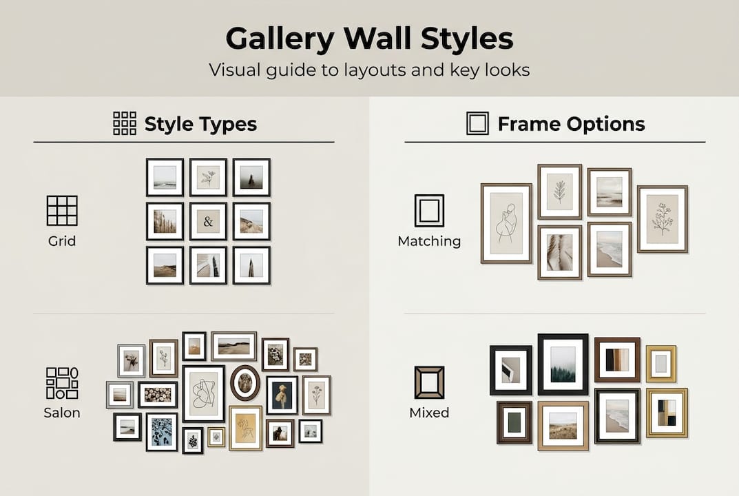
| Style | Look and feel | Best for | Pros | Cons |
|---|---|---|---|---|
| Grid | Uniform rows and columns, clean lines | Modern, minimal spaces | Easy to plan, very orderly | Less flexible, rigid feel |
| Salon-style | Dense, floor-to-ceiling, eclectic mix | Traditional, maximalist rooms | Rich and layered | Requires careful editing |
| Symmetrical | Mirrored around a central piece | Formal rooms, hallways | Balanced and polished | Can feel static |
| Organic freeform | Loose, evolving, no fixed pattern | Relaxed, personal spaces | Flexible, grows over time | Risk of looking cluttered |
The debate between mismatched frames and matching ones is genuinely interesting. Mismatched frames create a collected, lived-in quality that feels personal and warm. Matching frames produce harmony and visual calm. Neither is wrong. The key, as most experienced decorators will tell you, is to plan meticulously regardless of which route you take. Eclectic does not mean unplanned.
For inspiration on what’s working in homes right now, the latest wall decor trends show a strong move towards warmer tones and nature-inspired imagery. If you’re unsure where to start with subject matter, exploring top decor themes can help you narrow down a direction that suits your existing interior.
Pro Tip: Even in the most eclectic arrangement, choose one unifying element, whether that’s a shared frame colour, a consistent mat colour, or a recurring theme. That single thread is what makes a freeform wall feel intentional rather than accidental.
Essential steps to plan your gallery wall
Planning is where most gallery walls succeed or fail before a single nail goes in. Rushing this stage is the most common mistake, and it’s entirely avoidable.
Here’s a reliable process to follow:
- Choose your wall. Consider natural light, foot traffic, and how the wall relates to furniture below or beside it. A sofa, console table, or bed can anchor the arrangement visually.
- Measure the space. Note the exact width and height available. This determines how many pieces you can include without overcrowding.
- Gather your pieces. Lay everything out on the floor in the rough shape of your wall. This is where you audition combinations and spot what works.
- Cut paper templates. Trace each piece onto paper, cut it out, and use masking tape to position them on the wall. Rearrange freely without any commitment.
- Start with the anchor piece. According to the complete guide to gallery walls, the largest piece should sit at eye level, with its centre roughly 57 to 60 inches from the floor. Build outward from there, maintaining 2 to 3 inches of consistent spacing between pieces.
- Check balance. Step back regularly. Look at visual weight (darker, larger pieces carry more), and consider the rule of thirds to avoid everything clustering in the centre.
The floor layout stage is not optional. It’s where you discover that the combination you imagined doesn’t actually work, and where you find the one that does.
Pro Tip: Use paper templates on the wall before hammering any nails. It takes twenty minutes and saves hours of filling holes.
For choosing the right pieces in the first place, the wall art selection guide is a practical resource. And if you’re considering custom framing to unify your collection, the expert guide to framing art covers the decisions worth making carefully.
Arranging, hanging, and finishing touches
With your layout confirmed on paper, the physical hanging stage is actually the most straightforward part. Confidence here comes from preparation.
- Transfer your templates. Keep the paper pieces on the wall and hammer nails directly through them. Tear the paper away afterwards. The nail sits exactly where you planned.
- Work outward from the anchor. Hang the central piece first, then build outward symmetrically or organically depending on your chosen style.
- Use a spirit level. Even in freeform arrangements, individual frames should hang straight. Crooked frames pull attention away from the display as a whole.
- Check spacing as you go. A ruler or a piece of card cut to your desired gap width keeps spacing consistent without constant measuring.
Once the frames are up, finishing touches are what elevate a good gallery wall to a great one. As gallery wall design guidance suggests, mixing art types, including photos, prints, mirrors, and objects like woven baskets or ceramic plaques, adds texture and depth that flat frames alone cannot achieve.
| Finishing touch | Effect | Example |
|---|---|---|
| Directional lighting | Adds drama and focus | Picture light or angled spot |
| Small shelf or ledge | Breaks up the flat plane | Holds a plant or small object |
| Mirror | Reflects light, adds dimension | Round or arched mirror |
| Trailing plant | Softens hard edges | Pothos or string of hearts |
| Textile or woven piece | Adds warmth and texture | Macramé or woven wall hanging |
For ongoing inspiration as your collection grows, wall art ideas for urban interiors offers a useful starting point for refreshing or expanding a display.
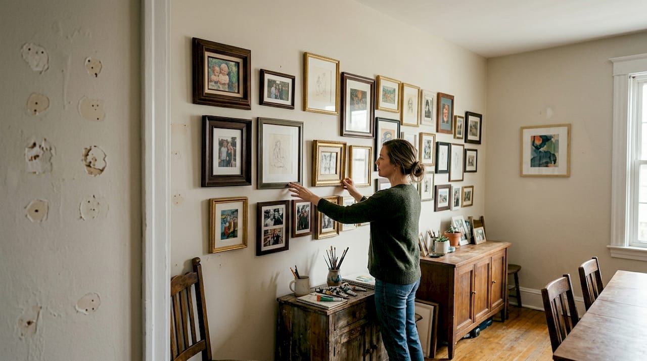
Why most gallery walls succeed (or fail): lessons from real homes
Here’s something most guides won’t say plainly: the gallery walls that look best in real homes are rarely the ones that followed every rule perfectly. They’re the ones that were edited ruthlessly.
The biggest problem we see is not poor taste. It’s overcrowding. People add pieces because they love them individually, without asking whether each one earns its place in the arrangement. A gallery wall with twelve pieces that all belong is far stronger than one with twenty where half are just filling space.
The other thing worth saying is that mismatched, organic arrangements often age better than perfect grids. A grid looks sharp on day one, but it’s unforgiving if you want to add a new piece or remove one. An organic arrangement can absorb change naturally. It grows with you.
The most meaningful gallery walls we’ve seen are the ones that tell a story: a mix of travel prints, family photographs, and a piece of art bought on impulse from a market. That kind of collection has personality that no perfectly curated grid can replicate.
Pro Tip: Leave deliberate gaps in your arrangement. A wall that looks slightly unfinished invites the next chapter. It signals that the story isn’t over yet.
For a deeper look at making your space genuinely yours, personalising your space with art is worth reading alongside this guide.
Ready to create your own gallery wall?
If this guide has sparked ideas, the next step is finding the right pieces. At Frametheworld.co.uk, you’ll find a wide range of prints and artworks suited to every gallery wall style, from clean modern grids to warm, eclectic salon arrangements. Browse Wabi Sabi wall art for a calming, nature-inspired aesthetic, or explore colourful paintings if you want your wall to make a bold statement. For something entirely personal, the custom print service lets you create bespoke pieces that fit your exact vision, size, and colour palette. Your gallery wall should feel like you. We can help make that happen.
Frequently asked questions
What is the purpose of a gallery wall?
A gallery wall adds personality and visual interest to a space by displaying a curated collection of art, photos, or objects with intentional style and composition.
How do you start arranging a gallery wall?
Begin by laying your chosen pieces on the floor to test combinations, then use paper templates on the wall before hanging. Start with the anchor piece at eye level and build outward from there.
Can I mix different frame styles on a gallery wall?
Yes, and it often looks better for it. A cohesive colour palette or theme is what unifies mixed frames, not uniformity of style.
What are the most popular gallery wall patterns?
Grid, salon-style, and symmetrical are the three most widely used patterns, each producing a distinctly different mood and level of visual complexity.


Leave a comment
This site is protected by hCaptcha and the hCaptcha Privacy Policy and Terms of Service apply.