

TL;DR:
- Proper art display requires careful decisions about measuring, lighting, and placement to achieve an intentional and cohesive look.
- Planning layouts with paper cutouts and adhering to standard heights ensure artwork appears balanced and visually appealing.
- Using high-CRI LED lighting and appropriate framing materials enhances artwork preservation and showcases each piece effectively.
Most art ends up hanging in the wrong place, at the wrong height, in the wrong light. It is not that people lack taste. It is that displaying art well requires a set of decisions most of us were never taught to make. This art display solutions guide walks you through everything, from measuring your walls to choosing your lighting, so that every piece you hang looks like it belongs exactly where it is. Whether you are decorating a single living room wall or planning a full gallery arrangement, these are the principles that actually work.
Table of Contents
- Key takeaways
- Essential preparation for art display
- Planning and arranging your artwork
- Lighting and preservation techniques
- Framing and mounting options
- Common display mistakes to avoid
- My honest take on what makes art display work
- Ready to put this into practice?
- FAQ
Key takeaways
| Point | Details |
|---|---|
| Preparation prevents mistakes | Measure walls and gather tools before you touch a single nail. |
| Hang at the right height | Centre artwork between 58 and 60 inches from the floor for comfortable viewing. |
| Lighting shapes perception | Use LED bulbs with a CRI of 90 or higher to show true colours accurately. |
| Plan layouts before hanging | Use kraft paper cutouts taped to the wall to test arrangements without damage. |
| Frame choices matter | Select glazing, mats, and mounting hardware that protect art as well as present it. |
Essential preparation for art display
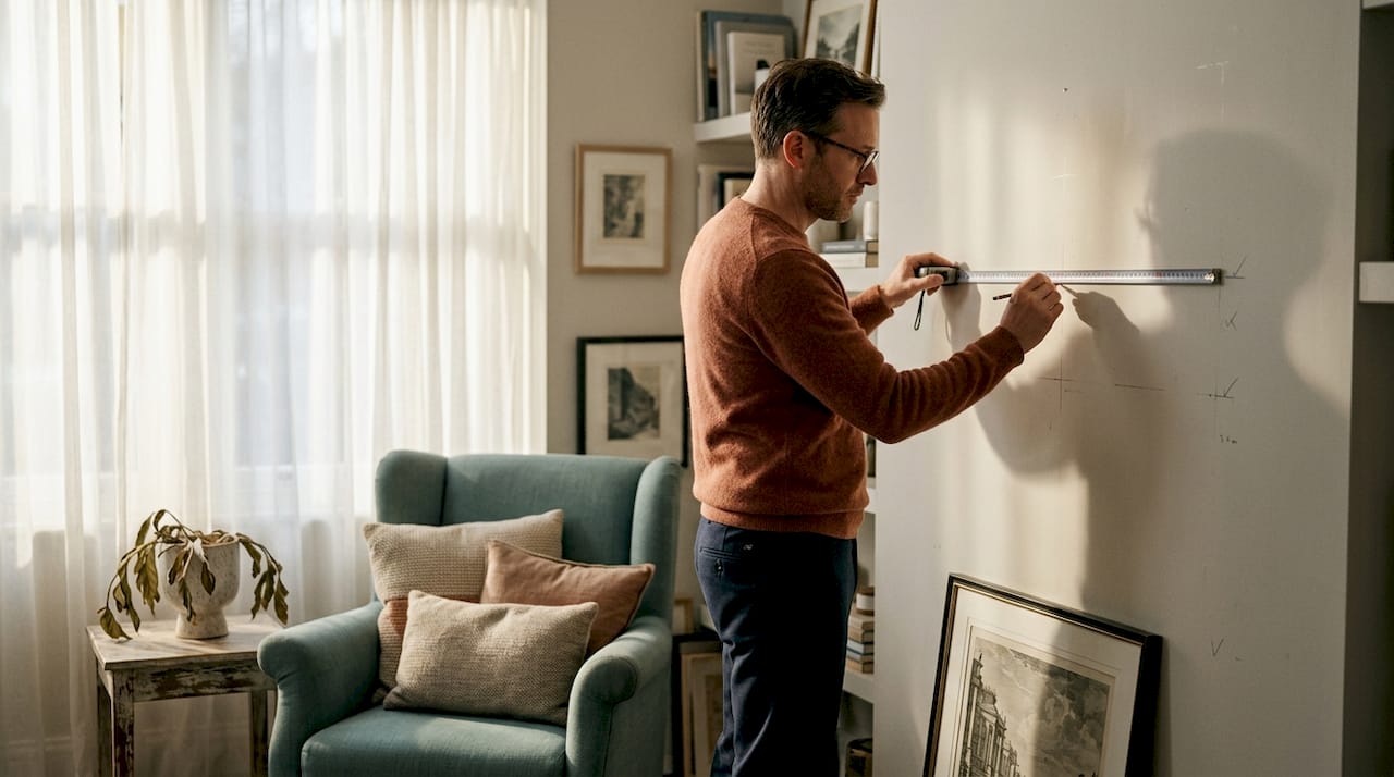
Before you hang a single piece, spend twenty minutes getting organised. The difference between a display that feels considered and one that feels accidental almost always comes down to preparation.
Start by measuring every wall you plan to use, and measure each artwork too. Note the width, height, and depth of frames. Write these down, because you will need them when you start planning layouts. Pay attention to how the room is used. A dining room wall is viewed mainly from seated height, which shifts your hanging height downward slightly compared to a hallway or standing-height space.
Here is what you need before you start:
- A tape measure and a pencil
- A spirit level (small and lightweight works well)
- Painter’s tape for marking and paper layout
- D-rings, picture hooks, and wall anchors sized to your artwork weight
- A hammer or drill and the correct fixings for your wall type (plasterboard, brick, and timber all need different approaches)
- Kraft paper or newspaper for making scale cutouts
Pro Tip: Weigh each artwork before choosing your fixings. A canvas print under 2kg can hang from a standard picture hook, but anything heavier needs a wall anchor rated for the load.
Understanding viewer sight lines is also worth your time. Think about where people stand or sit when they face the wall. That point of view determines the ideal hanging height and the distance between pieces in a group arrangement.
| Tool | Purpose |
|---|---|
| Spirit level | Keeps artwork straight during hanging |
| Tape measure | Confirms accurate spacing and height |
| Painter’s tape | Marks positions without wall damage |
| Wall anchors | Secures heavy frames safely to walls |
| Kraft paper | Creates scale layouts for trial arrangements |
Planning and arranging your artwork
This is where most people go wrong. They pick up a frame, hold it against the wall, decide it “looks about right,” and hammer in a nail. Thirty minutes later, the wall is dotted with holes and nothing lines up. There is a better way.
The standard hanging height for centred artwork is 58 to 60 inches from the floor. This is the measurement professional galleries use because it corresponds to the average eye level of a standing adult. It is the single most useful number in any art presentation solutions toolkit.
For gallery walls and group arrangements, the approach is slightly different. Research confirms that midpoint-anchored arrangements read as far more intentional than displays that begin at one edge and sprawl sideways. Start with your largest or most visually dominant piece at the centre, then build outward.
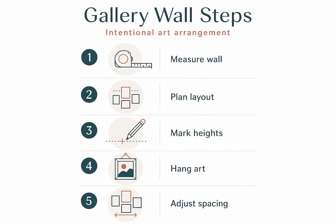
Here is a step-by-step layout process that prevents the hole-riddled wall problem:
- Lay all your artworks on the floor in the arrangement you want to create.
- Trace each frame onto a sheet of kraft paper and cut out the shapes.
- Tape the paper cutouts to your wall using painter’s tape. Paper cutout layouts take roughly 45 minutes but eliminate guesswork entirely.
- Stand back and assess the arrangement from normal viewing distance. Adjust until the balance feels right.
- Mark your nail positions through the paper, remove the cutouts, and hang with confidence.
Pro Tip: The 2/3 rule is a classical proportional design shortcut that works reliably: art above a sofa should span approximately two-thirds the width of the sofa beneath it. The result always looks grounded and considered.
For cohesive gallery walls, use consistent spacing between frames. A gap of 2 to 3 inches between pieces reads as intentional. Unify mismatched frames with a shared mat colour or a consistent frame finish, and the arrangement will feel curated rather than collected by accident.
| Layout type | Best suited for | Key consideration |
|---|---|---|
| Single piece | Feature walls, focal points | Follow the 58 to 60 inch centre height rule |
| Cluster or gallery | Stairwells, large walls | Anchor centrally, maintain 2 to 3 inch spacing |
| Salon style | Maximalist or eclectic interiors | Mix sizes freely but keep consistent mat or frame finish |
Lighting and preservation techniques
Lighting is where many home displays fall short. People install whatever ceiling light came with the room and assume it is good enough. It usually is not. Gallery lighting is a deliberate technical system designed to reveal true colours and artist intent, not simply to brighten a room.
For home use, the most important specification to understand is CRI, which stands for Colour Rendering Index. It measures how accurately a light source shows colours compared to natural daylight. LED bulbs with a CRI of 90 or higher show artwork colours accurately. Standard bulbs with a CRI around 80 introduce subtle distortions you may not consciously notice, but which dull the impact of the work.
Colour temperature matters too. Aim for 3000K to 3500K for a warm, gallery-like quality of light. Cool white or daylight bulbs at 5000K and above will make warm-toned artworks look flat and cold. For more on getting residential lighting right alongside art display, this kitchen lighting guide from Happy Doors has useful principles that transfer across rooms.
Key lighting considerations:
- Picture lights: Mounted directly above a frame, these give a traditional, intimate quality. They suit oil paintings and works in ornate frames.
- Track lighting: Adjustable track systems let you angle individual spotlights at multiple pieces without rewiring. This is the most flexible adjustable lighting solution for home galleries.
- Wall washers: These spread light evenly across a wall section, which suits salon-style arrangements with many smaller pieces.
- Avoid direct sunlight: Even indirect UV exposure causes fading and deterioration over time. UV-filtering glazing and UV window films are both effective protections.
Pro Tip: Position spotlights at a 30-degree angle to the artwork surface to avoid the two most common problems: glare bouncing off glass, and a “hotspot” of bright light concentrated at the centre with dark edges.
Museum practice offers a useful benchmark. Sensitive works should receive 5 to 10 foot-candles of illumination, while more robust pieces can handle up to 20, balancing visibility with preservation. For home purposes, this translates to using a dimmer switch on your picture or track lights, allowing you to calibrate intensity to the work.
Framing and mounting options
A frame is not just decoration. It is protection. The right framing choice preserves your artwork and shapes how viewers read it. The wrong choice competes with the art or, worse, lets moisture and UV damage degrade it over years.
Here is how the main options compare:
- Standard glass: Clear and affordable, but heavy and fragile. Not ideal for large pieces or households with children.
- UV-filtering glass or Plexiglas: Blocks the UV rays that cause fading. Plexiglas is lighter and shatter-resistant, which makes it a practical upgrade for most homes.
- Shadow boxes: These provide depth behind the artwork, which is especially useful for three-dimensional works, textiles and mixed media that cannot lie flat against glass. They also add visual drama to framed objects.
- Mats: A mat creates physical separation between artwork and glazing, preventing moisture transfer. Wider mats make smaller works feel more considered and gallery-like.
- Picture rails: These wall-mounted rails allow frames to hang from adjustable hooks and wires, making it easy to reposition works without new fixings every time.
For expert guidance on selecting the right frame, the Frametheworld framing art guide covers materials, depths, and finish choices in practical detail.
| Framing option | Best for | Key benefit |
|---|---|---|
| UV Plexiglas | Large canvases, family homes | Lightweight and protective |
| Shadow box | 3D works, textiles, objects | Adds depth and shields delicate items |
| Wide mat | Prints, photographs, drawings | Creates visual breathing room around the image |
| Picture rail system | Renters, frequent rearrangers | No new holes needed when repositioning |
Common display mistakes to avoid
Even with the best preparation, a few recurring mistakes can undermine an otherwise well-planned display. Knowing what they are makes them easy to sidestep.
- Hanging too high. This is the most common error. When in doubt, go lower, not higher. Art hung near ceiling height disconnects from the room and feels decorative rather than present.
- Overcrowding. More pieces do not automatically mean more impact. Crowded walls create visual noise. Give each work room to breathe. On a long wall, create implied zones with space between groupings rather than filling every centimetre.
- Ignoring scale. A small print on a large wall gets lost. A large canvas in a narrow corridor overwhelms. Matching artwork scale to wall scale is one of the most underrated art exhibition tips in any decorator’s toolkit.
- Poor lighting placement. A ceiling pendant centred in a room rarely illuminates wall art effectively. Always think about light direction relative to each specific piece.
- Rigid symmetry on organic walls. Perfectly symmetrical arrangements can feel sterile in living spaces. A slight asymmetry in a gallery grouping often reads as more natural and alive.
Pro Tip: If a display feels off but you cannot identify why, photograph it on your phone and look at the image rather than the wall. The camera flattens visual noise and makes imbalances easier to spot.
My honest take on what makes art display work
I have looked at a lot of art displays in homes and professional spaces. What I keep coming back to is this: the expensive pieces and the budget prints often perform equally poorly when the display itself is thoughtless. And equally, a modest, well-considered grouping with good lighting will outperform a costly canvas hung in the wrong spot every single time.
The shift that makes the biggest difference is moving from reactive to intentional. Most people start with the art they already own and ask “where can this go?” Curators start with the space and ask “what does this wall need to communicate?” Even applying that question loosely, as a homeowner standing in your sitting room, changes the decisions you make.
In my experience, lighting accounts for at least half of the impression a display makes. I have seen forgettable prints transformed by a well-positioned picture light, and I have seen beautiful originals made dull by the wrong bulb. Start there before you rearrange anything else.
The other thing I would encourage is layering narrative into art groupings rather than just filling wall space. A collection connected by theme, palette, or period tells a story. Viewers feel it even when they cannot articulate it. Matching art to your interior style is a starting point, but the real goal is a display with a point of view. That is what makes a room memorable.
— Lennard
Ready to put this into practice?
If you have worked through this guide and know what you want to display but have not yet found the right pieces, Frametheworld has collections built around exactly the kind of intentional display these principles describe. The Wabi Sabi wall art collection features hand-painted abstract works with texture and depth that reward good lighting and considered framing. For something bolder, the Pop Art collection brings vibrant, hand-painted retro and modern works that anchor a gallery wall with confidence. Frametheworld also offers bespoke framing and customisation services for clients who want artwork sized precisely for a specific wall or project. Browse the full range at Frametheworld to find pieces that work as hard as your display plan does.
FAQ
What height should art be hung on a wall?
The industry standard is to centre artwork between 58 and 60 inches from the floor, which aligns with the average adult eye level. For rooms where people are mostly seated, such as dining rooms, adjust the centre point down by a few inches.
How do I plan a gallery wall without making lots of holes?
Trace each frame onto kraft paper, cut out the shapes, and tape them to the wall with painter’s tape. This trial layout method takes around 45 minutes and lets you finalise spacing and arrangement before committing to fixings.
What type of lighting is best for displaying artwork?
Use LED bulbs with a CRI of 90 or higher and a colour temperature between 3000K and 3500K. Position spotlights or picture lights at a 30-degree angle to the artwork surface to prevent glare and uneven illumination.
Should I use glass or Plexiglas for framing art?
UV-filtering Plexiglas is lighter, shatter-resistant, and protects against the UV rays that cause colour fading. It is the more practical choice for most homes, particularly for large pieces or households with children.
How far apart should pieces in a gallery wall be spaced?
A gap of 2 to 3 inches between frames is the standard for gallery-style arrangements. Consistent spacing reads as deliberate and makes even a mixed collection of frames feel cohesive and curated.


Leave a comment
This site is protected by hCaptcha and the hCaptcha Privacy Policy and Terms of Service apply.