
TL;DR:
- Choosing office art requires careful assessment of space, lighting, and zone functionality to create an impactful environment. Selecting styles that match each area’s purpose and following proper hanging techniques enhances visual coherence and staff engagement. Regularly refreshing artwork and balancing quality with budget help maintain a dynamic, professional workspace that positively influences productivity and morale.
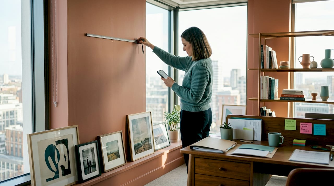
Choosing art for a workplace is harder than most people expect. You are not shopping for your living room. You are making decisions that affect how clients perceive your brand, how staff feel at their desks, and whether a meeting room feels energising or oppressive. This office decor art solutions guide cuts through the confusion by walking you through every stage: assessing your space, choosing the right styles, hanging artwork correctly, and managing your budget without compromising on quality. Whether you are starting from scratch or refreshing a tired office, this guide gives you a clear path forward.
Table of Contents
- Key takeaways
- Your office decor art solutions guide: start with the space
- Choosing the right art styles and types
- Planning, hanging, and installing your artwork
- Budget-conscious and premium options
- Keeping your art working over time
- My honest take on office art
- Transform your office with curated art from Frametheworld
- FAQ
Key takeaways
| Point | Details |
|---|---|
| Assess your space first | Measure walls, note lighting conditions, and define each room’s function before ordering anything. |
| Match art styles to zones | Use calming nature prints in focus areas and abstract or bold work in creative and collaborative spaces. |
| Follow the eye-level standard | Hang artwork with its centre at 57 to 60 inches from the floor for the most comfortable viewing experience. |
| Balance budget with quality | Fewer well-chosen pieces at a higher price point outperform a wall filled with cheap, mismatched prints. |
| Refresh artwork regularly | Rotating pieces seasonally maintains visual interest and signals to staff that the environment is cared for. |
Your office decor art solutions guide: start with the space
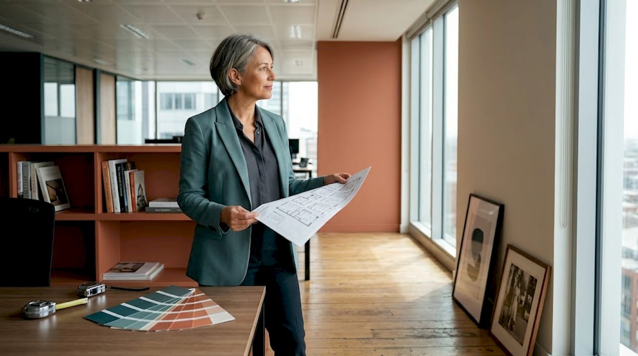
Before you browse a single collection or pick a colour palette, you need a clear picture of what you are working with. Rushing this step is the single biggest reason office art projects fall flat.
Start by defining the function of each area. A reception space has a different job to a breakout room or a row of individual desks. Reception art needs to make an immediate impression and reinforce your brand identity. Collaborative zones benefit from pieces that open up thinking. Focus areas, where people work alone on demanding tasks, call for something quieter and less visually demanding.
Measure before you commit. A useful rule of thumb is the 2/3 rule: artwork width should be roughly two thirds the width of the furniture below it. This applies to a print above a boardroom sideboard, a canvas above a reception desk, or a series of frames running along a corridor wall. Getting this proportional balance right separates offices that look professionally considered from ones that look like an afterthought.
Lighting deserves particular attention. Neglecting lighting and glare is one of the most common mistakes in office art installation, and it can render an expensive piece completely ineffective. Note whether each wall receives direct sunlight at any point during the day, and consider whether overhead lighting is warm, cool, or fluorescent. This directly affects colour rendering and can distort how a piece looks.
Finally, set a budget range before you start selecting. This does not mean being restrictive. It means having a realistic framework so you do not overspend in one area and leave others looking bare.
- Define the function of each room or zone before selecting any artwork
- Measure wall space and note the dimensions of furniture below hanging points
- Walk the office at different times of day to assess natural light patterns
- Note any surfaces with high glare risk, such as glass partitions or polished walls
- Set a per-zone budget rather than one overall figure to avoid imbalanced results
Pro Tip: Photograph each wall with your phone at the same time you plan to install art. Reviewing the images on a screen makes spatial imbalances and lighting problems far more obvious than standing in the room does.
Choosing the right art styles and types
Once you know your space, the creative work begins. This is where most office managers feel overwhelmed. The range of options is genuinely broad, and without a framework, it is easy to default to safe, uninspiring choices.
Art types for office environments fall into a few main categories. Prints and canvases are the most practical and affordable. Sculptural pieces and three-dimensional installations add depth and warmth without taking up floor space. Digital displays give you flexibility to rotate content and align art with seasonal campaigns or brand messaging. Acoustic art panels, which combine sound absorption with visual appeal, are increasingly popular in open-plan offices where noise is a constant problem.
Style selection should follow zone logic rather than personal taste. Here is a breakdown of how to match art styles to the areas where they will have the most impact:
| Office zone | Recommended style | Why it works |
|---|---|---|
| Reception and entrance | Bold, branded, or large-scale prints | Creates a strong first impression and communicates company identity |
| Meeting and boardrooms | Abstract or process-based art | Encourages open-ended thinking and helps break creative blocks |
| Individual workstations | Nature imagery or muted abstract | Calming and restorative without being distracting |
| Breakout and social areas | Playful, colourful, or pop-influenced art | Signals permission to relax and promotes informal conversation |
| Corridors and transition spaces | Photography, typographic prints, or series work | Maintains visual interest without demanding sustained attention |
Colour psychology plays a real role here. Blue and green tones are consistently linked to productivity and calm, while warm accents like ochre and terracotta bring energy without overwhelming. This does not mean every office needs a blue wall. It means the colours dominant in your chosen artwork should align with the intended atmosphere of each zone.
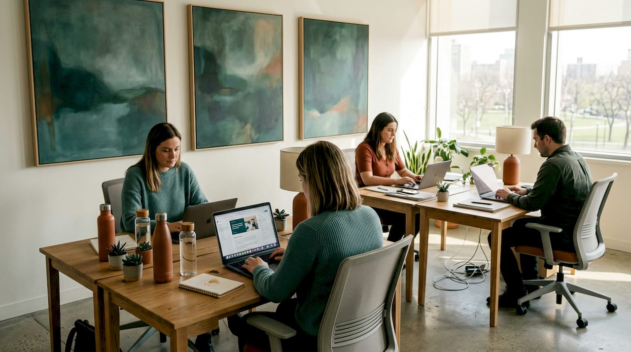
For collaborative zones in particular, abstract and process-based art is well worth considering. It encourages open-ended thinking and supports the kind of risk-taking that good collaboration requires. Work that feels ambiguous or unfinished actually prompts more conversation than literal, representational imagery.
Pro Tip: Do not treat sculptural accessories as an afterthought. Sculptural decor adds genuine warmth to structured workspaces without compromising professionalism. A single well-placed piece on a shelf or credenza can change how a whole room feels.
You can explore art styles for commercial spaces in more depth if you want a curated breakdown of which styles perform best in different professional environments.
Planning, hanging, and installing your artwork
Having great art is only half the job. How you arrange and install it determines whether it works. Poor installation is one of the most common reasons limited variety and misplaced pieces reduce the impact of an otherwise decent collection.
Follow these steps to get the execution right:
- Lay it out before you hang it. For gallery walls in particular, arrange pieces on the floor first to test spacing and composition. Cut paper templates to the exact dimensions of each frame and fix them to the wall with low-tack tape before drilling a single hole. This prevents costly mistakes and protects your walls.
- Use the eye-level standard. The professional benchmark is to hang art with its centre at 57 to 60 inches from the floor. This applies whether the piece is in a corridor, a meeting room, or a reception area.
- Maintain consistent spacing in groupings. Two to three inches between frames in a gallery arrangement looks considered. More than that and the grouping loses coherence. Less and it looks cluttered.
- Test lighting at multiple times of day. Test art placement in both natural and artificial light before committing to a permanent position. A piece that looks stunning in the morning may become invisible or glare-heavy by afternoon.
- Keep a maintenance schedule. Prints fade, frames collect dust, and fixings can loosen over time. A quarterly check keeps everything looking its best and signals to staff that the environment is actively maintained.
Here is a quick reference for the most common installation scenarios:
| Situation | Recommended approach |
|---|---|
| Single large canvas | Centre at 57 to 60 inches; hang at least 8 inches above furniture below |
| Gallery wall grouping | Use floor layout and paper templates; maintain 2 to 3 inch spacing |
| Corridor series | Align at consistent heights; use a single horizontal centre line throughout |
| Above a desk or workstation | Check for screen glare; opt for matte finishes over glass |
Pro Tip: Buy a decent laser level. It costs little and eliminates the frustration of crooked frames on long walls. Cheap spirit levels on poorly plastered walls will let you down.
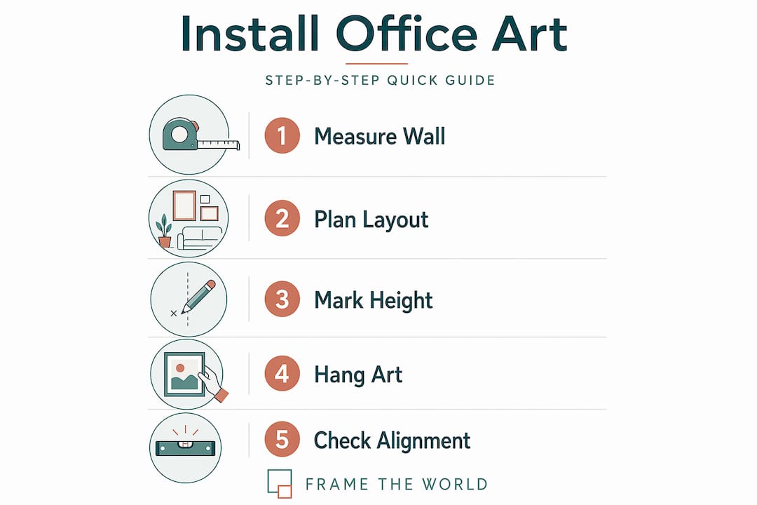
For workspace organisation advice that complements your installation process, including how to keep the area around your artwork clean and dust-free, home office maintenance tips offers practical guidance.
Budget-conscious and premium options
A meaningful office art update does not require a large investment. A basic refresh can start at around £400 to £500, covering a handful of quality prints for a reception or meeting room. The key is to spend deliberately rather than spreading a small budget too thin across too many pieces.
Here is how to allocate your spend effectively:
- Prioritise high-visibility zones first. Reception areas and boardrooms are seen by clients and visitors. These spaces justify a higher spend per piece.
- Use print-on-demand for secondary zones. Corridors, back-office areas, and storage-adjacent walls can carry more affordable giclée prints without looking underfunded.
- Invest in one statement piece per space. Rather than five mid-range prints, consider one genuinely strong piece and two or three complementary smaller works. Quality over quantity consistently produces more professional results.
- Consider bespoke or custom pieces for flagship spaces. Custom artwork communicates that a space has been designed with intention. It also removes the risk of seeing your office art in a competitor’s lobby. Frametheworld offers bespoke options for exactly this kind of commission.
- Budget for installation and frames separately. Many offices underestimate framing costs. A budget that includes only the print price often falls short when quality frames and professional installation are factored in.
Keeping your art working over time
Art that was right for your office two years ago may not be serving it now. Layouts change, teams grow, and what felt fresh can become invisible to people who walk past it every day.
Watch for these signs that your art is no longer working:
- Staff stop commenting on or noticing pieces they once engaged with
- Colours have faded due to direct sunlight exposure
- The style feels inconsistent with how the company has evolved
- New furniture or layout changes have altered the proportional balance of the room
- Frames or fixings show visible wear
Art in the workspace plays a direct role in supporting connection, flexibility, and employee well-being. Rotating pieces seasonally, even just swapping two or three works in high-traffic areas, keeps the environment feeling considered. Involving staff in the selection process, perhaps through a shortlist vote, builds genuine engagement and makes people feel invested in the space they work in.
My honest take on office art
I have seen a lot of office art decisions made badly. Not because managers do not care, but because the brief is usually too vague. “Something nice for the walls” produces exactly the kind of forgettable, committee-safe art that makes offices feel corporate in the worst sense of the word.
What I have found actually works is treating art placement as you would treat any other design decision: with intention and a clear brief. The offices I have encountered that do it well almost always have fewer pieces, not more. They have chosen work that means something in context, placed it where the proportions make sense, and committed to a coherent style rather than trying to please everyone.
The insight from how art transforms workplace design that resonates most with me is this: art is not decoration. It is environment. It shapes how people feel about being in a space, how much creative risk they are willing to take, and whether they feel the company they work for has any real character. That is worth getting right.
My practical advice: start with one zone, do it properly, and let the reaction from staff and visitors guide your next decision. Wholesale redecorations rarely work as well as phased, considered ones.
— Lennard
Transform your office with curated art from Frametheworld
If you are ready to put this guide into practice, Frametheworld makes the selection process genuinely straightforward. The platform lets you browse by style, format, and size, so you can filter directly for what your space needs rather than scrolling through thousands of irrelevant options.
For offices seeking understated sophistication, the Wabi Sabi abstract collection offers hand-painted textural pieces that work beautifully in reception areas, boardrooms, and focus zones. For creative studios, agencies, or client-facing spaces that want something bolder, the Pop Art wall collection brings energy and personality without tipping into chaos. Frametheworld also handles bespoke commissions for offices that need something entirely their own.
FAQ
What is a good starting budget for office art?
A basic office art refresh typically starts at around £400 to £500, covering a small selection of quality prints for a reception or meeting room. Prioritise high-visibility zones first and build out from there.
How high should office artwork be hung?
The professional standard is to hang artwork with its centre at 57 to 60 inches from the floor. This applies across most office settings and ensures comfortable viewing for standing and seated visitors.
What art styles work best in office environments?
It depends on the zone. Abstract and process-based art suits collaborative areas; nature imagery works well in focus zones; bold or branded work performs best in reception and client-facing spaces. You can read more in Frametheworld’s guide to office workspace aesthetics.
How often should office art be refreshed?
Rotating artwork seasonally, or at minimum once a year in high-traffic areas, keeps the office environment feeling active and maintained. This does not require replacing all pieces; swapping two or three works in visible locations is often enough.
Does office art actually affect productivity?
Yes. Research consistently links specific colours and art styles to mood and output. Blue and green tones in artwork support productivity and calm, while abstract styles in collaborative zones encourage creative thinking and reduce cognitive rigidity.

Leave a comment
This site is protected by hCaptcha and the hCaptcha Privacy Policy and Terms of Service apply.