
TL;DR:
- A gallery wall’s success depends on proper placement, curation, and layout planning to create a cohesive display. Hanging artwork at eye level, proportionate to furniture, and limiting frame styles ensure visual harmony and balance. Incorporating textured elements, personal items, and dimensional shelves adds warmth and personality, transforming a flat arrangement into an inviting focal point.
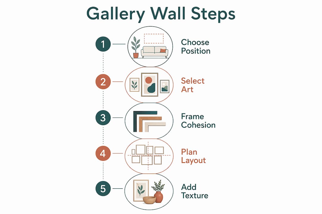
Styling a gallery wall is the practice of curating and arranging artworks, photographs, and decorative objects into a cohesive, intentional feature display. Done well, it transforms a blank wall into the most characterful room in your home. Done poorly, it looks like a jumble sale. The difference lies in three things: placement, curation, and layout planning. Interior designers use techniques like kraft paper templates, frame-finish limiting, and anchor-piece sequencing to keep the result polished. This guide covers all of it, from choosing your wall to adding lighting and texture.
How to style a gallery wall: choosing the right position and size
The single most important decision you make before hanging a single frame is where the display goes and how large it should be. Get this wrong and even beautiful art looks awkward.
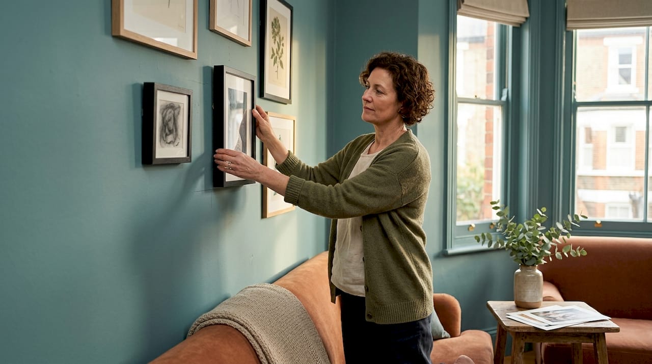
Hang at eye level, every time. The centre point of your gallery wall should sit between 57 and 60 inches from the floor. This is the standard used in professional galleries and it works because it places the visual heart of the arrangement at natural standing eye level. Most people hang art too high, which creates a disconnected feeling between the display and the furniture below.
Match the width to your furniture. A gallery wall above a sofa, console table, or sideboard should span roughly two-thirds the width of that piece. More precisely, the display should occupy 60 to 80 percent of the available wall width. A wall arrangement that is too narrow above a wide sofa looks timid. One that extends beyond the furniture edges looks unmoored.
Mind the gap above furniture. Leave 4 to 6 inches between the top of the furniture back and the lowest frame in your arrangement. This keeps the display visually connected to the piece below without crowding it.
| Wall type | Recommended width coverage | Notes |
|---|---|---|
| Above a sofa (2–3 seater) | 60–75% of sofa width | Keep lowest frame 4–6 inches above sofa back |
| Above a console or sideboard | 65–80% of furniture width | Works well with asymmetric layouts |
| Long empty wall with no furniture | Break into 2–3 zones | Leave breathing space between clusters |
| Narrow corridor | Full height, limited depth | Use thin frames projecting under 1.5 inches |
For long walls without furniture as a reference point, avoid one continuous sprawl. Breaking the display into two or three distinct clusters, each with its own internal logic, reads as intentional rather than chaotic. This approach also lets you decorate living room walls in stages without committing to a single fixed arrangement.
Pro Tip: Cut paper templates to the exact size of each frame and tape them to the wall with painter’s tape before you drill a single hole. This lets you test the composition in real light and at real height, and the whole process takes around 45 minutes rather than an afternoon of patching plaster.
What to put on a gallery wall: curating art and frames for cohesion
The art you choose matters less than how you frame and group it. A £10 print in a quality frame looks more intentional than an expensive piece in a cheap one. That single insight changes how you should allocate your budget.
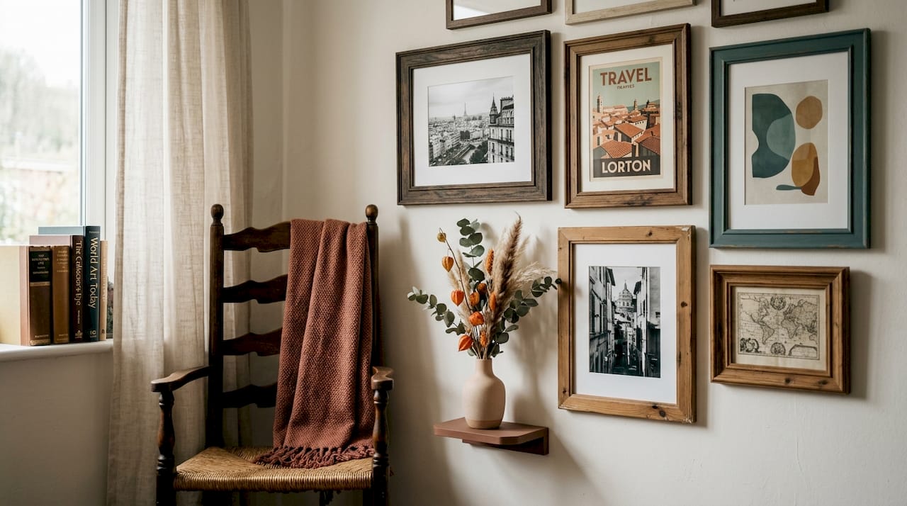
Build around a unifying element. This could be a colour palette, a subject matter, a mood, or a consistent mat colour. You do not need all pieces to match. You need them to belong to the same conversation. Black and white photography sits comfortably alongside abstract colour prints when both share a neutral mat and a consistent frame finish.
Limit your frame styles. Interior designers recommend no more than three frame styles across the entire display. A practical formula is two clean modern frames (thin black metal, natural oak) paired with one accent finish (brushed brass, ornate white). More than three finishes and the eye has nowhere to rest.
Here is what works well when selecting pieces and frames:
- Mix frame sizes deliberately. Use at least three size categories: small (under 8x10 inches), medium (11x14 to 16x20 inches), and large (20x24 inches and above). This creates visual rhythm rather than monotony.
- Include one unexpected element. A textile, a small mirror, a ceramic plate, or a child’s drawing adds personality that no print can replicate.
- Use consistent mat colours. White or off-white mats act as visual resets between disparate pieces, giving the eye a moment to pause before moving to the next work.
- Consider frame depth in tight spaces. In corridors or narrow alcoves, frames projecting more than 1.5 inches make the space feel cramped. Opt for thin metal profiles, flat wood, or canvas wraps instead.
Pro Tip: Before buying frames, photograph your shortlisted art pieces and mock them up digitally using a free tool like Canva or even a phone photo editor. Seeing the scale relationships on screen saves you from expensive framing mistakes.
For detailed guidance on materials and finishes, Frametheworld’s framing options guide covers the practical differences between wood, metal, and float frames.
How to arrange art on a gallery wall step by step
Layout planning is where most people go wrong. They start at a corner or an edge and work outward, which almost always produces an unbalanced result. The correct method starts from the middle.
- Identify the visual midpoint of your wall space. Mark it lightly with a pencil. This is your anchor point, not a corner, not an edge.
- Place your largest piece first. The anchor piece sets the tone for everything around it. It should sit at or near the centre of the arrangement, slightly above the midpoint of the total display height.
- Build outward with medium pieces. Place two or three medium-sized works around the anchor, alternating vertical and horizontal orientations to create movement.
- Fill gaps with smaller pieces. Small works act as punctuation. They fill visual gaps without competing with the anchor.
- Maintain 2 to 3 inches of spacing between each frame. This gives the display room to breathe while keeping the collection cohesive. For larger, airier pieces, up to 4 inches works well.
- Use kraft paper templates pinned or taped to the wall to test the full arrangement before committing. Preparing paper cutouts lets you test in real light and at real height, which no floor-based mock-up can replicate.
Layout style comparison:
| Layout style | Best for | Character |
|---|---|---|
| Grid | Uniform frames, photography collections | Ordered, modern, clean |
| Row-based | Long horizontal walls, above low furniture | Structured, editorial |
| Organic cluster | Mixed sizes and types, eclectic collections | Relaxed, collected, personal |
| Salon-style | Large walls, many pieces | Maximalist, dramatic, layered |
Pro Tip: Allow a variation of around 6 inches in the vertical alignment of your frames rather than forcing a perfectly rigid line. Slight variation reads as intentional and collected. Perfect alignment reads as corporate.
How do you add depth and personality to a gallery wall?
Flat framed prints alone produce a gallery wall that looks complete but rarely feels alive. Adding dimension is what separates a styled display from a furniture showroom mock-up.
Textured elements make the most immediate difference. Macramé wall hangings, woven textile panels, and embroidered hoops introduce tactile contrast that no print can provide. They also soften the hard geometry of rectangular frames, which is particularly useful in rooms with a lot of straight lines.
Small ledges and picture shelves add a three-dimensional layer. Place a narrow shelf within the arrangement and use it to display a small ceramic, a trailing plant, or a leaning print. This breaks the flatness of the wall plane and creates genuine depth. It also lets you style large wall art alongside smaller objects without the scale contrast feeling jarring.
Mirrors serve two purposes in a gallery wall. They break the visual flatness of the display and they bounce light back into the room, which makes the whole arrangement feel more dynamic. A round mirror in a brass or black frame works particularly well as a secondary anchor alongside a large print.
Lighting is the most underused tool in home gallery styling. Picture lights positioned above the anchor piece change the mood of the entire display. Battery-powered rechargeable models with adjustable colour temperature (warm white at 2700K is the standard for art) require no wiring and can be repositioned as your arrangement evolves.
- Add one textured piece for every four to five framed prints.
- Use a round or irregular-shaped mirror to contrast rectangular frames.
- Position a picture light above your anchor piece for immediate impact.
- Include at least one personal item: a family photograph, a child’s drawing, or a postcard from a meaningful trip.
Pro Tip: When mixing personal photographs with purchased art, print your photos at a larger scale than feels natural. A 12x16 inch family photograph commands the same visual weight as a mid-sized art print and stops personal photos from looking like afterthoughts.
Key takeaways
A well-styled gallery wall depends on three non-negotiable decisions: hanging at the correct height, anchoring from the centre outward, and limiting frame finishes to no more than three.
| Point | Details |
|---|---|
| Hang at eye level | Centre the display at 57 to 60 inches from the floor for natural, inviting viewing. |
| Size relative to furniture | The display should span 60 to 80 percent of the underlying furniture width. |
| Limit frame finishes | Use no more than three frame styles to maintain cohesion without visual chaos. |
| Anchor from the centre | Place the largest piece first at the visual midpoint, then build outward with medium and small works. |
| Add dimension beyond prints | Incorporate mirrors, textiles, shelves, and picture lighting to create warmth and depth. |
What I have learned from styling gallery walls
The single change that improved every gallery wall I have worked on was starting with the anchor piece rather than the collection. Most people gather art first and then try to make it work together. The better approach is to choose one statement piece, something large enough to command attention, and build the rest of the display around its scale, colour, and mood.
I have also come to believe that the fear of mixing frame finishes is overblown, provided you hold to one unifying element elsewhere. A consistent mat colour, a shared subject matter, or even a repeated size category is enough to hold a display together across three different frame finishes. The visual harmony comes from the relationship between pieces, not from matching hardware.
The trap I see most often is overcrowding. People fill every inch of available space and then wonder why the result feels anxious rather than curated. Breathing room between frames is not wasted space. It is what makes each piece legible.
The most memorable gallery walls I have seen all contain at least one thing that could not have been bought. A child’s painting, a handwritten note in a clip frame, a pressed botanical from a garden. These are the pieces that make visitors stop and ask questions. No amount of expensive art replicates that.
Gallery walls are not permanent installations. They are living arrangements. Swap one piece seasonally, add a new find from a market, retire something that no longer fits. The best ones evolve.
— Lennard
Start your gallery wall with Frametheworld
If you are ready to move from planning to hanging, Frametheworld makes it straightforward to find art that anchors a display with genuine character. The Wabi Sabi wall art collection offers hand-painted abstract pieces with natural texture and imperfection built in, exactly the kind of anchor works that give a gallery wall its personality. For something bolder, the Pop Art collection delivers vibrant, high-impact prints that hold their own as statement centrepieces. Frametheworld also offers personalisation and bespoke framing options, so you can match finishes precisely to your existing décor rather than compromising. Browse by size, style, and format to find pieces that fit your wall from the start.
FAQ
What height should a gallery wall be hung at?
The centre of a gallery wall should sit at 57 to 60 inches from the floor. This places the visual heart of the arrangement at natural eye level for a standing adult.
How many frame styles should a gallery wall have?
Limit your display to two or three frame finishes. More than three creates visual noise; fewer than two can feel flat and uninspired.
How much space should there be between frames?
Leave 2 to 3 inches between each frame as a standard. For larger or airier pieces, up to 4 inches of spacing works well without breaking the cohesion of the display.
What should I put on a gallery wall besides prints?
Mirrors, textiles, macramé, small shelves with ceramics or plants, and personal photographs all add dimension and warmth. Including one non-print element for every four to five framed pieces is a reliable rule.
How do I plan a gallery wall layout without making holes?
Cut kraft paper templates to the exact dimensions of each frame and tape them to the wall with painter’s tape. Arrange and rearrange until the composition feels right, then use the templates as guides for drilling. The process takes around 45 minutes and prevents unnecessary wall damage.

Leave a comment
This site is protected by hCaptcha and the hCaptcha Privacy Policy and Terms of Service apply.