
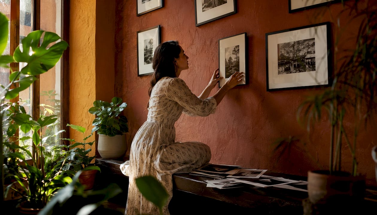
Black and white prints are the right choice for homes where light, form and mood need to do the work. Strip colour away and what remains is composition, tonal range and emotional weight — the three things that make a piece genuinely worth living with rather than merely decorating a wall.
Three reasons stand out immediately:
- Composition and form come forward. Without competing hues, a viewer’s eye goes straight to edges, geometry and the relationship between subject and space.
- Timelessness. Black-and-white photos avoid dating because they are untouched by transient colour-grading trends — a portrait printed in monochrome looks as considered in twenty years as it does today.
- Practical cohesion. Monochrome works across almost any palette, handles mixed lighting better than colour, and never clashes with seasonal redecoration.
The sections below cover the artistic mechanics, the best subjects and rooms, practical display guidance, and how to choose and commission a print that will hold its own for years.
Table of Contents
- Why black and white prints have such strong artistic power
- Which subjects and rooms suit monochrome prints best?
- Practical advantages of monochrome prints for home display
- How to choose a black and white print for your space
- How to display and style black and white prints at home
- Why a physical print matters more than a digital image
- How Frametheworld helps you choose and commission black and white prints
- Key takeaways
- The case for living with monochrome
- Commission or collect a black and white print with Frametheworld
Why black and white prints have such strong artistic power
The single strongest reason to choose monochrome is that it forces a viewer to engage with the image itself rather than its surface information. Colour tells you what something is; tone tells you what it feels like.
When colour is removed, attention shifts to edges, silhouette and the tonal relationship between elements. Removing colour elevates composition and form, making structural decisions visible that a saturated palette would otherwise mask. A portrait becomes about expression. An architectural shot becomes about geometry and repetition.
Light and shadow are the primary vocabulary in monochrome. The interplay of deep blacks, luminous highlights and the midtones between them creates drama that colour photography distributes across the spectrum instead. A well-controlled tonal range — where highlights roll off gradually rather than clipping to white — is what separates a compelling print from a flat one.
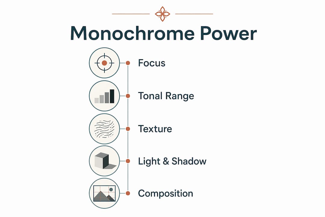
Texture becomes narrative. The grain of aged stone, the weave of fabric, the roughness of bark: all of these read more clearly in monochrome because there is no colour information competing for attention. Black and white photography brings out depth and texture in ways colour printing cannot replicate.
Pro Tip: When assessing whether a photo will work in monochrome, squint at it. If the shapes, light direction and tonal contrast still read clearly, it is a strong candidate. If the image relies on colour relationships to make sense, it probably is not.
Which subjects and rooms suit monochrome prints best?
Portraits, architecture, high-contrast landscapes and abstracts are the prime candidates for monochrome. The reason is consistent: these subjects carry their meaning through expression, geometry, light or texture rather than through hue.
- Portraits benefit because monochrome reduces distractions from uneven skin tone and background clutter, drawing attention to expression and light.
- Architecture and urban scenes translate well because structure, texture and light matter more than colour in built environments.
- Landscapes with strong tonal contrast — fog, dramatic skies, bare winter trees — gain power in monochrome; colour-dependent scenes like sunsets or tropical coasts generally do not.
- Abstracts and minimalist compositions suit monochrome because the format reinforces simplicity and keeps the viewer focused on form.
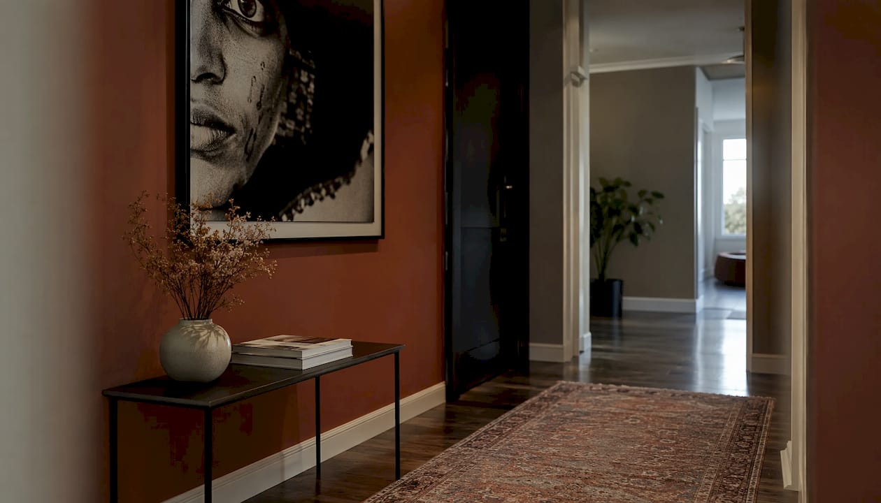
Room guidance follows the same logic. A hallway is ideal for a single strong portrait or architectural print: the narrow sightline means the image is encountered directly, and monochrome handles the variable artificial lighting typical of hallways without colour casts. A living room suits a larger architectural or landscape piece above a sofa, particularly in a minimal or neutral interior. A study or home office benefits from the restrained, focused quality of monochrome — it reads as considered rather than decorative. Bedrooms work well with quieter, lower-contrast prints; monochrome feels less visually stimulating than saturated colour, which suits a rest-oriented space.
Pairing examples worth considering: a close-cropped portrait in a narrow hallway at roughly 50×70 cm; an architectural grid or cityscape at 80×100 cm over a minimal sofa; a soft landscape or abstract at 60×80 cm in a bedroom where the mood should be calm rather than arresting.
Practical advantages of monochrome prints for home display
The practical case for monochrome is often underestimated. The most immediate benefit is that it sidesteps the problem of mixed light sources. Warm tungsten, cool daylight and LED all shift the apparent colour of a print differently. Monochrome is unaffected — there is no colour information to distort, so the print reads consistently whether the room is lit by morning sun or evening lamps.
Cohesion across a varied interior is the second practical gain. A monochrome print works alongside almost any wall colour, textile or furniture palette. It does not compete with a terracotta sofa or a sage-green wall the way a strongly coloured print might. Seasonal redecoration — new cushions, a different rug — rarely makes a monochrome piece look out of place. The benefits of decorative prints for your home are amplified when the piece does not need to be reconsidered every time the room changes.
Skin tones are the third practical argument. Mixed or uneven lighting makes colour portraits difficult: green reflected light from foliage, or the clash of warm and cool sources, can render skin tones unflattering in ways that are hard to correct in print. Monochrome removes the problem entirely.
Pro Tip: Before choosing a finish, stand in the room at the time of day you spend most time there and note the dominant light source. A warm, lamp-lit room suits a matte or fibre-based paper that absorbs rather than reflects. A bright, north-facing room with cool daylight can handle a semi-gloss finish without the surface looking harsh.
How to choose a black and white print for your space
Start with intent. A dramatic gallery piece — high contrast, large format, commanding presence — calls for different choices than a quiet study print meant to reward slow looking. Decide which you want before touching any other variable.
Substrate and finish are the most consequential decisions after that. Glossy and metallic surfaces boost perceived contrast and luminosity, making them well suited to high-contrast architectural or portrait work. Fine-art matte papers soften tonal transitions and suit intimate, low-contrast images. Silver-gloss metal substrates use the material itself as the brightest highlight, producing a luminosity paper cannot replicate — but they are unsuitable for subtle work. True fine-art black and white printing requires dedicated monochrome workflows and specialist materials, which is why it costs more than standard colour printing.
Size and viewing distance follow a simple rule of thumb: the print should fill roughly two-thirds of the wall width above a piece of furniture, and the viewing distance should be at least equal to the longest dimension of the print. For a UK wall art guide, 60×80 cm suits most single-wall placements; 80×100 cm or larger works for statement walls.
Framing changes perceived mood more than most people expect. A wide white mat with a slender natural wood frame gives a gallery-clean look. A slender black frame with no mat reads as modern and graphic. Warm wood frames add softness to high-contrast prints. For detailed guidance, framing options and materials are worth reviewing before committing.
Price factors include proofing runs, specialist monochrome workflows, and the choice between fibre-based and resin-coated papers. Fibre-based papers offer superior tonal control and archival longevity but cost more and require longer processing.
Checklist before commissioning:
- Confirm the image has a full tonal range (not just dark or just light)
- Specify neutral grey targets, not warm or cool
- Request a proof before the final print
- Agree on paper type, finish and intended framing before the file is processed
Pro Tip: Always request a soft proof or a small test print before committing to a large or archival piece. Screens emit light; paper reflects it. What looks neutral on a monitor often prints slightly warm or cool. A proof catches this before it becomes expensive.
How to display and style black and white prints at home
Placement matters more than most hanging decisions. The centre of a print should sit at roughly 145–150 cm from the floor — average eye level for a standing adult — unless the print is positioned above furniture, in which case leave 15–20 cm of clearance between the top of the furniture and the bottom of the frame.
For grouped arrangements, odd numbers work better than even ones. Three prints of varying sizes feel considered; four of the same size feel corporate. Keep spacing consistent — 5–8 cm between frames is a reliable interval. Scale the group to the wall: a cluster of small prints on a large wall looks lost.
Styling around monochrome prints is where many rooms go wrong by over-neutralising. A monochrome piece does not require a grey or white room. Pair it with warm textiles — linen, wool, terracotta cushions — to prevent the print from reading as cold. Brass or warm-toned metallics in nearby objects (a lamp, a mirror frame) add warmth without competing. Plants introduce organic contrast that softens the graphic quality of a strong black-and-white piece. If the room already has black interior doors or dark joinery, a high-contrast monochrome print will feel intentional rather than accidental.
Glare control near windows and lamps is a practical concern. Matte and fine-art papers are the safest choice in bright rooms; glossy or metallic finishes can create distracting reflections when a light source is nearby. For minimalist interiors, a single large matte print with a slender frame is almost always the right call.
Pro Tip: If a monochrome gallery wall feels too stark, introduce one small colour accent in the room rather than in the prints. A single coloured ceramic, a plant pot, or a throw in a warm tone is enough to prevent the space from feeling clinical.
Why a physical print matters more than a digital image
A print encourages slower viewing. On a screen, an image competes with notifications, ambient brightness and the knowledge that the next image is one swipe away. On a wall, it simply exists — and black and white benefits from that pause because its mood often lives in subtle tonal transitions that reward attention.
Paper reflects light rather than emits it, which changes how tonal subtleties read. Midtone separation — the gradation between a dark grey and a mid grey — is far more visible in reflected light than on a backlit screen. Highlights that look clean on a monitor can appear clipped on paper; shadows that look detailed on screen can print as flat black. Printing exposes edit shortcomings that screens hide, which is why proofing is not optional for serious monochrome work.
Longevity is the final argument. A well-made archival print on fibre-based paper, properly framed and kept from direct sunlight, will outlast any screen or digital storage format. The physical object carries a permanence that a file on a hard drive does not.
Photographers who concentrate on shooting exclusively in monochrome for several months report large improvements in tonal reading and composition skills — a discipline that translates directly into better print choices when commissioning or selecting work for display.
How Frametheworld helps you choose and commission black and white prints
Frametheworld provides curated collections and bespoke commission options for wall art, with the expertise to advise on monochrome choices from image selection through to substrate, framing and final display. Whether you are looking for a ready-made piece or a custom commission sized to a specific wall, the process is designed to remove the guesswork from a decision that is easy to get wrong.
Services include:
- Curated wall art collections browsable by style, theme, size and format — including pieces suited to monochrome-led interiors
- Bespoke commissions for custom sizes, specific subjects or large-scale interior projects
- Framing and printing options with guidance on paper, finish and framing to match the room and the image
- Advice for both private and professional clients, from single-room homeowners to interior designers and property developers
For readers ready to explore, the Wabi Sabi collection offers hand-painted pieces with the muted, textural quality that pairs naturally with monochrome photography. For a broader starting point, Frametheworld’s full collections are searchable by style and room type.
Lennard is an art décor contributor with a focus on print quality, interior display and the practical side of commissioning wall art for homes and commercial spaces.
Key takeaways
Black and white prints earn their place in a home through tonal focus, practical cohesion and a timelessness that colour work rarely achieves.
| Point | Details |
|---|---|
| Tonal range drives quality | A strong monochrome print needs full tonal range — deep blacks, clean highlights and visible midtone separation. |
| Substrate shapes the result | Matte fine-art paper suits intimate, low-contrast work; silver-gloss metal suits high-contrast, luminous pieces. |
| Monochrome handles mixed lighting | Colour casts from mixed light sources do not affect a monochrome print, making it more reliable across varied rooms. |
| Placement at eye level | Hang the centre of the print at 145–150 cm from the floor; leave 15–20 cm clearance above furniture. |
| Frametheworld for commissions | Frametheworld offers curated collections and bespoke commissions with framing and substrate guidance included. |
The case for living with monochrome
Most decorating advice treats black and white prints as a safe, neutral option — something you choose when you cannot decide on colour. That framing misses the point entirely.
The real reason to choose monochrome is that it asks more of the viewer. A well-made black and white print does not give you the easy read of a colourful scene. It asks you to look at light, at form, at the relationship between a face and the space around it. That is not a limitation. It is the point.
What tends to get overlooked is the role of substrate in this. Most people agonise over the image and treat the paper as an afterthought. In practice, the paper is half the print. A portrait on warm-toned fibre paper reads completely differently from the same file on a cool matte surface — one feels intimate, the other clinical. Getting that decision right is what separates a print that improves a room from one that merely occupies a wall.
The other underrated factor is scale. Monochrome scales up gracefully in a way that colour often does not, because there is no colour noise to amplify. A large monochrome print in a room with white interior trim and clean architectural lines can anchor an entire space. The same image at postcard size is a different object entirely. Commit to the size the image deserves, and the room will follow.
Commission or collect a black and white print with Frametheworld
If the article has convinced you that monochrome is the right direction, the next step is straightforward. Frametheworld offers both ready-made collections and fully bespoke commissions, with expert guidance on paper, finish and framing to match your specific wall and room.
- Browse the Wabi Sabi wall art collection for hand-painted pieces with the muted, textural quality that sits naturally alongside monochrome photography.
- Request a bespoke commission for a custom size, subject or large-scale project — the team works with both private homeowners and professional interior designers.
Visit Frametheworld to explore the full range or get in touch about a commission.


Leave a comment
This site is protected by hCaptcha and the hCaptcha Privacy Policy and Terms of Service apply.