
TL;DR:
- Contrast in wall art uses opposing elements like light versus dark and warm versus cool to create focus and mood. It influences a room’s atmosphere, perception, and memorability through value, color, texture, and edge contrast. High contrast energizes social spaces, while low contrast promotes calm, making deliberate contrast essential for impactful interior design.
Contrast in wall art is the deliberate use of opposing visual elements, such as light against dark, warm against cool, and rough against smooth, to create focus, depth, and mood within a space. In design terms, this principle is often called visual contrast, and it governs where your eye travels first when you enter a room. The role of contrast in wall art extends far beyond colour choice alone. It shapes atmosphere, corrects spatial perception, and determines whether a piece feels alive or flat on the wall. Techniques like chiaroscuro, the dramatic opposition of light and shadow used by Caravaggio and Vermeer, and the optical phenomenon known as simultaneous contrast both demonstrate how powerfully opposing elements command attention.
What are the different types of contrast used in wall art?
Contrast is a multi-dimensional design tool involving value, texture, and edge quality, not just colour. Each dimension works differently on the eye, and understanding them separately gives you far more control over how a piece performs in your home.
Value contrast is the difference between light and dark areas within a composition. It creates the illusion of depth and establishes focal points. Caravaggio built entire narratives around it, placing peak contrast on faces and hands to force the viewer’s gaze exactly where he wanted it. In a domestic setting, a print with strong value contrast will anchor a wall and hold attention across a room.
Colour contrast works through complementary pairings, warm versus cool tones, and differences in saturation. Simultaneous contrast is the optical effect where adjacent colours cause the eye to exaggerate their differences. Red placed next to green creates one of the most striking examples. This effect is why a piece of art can look completely different depending on the wall colour behind it.
Texture contrast is the difference between rough impasto brushwork and smooth, flat surfaces. A heavily textured canvas hung against a flat painted wall creates a tactile tension that draws you physically closer. Vermeer achieved a version of this through the contrast between soft fabric folds and hard, reflective surfaces within a single composition.
Edge contrast is the least discussed but often the most powerful. Hard, sharp edges placed next to soft ones control the viewer’s gaze more reliably than colour alone. The human eye prioritises sharper, clearer edges, which is why a piece with defined focal edges will always feel more dynamic than one where everything blurs together at the same softness.
- Value contrast: creates depth and establishes the primary focal point
- Colour contrast: uses complementary pairings and warm/cool opposition for visual energy
- Texture contrast: adds tactile tension between the artwork surface and the wall
- Edge contrast: directs the viewer’s gaze through hard versus soft transitions
Pro Tip: When choosing between two similar prints, hold them against your wall and look for which one has the sharpest edge definition at its focal point. That piece will hold attention better from across the room.
How does contrast shape the mood of a room?
The psychological impact of contrast intensity varies directly with room function. High contrast energises social spaces like living rooms and dining areas, where stimulation and conversation are the goal. Low contrast promotes calm, making it the better choice for bedrooms, reading nooks, and spaces designed for rest.
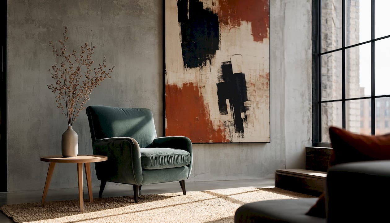
This is not a minor stylistic preference. Designers consistently find that imbalance in contrast leads to monotony or chaotic environments, and neither extreme serves a room well. A bedroom filled with high-contrast abstract prints can feel relentless rather than restful. A living room hung with low-contrast, muted works can feel dull and uninviting regardless of how well the furniture is arranged.
The practical framework for getting this right follows a simple logic:
- Identify the room’s primary function. Social and active spaces benefit from stronger contrast. Restful spaces need softer opposition.
- Assess the existing contrast in the room. Look at the furniture, flooring, and wall colour. If the room already has strong contrast through dark floors against pale walls, choose artwork that complements rather than amplifies.
- Introduce contrast in layers. Start with value contrast in the artwork, then consider whether colour or texture contrast adds to or overwhelms the existing scheme.
- Test at different times of day. Natural light shifts dramatically from morning to evening. A piece that reads as balanced at noon can feel harsh under artificial evening light.
Lack of contrast, more than any single colour choice, is what makes rooms feel dull. Layering contrast thoughtfully is what separates a professionally styled room from one that simply has furniture in it.
Pro Tip: If a room feels flat but you cannot identify why, look at the value range of your wall art. If the lightest and darkest tones in the piece are within a narrow band, the art is not doing enough work. Swap it for something with a wider value range before changing anything else.
What practical strategies help you select and place wall art using contrast?
Choosing art based on contrast principles is more reliable than choosing by colour match alone. The minor colour connection rule states that art does not need to match the dominant colours in a room. Instead, it should share a muted or secondary tone with the surrounding palette. This allows the artwork’s primary colours to contrast boldly without looking out of place.
Here is how to apply this in practice:
- Pull secondary tones, not dominant ones. If your sofa is a deep navy, look for artwork that contains a touch of navy as a background or shadow tone, not as its main colour. The art’s primary colours can then contrast freely.
- Manage the value gap between art and wall. A pale artwork on a pale wall disappears. A dark artwork on a dark wall does the same. Aim for at least two to three steps of difference on a value scale between the wall colour and the dominant tone of the piece.
- Match undertones across the room. Warm-toned art on a cool-grey wall creates an unintentional clash that reads as a mistake rather than a design choice. Align the undertones of your wall paint, artwork, and frame before worrying about surface colour.
- Use edge contrast to guide the eye. Hang artwork with its sharpest internal edges at natural eye level. This positions the focal point where the viewer’s gaze naturally lands when entering the room.
- Consider contrast for spatial correction. High-contrast art on a narrow wall creates a focal point that expands the perceived width of the space. Low-contrast pieces in large rooms can make the space feel empty and undefined.
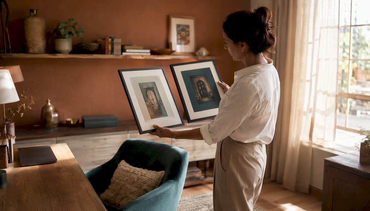
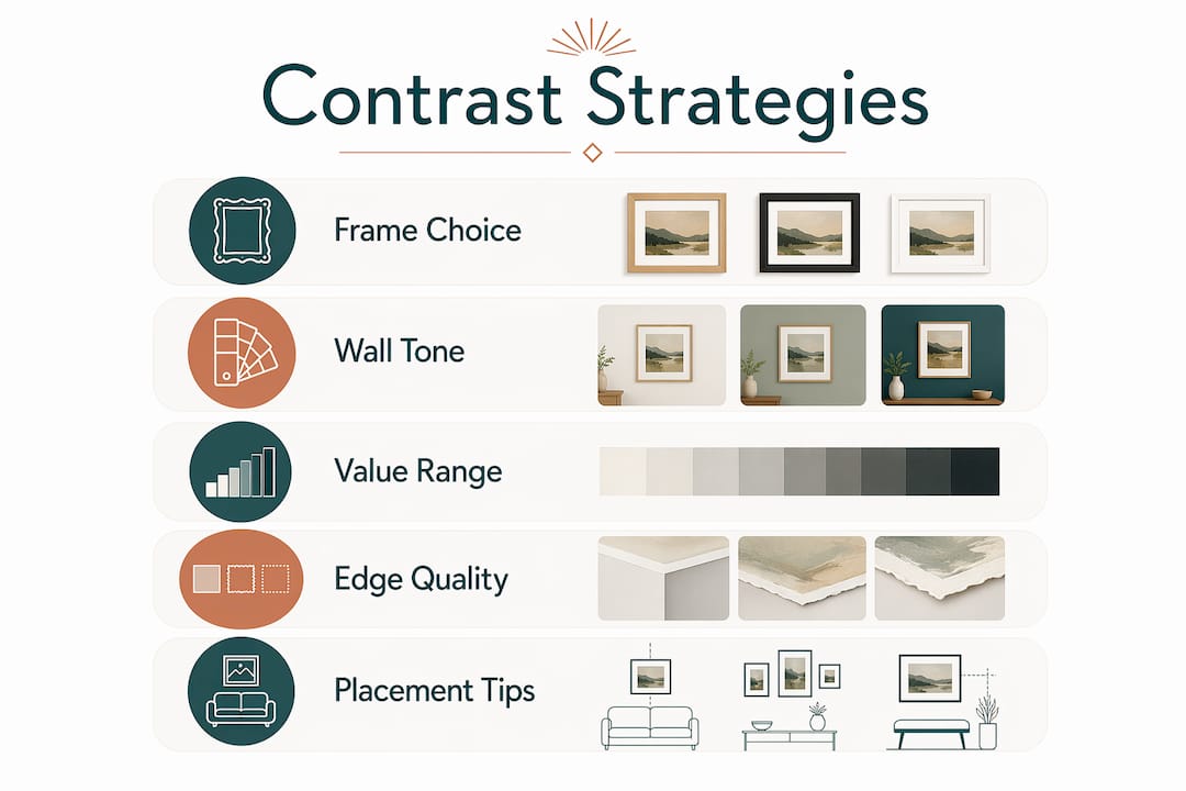
Frames act as a third colour layer between the artwork and the wall. Black frames suit cool or neutral walls; wood frames work best against warm-toned walls; gold and brass frames need warmth in the surrounding palette to avoid looking cold. Getting the frame right completes the contrast relationship between art and architecture.
| Wall tone | Recommended frame | Contrast effect |
|---|---|---|
| Cool grey or white | Black or dark metal | Strong value contrast, clean definition |
| Warm cream or terracotta | Natural wood or gold | Warm harmony with tonal depth |
| Deep navy or forest green | Brass or light wood | Warm accent against cool depth |
| Neutral mid-tone | Any, depending on art | Frame becomes the contrast decision |
For further guidance on matching art with interiors, the principles of undertone alignment and value management apply across every room type and style.
Pro Tip: Before buying a frame, hold a swatch of the frame colour against both the wall and the artwork simultaneously. The frame should feel like it belongs to both, not just one of them.
What common mistakes undermine contrast in wall art?
The most damaging mistake is not clashing colours. It is the absence of intentional contrast altogether. Intentional contrast reads as confident design; accidental or unplanned contrast reads as a mistake. The difference between the two is deliberateness, not the degree of opposition.
- Same-colour matching weakens impact. Choosing artwork that exactly repeats the dominant wall colour removes the value gap entirely. The piece blends into the background and loses its visual purpose.
- Over-layering contrast causes exhaustion. Using maximum contrast in the artwork, the frame, the wall colour, and the surrounding furniture simultaneously creates a space that feels chaotic rather than dynamic. Contrast needs a resting point.
- Ignoring colour temperature creates unintended clashes. Warm and cool tones placed together without intention look like a mistake. Placed together deliberately, with one clearly dominant, they create tension that feels considered.
- Assuming clashing is always wrong. Confident use of clashing colours, such as a vivid orange print on a deep teal wall, often creates the most memorable rooms. The key is committing fully rather than hedging.
- Neglecting how contrast affects spatial perception. Low-contrast pieces in large rooms can make the space feel cavernous and empty. Choosing art purely for colour without considering its value range misses this entirely.
When you approach contrast as a tool rather than a risk, the fear of getting it wrong largely disappears. For practical guidance on selecting wall art that works with your specific room, starting with value contrast is always the most reliable entry point.
Key takeaways
Contrast is the single most powerful tool for making wall art work in a room, operating through value, colour, texture, and edge quality simultaneously.
| Point | Details |
|---|---|
| Contrast has four dimensions | Value, colour, texture, and edge quality each influence how art performs in a space. |
| Match room function to contrast intensity | High contrast suits social spaces; low contrast promotes calm in bedrooms and restful rooms. |
| Use the minor colour connection rule | Art should share a muted secondary tone with the room, not match its dominant colour. |
| Frames complete the contrast relationship | Choose frame colour based on wall undertone to connect art and architecture effectively. |
| Intentional contrast always reads better | Deliberate clashing creates memorable rooms; accidental contrast reads as a mistake. |
Why contrast is the design principle most homeowners underestimate
I have spent years looking at rooms that feel almost right but not quite. The furniture is good. The paint colour is considered. The art is not cheap. And yet the room feels flat, like something is missing. Nine times out of ten, the problem is contrast, or rather the lack of it.
Homeowners tend to play it safe with wall art. They choose pieces that match the sofa, repeat the wall colour, or sit comfortably within a narrow tonal range. The result is a room where nothing fights for attention because nothing has enough contrast to earn it. Safe choices produce forgettable rooms.
What I find consistently is that a single swap, replacing a low-contrast print with one that has a genuine value range, transforms how the entire room reads. You do not need to repaint. You do not need new furniture. The art does the work because contrast gives it the authority to do so.
The other thing worth saying plainly: do not be afraid of bold contrast. A vivid, high-contrast piece on a quiet wall is not a risk. It is a decision. Rooms that people remember always have at least one moment of strong contrast, whether that is a dramatic artwork, a dark frame against a pale wall, or a textured canvas in an otherwise smooth space. Contrast is what gives a room its character. Without it, you have a catalogue of nice things that do not add up to anything.
For homeowners who want to see how colour in wall art transforms a space, the principle is always the same: contrast is not decoration. It is structure.
— Lennard
Wall art collections built around contrast, from Frametheworld
Frametheworld offers two collections that put contrast principles into practice immediately. The Wabi Sabi wall art collection centres on textured, hand-painted pieces that use organic imperfection and tactile surface variation to create contrast against smooth, contemporary walls. Each piece carries the kind of value and texture contrast that makes a room feel considered rather than assembled. For homeowners who want bolder impact, the Pop Art collection delivers strong colour contrast and retro-modern energy, ideal for creating a striking focal point in living rooms or hallways. Both collections are browsable by size, style, and format, making it straightforward to find a piece that works with your specific wall and room.
FAQ
What is the role of contrast in wall art?
Contrast in wall art is the deliberate opposition of visual elements, including light and dark, warm and cool tones, and hard and soft edges, to create focal points, depth, and mood. It determines where the viewer looks first and how the artwork interacts with the surrounding space.
How does contrast influence the mood of a room?
High contrast energises social spaces such as living rooms, while low contrast promotes calm in bedrooms and restful areas. The intensity of contrast in wall art directly shapes the psychological comfort of the room.
Should wall art match or contrast with the wall colour?
Art should share a muted secondary tone with the room rather than match its dominant colour. This approach, known as the minor colour connection rule, allows the artwork’s primary colours to contrast boldly without looking out of place.
What is edge contrast and why does it matter?
Edge contrast is the placement of hard, sharp elements next to soft, blended ones within a composition. The human eye prioritises sharper edges, making edge contrast one of the most reliable tools for directing a viewer’s gaze to the focal point of a piece.
Can contrast in wall art change how big a room feels?
High-contrast art on a narrow wall creates a focal point that expands the perceived width of the space. Low-contrast pieces in large rooms can make the space feel empty and undefined, so contrast choice directly affects spatial perception.


Leave a comment
This site is protected by hCaptcha and the hCaptcha Privacy Policy and Terms of Service apply.