
Choosing the right colour in wall art can increase a room’s perceived spaciousness and emotional comfort by up to 20%. Yet many homeowners struggle to select hues that harmonise with their interiors and achieve desired moods. This guide clarifies how colour psychology, 2026 trends, debunked myths, and a practical framework empower you to transform your living space with confident, impactful wall art choices.
Table of Contents
- Understanding Colour Psychology In Wall Art
- 2026 Colour Trends In Wall Art
- Common Misconceptions About Colour In Wall Art
- Comparative Framework For Choosing Wall Art Colours
- Practical Applications: Selecting And Integrating Colourful Wall Art
- Explore Our Curated Colourful Wall Art Collections
- Frequently Asked Questions
Key takeaways
| Point | Details |
|---|---|
| Colour influences mood | Specific hues in wall art affect emotions, spatial perception, and room ambiance significantly. |
| 2026 trends highlight earthy and electric tones | Terracotta, moss green, electric pastels, jewel tones, and textured monochrome dominate this year’s interior palettes. |
| Common myths debunked | Monochrome is not boring, bold colours need not overwhelm, and neutrals offer rich versatility. |
| Practical framework simplifies selection | Matching colour categories to room functions ensures harmonious, purposeful design outcomes. |
| Balanced integration techniques | Strategic placement and proportion of colour create visually appealing, cohesive interiors. |
Understanding colour psychology in wall art
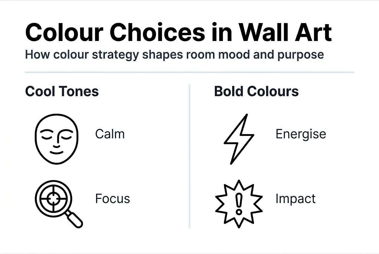
Colour psychology reveals how hues shape our emotional responses and spatial experiences. Blue hues in wall art induce calmness and improve focus by up to 15%, making them ideal for bedrooms and home offices. Cool tones like aqua and slate visually expand smaller rooms, creating an airy, open feeling.
Warm earth tones such as terracotta, ochre, and burnt sienna foster comfort and connection to nature. These colours stimulate feelings of warmth and security, perfect for living rooms and dining areas where social interaction thrives. Rich reds and oranges energise spaces, but moderation is key to avoid overwhelming the senses.
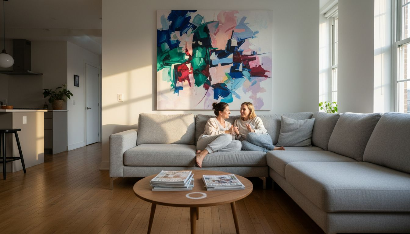
Bold colours like emerald green or deep plum add drama and focal interest. They work best as accent pieces rather than dominant visual elements. Understanding how art shapes the mood of a room allows you to curate spaces that align with intended activities and emotional goals.
Consider these emotional associations:
- Blue promotes tranquillity and mental clarity
- Green balances energy and fosters renewal
- Yellow uplifts mood and sparks creativity
- Red stimulates conversation and appetite
- Purple evokes luxury and contemplation
Pro Tip: Test wall art colours in your space before committing. Natural and artificial lighting dramatically alter how hues appear throughout the day.
“Colour is a power which directly influences the soul. Colour is the keyboard, the eyes are the hammers, the soul is the piano with many strings.” – Wassily Kandinsky
By applying colour psychology in wall art, you transform rooms into intentional environments that support wellbeing and aesthetic pleasure.
2026 colour trends in wall art
This year’s interior design landscape showcases a fascinating blend of grounded naturalism and expressive vibrancy. Rich earthy tones dominate 2026 palettes, with terracotta, moss green, and warm clay hues leading the charge. These colours reflect a collective desire for authenticity and connection to the natural world.
Electric pastels emerge as a bold counterpoint to earthy neutrals. Soft lavender, mint green, and peachy coral offer playful energy without visual aggression. These tones inject personality into minimalist spaces and complement contemporary furniture beautifully.
Jewel tones such as sapphire blue, emerald green, and ruby red gain traction as statement pieces. They add depth and sophistication to neutral backdrops. These saturated hues work particularly well in gallery walls where varied colours create dynamic visual interest.
Monochrome black and white art experiences a textured revival. Rather than flat prints, 2026 favours pieces with visible brushstrokes, layered paint, or mixed media elements. This evolution adds tactile dimension and prevents monochrome from feeling stark or clinical.
Key 2026 colour directions include:
- Terracotta and burnt orange for warmth and grounding
- Moss green and sage for natural serenity
- Electric lavender and mint for contemporary playfulness
- Deep jewel tones for luxurious focal points
- Textured monochrome for timeless sophistication
Explore wall art trends 2026 inspiring ideas for stylish spaces to see how these palettes translate into curated collections. Aligning your choices with current trends ensures your interiors feel fresh and intentional.
Common misconceptions about colour in wall art
Many homeowners harbour limiting beliefs about colour that prevent them from exploring creative possibilities. Let’s dismantle three persistent myths that restrict confident design choices.
Myth 1: Monochrome art is simple and lacks visual interest. Reality: Monochrome pieces offer complexity through texture, composition, and tonal variation. A black and white abstract with layered brushstrokes or photographic depth creates striking focal points. Texture transforms monochrome from flat to dynamic.
Myth 2: Bold colours always overwhelm small spaces. Reality: Strategic placement of bold hues actually enhances small rooms by creating intentional focal points. A single vibrant piece draws the eye and adds character without dominating. The key lies in proportion and surrounding neutrals that provide visual breathing room.
Myth 3: Neutral colours mean boring or bland interiors. Reality: Neutrals encompass an expansive spectrum from warm beiges and taupes to cool greys and soft whites. Layering various neutral tones with different textures creates sophisticated, calming environments. Neutral wall art allows furniture and architectural features to shine.
Additional misconceptions to challenge:
- Matching wall art to wall colour creates boring uniformity (subtle contrast adds depth)
- Dark colours make rooms feel smaller (they can add intimacy and drama when balanced with lighting)
- You must follow strict colour theory rules (personal preference and experimentation matter most)
Pro Tip: Visit galleries or showrooms to see how professional designers use colour in unexpected ways. Real-world examples often reveal possibilities that theory alone cannot.
Questioning these assumptions frees you to experiment with colours that genuinely resonate with your aesthetic vision and functional needs.
Comparative framework for choosing wall art colours
Selecting appropriate colours becomes straightforward when you match hue categories to room functions and design goals. This framework clarifies which colours deliver specific visual and emotional outcomes.
| Colour Category | Visual Effect | Emotional Impact | Best Room Applications | Design Considerations |
|---|---|---|---|---|
| Cool colours (blue, aqua, grey) | Expand space, recede visually | Calm, focus, serenity | Bedrooms, home offices, bathrooms | Pair with warm accents to prevent coldness |
| Warm colours (terracotta, ochre, red) | Create intimacy, advance visually | Comfort, energy, social connection | Living rooms, dining areas, kitchens | Use in moderation to avoid overwhelming |
| Bold accents (emerald, sapphire, plum) | Command attention, focal drama | Stimulation, creativity, confidence | Studios, feature walls, gallery walls | Limit to 20% of visual space for balance |
| Neutral and earthy (beige, taupe, sage) | Ground and balance, versatile | Relaxation, stability, natural connection | Any room, transitional spaces | Layer different neutral tones for depth |
This comparison reveals how colour strategy directly supports room purpose. Cool tones suit private, contemplative spaces where mental clarity matters. Warm hues excel in social areas where connection and comfort take priority.
Bold colours energise creative zones but require careful proportion management. A single vibrant piece creates impact without visual chaos. Neutral palettes offer flexibility and timeless appeal across changing decor trends.
Consult the wall art selection guide perfect art home for deeper insights into matching art characteristics to interior goals. Understanding how art shapes mood of a room reinforces why colour alignment matters so profoundly.
Applying this framework transforms colour selection from guesswork into strategic, intentional design decisions that deliver desired results.
Practical applications: selecting and integrating colourful wall art
Translating colour knowledge into actionable steps ensures harmonious, visually appealing results. Follow this systematic approach to select and integrate wall art colours effectively.
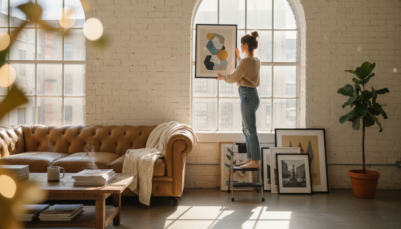
Step 1: Assess room function and existing palette. Identify the room’s primary purpose and catalogue current wall colours, furniture hues, and textile shades. This inventory reveals which colours need reinforcement and which require contrast.
Step 2: Choose art colours that complement or contrast intentionally. Complementary colours (opposite on the colour wheel) create vibrant energy. Analogous colours (adjacent on the wheel) offer harmonious calm. Decide which effect suits your space.
Step 3: Apply the 20% rule for bold colours. Limit vibrant hues to less than 20% of the room’s visual elements. This proportion provides impact without overwhelming. A single bold piece or small gallery cluster achieves this balance.
Step 4: Match art colours to wall paint strategically. Warm eucalyptus or khaki walls pair beautifully with terracotta and moss green art. Cool grey walls complement electric pastels and jewel tones. Coordinated palettes feel cohesive rather than chaotic.
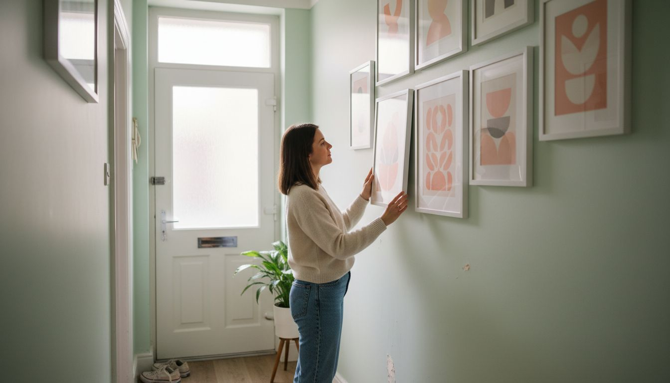
Step 5: Mix frame shapes and sizes for visual rhythm. Varied frames prevent monotony and add personality. Combine rectangular, square, and circular frames in different finishes. This diversity creates dynamic, curated gallery walls.
Step 6: Consider lighting impact on colour perception. Natural daylight reveals true colours, while warm artificial light enhances yellows and reds. Cool LED lighting intensifies blues and greens. Test art placement under different lighting conditions.
Practical integration tips:
- Start with one statement piece and build around it
- Use neutral furniture as a backdrop for colourful art
- Repeat art colours in smaller decor elements (cushions, vases) for cohesion
- Allow negative space between pieces for visual breathing room
- Rotate seasonal art to refresh colour palettes affordably
Explore how to choose wall art uk guide for additional selection criteria beyond colour. Learn how to decorate living room walls with comprehensive layout and styling techniques.
These practical steps transform colour theory into tangible, beautiful interiors that reflect your personal style and functional needs.
Explore our curated colourful wall art collections
FrameTheWorld offers expertly curated collections that bring the colour strategies discussed here directly into your home. Our colourful hand painted canvas art features vibrant originals and high-quality reproductions spanning abstract, landscape, and contemporary styles. Each piece delivers the bold, earthy, or jewel tones trending in 2026.
Seeking personalised colour solutions? Our custom print service allows you to specify exact hues, sizes, and finishes that perfectly match your existing decor. This flexibility ensures seamless integration with your carefully chosen palette.
For enthusiasts of textured monochrome and natural earthy tones, explore our wabi sabi wall art collection. These pieces embody the grounded, authentic aesthetic dominating current trends whilst offering timeless visual appeal.
Frequently asked questions
What does colour psychology mean in wall art?
Colour psychology studies how different hues influence human emotions and behaviour. In wall art, this means specific colours can promote calmness, energy, or comfort depending on your choice. For example, blue shades typically create a calming mood ideal for bedrooms.
How can I use bold colours in wall art without overwhelming a room?
Use bold colours sparingly, ideally limiting their coverage to under 20% of the room’s visual elements. Accent walls or smaller art pieces work best for these focal colour pops. Surround bold pieces with neutral tones to create visual balance and breathing room.
What are the top colour trends for wall art in 2026?
Earthy tones such as terracotta and moss green dominate 2026 interior palettes. Electric pastels like soft lavender and mint green are gaining popularity as vibrant yet gentle accents. Textured monochrome pieces offer timeless contrast with contemporary depth. Discover more about 2026 wall art colour trends to align your choices with current styles.
Should wall art colours match or contrast with wall paint?
Both approaches work depending on your design goals. Matching creates harmonious, serene environments, whilst contrasting adds visual interest and focal drama. Consider your room’s function and existing palette when deciding. Complementary contrast energises spaces, whilst analogous harmony soothes them.
Can neutral wall art work in colourful rooms?
Absolutely. Neutral wall art provides visual rest in colourful rooms, preventing sensory overload. Monochrome or beige pieces ground vibrant furniture and textiles, creating balanced, sophisticated interiors. This approach allows colourful decor elements to shine without competing for attention.

Leave a comment
This site is protected by hCaptcha and the hCaptcha Privacy Policy and Terms of Service apply.