
TL;DR:
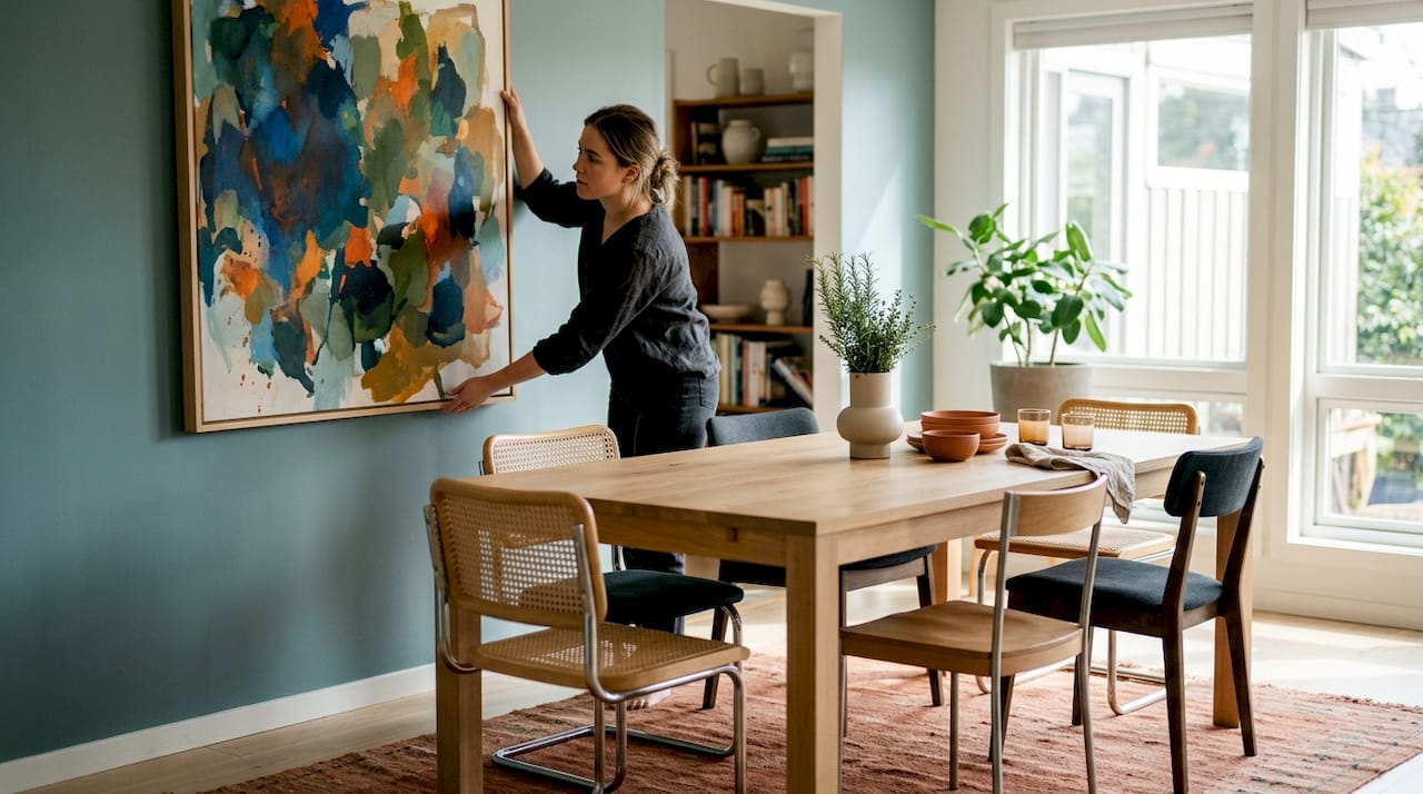
- Dining room art influences the mood, scale, and social atmosphere of the space through thoughtful selection.
- The best pieces feature warm, nature-inspired themes, are scaled to two-thirds of the table’s width, and hung at 145–155cm center height for comfort.
Dining room art is defined as wall-based artwork chosen specifically to shape the mood, scale, and social character of a dining space. The right piece does far more than fill a blank wall. European interior design experts treat dining rooms as “emotional engineering” spaces, where art functions as a behavioural design instrument that directs appetite, conversation, and atmosphere. Whether you rent a flat or own a four-bedroom house, the dining room art examples in this guide will help you choose, arrange, and light artwork that genuinely transforms the room. Frametheworld offers curated collections across every style covered here.
1. Popular styles and themes for dining room walls
The most effective dining room wall decor draws on themes that feel at home around food, conversation, and shared time. Nature-inspired art such as botanical prints, landscapes, and still lifes evokes abundance and sits naturally in a dining context. These subjects avoid the clichéd “fruit bowl” territory when rendered in muted, abstract, or graphic styles rather than literal illustration.
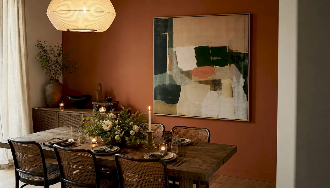
Abstract modern art works particularly well in dining rooms because it invites interpretation without demanding attention. A large abstract canvas in ochre, terracotta, or deep green flatters the skin tones of guests and complements warm candlelight. Portraits and figurative works add character and give guests something to discuss between courses.
Warm colour palettes including ochres, terracottas, and deep greens enhance the appeal of food and create a convivial atmosphere. Art should harmonise with the room’s lighting temperature to avoid colour clashes or a muddy appearance under artificial light. Cool, high-contrast palettes suit modern dining rooms with pendant lighting and pale walls.
- Abstract and geometric prints: Clean lines and tonal depth without visual noise
- Botanical and floral art: Timeless, organic, and available in every scale
- Still life paintings: Traditionally linked to dining; works best in a contemporary rendering
- Landscape photography or painting: Brings space and calm to smaller dining rooms
- Food and drink motifs: Effective when treated graphically rather than literally
- Portraiture: Adds personality and anchors a gallery wall
Pro Tip: Match the dominant colour in your artwork to one accent already present in the room, such as a cushion, rug, or crockery colour. This creates cohesion without redecorating.
2. Art arrangements: single pieces, gallery walls, and clusters
A single large artwork is the most confident choice for a dining room. Single artworks sized at two-thirds to three-quarters of the table width maximise visual harmony and define the dining area as a social zone. A rectangular table pairs naturally with a horizontal canvas or triptych; a round table suits a square or circular piece.
Gallery walls suit informal dining rooms and work well in rented spaces where you want maximum impact without major commitment. The key rule: consistent spacing of 5–7cm between pieces and a restrained colour palette or shared frame style keeps the arrangement cohesive rather than cluttered. Arrange pieces on the floor first, building outward from one dominant piece, before committing to the wall.
Thematic clusters sit between a single artwork and a full gallery wall. Three or four pieces sharing a subject, palette, or frame style create a collected, curated feel. Asymmetrical layouts work well for informal dining rooms, while symmetrical arrangements suit more formal settings.
Framing choices affect visual weight significantly. Simple wood or metal profiles often outperform ornate frames in dining rooms because guests sit close to the walls and ornate detailing becomes distracting at that proximity. Float framing and matting add breathing space around a print and create a subtle shadow that lifts the piece from the wall.
Pro Tip: Use brown paper and masking tape to create templates of each piece before hanging. Stick them to the wall and live with the layout for a day before drilling.
3. Material and framing choices that suit dining rooms
Canvas is the most practical material for dining room art. It absorbs light and provides texture, reducing glare and contributing to a warm atmosphere. Canvas also tolerates the slight humidity and temperature fluctuation that dining rooms experience during meals.
Metal and acrylic prints add a polished, contemporary feel. They suit modern dining rooms with clean lines and neutral palettes. Both materials require careful positioning to avoid light reflection hotspots, particularly near pendant lights or candles.
- Canvas: Warm, textured, glare-free, and forgiving in variable lighting
- Metal prints: Sleek and vivid, but position away from direct light sources
- Acrylic: High-gloss depth, best suited to cool, modern dining rooms
- Wood panels: Add natural warmth and tactile interest; complement timber furniture
- Textile art: Woven or embroidered pieces bring softness and acoustic benefit
Framing materials that match room fixtures create a subtle rhythm across the space. Brass frames echo brass pendant lights; black metal frames tie to black chair legs or window frames. This kind of material echo is one of the simplest ways to make a room feel considered rather than assembled.
Moisture and heat affect art materials over time. Avoid hanging unprotected paper prints directly above a radiator or adjacent to a kitchen hatch. Canvas and sealed prints handle these conditions far better than unframed paper.
4. How to position and light dining room art for best effect
Artwork hung at the correct height makes a measurable difference to how a room feels. Positioning artwork with its centre at 145–155cm from the floor aligns with both seated and standing eye levels, making art comfortable to view from the table and when moving around the room.
When hanging art above a sideboard or console table, maintain a gap of 15–25cm between the top of the furniture and the bottom of the frame. This visually grounds the artwork to the piece below it. Art hung too high floats disconnected from the room; art hung too low feels cramped.
Lighting transforms the same artwork into something entirely different. Picture lights mounted directly on the frame provide focused, warm illumination and suit traditional or formal dining rooms. Recessed ceiling spotlights angled at 30 degrees to the wall highlight art without creating harsh shadows. Plug-in picture sconces offer a flexible option for renters who cannot install fixed wiring.
Pro Tip: Use a warm-white bulb (2,700–3,000K) to light dining room art. Cool-white light flattens warm-toned paintings and makes ochres and terracottas look grey.
Glare is the most common problem with glass-fronted or acrylic art in dining rooms. Anti-reflective glass eliminates most of this, but positioning also helps. Angle the artwork very slightly forward at the top, using picture hooks that tilt the frame, to redirect ceiling light away from the viewer’s sightline.
For an art selection checklist that covers every room in the home, Frametheworld’s 2026 guide walks through scale, colour, and material decisions step by step. If you want to understand how 2026 interior design art trends are shaping dining room choices, that guide covers the shift toward textured, handmade, and nature-referencing work.
Key takeaways
The most effective dining room art combines correct scale, a warm or nature-inspired theme, and placement at 145–155cm centre height to support both atmosphere and social comfort.
| Point | Details |
|---|---|
| Scale to the table | Choose artwork two-thirds to three-quarters the width of your dining table for visual balance. |
| Warm palettes work best | Ochres, terracottas, and deep greens flatter skin tones and complement dining lighting. |
| Gallery wall spacing | Keep 5–7cm between pieces and share a frame style or colour palette for cohesion. |
| Canvas for practicality | Canvas absorbs light and handles dining room humidity better than metal or acrylic. |
| Hang at 145–155cm centre | This height aligns with both seated and standing eye levels for comfortable viewing. |
Why the best dining room art is never just decoration
by Lennard
I have spent years helping people choose art for their homes, and the dining room is the space where I see the biggest gap between what people hang and what would actually serve them. Most homeowners treat the dining room wall as an afterthought. They hang something inoffensive and move on.
The rooms that genuinely work are the ones where the art was chosen with the same care as the table itself. A single large canvas in the right scale and palette changes how long people linger after a meal. I have seen it happen repeatedly. The art gives the eye somewhere to rest and the conversation somewhere to go.
My honest view is that trends matter far less than most people think. A botanical print in muted greens will outlast any trend cycle. What dates a room is not the subject matter but the execution: cheap frames, wrong scale, or art hung too high. Get those three things right and almost any style works.
The one thing I would push back on is the idea that affordable dining room artwork means compromising on quality. Frametheworld’s collections include hand-painted pieces at accessible price points. You can read more about matching art with your interior to understand how to make any budget work well. Art is not a finishing touch. It is part of how the room functions.
— Lennard
Curated dining room art at Frametheworld
Frametheworld offers two collections particularly well suited to dining rooms. The Wabi Sabi wall art collection features hand-painted abstract pieces with textured surfaces and natural imperfection. These works bring depth and warmth to dining rooms without competing with the food or the guests. Each piece is unique, which suits homeowners who want something with genuine character rather than a mass-produced print.
For a bolder approach, the Pop Art collection offers vibrant, retro-modern pieces that work as strong focal points in contemporary dining rooms. Both collections are browsable by size, format, and colour, making it straightforward to find art that fits your wall dimensions and palette. Frametheworld also offers customisation for homeowners who want a bespoke piece sized to their exact table width. If you want to commission original art for a specific brief, Literary Revelations provides a submission route for bespoke commissions.
FAQ
What size art works best above a dining table?
Choose a piece that is two-thirds to three-quarters the width of your dining table. This proportion creates visual balance and anchors the artwork to the dining area.
What are the best art themes for a dining room?
Botanical prints, landscapes, still lifes, and abstract works in warm palettes are the most effective choices. These themes complement food, conversation, and warm lighting without dominating the space.
How high should dining room art be hung?
Hang artwork with its centre at 145–155cm from the floor. When positioning above a sideboard or table, leave a gap of 15–25cm between the furniture and the bottom of the frame.
Is canvas or print better for a dining room?
Canvas is the better practical choice for most dining rooms. It absorbs light, reduces glare, and handles the humidity and temperature changes that occur during meals better than metal or acrylic.
How do I create a gallery wall in a dining room?
Start with one dominant piece and build outward. Keep spacing consistent at 5–7cm between frames and use a shared colour palette or frame finish to hold the arrangement together.

Leave a comment
This site is protected by hCaptcha and the hCaptcha Privacy Policy and Terms of Service apply.