
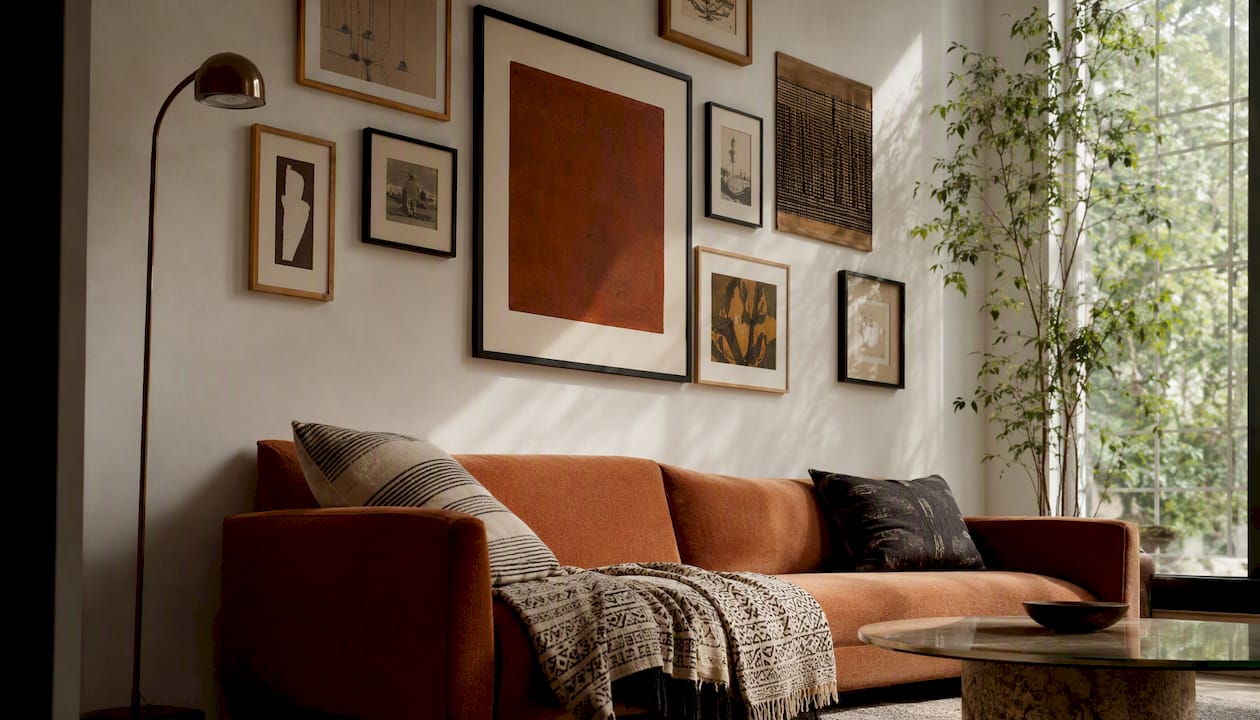
Start with an off-centre anchor piece and build outward from it. That single decision, more than any other, is what separates a gallery wall that looks curated from one that looks like it happened by accident. Everything else, the spacing, the frame mix, the odd little sculpture you tuck into a corner, follows from where that first piece goes.
Before you touch a nail, three numbers matter more than any style advice:
- The optical centre of the whole arrangement (not each frame) should sit around eye level from the floor.
- Leave 2 to 3 inches (5 to 8cm) between frames for a tight, cohesive cluster, or 4 to 6 inches if you want it to feel more relaxed.
- Above a sofa or console, the grouping should span roughly 50 to 75% of the furniture’s width and start 6 to 8 inches above it.
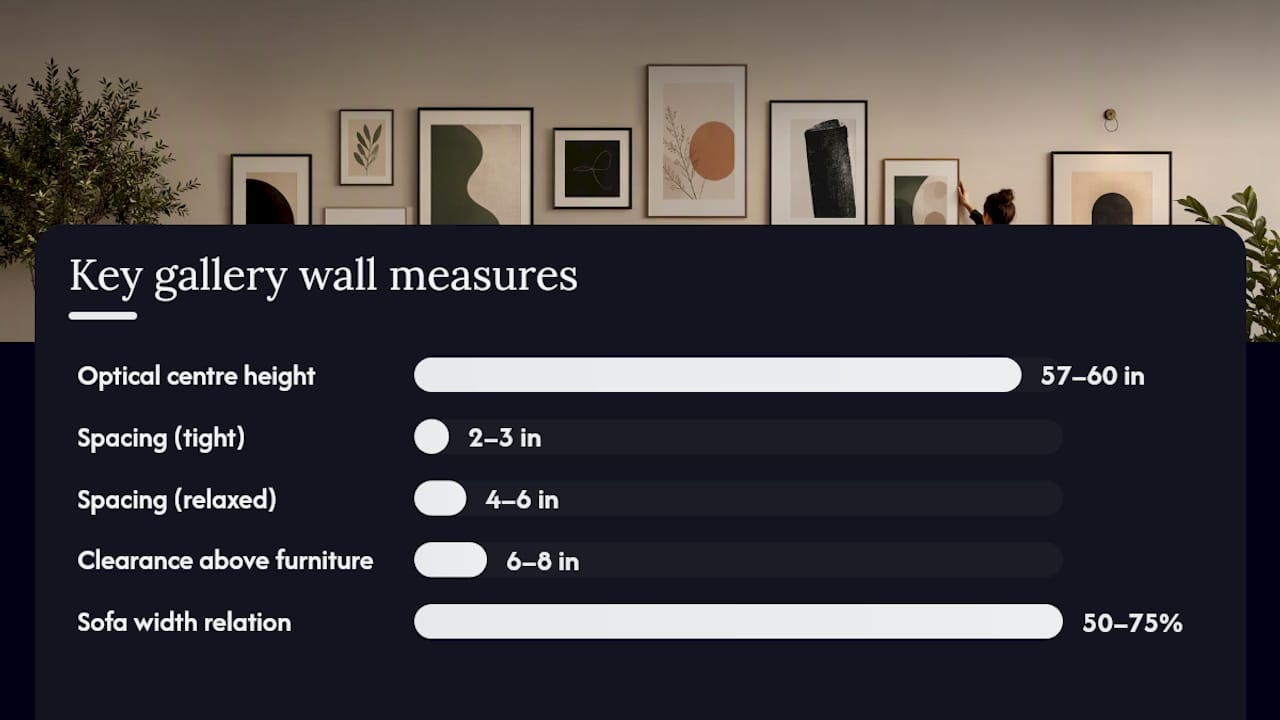
Measurement callout: Aim the centre of your entire arrangement, not any single frame, at 57 to 60 inches high. Above seating, keep the whole grouping within 50 to 75% of the furniture’s width, with the lowest frame edge 6 to 8 inches clear of the cushions.
Key Takeaways
An asymmetrical gallery wall works when you anchor it with one off-centre piece, keep the whole composition’s optical centre at eye level, and maintain consistent spacing throughout.
| Point | Details |
|---|---|
| Anchor first | Choose one standout piece and hang it before anything else, working outward from there. |
| Centre the composition, not each frame | Aim the optical centre of the entire arrangement at 57 to 60 inches from the floor. |
| Keep spacing consistent | Use 2 to 3 inches for a tight look or 4 to 6 inches for a relaxed one, never both. |
| Respect furniture proportions | Span 50 to 75% of sofa width and hang 6 to 8 inches above the cushions. |
| Test before you commit | Lay pieces on the floor and use paper templates on the wall before hammering a single hook. |
| Shop with intention | Frametheworld’s Wabi Sabi and Pop Art collections offer ready-to-hang anchors and custom sizing for asymmetric layouts. |
Table of Contents
- Asymmetrical gallery wall ideas: seven layouts that actually work
- How to plan the scale, spacing and proportions
- A step-by-step method for composing and hanging your wall
- Making asymmetry look intentional, not accidental
- Choosing frames, mixed media and objects that add interest
- Common gallery wall mistakes and how to fix them
- Are gallery walls still worth doing?
- Designer-level tips worth stealing
- Ready-to-hang and bespoke options from Frametheworld
- Sources
Asymmetrical gallery wall ideas: seven layouts that actually work
Asymmetry isn’t the absence of a plan. It’s a different plan, one where the visual weight balances across the wall rather than mirroring itself down a centre line. Here are seven layouts worth trying, each suited to a different wall or room.
- Off-centre anchor cluster. Pick your largest or boldest piece, hang it left or right of the wall’s midpoint, then build a loose cluster of smaller works around it. Works well on wide living room walls where you want a clear focal point that isn’t dead centre.
- Salon-style organic spread. A denser, more layered arrangement with pieces of wildly varying sizes touching close together. Best suited to a stairwell or a large hallway where people pass slowly enough to take it in.
- Horizontal run above a sofa. A loose line of frames that drifts slightly up or down rather than sitting perfectly level, anchored by one larger piece toward one end. Ideal for low, wide sofas where a symmetrical grid would feel stiff.
- Staircase diagonal. Frames step upward or downward following the pitch of a staircase, usually increasing in size as they climb. This is the one layout where following an existing architectural line, rather than fighting it, is the right call.
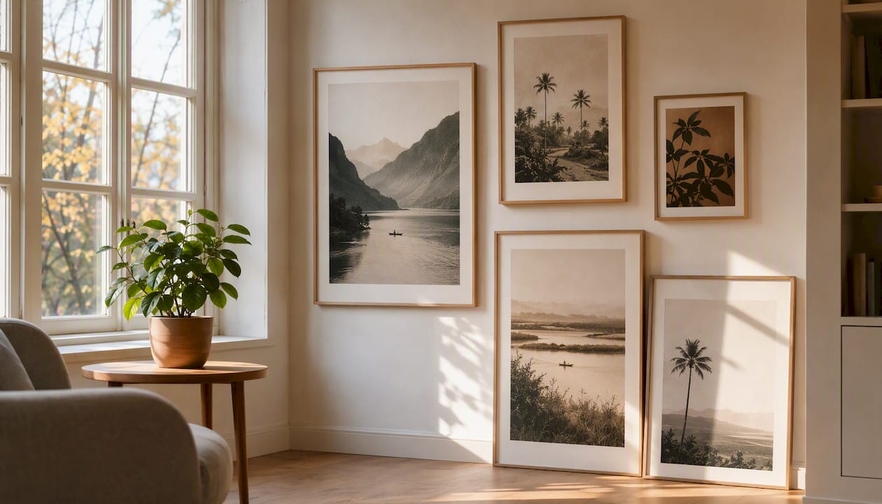
- Ledge-layered gallery. Frames lean against a picture ledge rather than hang, layered two or three deep, easy to rearrange without new holes. Great for renters or for anyone who updates their collection often.
- Mini-grids within a larger cluster. A tight 2x2 or 3x2 grid of matching small frames sits inside a looser asymmetric spread, giving the eye a moment of order before it wanders again. Works on medium walls where you want structure without full symmetry.
- Object-punctuated vignette. Two-dimensional art mixed with a mirror, a small shelf, or a piece of textile work breaking up the frame rhythm. This suits a reading nook or a small feature wall where you want texture, not just flat prints.
If you’re briefing a photographer or pulling reference images, ask for three angles per layout: a tight crop showing frame spacing and finish detail, a full-wall shot showing the whole composition against the room, and a context shot with furniture in frame so the scale reads properly.
How to plan the scale, spacing and proportions
Get the measurements wrong and no amount of styling talent saves the wall. Get them right and even a modest budget of prints looks deliberate.
The 57 to 60 inch figure refers to the optical centre of the whole composition, a concept worth sitting with for a second. If you have nine frames scattered across a wall, you don’t centre each one at eye level individually, you treat the entire cluster as one shape and aim its visual midpoint there. Get this wrong and even a technically level arrangement reads as too high or too low.
Spacing is the second lever. A gap of 2 to 3 inches between frames reads as tight and cohesive, the kind of spacing you see in a considered salon wall. Push that to 4 to 6 inches and the arrangement breathes more, feeling airier and more contemporary. The mistake most people make is mixing the two within one wall, tight in one corner, loose in another, which reads as inconsistent rather than intentional.
Furniture relation is the rule people skip most often, and it shows. A gallery wall above a sofa should span 50 to 75% of the sofa’s width, with the bottom edge sitting 6 to 8 inches above the top cushion. Leave at least 3 to 4 inches of clearance from the ceiling or any crown moulding so the top of the arrangement doesn’t feel cramped.
| Measurement | Guidance | Where to apply it |
|---|---|---|
| Optical centre height | 57 to 60 inches from floor | Centre of the entire arrangement, not individual frames |
| Frame-to-frame spacing | 2 to 3 inches (tight) or 4 to 6 inches (relaxed) | Consistent throughout one wall, never mixed |
| Sofa width relation | 50 to 75% of sofa width | Groupings hung above seating |
| Clearance above furniture | 6 to 8 inches | Bottom edge of lowest frame to top of cushion |
For a full internal walk-through on how these figures translate to actual placement above furniture, this wall art placement guide breaks down the relationship in more detail.
A step-by-step method for composing and hanging your wall
Skip the improvisation and work through this sequence. It costs you an extra half hour up front and saves you a wall full of unnecessary holes.
- Choose your anchor and restrict your palette. Pick one standout piece, then decide on a frame finish story before buying anything else, one dominant finish plus perhaps a single accent metal.
- Compose on the floor first. Lay every piece out on the floor in your intended arrangement, photograph it from above, and adjust until the balance feels right. This is where you catch problems for free.
- Cut paper templates. Trace or cut paper to the exact size of each frame and tape the templates to the wall in the layout you tested on the floor. This step lets you preview spacing and density before a single hook goes in.
- Hang the anchor piece first. Get this one level and correctly positioned relative to your eye-level and furniture rules, then work outward, hanging adjacent pieces one at a time and stepping back to check the composition after each one.
- Make small corrections as you go. If a gap looks too wide once real frames replace paper, shift the next piece slightly rather than forcing it to match your original plan exactly.
Tools worth having on hand: a laser level, a tape measure, your paper templates, a mix of picture hooks rated for the weight of each piece, and removable hanging strips for lighter items you might want to reposition later.
Pro Tip: Nail-hole fatigue is real. Once you’ve patched and repainted a wall for the third time because a “final” layout wasn’t final, you learn to trust the paper template stage completely. Give yourself permission to leave the templates up for a few days before committing.
Making asymmetry look intentional, not accidental
Visual weight is the quality that separates a wall that looks curated from one that looks cluttered, and it has nothing to do with actual size. A small, dark, densely detailed print can carry as much visual weight as a much larger pale abstract piece. The trick is distributing that weight across the wall so no single side feels heavier.
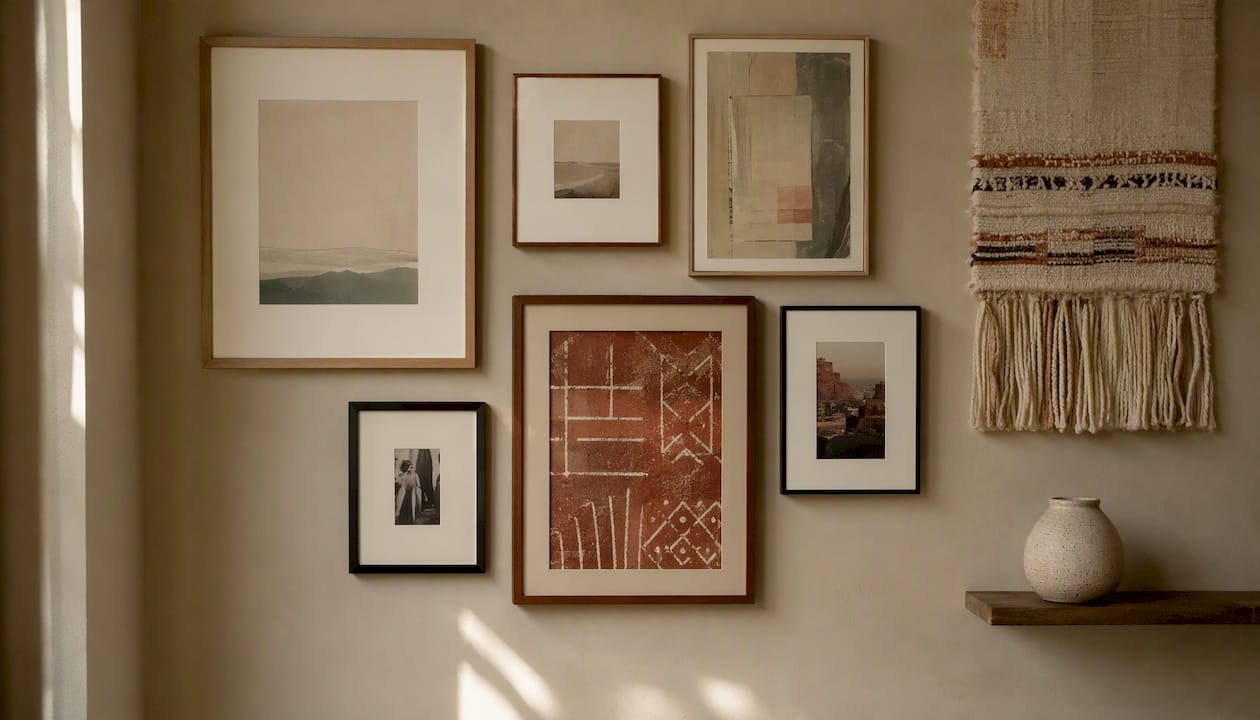
Balance large against small, dark against light, and flat prints against anything with real depth or texture. Mixing sizes and media this way, letting one big piece anchor a scattering of smaller works, tends to read better than an arrangement where everything sits at similar scale.
Finish cohesion matters just as much as layout. Pick one dominant frame finish, matte black works in most modern interiors, and allow yourself one accent finish at most, a warm brass or antique gold, say. Anything beyond two finishes starts to look like leftovers from different projects rather than a considered collection.
Picture a wall with a large abstract canvas sitting slightly left of centre, three small square prints stepping diagonally down and to the right of it, and a narrow mirror tucked into the lower right corner to catch the eye back toward the anchor. That diagonal pull, and the mirror acting as a visual full stop, is what makes an asymmetric layout feel like it was designed rather than assembled at random.
- Balance one large statement piece against a cluster of three or four smaller works, never against a single equal-sized rival.
- Keep negative space consistent. Uneven breathing room between clusters is one of the fastest ways to make a wall look unplanned.
- Limit yourself to two dominant colours across all the artwork, even if individual pieces contain more.
Pro Tip: If you’re struggling to judge balance, take a photo of the wall and view it in black and white. Colour hides weight imbalances that greyscale exposes instantly.
Choosing frames, mixed media and objects that add interest
The materials you choose do as much work as the layout itself. Designers increasingly reach for three-dimensional elements, fibre art, small shadow boxes, a single sculptural object, specifically to stop a gallery wall reading as flat and catalogue-like.
Frame styles need to speak the same language even when the art inside them doesn’t. A run of thin matte black frames will happily hold a mix of botanical prints, abstract paintings, and black-and-white photography because the frame consistency does the unifying work. Mixing three or four frame widths and finishes in one small cluster, by contrast, makes even beautifully chosen art look disjointed.
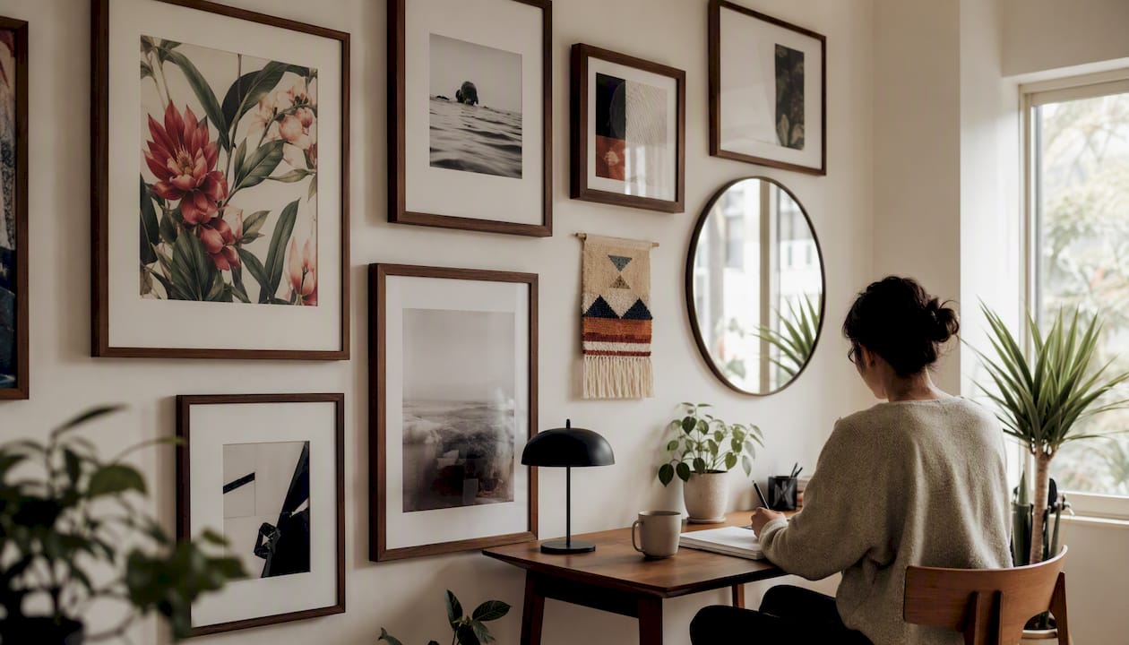
For mixed media, think in layers rather than a flat list: a painting or large print as the anchor, one or two smaller framed prints for rhythm, a small mirror or textile piece for texture, and perhaps one modest sculptural object on a floating shelf within the cluster rather than hanging flush with everything else. That physical projection off the wall is often what gives an otherwise flat arrangement real depth.
Match materials to the room’s broader style. Light oak or pale frames suit Scandinavian-leaning interiors, matte black reads as more contemporary, and warm brass or bronze tones sit naturally in a traditional or eclectic scheme. Whatever you choose, match your mounting hardware to the actual weight of each piece, a heavy framed canvas needs a proper stud-anchored hook, not the same adhesive strip you’d use for a light paper print. For more on pairing frame finishes across a mixed collection, this guide on mixing art themes cohesively is worth a read.
Pro Tip: Keep one “wildcard” object, a small ceramic piece, an unusual mirror shape, off to one side rather than centred. It reads as a deliberate flourish rather than an afterthought when it’s slightly off the main axis.
Common gallery wall mistakes and how to fix them
Most gallery walls that feel “off” suffer from one of a small handful of problems, and every one of them has a quick fix.
- Too many tiny pieces with no anchor. The wall lacks a focal point and reads as busy rather than curated. Fix: introduce one larger piece, even a single oversized print, to give the eye somewhere to land first.
- Mixing incompatible layout styles. Combining a strict grid with a loose organic scatter on the same wall confuses the eye. Fix: pick one style per wall and keep any grid elements contained within their own small section, as with the mini-grid approach.
- Ignoring the furniture relationship. A gallery wall that’s too wide, too narrow, or hung too high above a sofa looks disconnected from the room. Fix: remeasure against the 50 to 75% sofa-width rule and adjust the outer pieces inward or outward.
- Mismatched frame finishes. Gold, silver, black and natural wood all competing in one cluster looks like an accumulation rather than a collection. Fix: repaint or swap frames so no more than two finishes appear across the whole wall.
- Uneven or inconsistent spacing. Gaps that vary randomly between pieces read as sloppy rather than organic. Fix: remeasure with a consistent 2 to 3 inch or 4 to 6 inch gap throughout, picking one and sticking to it.
Quick troubleshooting checklist when a wall “feels off”: stand back ten feet and ask whether one piece draws your eye first (if not, add an anchor), check whether the spacing is even (if not, remeasure), and check whether more than two frame finishes are visible (if so, swap one out).
Are gallery walls still worth doing?
Gallery walls haven’t gone anywhere, and the current direction of the style is arguably more forgiving than the perfectly matched grids that dominated a decade ago. The most successful versions now look collected over time rather than bought in one trip, mixing personal photography with proper art prints, restraining the colour palette, and leaning on mixed media rather than uniform framed prints.
Whether you go minimalist or maximalist depends mostly on the room and your own tolerance for visual density. A small cluster of five to seven pieces suits a hallway or a reading nook, somewhere you pass through rather than linger. A fuller salon-style spread of ten or more pieces earns its place in a living room or stairwell, somewhere you’re happy to stand and look for longer. Neither approach is more current than the other; they simply solve different problems.
Designer-level tips worth stealing
A handful of habits separate a wall that looks professionally styled from one that looks like a weekend project, and none of them require special skill, just a bit of discipline before the hammer comes out.
Hang your anchor piece first, always, and resist the urge to start with whatever’s easiest to hang or closest to hand. Work from the optical centre of the whole composition rather than centring any individual frame on the wall, since that’s the measurement that actually reads correctly from across the room. And where you have a choice, lean toward odd numbers, five, seven, or nine pieces tend to read as more dynamic than an even count, which the eye tends to want to split into pairs.
A few more worth applying immediately:
- Add pieces gradually over weeks rather than filling the wall in one sitting; a gallery wall that grows slowly tends to look more considered than one assembled all at once.
- Photograph your floor layout from directly above before committing, since perspective from standing height distorts how the spacing will actually read on the wall.
- Keep one piece of “breathing room” larger than the rest of your gaps, near the edge of the cluster, so the whole arrangement has somewhere to visually exhale.
If you’re working toward a specific finished look rather than starting from scratch, Frametheworld’s collections are organised by style and format specifically so you can build a cohesive anchor-and-cluster arrangement without hunting across dozens of separate sellers.
A stylist’s note on why the off-centre anchor works
The off-centre anchor approach works because it mimics how the eye actually moves through a room rather than fighting it. Symmetry is restful, but it’s also static. It gives the eye nowhere to go once it’s taken in the centre point. An asymmetric arrangement, built properly around one anchor and a considered spread outward, creates a kind of visual tension that keeps the eye travelling, which is exactly what makes a wall feel alive rather than decorative wallpaper.
What I’d push back on is the idea that asymmetry means “anything goes.” It doesn’t. Every successful asymmetric wall I’ve studied still follows the measurement discipline, the eye-level centre, the consistent spacing, the furniture relationship, it just applies that discipline to an off-centre composition rather than a mirrored one. If you want a custom anchor piece sized precisely to your wall and your existing pieces, that’s exactly the kind of project Frametheworld’s bespoke commissions are built to handle.
Ready-to-hang and bespoke options from Frametheworld
Not every reader wants to source frames, mixed media, and a statement anchor piece from five different places. If that’s you, Frametheworld’s hand-painted collections are built to give you a cohesive starting point without the hunting. The Wabi Sabi wall art collection leans into the organic texture and imperfection that suits an asymmetric, salon-style cluster particularly well, while the Pop Art collection gives you a bold, confident anchor piece if your wall needs one strong focal point to build the rest of the arrangement around.
Every piece can be customised by size, so you’re not stuck squeezing a standard canvas into a gap it wasn’t made for, and bespoke commissions are available if you’d rather have a piece designed specifically for your anchor spot. Browse the full Frametheworld collection to start planning your wall around artwork that’s ready to hang the day it arrives.
Sources
- 13 gallery wall ideas to make your blank space a work of art | Architectural Digest
- How to style a gallery wall the right way, according to designers - House Beautiful
- Gallery Wall Layout Ideas: How to Plan, Arrange and Hang Art the Right Way - Your Home Revival
- Gallery wall layout guide - the decorholic
- Gallery wall decor designs - The Spruce

Leave a comment
This site is protected by hCaptcha and the hCaptcha Privacy Policy and Terms of Service apply.