
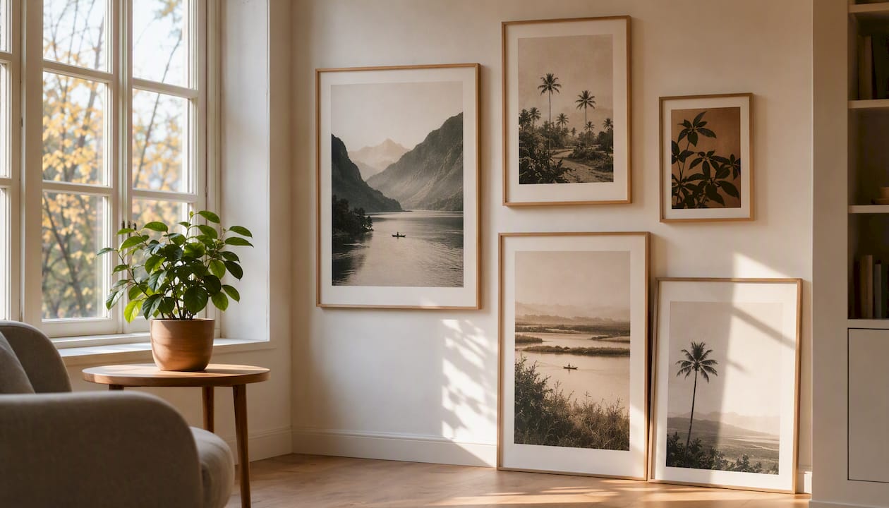
The main Scandinavian art print styles fall into seven recognisable camps: minimalist/abstract, botanical/landscape, folk motifs, mid-century modern, line/silhouette figures, geometric/pattern, and typographic/poster. Each has a distinct visual signature you can spot in seconds.
- Minimalist/abstract: muted tones, negative space
- Botanical/landscape: soft greens, single stem or horizon
- Folk motifs: floral scrollwork, saturated accent colour
- Mid-century modern: flat shapes, mustard and rust tones
- Line/silhouette: one continuous contour, no fill
- Geometric/pattern: repeated tiles, tonal contrast
- Typographic/poster: bold sans-serif, graphic layout
Minimalist and line-based prints suit calm bedrooms and studies; folk motifs and pattern prints bring warmth to hallways and living spaces.
Key Takeaways
Scandinavian art print styles share a common language of restraint, natural motifs, and functional composition, but each of the seven main styles reads differently on a wall.
| Point | Details |
|---|---|
| Seven core styles | Minimalist, botanical, folk motif, mid-century, line/silhouette, geometric, and typographic prints each have distinct visual cues. |
| Negative space signals quality | Authentic Scandi prints favour restrained composition over dense, decorative arrangements. |
| Check print process first | Look for giclée printing, archival paper, and named artist credits before buying. |
| Follow the sizing rule | A print should cover roughly 60 to 75% of the wall space above furniture. |
| Frametheworld offers curated and bespoke routes | Hand-painted collections and custom commissions provide cohesive palettes and archival materials for any wall size. |
Table of Contents
- What defines Scandinavian art print styles?
- A catalogue of Scandinavian print styles to know
- Materials, print types and framing: what to look for
- How to choose and style Scandinavian prints for your home
- Where these looks come from: folk roots to Nordic minimalism
- A curator’s note on selecting Scandinavian prints
- Curated collections and bespoke commissions worth considering
- Sources
What defines Scandinavian art print styles?
Whatever the individual style, Nordic prints share a handful of consistent principles: restraint, function, and a close relationship with the natural world. If a print looks calm rather than busy, and every element seems to earn its place, it’s probably working from this playbook.
- Simplicity: few elements, no unnecessary decoration
- Functional composition: the piece works with a room rather than dominating it
- Muted or natural palette: oatmeal, sage, charcoal, dusty terracotta
- Generous negative space: background often outweighs subject
- Natural motifs: birds, botanicals, coastlines, forests
- Craft references: subtle nods to weaving, woodblock, or folk painting techniques
The negative space rule is the easiest to spot in practice: a single fern or a lone bird silhouetted against a large pale field is a classic Scandi composition, whereas a cluttered arrangement of five motifs on one sheet usually isn’t. Modern Scandinavian design formally emerged as a movement in the 1930s, built around exactly this kind of functional, pared-back composition. That discipline still shapes what counts as authentically Nordic today.
Pro Tip: Check the print’s technical details before buying. Genuine quality signals include a named artist credit, giclée printing (a fine-art inkjet process using archival pigments), heavier paper stock, and fade-resistant inks. A print with none of these listed is often a low-cost reproduction dressed in Scandi colours rather than the real thing.
A catalogue of Scandinavian print styles to know
Each style below has a quick identifier, where it tends to work best in a home, and search terms worth trying if you’re browsing or commissioning.
-
Minimalist/abstract. Soft layered shapes and a muted palette define this category, with balance and negative space doing most of the visual work.
- Palette and motif: sage, blush, or grey tones with overlapping geometric forms
- Where it sits: living rooms, studies, above a sofa
- Search terms: “Scandi abstract print,” “Nordic minimalist wall art”
-
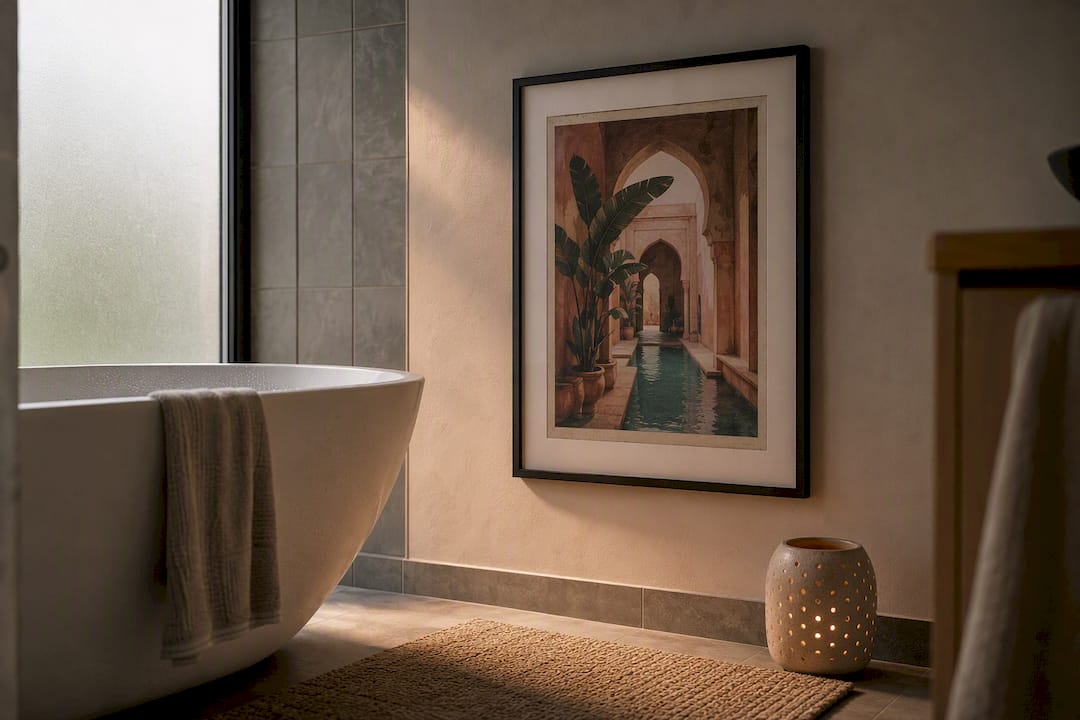
Botanical/landscape. A single stem, a coastline, or a simplified forest scene, usually rendered in flat, muted colour.
- Palette and motif: sage green, dusty blue, ochre; one dominant natural subject
- Where it sits: bedrooms, bathrooms, reading nooks
- Search terms: “Nordic botanical print,” “Scandinavian landscape art”
-
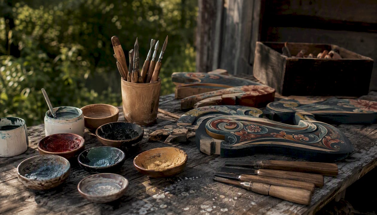
Folk motifs. Rooted in regional painted traditions such as rosemaling in Norway and Dala painting in Sweden, these prints use floral scrollwork and brighter accent colours against pared-back grounds. These traditions draw on nature and regional craft, and designers frequently simplify them into cleaner, wall-friendly layouts.
- Palette and motif: cream base with red, blue, or ochre floral detail
- Where it sits: hallways, kitchens, as an accent among minimalist pieces
- Search terms: “Nordic folk pattern print,” “rosemaling art print”
-
Mid-century modern. Flat, graphic shapes in mustard, rust, and forest tones, often echoing 1950s and 60s Scandinavian furniture design.
- Palette and motif: mustard, teal, burnt orange; abstract organic forms
- Where it sits: living rooms, dining areas
- Search terms: “Scandi mid-century print”
-
Line/silhouette. A single continuous line traces a face, body, or animal, with no shading or fill.
- Palette and motif: monochrome or one accent colour on white
- Where it sits: bedrooms, gallery walls, small spaces
- Search terms: “Nordic line art print,” “single line drawing print”
-
Geometric/pattern. Repeated tiles, triangles, or simplified botanical sprigs built for coordination across a room rather than standing alone. Nordic Folk pattern collections typically pair restrained palettes with small, repeatable motifs designed to translate across prints, textiles, and rugs.
- Palette and motif: tonal neutrals with one contrast shade
- Where it sits: alongside cushions or rugs in the same pattern family
- Search terms: “Scandi geometric pattern print”
-
Typographic/poster. Bold sans-serif type, often a place name, quote, or single word, laid out with generous margins.
- Palette and motif: black, white, occasional colour block
- Where it sits: entryways, home offices, kitchens
Materials, print types and framing: what to look for
The print process and substrate matter more than the design itself for how a piece ages on your wall. Giclée printing on archival, acid-free paper is the standard to look for, since it resists fading far longer than standard inkjet output.
- Paper vs canvas: archival paper suits framed minimalist and line-art prints; canvas suits larger botanical or abstract pieces
- Limited editions: numbered runs with a signed certificate tend to hold value and quality better than open editions
- Paper weight: heavier stock (around 200gsm or above) feels substantial and lies flatter once framed
- Ink fade resistance: archival pigment inks outperform dye-based inks in direct sunlight
For framing, thin black or natural oak frames suit minimalist and geometric prints, while a white passepartout adds breathing room around botanical or folk pieces. As a sizing rule of thumb, a single print should cover a majority of the wall space above furniture such as a sofa or console.
How to choose and style Scandinavian prints for your home
Work through this order: room function, then colour harmony, then scale, then framing, then placement. Skipping straight to “which print looks nice” is the most common reason a gallery wall ends up feeling disjointed.
- Measure your wall space before browsing, including the furniture beneath it.
- Choose scale using the 60 to 75% rule above; for a gallery wall, treat the whole grouping as one shape.
- Coordinate your palette by picking one dominant neutral and one accent colour that repeats across every piece.
- Select frame and mat depth to match the room’s existing woodwork, tonal blacks or oak for modern spaces, wider white mats for a gallery-style hang.
- Place and hang with the print’s centre at roughly 145 to 150 centimetres from the floor, which keeps artwork at natural eye level in most rooms.
For grouped prints, leave a small, consistent amount of space between frames so the arrangement reads as one composition rather than scattered pieces. Mixing a single folk-motif print among several minimalist pieces works well; mixing three or four bold folk patterns together usually competes for attention.
Pro Tip: If you’re nervous about scale, lay the prints out on the floor first and photograph the arrangement from above. It’s far easier to spot spacing problems on a screen than on a wall covered in nail holes.
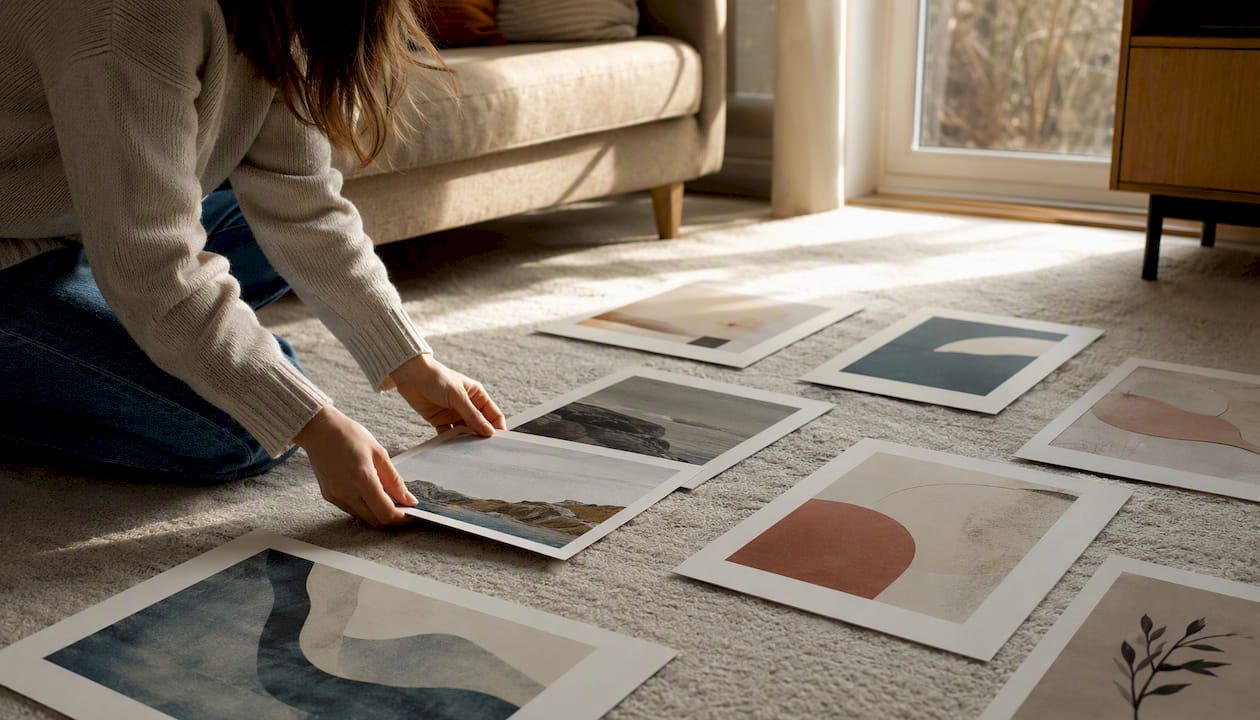
For more room-specific pairings, this guide to wall art styles for modern interiors walks through additional combinations.
Where these looks come from: folk roots to Nordic minimalism
Contemporary Scandi prints simplify centuries-old folk craft into the clean, functional style that took hold across the region in the twentieth century. Regional painted traditions, rosemaling in Norway, Dala painting in Sweden, alongside paper cutting and scrimshaw, grew out of nature and available materials long before “Scandinavian design” existed as a label. Modern Scandinavian minimalism then formally emerged in the 1930s, prioritising simplicity and durability over ornament, a shift you can see reflected in how prints look today.
| Feature | Folk art | Modern minimalism |
|---|---|---|
| Motifs | Floral scrollwork, animals, figures | Single subject or abstract form |
| Palette | Saturated reds, blues, ochre | Muted neutrals, one accent tone |
| Complexity | Dense, decorative patterning | Sparse, restrained composition |
| Materials | Painted wood, textiles, paper cuts | Fine-art paper, canvas, giclée print |
A curator’s note on selecting Scandinavian prints
When selecting prints for a collection, quality and provenance come first: the paper stock, the printing process, and whether the artist behind the piece is credited and has a story worth telling. Palette runs a close second, since a print that doesn’t sit within a coherent colour family undoes even the best individual design. Readers building out a room can browse curated collections or ask about bespoke sizing if nothing quite fits the wall in question.
Curated collections and bespoke commissions worth considering
If you want guaranteed visual cohesion without hunting across dozens of retailers for pieces that actually match, a curated collection or a bespoke commission solves that problem in one step. Frametheworld’s hand-painted collections are built around the same principles covered above: restrained palettes, credited artists, and archival materials that hold their colour for years rather than fading within a season.
- Curated groupings designed to work together, not just individually
- Custom sizing for awkward walls or oversized statement pieces
- Framing options including natural wood and thin black profiles
- Archival paper and canvas with fade-resistant inks
If the muted, textured look of wabi-sabi abstract pieces suits your space, the Wabi Sabi Wall Art collection is worth a browse, and bespoke sizing is available for any wall that doesn’t fit a standard format. For readers wanting bolder colour or a typographic statement instead, the Pop Art collection offers a contrasting direction within the same quality standards.
Sources
- Century of the child: Nordic design for children 1900 to today | V&A
- An overview of traditional Scandinavian folk art | Rug & Kilim
- Nordic Folk - Seamless Patterns by Milky April | CreativeMarket

Leave a comment
This site is protected by hCaptcha and the hCaptcha Privacy Policy and Terms of Service apply.