
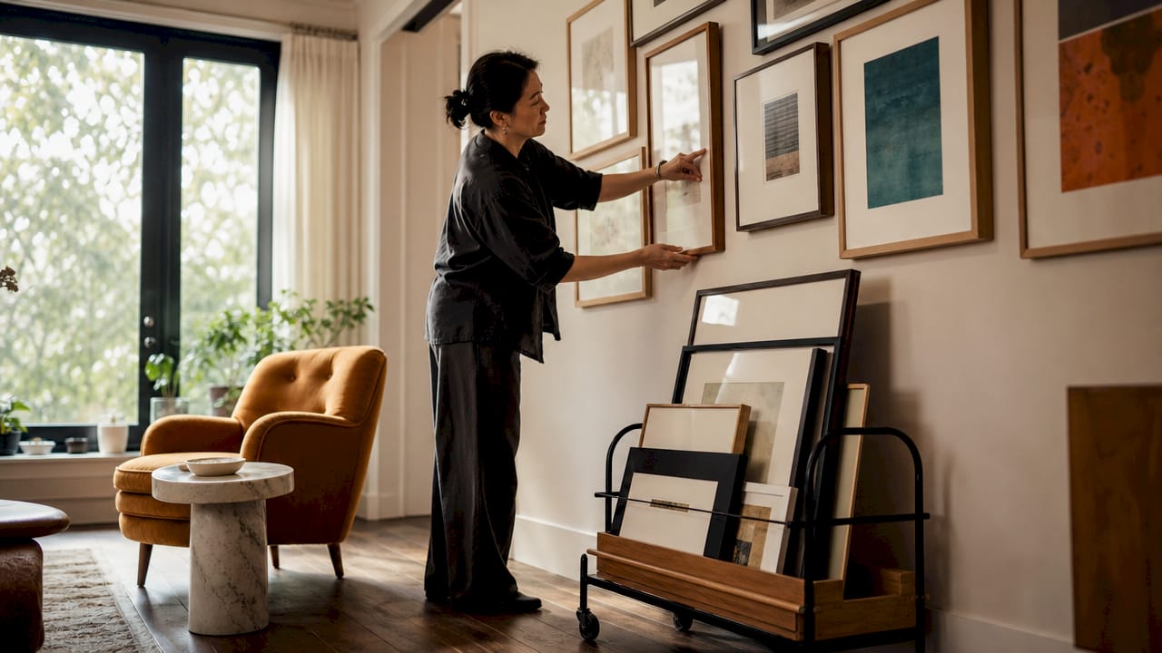
TL;DR:
- Proper art placement creates visual harmony by aligning artwork with furniture, lighting, and room proportions. Following professional guidelines, such as centering art at 57 to 60 inches and maintaining appropriate spacing from furniture, ensures a polished look. Thoughtful planning, including floor layouts and flexible display ideas, enhances room coherence and personal style.
Art placement is the deliberate process of positioning artworks so they align with room proportions, furniture, lighting, and interior style to create a cohesive and visually balanced space. Most homeowners treat hanging a picture as an afterthought, yet the difference between a room that feels polished and one that feels disjointed often comes down to a few centimetres and a considered eye. This guide to art placement covers the measurable rules interior designers rely on, from correct hanging height and furniture proportion to gallery wall composition and lighting adjustments, so you can approach every wall with confidence.
What does a guide to art placement actually cover?
Art placement, sometimes called picture hanging or artwork positioning in professional interior design, is far more structured than most people realise. The core principle is that art and furniture should read as one unified visual unit rather than separate elements competing for attention. When you understand that principle, every decision about height, scale, and spacing becomes logical rather than guesswork.
The standard used by galleries and professional designers places the centre of artwork at 57 to 60 inches from the floor. That figure reflects average standing eye level and is the benchmark most interior designers apply as a starting point before adjusting for room function or furniture height. Knowing this single number immediately removes the most common source of uncertainty when hanging art.
How high should you hang art above furniture?
Getting the height right is the single most impactful decision in any art placement strategy. The relationship between a piece of art and the furniture beneath it determines whether the room feels grounded or unsettled.
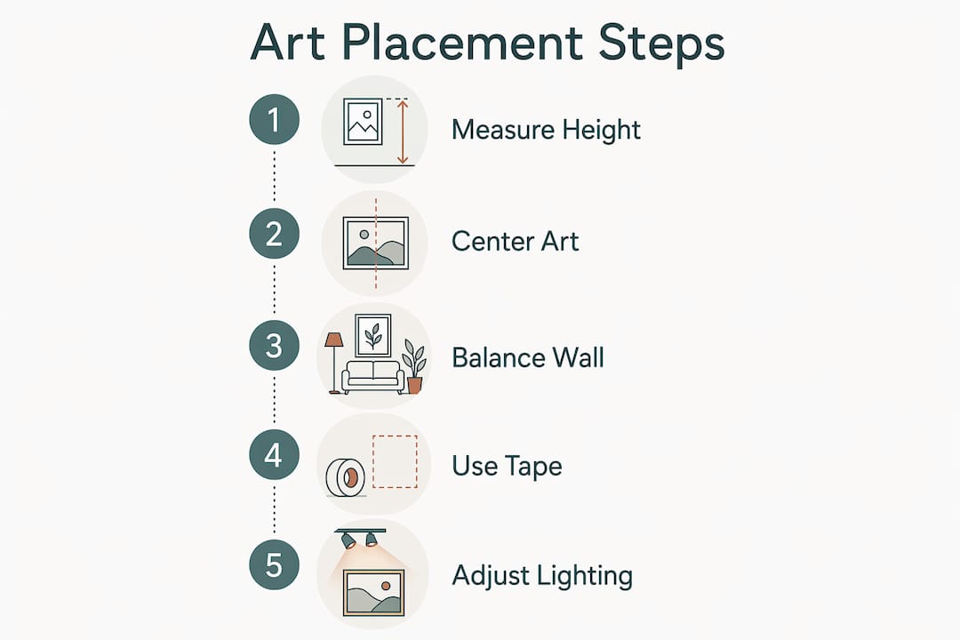
Follow these steps for consistent, professional results:
- Measure the furniture width. The artwork or grouping should span two-thirds to three-quarters of the furniture’s width. A sofa that is 200 cm wide calls for art or a grouping that spans roughly 133 to 150 cm.
- Mark the gap above the furniture. Leave a gap of 4 to 10 inches between the top of the furniture and the bottom of the frame. Closer to 4 inches creates a tight, anchored connection. Closer to 10 inches suits taller or more architectural pieces.
- Check the centre height. The centre of the artwork should sit at approximately 57 to 60 inches from the floor when you are standing. If the furniture is particularly low, such as a floor-level bed platform, adjust slightly upward so the art does not appear to sit on the floor.
- Step back and assess. View the wall from the room’s natural entry point and from the primary seating position. Both sightlines matter.
The proportion rule is worth taking seriously. A small print above a wide sideboard creates what designers call the postage stamp effect, where the art looks lost and the wall looks bare. Choosing appropriately sized works for the wall and furniture beneath them is as important as the hanging height itself.
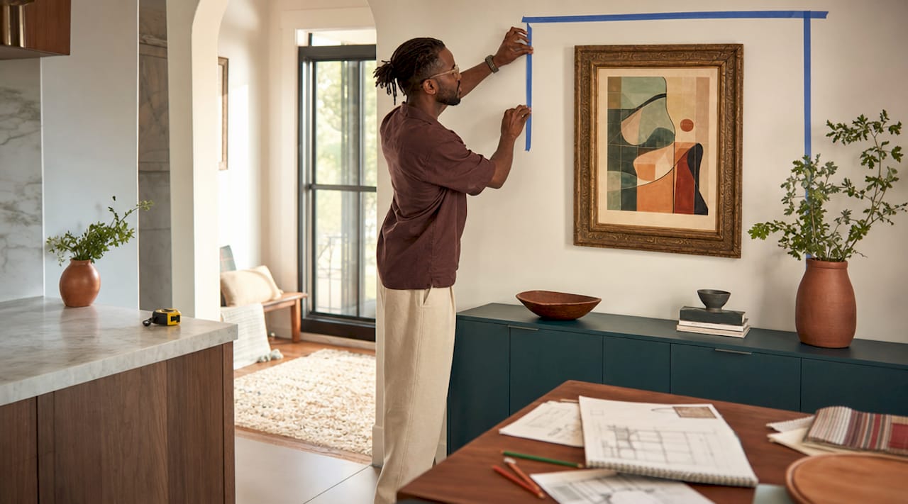
Pro Tip: Use a strip of painter’s tape on the wall to mark the proposed bottom edge of the frame before you commit to a nail. It costs nothing and saves considerable patching.
How do you create a balanced gallery wall?
A gallery wall succeeds or fails based on whether it reads as a single composed unit or a random collection of frames. The distinction is entirely in the planning.
The most reliable approach, used by designers including Emily Henderson, is to treat groupings as one piece by mapping the entire perimeter on the floor or wall before a single nail goes in. Lay all the pieces on the floor in their intended arrangement, photograph it, then transfer the layout to the wall using butcher paper templates or painter’s tape outlines.
Key principles for a cohesive grouping:
- Consistent spacing. Maintain 2 to 4 inches between frames throughout the arrangement. Tighter spacing creates a formal, structured feel. Slightly wider gaps suit a more relaxed, airy composition.
- A clear anchor piece. Start with the largest or most visually dominant work at the centre or optical centre of the grouping, then build outward symmetrically or asymmetrically depending on your preferred style.
- Frame cohesion. Mixing frame styles works well when you maintain consistency in one other element, such as colour, finish, or mat width. Mixing everything simultaneously produces visual noise rather than character.
- Defined outer edges. The perimeter of the grouping should form a recognisable shape, whether a rectangle, square, or intentional organic form. Stray pieces that drift outside the implied boundary break the composition.
Pro Tip: Photograph your floor layout before transferring it to the wall. The camera flattens perspective and reveals imbalances your eye misses when you are standing over the pieces.
Eclectic gallery walls with mismatched frames and varied subjects can look exceptional, but they require more planning than uniform arrangements, not less. The role of art in interior design is to add personality within a coherent visual structure, and that applies equally to a single statement piece and a wall of twenty prints.
How do lighting and room function affect art placement?
Room function changes the optimal viewing height, and natural light determines which art mediums are safe to display where. Both factors are frequently overlooked in standard wall art placement tips.
Consider these adjustments based on how a room is used:
- Dining rooms and bedrooms. People spend most of their time seated in these spaces. Lower the centre height to 52 to 54 inches from the floor to align with seated eye level. Art hung at standing height in a dining room feels disconnected from the table and the people around it.
- Sunlit walls. Avoid placing photographs or paper-based works in direct sunlight. UV exposure causes irreversible fading within months. Use UV-protective glazing if a sunlit position is unavoidable, or choose canvas prints and oil-based mediums that are more resistant to light damage.
- Picture lighting. A dedicated picture light or directional spot fitted to a track above the artwork dramatically improves visual impact in rooms with low ambient light. It also draws the eye to the piece intentionally, reinforcing its role as a focal point.
- Traffic flow. Art placed along a hallway or staircase should be hung slightly lower than the standard 57 to 60 inch rule to account for the fact that viewers are often moving rather than standing still.
“View the home as a unified gallery where art placements across rooms complement each other and respect function and natural light.” Martha Stewart
That principle is practical, not abstract. When you walk from a living room into a hallway and the art in both spaces feels considered and connected, the home gains a coherence that is immediately felt even if it is not consciously identified.
What are the most common art placement mistakes?
Even well-chosen art fails when placement is careless. These are the errors that appear most frequently in residential interiors, along with straightforward corrections.
- Hanging art too high. The number one mistake is positioning art too far above furniture, creating a floating, unanchored effect. The fix is simple: lower the piece until the gap between furniture and frame sits within the 4 to 10 inch range.
- Choosing art that is too small. A single A4-sized print above a king-size bed or a large sofa looks timid and emphasises the emptiness around it. Scale up, or group smaller pieces to achieve the necessary visual weight.
- Overcrowding a small wall. More pieces do not always mean more impact. A small wall with three competing frames often reads as cluttered. One well-chosen, correctly scaled piece can carry more presence than five poorly arranged ones.
- Ignoring the light source. Art hung directly opposite a large window catches glare on the glass, making it difficult to see and potentially damaging the work. Angle or reposition pieces to avoid direct reflection.
- Treating art as an afterthought. Art anchored to furniture and room proportions reads as intentional. Art hung wherever a nail happened to be left by a previous occupant does not. Plan placement before you hang, not after.
What are the best flexible art display ideas?
Not every piece of art needs to be fixed to a wall, and some of the most characterful interiors use a mix of hanging, leaning, and layering to create depth and a sense of personality that evolves over time.
- Leaning art on surfaces. Leaning framed pieces on a console table, mantelpiece, or deep shelf creates a relaxed, gallery-like atmosphere. It also allows you to swap pieces seasonally without filling walls with holes.
- Layering frames and objects. Placing a framed print in front of a larger canvas, or combining framed art with sculptural objects on a shelf, adds dimensional interest that flat wall arrangements cannot achieve.
- Using print sizing strategically. A single oversized print in a small room can make the space feel larger and more considered. Conversely, a collection of smaller prints in matching frames brings order to a large, bare wall without the commitment of a full gallery arrangement.
- Evolving displays. Treat your art arrangement as a living part of the home rather than a permanent fixture. Rotating pieces between rooms, introducing new works, and adjusting groupings as your interior style develops keeps the space feeling fresh and personal.
For guidance on selecting the right pieces to begin with, Frametheworld’s wall art selection guide covers how to match art styles and sizes to different room types.
Key takeaways
Effective art placement depends on treating artwork and furniture as one visual unit, applying consistent height and proportion rules, and adjusting for room function and light.
| Point | Details |
|---|---|
| Standard hanging height | Centre artwork at 57 to 60 inches from the floor as a baseline, then adjust for room function. |
| Proportion to furniture | Art width should span two-thirds to three-quarters of the furniture beneath it. |
| Gallery wall planning | Map the full layout on the floor or wall before hanging to treat the grouping as one composed unit. |
| Seated room adjustment | Lower the centre height to 52 to 54 inches in dining rooms and bedrooms to match seated eye level. |
| Avoid the floating effect | Keep a 4 to 10 inch gap between furniture and frame to anchor art visually to the room. |
Why small adjustments make the biggest difference
I have spent years looking at rooms where the art choices were genuinely excellent but the placement undermined everything. A beautiful abstract canvas hung 30 cm too high above a sofa does not just look wrong. It makes the whole room feel slightly off, and most people cannot identify why.
The insight that changed how I approach placement came from lowering art even a few inches and watching the room settle. The sofa and the artwork suddenly belonged to each other. The wall stopped being a separate surface and became part of the seating arrangement. That shift is not subtle once you see it.
What I find most designers get wrong is treating the rules as constraints rather than starting points. The 57 to 60 inch guideline is not a law. It is the average of what works, and your room may call for something slightly different based on ceiling height, furniture scale, or the proportions of the art itself. The rule gives you a reliable anchor. Your eye and the specific room give you the final answer.
My honest advice is to spend more time planning on the floor than standing on a ladder. Lay pieces out, photograph them, live with the arrangement visually for a day before committing. The homes that feel most considered are rarely the result of expensive art. They are the result of patient, deliberate placement. For more professional tips on integrating art into your interior scheme, Frametheworld’s expert interior design tips are worth reading alongside this guide.
— Lennard
Find the right art for your walls at Frametheworld
Once your placement strategy is clear, the next step is finding art that suits the scale, style, and mood of each space. Frametheworld’s Wabi Sabi wall art collection features hand-painted abstract pieces with organic textures and muted tones that work particularly well in living rooms, bedrooms, and dining spaces where a calm, considered aesthetic is the goal. For rooms with specific size requirements or a distinct colour palette, Frametheworld’s custom print service allows you to specify dimensions and personalise the artwork to fit your wall precisely. Browse by style, size, or format to find pieces that are ready to place, not just hang.
FAQ
What height should art be hung at?
The centre of a piece of art should sit at 57 to 60 inches from the floor for standard standing eye level. In rooms where people are primarily seated, such as dining rooms or bedrooms, lower the centre to 52 to 54 inches.
How wide should art be relative to the sofa beneath it?
Art or a grouping above a sofa should span approximately two-thirds to three-quarters of the sofa’s width. This proportion creates a visual connection between the furniture and the artwork without overwhelming the wall.
How much space should there be between art and furniture?
Leave a gap of 4 to 10 inches between the top of the furniture and the bottom of the frame. A tighter gap of around 4 inches anchors the art firmly to the furniture, while up to 10 inches suits taller or more architectural pieces.
How do you plan a gallery wall without making holes everywhere?
Lay all pieces on the floor in your intended arrangement, photograph the layout, then transfer it to the wall using butcher paper templates or painter’s tape outlines before committing to any nails.
Can you display art without hanging it on the wall?
Leaning framed pieces on consoles, mantlepieces, or shelves is a practical and stylish alternative to wall hanging. It allows you to change arrangements easily and adds a relaxed, layered quality to the room.



Laat een reactie achter
Deze site wordt beschermd door hCaptcha en het privacybeleid en de servicevoorwaarden van hCaptcha zijn van toepassing.