
TL;DR:
- Frame selection influences the visual impact and longevity of artwork by balancing material quality, scale, and style. Choosing mismatched or overly ornate frames can distract from or diminish the art’s presence, while well-chosen frames enhance and support it. Practical considerations like room humidity, light conditions, and daily lifestyle help determine the best material and design for each space.
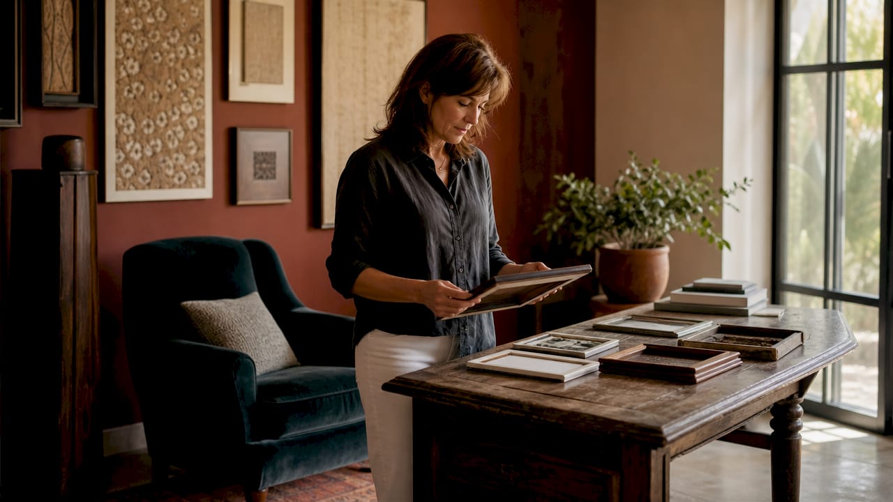
Frame selection is the single most influential decision you make after choosing a piece of art. The right frame protects your artwork, anchors it within a room, and communicates something about your taste before anyone reads a label or asks a question. Get it wrong, and even a beautiful print can look cheap, mismatched, or lost against the wall. Get it right, and the frame becomes invisible in the best possible way: the art simply belongs.
Understanding why frame selection matters means recognising that frames do two jobs at once. They preserve the artwork physically, and they shape how the eye reads it. A heavy gilt frame around a delicate watercolour creates visual noise. A thin black metal profile around a bold abstract print can make the colour sing. The framing process is not an afterthought. It is the final act of curation.
What factors determine the best frame for your artwork and space?
Choosing the right frame follows a logical sequence. Professionals recommend evaluating size, material, colour, and lifestyle compatibility in order, eliminating poor options at each stage before committing to a final choice. That method prevents the common mistake of falling in love with a frame in isolation, only to find it overwhelms the artwork or clashes with the room.
Scale and proportion
Scale is the first filter. A frame that is too wide visually competes with the artwork itself. One that is too narrow fails to give the piece enough visual weight on the wall. As a general rule, the frame moulding width should reflect the size of the artwork: larger prints suit wider mouldings, while smaller works benefit from slimmer profiles. The depth of the frame also matters. A canvas with physical texture needs a deeper box frame to avoid the surface touching the glazing.

Pro Tip: Hold a strip of card or tape around your artwork at the width you are considering before buying. Seeing the proportion in situ saves expensive mistakes.
Colour and finish
Colour choice is where most homeowners go wrong. The instinct is to match the frame to the dominant colour in the artwork, but visual balance often comes from contrast rather than matching. A warm oak frame around a cool-toned photograph creates a pleasing tension. A white or off-white frame around a botanical print lets the greens breathe. The finish, whether matte, gloss, or textured, also affects how light interacts with the frame across different times of day.
Key considerations when choosing colour and finish:
- Warm tones (gold, oak, walnut) suit oil paintings, botanical prints, and traditional interiors
- Cool tones (silver, black, white) complement photography, abstract art, and contemporary rooms
- Natural wood works across most styles and ages well over time
- Metallic finishes add drama but require confident placement to avoid looking cold
Material types and their style impact
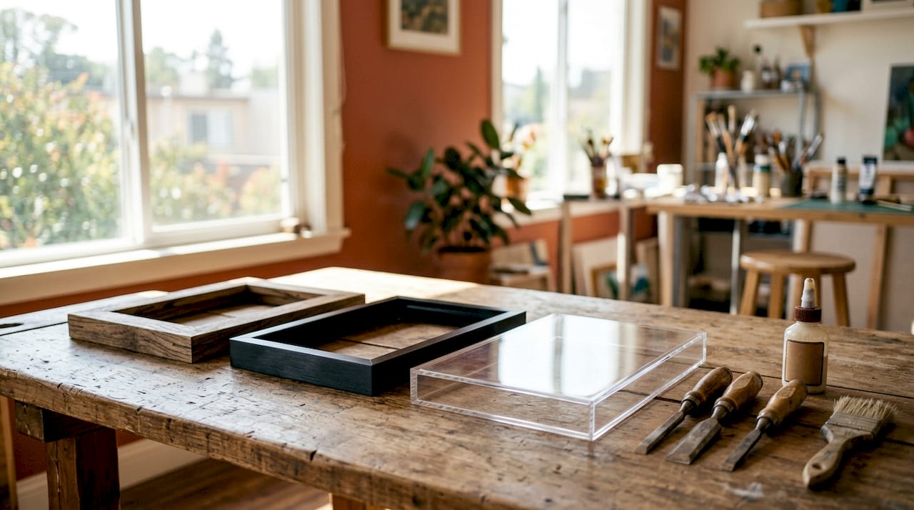
Wood, metal, and acrylic each bring distinct qualities to a frame. Wood is the most versatile: it accepts paint, stain, and gilding, and suits everything from rustic farmhouse interiors to gallery-style white walls. Metal frames, typically aluminium, are slim and precise. They suit photography and graphic prints particularly well. Acrylic or Perspex frames create a floating effect that works beautifully with prints where you want the wall colour to become part of the composition. For a deeper look at how materials perform across different art types, Frametheworld’s guide to framing options for wall art covers the practical trade-offs clearly.
How do frame styles influence the visual perception of art?
Frames shape how the eye moves around an artwork. Angular frames add definition and a sense of structure, while rounded or curved profiles soften the overall impression. The same principle applies to rooms: a heavily ornate frame in a minimalist space creates friction, while a simple profile in a maximalist room can look timid. The goal is harmony, not uniformity.
| Frame style | Best suited to | Visual effect |
|---|---|---|
| Ornate gilt | Classical paintings, traditional rooms | Adds grandeur, draws the eye inward |
| Slim black metal | Photography, graphic prints, modern interiors | Clean, precise, lets the art lead |
| Natural wood | Botanical, landscape, Scandi-style rooms | Warm, grounded, versatile |
| Floating acrylic | Abstract, contemporary prints | Airy, modern, wall colour becomes part of the piece |
| Wide white matte | Gallery-style displays, mixed collections | Neutral, professional, creates breathing room |
Thick, detailed mouldings slow the eye down. They create a sense of ceremony around the artwork, which suits portraits and classical subjects. Thin profiles do the opposite: they accelerate the eye into the image, which works well for photography and bold graphic work. Choosing between them is not about personal preference alone. It is about what the artwork itself is asking for.
Frame style also interacts with furniture. A room with dark walnut furniture and warm lighting calls for frames in similar tonal territory. A bright, white-painted room with linen sofas suits pale wood or white frames. When you are building a gallery wall, mixing frame styles can work beautifully, but keeping a consistent finish or colour family ties the arrangement together.
Why material choice affects durability and artwork protection
Material selection is both a style and a functional decision. Durability, weight, and maintenance all vary significantly between frame materials, and the wrong choice for your environment can shorten the life of both the frame and the artwork inside it.
Solid wood frames are durable and repairable. If a corner chips, a craftsperson can restore it. MDF frames with a painted or foil finish are lighter and less expensive, but they do not respond well to humidity or knocks. In rooms with fluctuating temperature or moisture, such as kitchens or bathrooms, solid wood or metal frames outperform MDF significantly.
Common material pitfalls to avoid:
- MDF in humid rooms: swells and warps over time, damaging the artwork
- Cheap metal alloys: can corrode in coastal or damp environments
- Acrylic glazing without UV protection: allows light to fade artwork faster than glass with UV filtering
- Frames without a backing board: leave artwork vulnerable to dust and physical damage from behind
Lightweight frames suit large-format prints where wall fixings need to carry significant weight. A heavy ornate frame on a large canvas can require specialist fixings and wall anchors. Thinking about installation before you buy saves considerable frustration. For collectors who display unusual or sentimental items, creative display solutions like those used for framing collector pieces show how material and mounting choices directly affect both preservation and presentation.
How does your lifestyle shape your frame selection decisions?
Your home’s daily reality should drive frame choices as much as aesthetics do. Active households with children benefit from frames that are lightweight, securely mounted, and finished in materials that wipe clean easily. A heavily textured plaster-effect frame in a busy family kitchen is a dust trap. A smooth lacquered wood or metal frame in the same space is far more practical.
Lighting conditions matter more than most homeowners realise. Rooms with strong natural light or south-facing windows create glare on glass-fronted frames. Anti-reflective or non-reflective glazing solves this, but it adds cost. In darker rooms, a frame with a warm finish and standard glass performs well without the premium. Matching your frame to the room’s light conditions is one of the most underrated frame selection tips in interior design.
Pro Tip: If you rotate artwork seasonally or like to refresh your walls, choose frames with simple clip or turn-button backs. Swapping prints takes minutes rather than a trip to the framers.
Rotation framing is a genuinely useful concept for art enthusiasts who collect more than they can display at once. Buying a small set of quality frames in a consistent style, then rotating prints within them, keeps walls feeling fresh without the cost of reframing each piece. It also means you can respond to seasonal light changes, moving warmer-toned prints into a room in winter and cooler, lighter works in summer.
Key takeaways
Frame selection defines the visual impact and longevity of artwork, and the best choice always balances material quality, proportional scale, style harmony, and the practical demands of the space.
| Point | Details |
|---|---|
| Scale before style | Match moulding width to artwork size before considering colour or finish. |
| Material suits the room | Choose solid wood or metal in humid or high-traffic spaces; avoid MDF near moisture. |
| Contrast over matching | Frame colour often works better in contrast to the artwork’s dominant tone than matching it. |
| Lifestyle drives practicality | Busy households need smooth, easy-care frames; rotation framing suits active collectors. |
| Style signals intention | Frame thickness and detailing direct how the eye reads the artwork and the room. |
Frames are not neutral: what I have learned from years of watching people get this wrong
Most homeowners treat the frame as the last decision, the thing you sort out after the art is chosen and the wall is measured. That instinct is understandable. The art feels like the point. But I have seen genuinely beautiful prints reduced to visual noise by the wrong frame, and I have seen modest, inexpensive prints transformed into statement pieces by a confident framing choice.
The most common mistake is choosing a frame that competes with the artwork rather than supporting it. Ornate gold frames on abstract prints, thin black profiles on large oil paintings, frames that match the wall colour so closely the whole thing disappears. These are not rare errors. They happen constantly, even in well-designed homes.
The second mistake is treating frames as permanent. Artwork and interiors evolve, and a frame that suited a room five years ago may not suit it now. Investing in quality frames that can be reused with different prints is far more sensible than buying cheap frames that are discarded with each change.
My honest recommendation: spend at least as much time choosing the frame as you spent choosing the artwork. Guidelines are helpful, but the final test is always whether the combination feels right in the actual room, in the actual light, next to the actual furniture. Trust that instinct once you have done the groundwork.
— Lennard
Art and frames, curated together at Frametheworld
Frametheworld brings art and framing thinking together in one place. The Wabi Sabi wall art collection pairs beautifully with natural wood and linen-finish frames, making it a strong choice for homeowners who want warmth and texture without visual clutter. For bolder interiors, the Pop Art collection suits slim black or metallic frames that let the colour and energy of the work take centre stage. Frametheworld serves both private customers and professional interior clients, with customisation options for those who want a bespoke fit between artwork and frame. Browse by style, size, or theme to find combinations that work for your space.
FAQ
Why does frame selection matter for interior design?
Frame selection shapes how artwork integrates with a room’s colour scheme, furniture, and lighting. The wrong frame can make a strong piece look out of place; the right one makes the art feel like it was always meant to be there.
What should I consider when choosing a frame material?
Consider the room’s humidity, the artwork’s weight, and your maintenance preferences. Solid wood and metal outperform MDF in damp or high-traffic environments, and UV-filtering glazing protects artwork from fading.
How do I match a frame style to my artwork?
Let the artwork’s subject and energy guide you. Bold, graphic work suits slim and precise frames; classical or figurative pieces suit wider, more detailed mouldings. Contrast between frame and artwork often creates more visual interest than matching.
Can I use the same frame for different artworks?
Yes, and it is a practical approach for collectors who rotate prints. Choose frames with simple back-opening mechanisms and a neutral finish that works across multiple pieces.
Does frame colour need to match the room’s decor?
Not exactly. The frame should sit comfortably within the room’s tonal range without matching it precisely. A frame that picks up one secondary colour from the room, rather than the dominant one, tends to create the most balanced result.


Laat een reactie achter
Deze site wordt beschermd door hCaptcha en het privacybeleid en de servicevoorwaarden van hCaptcha zijn van toepassing.