
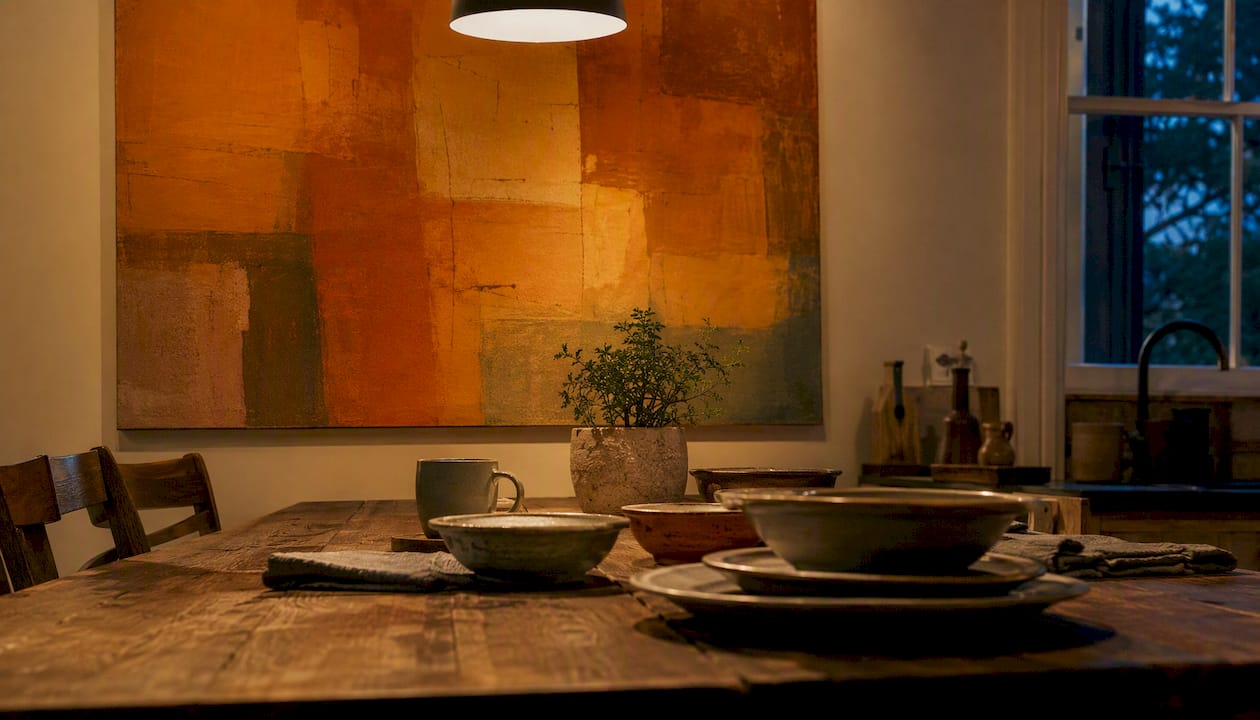
The four choices that most reliably transform a dim room are saturated warm colour, larger-format art, reflective or metallic finishes, and directional lighting aimed at the piece. Your one-line action plan: pick one saturated warm canvas in the right scale for your wall, position a directional lamp or picture light above it, and choose a gloss varnish, metallic pigment, or glazed frame to catch whatever light the room offers.
Three things you can do in under 30 minutes:
- Swap a small framed print for the largest canvas that fits the wall comfortably (more on scale below).
- Add a warm-toned floor lamp or clip-on picture light angled at the artwork.
- Replace a pale, muted frame with a warm gold or burnished brass alternative to reflect ambient light.
Pro Tip: Before buying anything, hold your phone up and photograph the wall under your room’s lamps at night. That image shows you exactly how colours shift in your specific light — and it is the fastest way to rule out pastels before you spend money on them.
Key takeaways
Saturated warm colour, larger-format art, a reflective or metallic finish, and directional warm-white lighting are the four moves that most reliably brighten a low-light room with art.
| Point | Details |
|---|---|
| Choose saturated warm hues | Gold, terracotta, ochre, and vivid teal hold their presence in shadow; pale pastels grey out. |
| Scale up, simplify the composition | One large canvas reads more clearly in dim light than multiple small prints with competing shadow lines. |
| Specify a satin or semi-gloss finish | Varnished or metallic surfaces reflect available light; flat matte finishes absorb it. |
| Use directional warm-white lighting | A 2700–3000K picture light or track spot aimed at 30 degrees produces the largest brightening effect. |
| Commission from Frametheworld | Bespoke sizing, finish selection, and digital mock-ups remove the guesswork for low-light rooms. |
Table of Contents
- Why wall art changes how bright a room feels
- Which colours, tones and finishes work best in dim rooms
- Scale, composition and hanging rules that maximise brightening
- Materials and finishes that help art perform in low light
- How to pair art with lighting, mirrors and surrounding decor
- Practical art ideas by room
- What to ask before buying or commissioning art
- How Frametheworld approaches art for low-light rooms
- A note on why this is worth getting right
- Frametheworld’s custom art for your low-light room
- Sources
Why wall art changes how bright a room feels
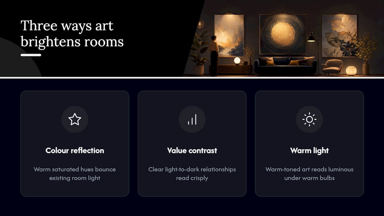
Art changes perceived light through three mechanisms: colour reflection, value contrast, and the way a surface finish catches available light. A canvas with a warm, saturated ground bounces more of the room’s existing light back toward the viewer than a pale, matte print does. The effect is perceptual rather than physical, but it is consistent enough that designers rely on it deliberately.
Shadows are the hidden variable. In a dim room, shadows subdue pigment, which means a colour that looks vivid in a showroom can read as muddy or flat on your wall at 7pm. The fix is not to choose lighter colours — it is to choose more saturated ones. As Sherwin-Williams notes, designer Ellen Divers recommends compensating for shadow by selecting colours that are more pigmented and saturated than you would choose for a sunlit room.
Value contrast matters too. A piece with a clear light-to-dark relationship reads more crisply in dim conditions than one with subtle tonal gradations that blur together when the light drops. Colour temperature is the third factor: warm-toned art (amber, terracotta, gold) reads as luminous under incandescent or warm-LED sources, while cool blues and greys can appear flat or even slightly greenish under the same bulbs. Architectural Digest reports that the right combination of colour, scale, placement and lighting can make wall art materially increase perceived brightness in a room. The role of art in interior design extends well beyond decoration — it is one of the most cost-effective tools for shifting how a space feels.
Which colours, tones and finishes work best in dim rooms
Choose cleaner, more saturated warm hues rather than pale pastels. Gold, terracotta, vivid ochre, burnt sienna, and saturated teal all hold their presence when light levels drop. Muted pastels — dusty pink, pale sage, washed-out lavender — lose their identity in shadow and tend to read as beige or grey by evening.
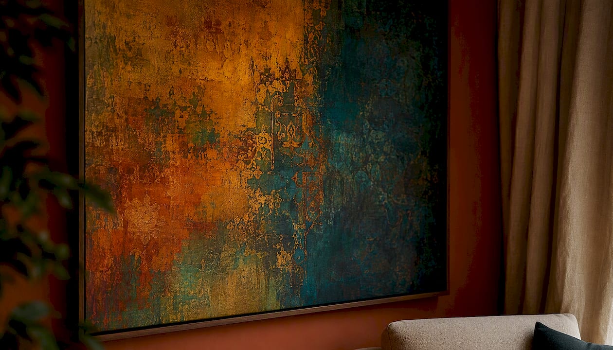
Warm versus cool undertones matter more in a north-facing or windowless room than anywhere else. North-facing rooms receive reflected sky light, which skews blue-grey. A cool-toned artwork (icy blue, silver-grey, pale mint) will amplify that grey cast rather than counteract it. Warm undertones in the artwork — amber, red-orange, golden yellow — push back against the cool ambient light and read as genuinely warm. Elle Decor’s guidance on brightening dark rooms recommends lighter mid-tones and metallic touches for artwork to reflect ambient light and read more clearly in dim spaces.
Colour families that perform well in low light:
- Warm golds and ambers: hold luminosity under incandescent and warm-LED sources.
- Terracotta and burnt sienna: saturated enough to resist shadow without feeling aggressive.
- Deep, saturated teal: works as a cool accent that still carries enough pigment to read clearly.
- Ochre and mustard: among the most forgiving hues in genuinely dim conditions.
Colours to avoid:
- Muted pastels (dusty rose, pale sage, washed lavender) — they grey out.
- Desaturated mid-greys — they disappear into the wall.
- Very dark, low-contrast compositions with no lighter passages — they become invisible.
Pro Tip: Download a free colour-temperature app or simply photograph a paint swatch or art print under your room’s lamps at night. If the colour looks flat or grey in the photo, it will look the same on your wall. Test before you commit.
For guidance on matching art to your interior palette, the undertone of your wall colour is the starting point — art that shares its undertone will blend; art that contrasts it will create the visual tension that reads as brightness.
Scale, composition and hanging rules that maximise brightening
Larger-format art and the correct hanging height create fewer visual interruptions and help a wall read as brighter and more open. A single wide canvas reads more clearly in dim light than a grid of small prints, because each small frame introduces its own shadow line and the eye has to work harder to resolve the composition. Willow & Hall’s practical advice reinforces this: scale often outperforms colour alone, with one larger, simpler image reading far more clearly in dim light than multiple small, detailed prints.
The 2/3 rule and hanging height
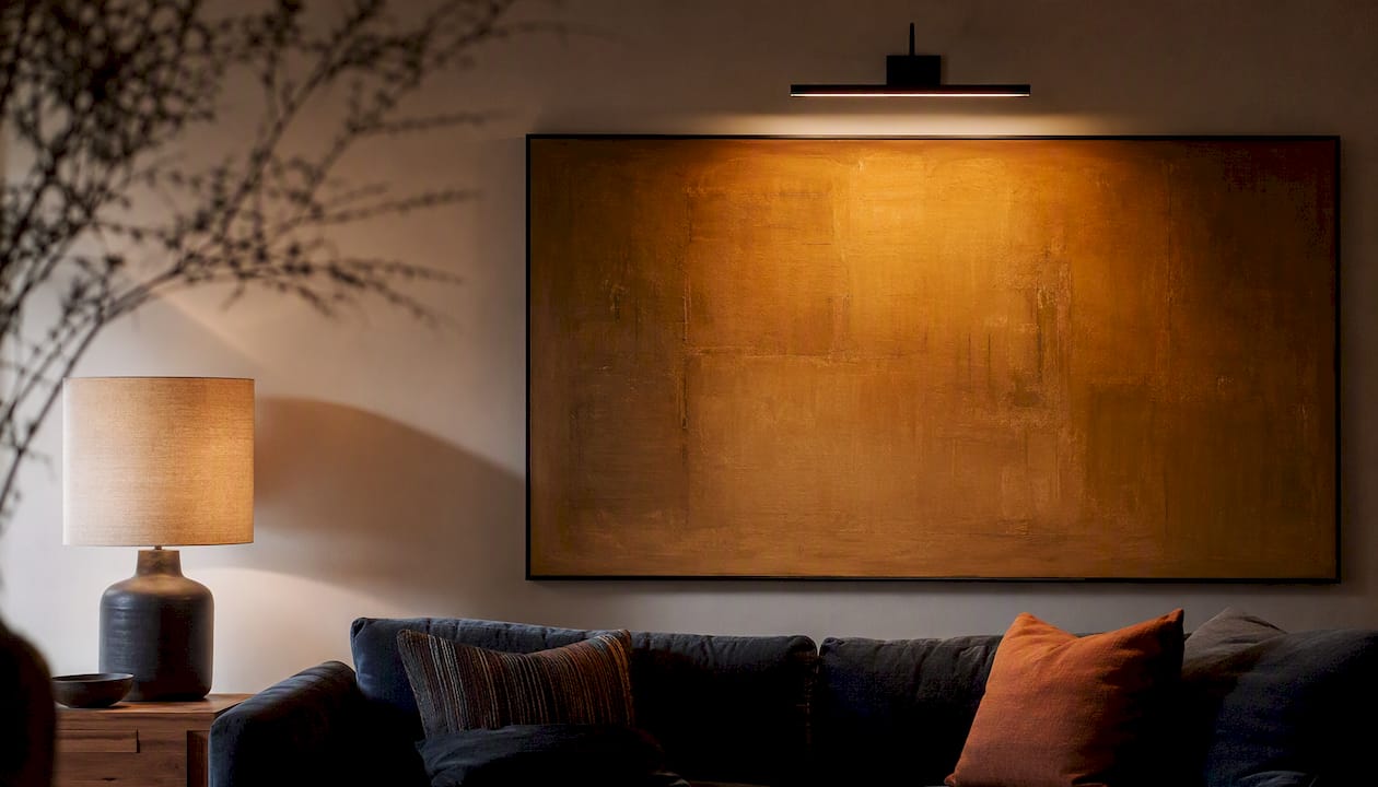
The 2/3 rule is a reliable starting point: the width of your artwork should be roughly two-thirds the width of the furniture or wall section it sits above. In a low-light room, err toward the larger end of that range rather than the smaller. A piece that feels slightly generous in daylight will feel appropriately anchored by evening.
Hanging height is where most people go wrong. The standard recommendation is to hang art so its centre sits at eye level, roughly 145–150cm from the floor. In a low-light room, dropping the centre point by 5–10cm can help: it brings the piece into the zone where lamps and wall lights are most effective, and it reduces the amount of shadow cast above the frame onto the wall. Measure from the floor to the hanging wire or bracket, not the top of the frame.
Composition choices for dim conditions
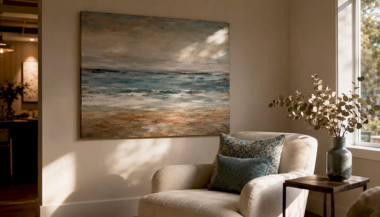
Simple, higher-contrast compositions read more clearly when light levels drop. A single large abstract with a warm ground and a few bold marks will hold its presence at 9pm in a way that a detailed botanical print will not. If you prefer figurative or photographic work, choose pieces with a clear light source within the image itself — a painting of sunlit water, a photograph of a bright interior — because the implied light within the image contributes to the room’s perceived warmth.
For practical display solutions tailored to different room types, the general principle holds: one strong piece beats a gallery wall in a dim room, because each additional frame multiplies the shadow lines.
Materials and finishes that help art perform in low light
Textured hand-painted canvas, metallic pigment, and varnish enhance perceived light more reliably than flat matte photographic prints in genuinely dim rooms. The reason is straightforward: a matte surface absorbs light from every angle, while a textured or varnished surface reflects it directionally, creating micro-highlights that read as luminosity.
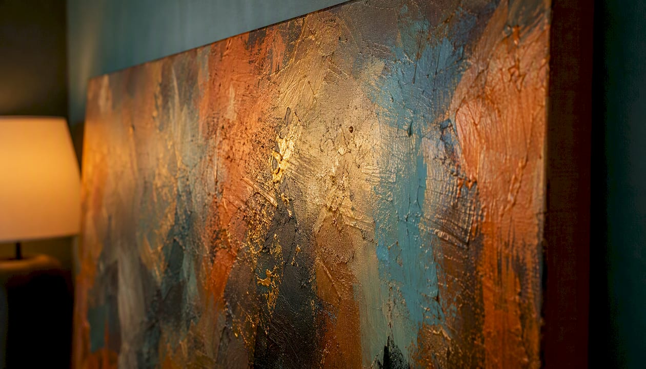
Elle Decor confirms that metallic touches and reflective surfaces in artwork can pick up and reflect ambient light, helping a painting look brighter in a dim room. Contemporary painters working with mica grounds — a fine mineral pigment that shifts appearance with the angle of light — use this property deliberately to produce a shifting luminosity in dim interiors.
The trade-off with reflective finishes is glare. A high-gloss varnish under a direct spotlight can produce a hot spot that obscures the image. The solution is to use a satin or semi-gloss varnish rather than full gloss, and to angle directional lighting at roughly 30 degrees from the vertical rather than straight on. Archival glass and museum-grade acrylic both reduce UV damage, but museum acrylic is lighter and produces less glare than standard glass under directional light — worth knowing if you are framing a print rather than hanging a canvas.
| Material | Reflectance | Glare risk | Best use | Care notes |
|---|---|---|---|---|
| Hand-painted canvas with satin varnish | Medium-high | Low-medium | Most dim rooms; warm or cool palette | Dust with soft cloth; avoid direct moisture |
| Giclée print with UV varnish | Medium | Low | Photographic or detailed work | Keep from direct sunlight to prevent fade |
| Metallic pigment or mica ground | High (directional) | Medium | Feature walls; warm ambient lighting | Do not use abrasive cleaners |
| Framed under museum acrylic | Medium | Low | Prints and works on paper | Wipe with anti-static cloth |
- Ask your supplier for a finish sample or a digital mock-up before committing to a large piece.
- Specify satin or semi-gloss varnish rather than matte when ordering a hand-painted canvas for a dim room.
- If framing under glass, request museum-grade or anti-reflective glass to reduce glare from lamps.
For a deeper look at framing options and materials, the choice of glazing alone can shift how a piece reads under artificial light.
One edge-case worth knowing: glow-in-the-dark or photo-luminescent art can reveal a secondary luminous effect after lights go out, but it requires a charging light source and tends to need brighter room lighting for a full charge in dim daytime conditions — so it is a novelty option rather than a practical brightening solution for most low-light rooms.
How to pair art with lighting, mirrors and surrounding decor
A small amount of directional, warm-CRI lighting aimed at the artwork produces the largest perceived brightening effect of any single intervention. The artwork becomes a lit focal point, and the eye reads the whole wall as brighter because of it.
Practical lighting options:
- Picture lights: mounted directly to the frame or the wall above it; ideal for a single large canvas. Choose a warm-white bulb (2700–3000K) with a CRI of 90 or above to render the artwork’s colours accurately.
- Adjustable wall washers or track spots: more flexible; can be repositioned as you change the art. Angle at roughly 30 degrees from vertical to minimise glare on varnished or metallic surfaces.
- Floor lamps positioned beside the artwork: a warm-toned uplighter beside a large canvas creates a pool of light that reads as part of the composition.
- Avoid cool-white or daylight bulbs (5000K+): they shift warm pigments toward grey and undermine the effect you are trying to create.
Mirrors placed near artwork amplify reflected light and add perceived depth. Kevin Francis Design’s research on decorative mirrors confirms that placing a mirror near artwork can amplify the artwork’s reflectance and perceived brightness. The most effective placement is a large mirror on an adjacent wall rather than directly opposite the art — opposite placement can create a flat, doubled reflection, while an adjacent mirror catches the light from the picture lamp and bounces it across the room.
Gloss paint on the wall behind or beside the artwork also contributes. A satin or eggshell finish on the wall reflects more light than a flat emulsion, and a warm-toned wall colour (deep amber, warm terracotta, rich cream) will interact with the artwork’s pigments rather than compete with them.
Pairing examples:
- Large warm abstract canvas + adjustable track spot at 30 degrees + warm-white 2700K bulb: the most reliable combination for a living room or hallway.
- Metallic mica painting + floor uplighter beside it: produces a shifting luminosity as the ambient light changes through the evening.
- Giclée print under museum acrylic + picture light with 3000K LED strip: clean, gallery-style effect with minimal glare.
Practical art ideas by room
Hallway
The highest-impact move in a hallway is one wide, warm canvas that fills the dominant wall. Hallways are often the darkest space in a home, and a gallery wall of small prints makes them feel more cluttered rather than brighter. Choose a piece with a warm ground — amber, ochre, terracotta — in the largest format the wall can take. A slim brass or warm-gold frame adds reflectance without adding visual weight. A single directional picture light above it does more for the space than any amount of pale paint. Practical small-space decorating advice consistently points to warm hues and larger-scale pieces as the highest-return moves in compact, dim spaces.
Living room
Scale is the priority here. A canvas that covers roughly two-thirds of the sofa or main seating wall anchors the room and gives the eye a clear focal point. Warm, saturated abstracts with metallic or varnished finishes perform particularly well because they shift appearance as lamps come on in the evening. Avoid very dark, low-contrast pieces unless you are pairing them with strong directional lighting — a moody painting in an unlit corner simply disappears.
Bedroom
A large, calming saturated field with metallic highlights works well above the bed. The scale should feel generous: in a standard double bedroom, a canvas of 100–120cm wide reads as intentional rather than lost. Warm ochre, deep teal, or a muted gold ground all hold their presence under bedside lamps. Avoid highly detailed or busy compositions directly above the bed — they create visual noise in a space meant to feel restful.
Kitchen
Kitchens often have task lighting rather than ambient lighting, which means art needs to work harder. A bold, graphic piece with high contrast and warm tones — think vivid ochre, deep red, or a saturated botanical — reads clearly under under-cabinet LEDs or pendant lights. Avoid paper-based prints near steam sources; a canvas with a protective varnish is more practical.
Bathroom
A windowless bathroom is one of the trickiest low-light spaces. The best approach is a single medium-format piece with a metallic or varnished finish, hung at eye level and lit by a warm-toned vanity light. Moisture is the main practical concern: choose a canvas with a sealed varnish finish rather than a paper print, and keep the piece away from direct splash zones. A warm, abstract piece in amber or gold reads as spa-like rather than clinical.
What to ask before buying or commissioning art
Insist on a mock-up, a finish sample, and a clear size template before committing to any piece for a low-light room. Those three things eliminate the most common and expensive mistakes.
Ordered buyer checklist:
- Measure the wall first. Note the width of the wall section and the furniture below it. Calculate two-thirds of that width as your minimum canvas width.
- Request a digital mock-up. Ask the artist or retailer to place the piece on a photo of your actual wall. Most reputable suppliers offer this; if they do not, it is a warning sign.
- Confirm the finish. Specify satin or semi-gloss varnish for a dim room. Ask whether the finish is UV-protective and how it should be cleaned.
- Check light compatibility. Tell the supplier what type of lighting you have (warm LED, halogen, fluorescent) and ask whether the finish and pigments are suited to it.
- Clarify delivery and hanging options. Ask whether the piece arrives ready to hang, what fixings are included, and whether a hanging service is available.
- Understand the return or amendment policy. For a bespoke commission, confirm what happens if the colour or finish does not match expectations once installed.
A short sample request you can send to any artist or retailer:
“I have a north-facing room with warm LED lighting (approximately 2700K). Could you provide a digital mock-up of this piece on a mid-tone wall, and confirm whether the finish is satin or semi-gloss? I’d also like to know the varnish type and whether a finish sample is available before I order.”
For displaying art in small, dim spaces with maximum visual impact, the mock-up step is the single most useful thing you can do before spending money.
How Frametheworld approaches art for low-light rooms
Frametheworld offers bespoke sizing, finish selection, and colour-matching that remove the most common barriers when buying art for a dim or north-facing room. Every piece can be specified to the exact dimensions your wall needs, with a choice of varnish sheen and pigment palette chosen to work with your lighting rather than against it.
The process is straightforward. Share photos of your room, your wall measurements, and the type of lighting you have (bulb temperature, lamp position), and Frametheworld’s team will recommend a size, palette, and finish combination suited to your specific conditions. A digital mock-up is available before production begins, so you can see the piece in context before committing.
What Frametheworld needs to make a strong recommendation:
- A photo of the wall in your room’s typical evening lighting.
- The wall width and the width of any furniture below the hanging position.
- Your bulb type and approximate colour temperature (warm white, cool white, or daylight).
- Any colour preferences or palette constraints from the existing room scheme.
Frametheworld’s hand-painted canvases are produced with archival pigments and finished to your specified sheen level, from matte through to satin and semi-gloss. The art for dark rooms guide on the Frametheworld blog covers the full selection process in detail, including how to brief a commission for a specific light condition.
A note on why this is worth getting right
The rooms that most need good art are usually the ones that get the least attention — the north-facing bedroom, the windowless hallway, the kitchen with no natural light. Choosing the right piece for those spaces is not a luxury decision. A well-chosen canvas in a dim room changes the mood of the space every single evening, which is a return on investment that a new sofa or a coat of paint rarely matches. Perceived warmth and brightness affect how long people want to stay in a room, how relaxed they feel, and — for anyone thinking about resale — how a property photographs and presents to buyers. The effort of getting the colour, scale, and finish right is modest. The difference it makes is not.
Frametheworld’s custom art for your low-light room
Frametheworld produces hand-painted canvases in custom sizes, with finish and colour options chosen specifically for dim or artificially lit rooms. Where a generic print leaves you guessing, a bespoke piece from Frametheworld is specified to your wall dimensions, your lighting type, and your palette — with a digital mock-up before production so there are no surprises on delivery.
The Wabi Sabi collection is a strong starting point for low-light rooms: textured, warm-toned hand-painted canvases that hold their presence under artificial light and develop a quiet luminosity as the evening light changes. For bolder, more saturated options, the colourful paintings collection offers vivid, high-pigment works that resist the greying effect of shadow. Browse both collections at Frametheworld or contact the team directly to discuss a bespoke commission for your specific room.
Sources
- Living style: bringing colors out of the shadow (Sherwin‑Williams)
- How to brighten a dark room (Elle Decor)
- Architectural Digest
- How decorative wall mirrors add light, depth and style (Kevin Francis Design)
- Glow in the dark art (Stella Murals / Shadowlux)


Laat een reactie achter
Deze site wordt beschermd door hCaptcha en het privacybeleid en de servicevoorwaarden van hCaptcha zijn van toepassing.