
TL;DR:
- Following a sequential process, interior art design starts with defining the room’s purpose and measuring space accurately. It then progresses through furniture placement, color selection, lighting, textiles, and finally art and accessories for a cohesive look. Proper sequencing ensures visual harmony, functionality, and a personalized atmosphere while preventing costly mistakes.
Interior art design step by step is a systematic process that begins with defining room purpose and ends with art and accessory placement to create a cohesive, functional home. Professional interior designers call this approach “space planning with layered styling,” and it follows a clear sequence that prevents costly mistakes. Tools like Room Sketch 3D, painter’s tape, and standard ergonomic spacing rules are the backbone of this method. Skip the sequence and you risk beautiful art hanging in a room that simply does not work. Follow it and you get a space that looks considered, feels comfortable, and reflects your personality.
How to start your interior art design step by step
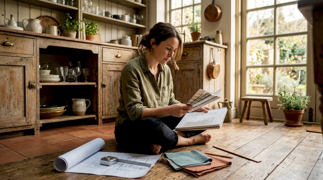
The first step in any step by step room design is defining the room’s purpose. A home office demands clear sightlines and task lighting. A living room needs social flow and comfortable seating distances. Write down the primary function before you buy a single item.
Setting a realistic budget comes next. A common interior design tip is to allocate roughly 10% of your total room budget to accessories, art, and decorative pieces. That figure keeps spending proportional and stops you blowing the budget on a statement print before the sofa is sorted.
Finding your personal style is the third foundation. Browse platforms like Pinterest or Houzz and save images that genuinely appeal to you. After 20 or 30 saves, patterns emerge: you might lean towards Wabi Sabi textures, bold Pop Art colour, or clean Scandinavian lines. That pattern becomes your style brief.
Measuring your space accurately is non-negotiable. Accurate room measurement forms the basis for every layout decision that follows. Record the length, width, and ceiling height, then note every door swing, window frame, and fixed radiator. Missing a radiator position has derailed more than one well-intentioned design.
- Write down the room’s primary function
- Set a total budget and assign 10% to accessories and art
- Identify your style by saving 20–30 reference images
- Measure the room including all permanent features
- Build a digital floor plan using Room Sketch 3D or a similar tool
Pro Tip: Use Room Sketch 3D to visualise your layout before moving any furniture. A digital plan catches proportion errors that are invisible on paper.
How do you plan furniture layout and colour palettes?
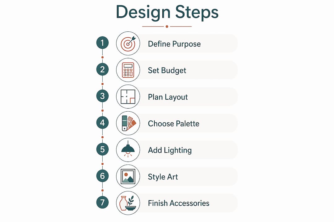
Furniture placement is where beginner interior art projects most often go wrong. The rule is simple: place the largest piece first. In a living room, that is the sofa. Position it to face the room’s natural focal point, whether that is a fireplace, a feature wall, or a large window.
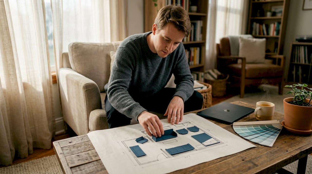
Secondary furniture follows ergonomic spacing standards. Standard ergonomic spacing advises 16–18 inches clearance between a sofa and a coffee table, and roughly 18 inches of breathing room around other tables. These numbers exist because they match how people actually move and reach. Ignore them and the room feels cramped even when it looks fine in photographs.
Colour palette selection works best when kept controlled. Choose one dominant colour, one secondary colour, and one accent. The 60-30-10 rule is the industry standard: 60% dominant (walls, large furniture), 30% secondary (curtains, rugs), 10% accent (cushions, art, accessories). This ratio creates harmony without making a room feel flat.
The rule of thirds applies to both art placement and furniture arrangement. Divide the wall or surface into thirds horizontally and vertically, then position focal points at the intersections. This is the same compositional principle used in photography and painting, and it works equally well in physical space.
| Element | Spacing standard | Why it matters |
|---|---|---|
| Sofa to coffee table | 16–18 inches | Comfortable reach and leg room |
| Table to walkway | 18 inches minimum | Clear circulation path |
| Art centre height | 145–150cm from floor | Aligns with average eye level |
| Frame to frame gap | 5–8cm | Cohesive gallery wall appearance |
Pro Tip: Cut paper templates to the exact size of your furniture pieces and arrange them on a scaled floor plan. You will spot awkward gaps and blocked doorways before lifting anything heavy.
When should you layer lighting, rugs, and accessories?
Lighting and art come late in the design timeline, and that sequencing is deliberate. Lighting is added in step 8, rugs and textiles in step 9, and accessories and art in step 10. Adding them earlier means you are decorating around incomplete furniture decisions, which leads to mismatched scales and wasted purchases.
Lighting works in three layers: ambient, task, and accent. Ambient lighting provides general illumination (ceiling fixtures, recessed lights). Task lighting serves specific activities (reading lamps, under-cabinet strips). Accent lighting highlights art and architectural features (picture lights, directional spotlights). Layering different lighting types transforms how a room feels more than furniture or decor alone. A dimmer switch on ambient lighting is one of the highest-return investments in any room.
Rugs define zones within open-plan spaces. The front legs of all seating should sit on the rug, not float beside it. A rug that is too small makes furniture look like it is hovering. Curtains hung close to the ceiling and extending beyond the window frame make ceilings feel taller and windows feel larger.
Accessories are the final creative layer. Grouped accessories arranged in odd numbers, such as three or five pieces, create natural visual movement and avoid static, symmetrical displays. Vary the heights and materials within each grouping: a tall vase, a mid-height candle, and a low stack of books reads as intentional rather than accidental.
- Use three lighting layers in every room: ambient, task, and accent
- Add a dimmer to ambient circuits for instant atmosphere control
- Anchor rugs so front furniture legs sit on the rug surface
- Hang curtains close to the ceiling, not the window frame
- Group accessories in threes or fives with varied heights and textures
- Include at least one plant or botanical element for visual softness
Pro Tip: Plants, including artificial varieties like IKEA’s FEJKA range, reduce psychological stress by engaging the brain visually. A single plant in a corner softens hard lines without requiring maintenance.
How to style and hang art for maximum impact
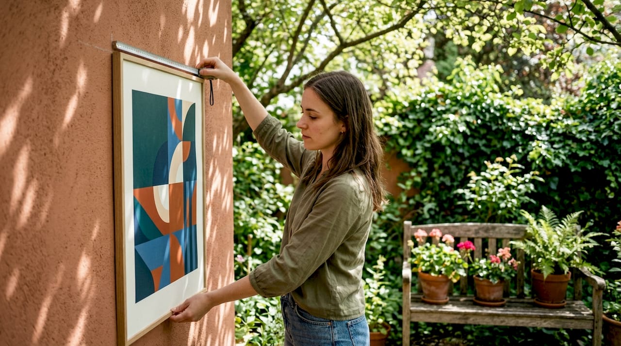
Art placement is the step where creative interior design ideas either come together or fall apart. The industry standard for hanging art is to centre the piece at 145–150cm from the floor. That height aligns with average eye level and is the same standard used by commercial galleries worldwide. Hanging art too high is the single most common mistake in residential interiors.
For gallery walls, consistent frame spacing of 5–8cm creates a cohesive arrangement. Wider gaps make the grouping look scattered. Tighter gaps make it look crowded. The sweet spot sits between those two extremes and applies regardless of frame size or style.
- Choose a “springboard” piece: the largest or most visually dominant artwork in the collection
- Centre the springboard piece at 145–150cm from the floor
- Arrange remaining frames on the floor first to test the composition
- Use painter’s tape to outline the arrangement on the wall before hammering nails
- Maintain 5–8cm gaps between frames throughout the arrangement
- Step back and assess from the room’s main entry point before committing
Balancing art with furniture matters as much as the art itself. A large artwork above a sofa should not exceed the sofa’s width. A small print above a king-size bed looks lost. Use the art selection checklist from Frametheworld to match scale, colour, and style before purchasing.
| Approach | Best for | Common mistake |
|---|---|---|
| Single statement piece | Focal walls, above sofas | Hanging too high or too small |
| Gallery wall | Stairwells, dining rooms | Inconsistent spacing or random heights |
| Diptych or triptych | Bedrooms, corridors | Gaps too wide, breaking the visual unit |
| Shelf display | Alcoves, home offices | Overcrowding with no breathing room |
Pro Tip: Before hanging a single nail, read Frametheworld’s guide on styling a gallery wall. The floor-layout method alone will save you hours of repositioning.
What are the most common pitfalls in interior art design?
The most frequent mistake in artistic home decor is prioritising aesthetics over daily function. Good design first resolves movement, sightlines, and daily routines before focusing on how things look. A beautiful arrangement that blocks a natural walkway will irritate you every single day.
Clutter is the second major pitfall. The difference between a curated room and a cluttered one is ruthless editing. Editors recommend removing half the objects on any shelf or surface before adding anything new. That principle sounds extreme until you try it and see how much breathing room it creates.
“The best rooms have something to say and know when to stop.” This principle applies directly to art collections: a few well-chosen pieces carry more weight than a wall covered in prints competing for attention.
Shelving displays benefit from the rule of thirds and varied heights. Grouping objects in varied heights and materials following the rule of thirds creates intentional, balanced displays. Mix a tall sculptural piece with a mid-height framed print and a low decorative object. The variation creates rhythm without chaos.
- Never fill every shelf and surface: leave 30–40% of shelf space empty
- Rotate accessories seasonally to keep the room feeling fresh without buying more
- Edit existing art collections before adding new pieces
- Check that every decorative object earns its place by adding colour, texture, or meaning
- Avoid matching sets: slight variation in frames, materials, and scales reads as collected rather than purchased
Key takeaways
Interior art design step by step works because it follows a fixed sequence: purpose and measurement first, furniture and colour next, then lighting and textiles, and finally art and accessories last.
| Point | Details |
|---|---|
| Define purpose before buying | Establish the room’s function and budget before selecting any furniture or art. |
| Measure everything first | Accurate room dimensions, including doors and fixed features, prevent costly layout errors. |
| Follow ergonomic spacing | Keep 16–18 inches between sofa and coffee table and 18 inches around other tables for comfortable flow. |
| Hang art at eye level | Centre artwork at 145–150cm from the floor and maintain 5–8cm gaps in gallery arrangements. |
| Edit before you add | Remove half the objects from any surface before introducing new pieces to avoid visual clutter. |
Why the sequence matters more than the style
I have worked with enough rooms to know that the sequence is the design. Homeowners who skip straight to art selection almost always end up with beautiful prints that fight the furniture, clash with the lighting, or hang at the wrong height on the wrong wall. The process feels slow at the start, but every step you take in order saves you from an expensive reversal later.
The detail that surprises most people is how profoundly frame height affects perception. Moving a piece from 160cm down to 147cm can make a ceiling feel taller and a room feel calmer. That is not a small adjustment. It is the difference between a room that feels right and one that feels slightly off without anyone knowing why.
My honest advice is to spend more time on the floor plan and the editing stage than on the shopping stage. The most striking rooms I have seen are not the ones with the most art. They are the ones where every piece has space to breathe, every grouping has a clear logic, and the lighting makes the whole arrangement come alive after dark. Patience and a willingness to remove things are the two most underrated skills in interior design.
For practical guidance on art placement principles, Frametheworld’s resource library is worth bookmarking before you start any new room project.
— Lennard
Wall art collections to complete your interior design
Frametheworld offers curated collections that align directly with the layered design approach covered in this guide. The Wabi Sabi wall art collection features hand-painted abstract textures and imperfect forms that work beautifully as springboard pieces in gallery walls or as single statement works above a sofa. For homeowners drawn to bold colour and graphic energy, the Pop Art collection delivers vibrant, hand-painted retro and modern pieces that anchor contemporary interiors with confidence. Both collections are browsable by size, style, and format, making it straightforward to match scale and proportion to your specific wall dimensions. Frametheworld also offers bespoke and customisation options for projects that need something entirely specific.
FAQ
What height should art be hung at?
The industry standard is to centre artwork at 145–150cm from the floor. This aligns with average eye level and is the same standard used in commercial galleries.
How far apart should frames be in a gallery wall?
Maintain a consistent gap of 5–8cm between frames. Wider gaps make the arrangement look scattered; tighter gaps make it look crowded.
When should I add art and accessories to a room?
Art and accessories come last in the design sequence, after furniture, colour palettes, lighting, rugs, and textiles are all in place. Adding them earlier leads to scale and colour mismatches.
How do I avoid a cluttered look with decorative objects?
Remove at least half the objects from any shelf or surface before adding anything new. Leave 30–40% of shelf space empty to give each piece visual breathing room.
What is the best way to plan a gallery wall without damaging the wall?
Arrange the frames on the floor first to test the composition, then use painter’s tape to outline each frame’s position on the wall before hammering any nails.


Leave a comment
This site is protected by hCaptcha and the hCaptcha Privacy Policy and Terms of Service apply.