

TL;DR:
- Choosing art styles involves matching your personal aesthetic to your home’s character to create a cohesive space.
- Use a style recipe of three descriptive words to guide your selection and avoid impulse buys.
Selecting art styles is a deliberate process of matching your personal aesthetic to your home’s character, not a matter of picking whatever fills a blank wall. The right art style shapes a room’s emotional tone, reinforces your interior design, and expresses who you are. This guide covers how to select art styles with confidence, from defining your personal taste to understanding popular art styles and avoiding the most common mistakes homeowners make.
How to identify your personal aesthetic before choosing art styles
Your personal aesthetic is the foundation of every good art selection. Without it, you end up buying pieces that feel disconnected from each other and from your home.
Start by reflecting on the colours, moods, textures, and shapes you are naturally drawn to. Look at your wardrobe, your favourite rooms in other people’s homes, and the environments where you feel most at ease. These preferences are consistent signals, not random.
A practical method is to build a style recipe using three descriptive words. Write down five words that describe your ideal aesthetic, then cut two. The remaining three become your filter. Words like “calm, organic, minimal” point you towards soft abstract prints or nature-inspired photography. Words like “bold, graphic, urban” steer you towards geometric flat art or editorial line work.
Pro Tip: Use your style recipe as a strict shopping rule. If a piece does not match at least two of your three words, put it back. This single habit prevents impulse buys that clutter rather than define a space.
- Write your three style words on your phone notes app so they are always with you when browsing.
- Pull images from Pinterest, Frametheworld, or design magazines and look for patterns in what you save.
- Notice which rooms in hotels or restaurants make you feel good, then describe why in three words.
- Test your recipe against pieces you already own. If your favourite print does not match your words, refine the words, not the print.
Personal style preferences develop through reflection and evolve over time. This means your recipe is a living tool, not a permanent label.
What are the key contemporary art styles and which suits you?
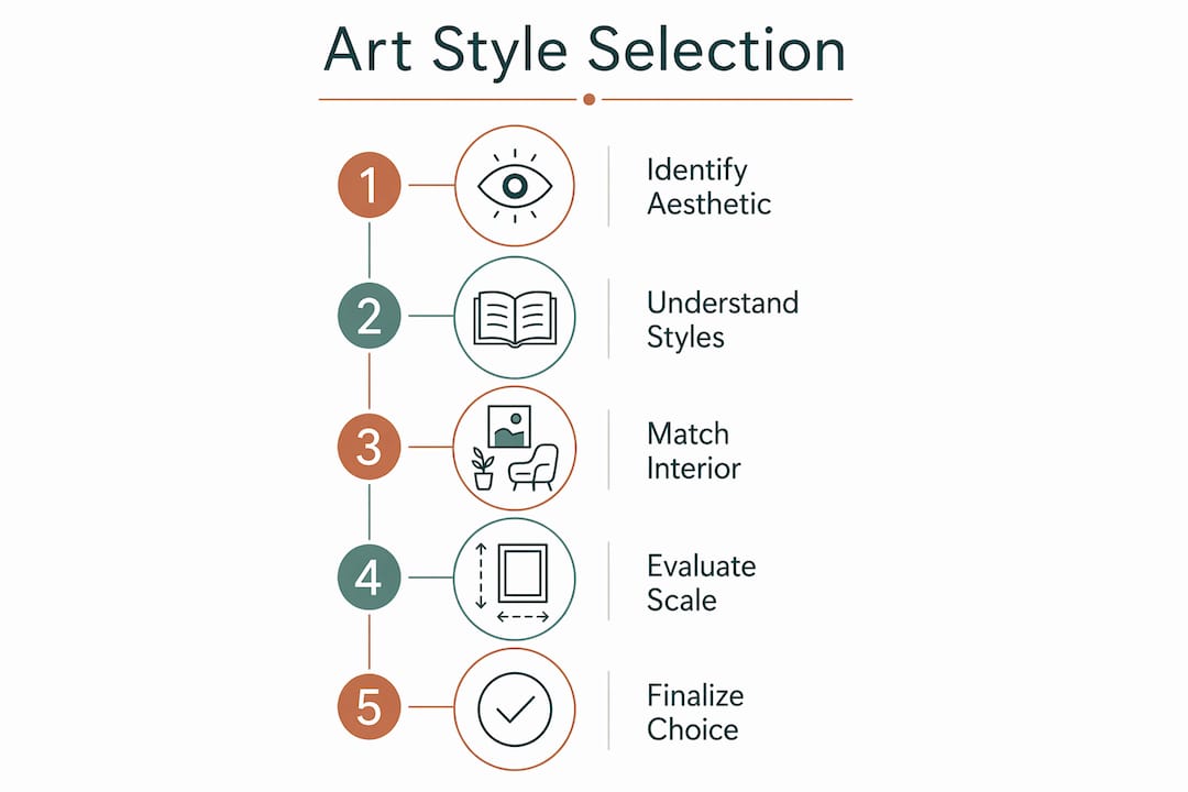
Understanding different art styles removes the guesswork from choosing. Each style carries a distinct emotional register and suits specific interior personalities.

| Art style | Visual character | Emotional tone | Best suited to |
|---|---|---|---|
| Doodle / Hand-drawn | Loose lines, playful marks | Warm, approachable, human | Family homes, creative studios |
| Geometric Flat | Clean shapes, flat colour blocks | Ordered, confident, modern | Minimalist or corporate-inspired interiors |
| Editorial Line Art | Sparse, precise linework | Sophisticated, restrained | Contemporary living rooms, home offices |
| Abstract | Expressive marks, layered colour | Emotional, atmospheric | Bohemian, eclectic, or gallery-style spaces |
| Photorealistic Collage | Mixed photography and illustration | Layered, narrative, urban | Loft spaces, creative or industrial interiors |
| Memphis-inspired | Bold geometry, clashing colour, pattern | Energetic, retro, playful | Maximalist rooms, accent walls |
| Wabi Sabi | Natural textures, imperfection, muted tones | Calm, grounded, authentic | Relaxed, organic, or Japandi-style homes |
Design industry guidance recommends using a decision matrix that links art styles with personality archetypes. Human-centred spaces suit Doodle and Hand-drawn styles. Premium or enterprise-inspired interiors favour Geometric Flat and Editorial Line Art. This framework removes subjectivity from the process and gives you a clear starting point.
Abstract art sits in the middle of the spectrum. It works across many interior types because its meaning is open. The risk is that it can feel generic if chosen without intention. Pair abstract prints with specific colours or textures from your existing decor to anchor them.
Memphis-inspired art is the most polarising choice. It demands commitment. One Memphis print in a neutral room creates a focal point. Several create visual noise. Use it as a single statement piece rather than a collection.
Practical criteria for selecting art styles that complement your interior
Your style recipe and your knowledge of art styles are tools. The next step is applying them to your actual space.
Match art style families to your interior design theme first. Minimalist interiors pair naturally with Editorial Line Art or Geometric Flat. Bohemian rooms absorb Abstract and Hand-drawn styles without effort. Japandi or wabi sabi interiors call for muted, textured pieces with natural imperfection. When the art style family aligns with the interior theme, cohesion happens without force.
Art should be integral to space design from the start, not added at the end as decoration. This is the single most practical shift you can make. When you plan a room, place art in the brief alongside furniture and colour. Art chosen early shapes the room’s personality. Art chosen last fills gaps.
Pro Tip: Before buying a large piece, tape paper to the wall at the intended size. Live with it for two days. Scale problems become obvious immediately, and you avoid expensive returns.
Large artwork requires a clearly defined sightline and balance achieved through colour, form, and contrast with surrounding decor. A large canvas on a bare wall works. The same canvas competing with a busy gallery wall does not.
| Selection criterion | What to check |
|---|---|
| Style recipe match | Does the piece match at least two of your three style words? |
| Interior theme alignment | Does the art style family suit your room’s design theme? |
| Scale and sightline | Is the piece proportionate to the wall and visible from the natural viewing point? |
| Colour dialogue | Does the art share at least one colour or tonal value with the room? |
| Emotional register | Does the piece create the mood you want in that specific room? |
Production investment also influences selection. Some styles, such as 3D rendering or photorealistic collage, carry higher production costs and therefore higher price points. Geometric flat and editorial line art are often available as quality prints at accessible prices. Knowing this helps you allocate budget across a home rather than spending everything on one room.
Frametheworld’s art selection checklist covers these criteria in a structured format for each room type, which is useful when you are working through multiple spaces at once.
Common mistakes to avoid when choosing art styles for your home
Most art selection errors come from treating art as decoration rather than design. Recognising these patterns saves money and prevents rooms that feel assembled rather than considered.
“Impactful interiors typically include authentic art that provides an unexpected perspective or emotional dimension.” — Vogue Adria
The most common trap is decorator art: choosing pieces purely because they match the sofa colour or the curtain fabric. Matching is not the same as harmonising. A piece that simply echoes existing colours adds nothing to a room. A piece that introduces a new tone or texture while sharing the room’s emotional register adds depth.
- Do not choose art styles based on trends alone. A Memphis print that feels current in 2026 may feel dated in three years. Your style recipe is a better guide than any trend report.
- Avoid using artist names as your only reference point when describing what you want. Descriptive phrases yield more precise results than blunt artist references. “Loose gestural marks in muted earth tones” is more useful than “like Basquiat” when communicating with a gallery or browsing a collection.
- Do not lock your preferences in place permanently. Art style preferences evolve through exposure and reflection. A style recipe that served you three years ago may need updating. Revisit it annually.
- Avoid adding art as an afterthought. Art shapes personality and emotional resonance in interiors. Treating it as the last purchase in a room means it will always feel like a finishing touch rather than a defining element.
The goal is not a perfectly uniform home. Harmony allows individuality. One piece that introduces tension or surprise in an otherwise cohesive room is a sign of confidence, not a mistake. Frametheworld’s guide on selecting art by style explains how cohesion and individuality can coexist without conflict.
Key takeaways
Selecting art styles with intention, using a personal style recipe and a clear understanding of art style families, is the most reliable method for creating a home that feels both cohesive and authentic.
| Point | Details |
|---|---|
| Build a style recipe | Narrow your aesthetic to three descriptive words and use them as a strict filter when buying art. |
| Match style families to interiors | Align art style categories with your interior design theme before considering individual pieces. |
| Plan art early | Introduce art at the start of interior planning so it shapes the room rather than filling gaps. |
| Avoid decorator art | Choose pieces that add emotional depth, not just colour matching with existing furniture. |
| Let preferences evolve | Revisit your style recipe annually as your taste develops through exposure and reflection. |
Art selection is more personal than most guides admit
Most art advice focuses on rules: scale, proportion, colour theory. Those things matter. But the deeper truth is that selecting art for your home is an act of self-knowledge, and most people have not done the groundwork.
I have seen beautifully furnished rooms that feel empty because the art was chosen last, in a hurry, from a single shop. The furniture is considered. The lighting is considered. The art is an afterthought. It shows immediately.
The style recipe exercise sounds simple, almost too simple. But in practice, having three words that describe your aesthetic changes how you browse. You stop being attracted to everything and start being selective. That shift is the difference between a home that looks collected and one that looks assembled.
The other thing worth saying is that tension is not a problem. A room that is entirely cohesive can feel inert. One piece that surprises you, that does not quite fit the formula but feels right, is often the piece that makes the room memorable. Trust that instinct when it appears. It usually means you have found something genuinely expressive rather than merely decorative.
Start with your three words. Apply them consistently. Then allow one exception per room. That exception is usually the piece people remember.
— Lennard
Discover art styles that suit your home at Frametheworld
If your style recipe points towards calm, organic, or grounded aesthetics, wabi sabi wall art is worth exploring. Wabi sabi art embraces natural imperfection, muted tones, and tactile textures. It suits Japandi interiors, relaxed living rooms, and any space where you want warmth without clutter. Frametheworld’s wabi sabi wall art collection brings together hand-painted abstract textures and nature-inspired pieces that work across a range of interior styles. Use your style recipe to filter the collection and find pieces that genuinely fit your space. For broader guidance on pairing art with your existing interior, Frametheworld’s advice on matching art with interiors covers scale, colour, and placement in practical detail.
FAQ
What is a style recipe and how does it help with art selection?
A style recipe is a set of three descriptive words that define your personal aesthetic. It acts as a filter when browsing art, helping you reject pieces that do not fit and commit to those that do.
Which art style suits a minimalist home?
Geometric Flat and Editorial Line Art suit minimalist interiors best. Both styles use clean forms and restrained colour, which complement rather than compete with spare, uncluttered spaces.
Should I choose art to match my furniture colour?
Matching art to furniture colour alone produces decorator art that adds nothing to a room. Art should harmonise with the room’s emotional tone and introduce some depth or contrast, not simply echo existing colours.
When in the design process should I choose art?
Art should be chosen at the start of interior planning, not at the end. Art selected early actively shapes the room’s personality rather than filling gaps left by other decisions.
How do I describe an art style I want without naming an artist?
Use descriptive phrases that capture visual and emotional qualities. “Loose gestural marks in muted earth tones” or “precise linework with minimal colour” communicates your intent more clearly and reliably than referencing a specific artist’s name.


Laat een reactie achter
Deze site wordt beschermd door hCaptcha en het privacybeleid en de servicevoorwaarden van hCaptcha zijn van toepassing.