
TL;DR:
- Proper art display involves precise measurements, high-quality lighting, and secure hardware for preservation. Homeowners should hang artwork at 57–60 inches and ensure proper spacing and lighting to create gallery-quality arrangements. Planning layouts with templates and secure fixings prevents damage and achieves a cohesive, intentional display.
An expert art display guide defines how to position, light, and secure artworks at home to achieve gallery-quality presentation and preservation. The gap between a wall that looks cluttered and one that looks curated comes down to three things: measurement, lighting, and hardware. This art display guide 2026 covers all three with the precision that museums use and the practicality that homeowners need. From the 57–60 inch hanging rule to LED lighting with a Colour Rendering Index above 90, the techniques here apply whether you are arranging a single statement piece or a full gallery wall.
What are the key measurements for hanging art effectively?
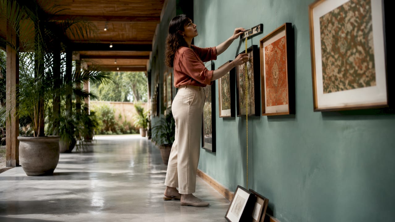
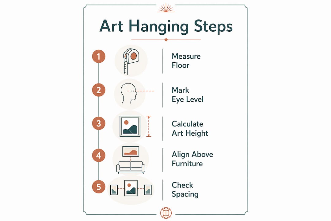
The centre of any artwork should sit 57–60 inches from the floor. This aligns with average eye level and matches the standard used by museums worldwide. Sixty inches is the ideal mark for a standing viewer; 57 inches works better in rooms where people spend more time seated.
When art hangs above furniture, the width and gap ratio matters as much as height. The artwork should span 60–75% of the furniture’s width below it. A sofa that is 200 centimetres wide calls for art between 120 and 150 centimetres wide. The vertical gap between the top of the furniture and the bottom of the frame should sit at 6–12 inches. This gap preserves a visual connection between the two without making the art feel bolted to the furniture.
Common hanging mistakes to avoid
The single most common error is hanging art too high. People instinctively push pieces upward, especially on tall walls, which breaks the visual link between art and the room below. The second mistake is ignoring scale. A small print on a large wall reads as an afterthought, not a choice.
Pro Tip: Tape a piece of paper the same size as your artwork to the wall before you drill anything. Stand back, sit down, and walk past it. You will know within thirty seconds whether the placement is right.
| Placement rule | Measurement |
|---|---|
| Ideal centre height | 57–60 inches from floor |
| Art width above furniture | 60–75% of furniture width |
| Gap above furniture | 6–12 inches |
| Tight gallery wall spacing | 2–4 inches between frames |
| Loose gallery wall spacing | 6–10 inches between frames |
How does lighting enhance and preserve your artworks?
Lighting is both a storytelling device and a conservation tool. The right light makes colours sing. The wrong light fades pigments and flattens texture within years.
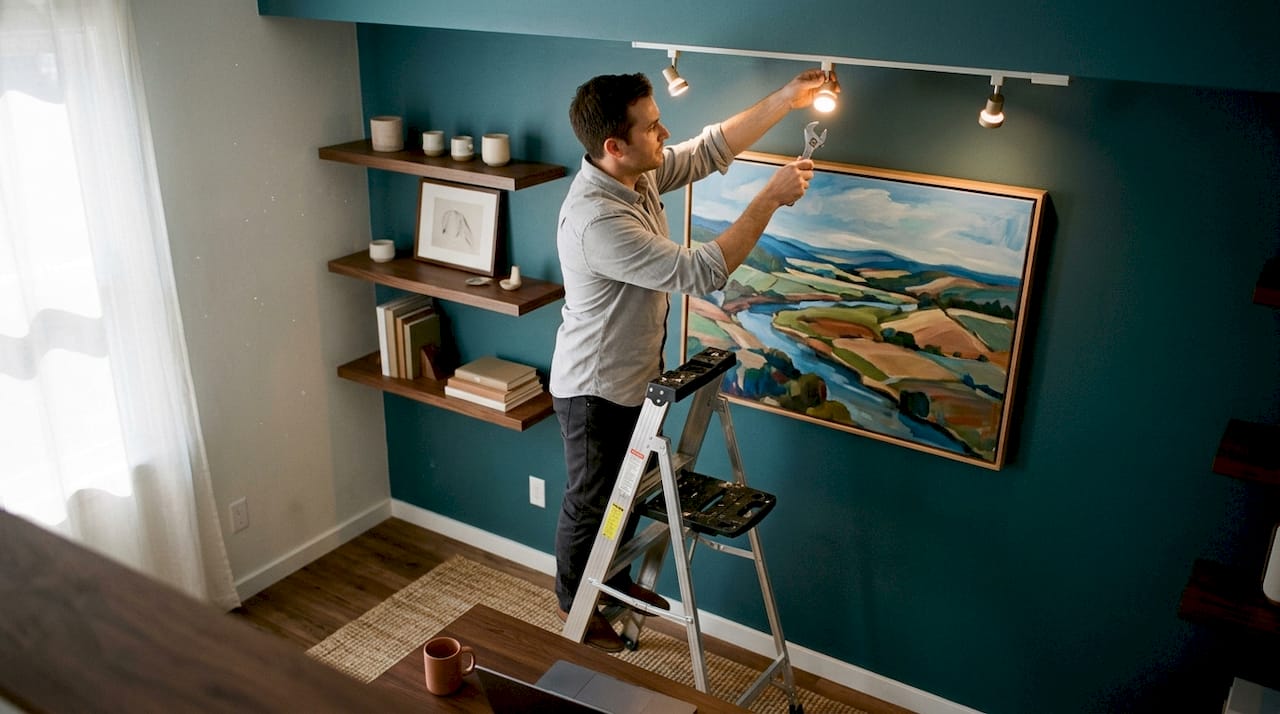
LED bulbs with a CRI of 90 or higher deliver the most accurate colour rendering with minimal UV output. CRI measures how faithfully a light source reveals colour compared to natural daylight. A CRI below 80 shifts warm tones and muddies blues. For sensitive works on paper or fabric, keep light intensity at 5–10 foot-candles. Oil paintings on canvas tolerate slightly more.
Practical lighting choices for 2026
The role of lighting in home remodels has shifted significantly as LED technology has matured. Picture lights, adjustable track lighting, and recessed directional spots all work well for art. The key is angle. Position fixtures at 30 degrees from vertical to reduce glare and hotspots on glazed or varnished surfaces.
- Use LED bulbs rated CRI 90–95 for accurate colour and low UV output
- Set light intensity to 5–10 foot-candles for works on paper, textiles, or photography
- Angle fixtures at 30 degrees from vertical to eliminate glare on glazed frames
- Choose adjustable colour temperature bulbs (2,700–3,000K for warm rooms, 3,500K for neutral spaces)
- Avoid positioning lights directly above a piece, which creates harsh shadows at the bottom
Pro Tip: Dimmer switches cost very little and give you full control over mood and intensity. Pair them with adjustable track heads and you have a lighting rig that rivals a commercial gallery.
What hardware and installation techniques keep art safe?
Choosing the wrong fixings is the fastest way to damage both your art and your walls. The first step is always to assess the weight of the frame and the material of the wall behind it.
For any artwork over 10 pounds, heavy-duty anchors or stud mounting are non-negotiable. Plasterboard alone will not hold a heavy frame reliably over time. Hitting a wall stud gives you a fixing point that can hold far more weight and will not work loose with seasonal movement in the building fabric.
A step-by-step installation method
Professional installers follow a clear sequence. Skipping steps is where amateur installations go wrong.
- Weigh the frame and identify the wall material (plasterboard, brick, or timber stud)
- Locate studs with a stud finder or use a strong wall anchor rated above the frame’s weight
- Mark the hanging point with a pencil, not a pen
- Create a paper template of the frame and tape it to the wall at the correct height
- Confirm the centre sits at 57–60 inches from the floor before drilling
- Use two fixing points for any frame wider than 40 centimetres to prevent tilting
- Check level with a spirit level after hanging, not before
“Plan the layout carefully with templates before you make a single hole. Drill-as-you-go is the most expensive approach in the long run.” — Colorado Art Services
Pro Tip: For a gallery wall with multiple frames, cut paper templates for every piece and arrange them on the floor first. Photograph the layout, then transfer it to the wall using the photo as your reference.
Planning your layout on the floor before drilling prevents the crooked arrangements and excess holes that plague rushed installations.
How do you compose a gallery wall with intention?
A gallery wall works when you treat the entire group as a single visual object, not a collection of individual pieces. The eye should read the arrangement as one composition before it reads the individual frames.
Spacing consistency is the foundation. Tight clusters use 2–4 inches between frames. Looser, more relaxed arrangements use 6–10 inches. Mixing both within one wall creates visual noise. Pick one approach and apply it throughout.
Symmetrical vs asymmetrical arrangements
Symmetrical gallery walls suit formal rooms: dining rooms, entrance halls, and studies. They use matching or mirrored frame sizes arranged around a central axis. Asymmetrical arrangements suit living rooms and bedrooms, where a more relaxed, collected feel fits the function of the space. Both approaches work. The mistake is starting without a plan.
- Use three or more different frame sizes for visual depth
- Centre the overall arrangement at 57–60 inches, not each individual piece
- Test the full layout on the floor before touching the wall
- Consider the room’s architecture: chimney breasts, alcoves, and doorways all create natural frames for art
- Mix media (paintings, prints, photography) to add texture and prevent the wall from feeling flat
Pro Tip: Photograph your floor layout from standing height. This gives you a preview close to what the wall will look like and lets you make adjustments without any commitment.
For more ideas on 2026 wall art arrangements, Frametheworld’s blog covers the formats and styles gaining traction this year.
What are the top art display trends for homeowners in 2026?
The dominant shift in art display ideas 2026 is the move toward intentional, conservation-aware presentation. Homeowners are no longer treating art as decoration. They are treating it as an asset worth protecting and presenting properly.
LED lighting with smart controls is the single biggest technical change. Systems that allow you to adjust colour temperature and intensity from a phone mean that the same wall can look warm and intimate in the evening and crisp and gallery-like during the day. This flexibility suits the way people actually use their homes.
Mixing media is the most visible stylistic trend. Walls that combine oil paintings, photographic prints, and textile works read as curated rather than accumulated. The colour choices in wall art are also shifting, with earthy neutrals and bold accent pieces appearing together rather than in separate rooms.
- Smart LED systems with app control for colour temperature and intensity
- Mixed media gallery walls combining paintings, prints, and photography
- Sustainable framing materials including recycled timber and acid-free mounts
- Bold statement pieces on otherwise plain walls, replacing busy multi-frame arrangements
- Art integrated with furniture groupings rather than treated as a separate wall feature
The 2026 interior design art trends tracked by Frametheworld show a clear appetite for pieces that feel personal and considered rather than mass-produced and generic.
Key takeaways
Effective art display in 2026 requires precise measurements, conservation-grade lighting, proper hardware, and deliberate composition, applied together rather than in isolation.
| Point | Details |
|---|---|
| Hang at the right height | Centre artwork at 57–60 inches from the floor to match museum standards and eye level. |
| Match art width to furniture | Art above furniture should span 60–75% of the furniture’s width for visual balance. |
| Use LED lighting with high CRI | Choose bulbs rated CRI 90–95 to render colour accurately and protect art from UV damage. |
| Plan before you drill | Use paper templates on the floor to finalise gallery wall layouts before making any holes. |
| Choose hardware for the weight | Use wall anchors or stud fixings for any frame over 10 pounds to prevent damage and ensure safety. |
Why the rules are a starting point, not a finish line
I have seen beautifully measured installations that feel cold, and I have seen instinctive arrangements that stop people in their tracks. The measurements in this guide are not arbitrary. The 57–60 inch rule exists because it works for most people in most rooms. But most is not all.
The mistake I see most often is homeowners applying one rule in isolation. They nail the hanging height but ignore the furniture scale. Or they get the lighting right but drill without a template and end up with a crooked cluster. Professional installation blends precise measurement with spatial judgement. You read the room, consider how people move through it, and then apply the numbers.
Lighting is the element people underestimate most. A piece that looks flat under a warm incandescent bulb can become extraordinary under a well-angled LED track light. Good lighting does not just illuminate. It shapes how the viewer reads the work. Spend as much time on your lighting plan as you do on your hanging plan.
My honest advice: learn the rules, apply them as a baseline, and then trust your eye. Walk into the room at different times of day. Sit in the chair you actually use. The art should work for the life you live in the space, not for a photograph of it.
— Lennard
Frametheworld’s collections for your 2026 display
Frametheworld offers hand-painted originals and curated print collections that are ready to hang and built to display well. The Wabi Sabi wall art collection suits the earthy, textured aesthetic that defines 2026 interior trends, with abstract pieces that work as single statements or within a gallery arrangement. For homeowners who want something bolder, the Pop Art collection delivers high-contrast, hand-painted pieces that hold their own on large walls. Both collections are browsable by size and format, making it straightforward to find a piece that fits the measurements and proportions covered in this guide.
FAQ
What height should art be hung at?
The centre of any artwork should sit 57–60 inches from the floor. This matches average eye level and the standard used by museums and professional installers.
How wide should art be above a sofa?
Art above a sofa should span 60–75% of the sofa’s width. A 200-centimetre sofa calls for art between 120 and 150 centimetres wide to maintain visual balance.
What CRI rating is best for lighting art?
Use LED bulbs with a CRI of 90 or higher. This rating delivers accurate colour rendering and produces minimal UV output, which protects art from fading over time.
How do I plan a gallery wall without damaging the wall?
Cut paper templates the same size as each frame and arrange them on the floor first. Once you are satisfied with the layout, tape the templates to the wall and use them as drilling guides.
What spacing should I use between frames on a gallery wall?
Use 2–4 inches between frames for a tight, cohesive cluster. Use 6–10 inches for a looser, more relaxed arrangement. Apply one spacing consistently across the entire wall.


Laat een reactie achter
Deze site wordt beschermd door hCaptcha en het privacybeleid en de servicevoorwaarden van hCaptcha zijn van toepassing.