
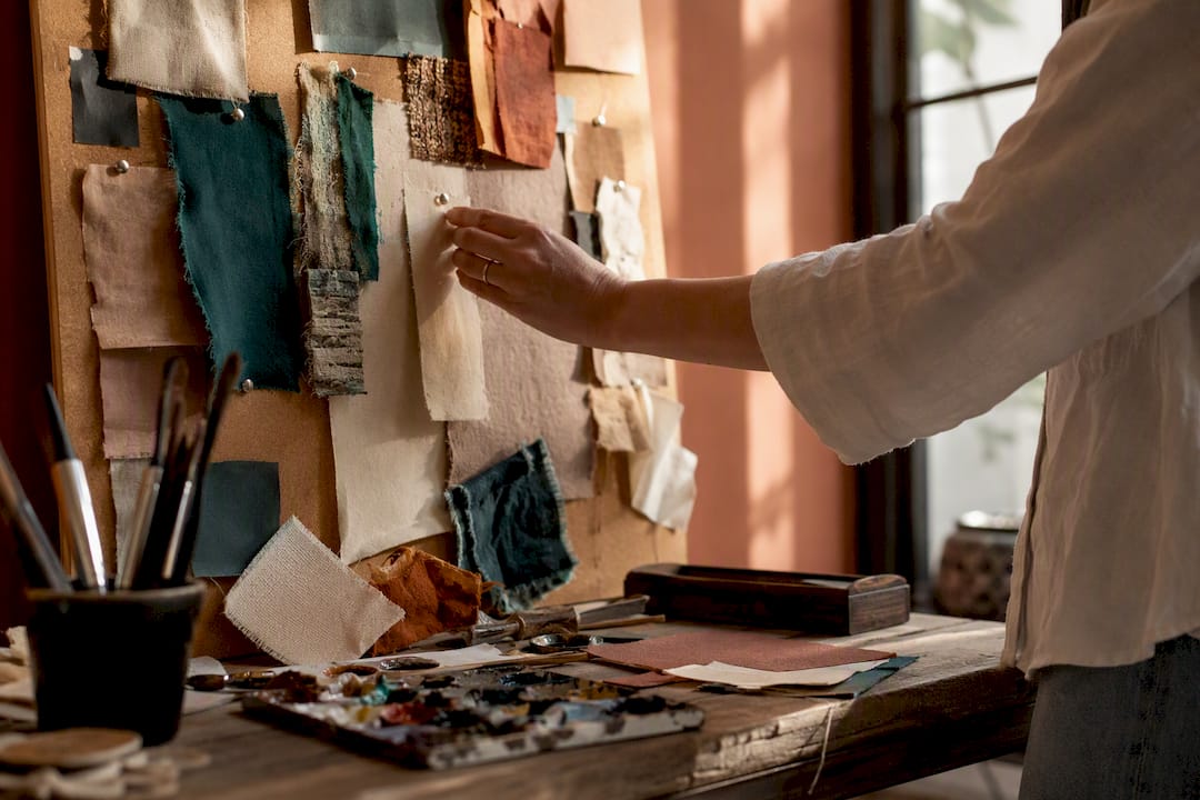
An art mood board is a curated collection of images, colour swatches, textures and sketches that fixes the palette, mood and compositional direction of a piece before you touch a brush or a camera. It works as a visual brief, whether you’re pitching a client, prepping a portfolio, or just trying to get out of your own head.
Need a starting point? Pick one of these and build from there:
- Monochrome texture study — one colour, five surfaces, endless tonal variation.
- Series colour story — the palette that ties a body of work together.
- Material swatch collage — fabric, paper, paint chips, actual bark.
- Photographic composition study — framing and light references only.
- Portfolio series board — the narrative thread for a GCSE or degree submission.
- Cinematic grade board — colour grading pulled from film stills.
- Nature close-up board — macro shots of pattern and texture in the wild.
- Abstract mark-making board — gestures, drips, scratches, nothing figurative.
Physical boards suit hands-on studio work; digital ones win when you need to share or revise fast.
Key Takeaways
A mood board earns its place only when it fixes palette, scale and intent clearly enough that someone else could act on it without asking you a single question.
| Point | Details |
|---|---|
| Start with a sentence | Write your intended vibe in one line before collecting any images. |
| Cap your references | Keep to 10 to 15 strong images rather than dozens of weak ones. |
| Use the rule of thirds | Place your focal image or swatch on a third-line intersection for balance. |
| Match format to purpose | Build physical for tactile studio work, digital for sharing and revisions. |
| Translate palette to scale | Check how your dominant colour reads at full canvas size before committing. |
Table of Contents
- Art mood board ideas: choosing physical or digital formats
- Twelve art mood board ideas with layout notes
- Rule of thirds and other layout tricks for mood boards
- Digital tools and templates for building your board
- Turning a mood board into a real art selection (Frametheworld’s checklist)
- Mistakes that quietly ruin a mood board
- What the research actually tells us about mood boards
- Sources
Art mood board ideas: choosing physical or digital formats
Physical boards give you something a screen can’t: actual texture. Pin a scrap of hessian next to a paint swatch and you’ll see the colour shift in a way no monitor reproduces. They’re brilliant for studio walls, where you glance up mid-brushstroke and recalibrate. The downside is portability. You can’t email a corkboard to a client in Leeds.
Digital boards solve that instantly. Adobe Express recommends a simple workflow: define your goal, choose a format, gather assets, then design and refine. Export as a PDF or shareable link and a client or assessor sees it in seconds, and you can rearrange it fifty times without wasting a single pin.
For a physical board you need almost nothing: see this guide to home decor fabric selection for stunning results when choosing fabric scraps to add tactile samples to your mood board.
- A cork or foam board, roughly A2
- Printed images, magazine tears, fabric scraps
- Masking tape or pins (avoid permanent glue until you’re certain of the layout)
- A handful of paint swatches or Pantone chips
Pro Tip: Build the first draft physically, even if you’ll digitise it later. Moving paper by hand forces decisions your cursor lets you avoid.
Choose physical when you’re deep in studio practice and want tactile feedback. Choose digital when the board needs to travel, get approved, or evolve over several sittings.
Twelve art mood board ideas with layout notes
Here’s a working bank of themes, each with what to collect, a focal point, and roughly how many pieces to gather. Design roundups suggest 15 to 25 strong references is the sweet spot before a board starts feeling cluttered rather than curated.
- Monochrome texture study — Collect concrete, linen, rust, skin, and paper in one hue. Focal point: the texture with the most contrast. Layout: grid of nine, or a single large hero shot with eight supporting swatches.
- Series colour story — Pull five to seven colours that recur across a planned body of work. Focal point: the dominant colour block. Layout: horizontal strip beneath a central reference image.
- Material swatch collage — Fabric, paper stock, foil, sand. Focal point: the material you’ll actually paint or print onto. Layout: overlapping tiles, no gaps.
- Photographic composition study — Reference shots that show framing, not subject. Focal point: your strongest crop. Layout: rule-of-thirds grid overlay.
- Portfolio series board — For GCSE or A-level submissions, 10 to 15 images that trace one idea’s development. Focal point: your final piece sketch. Layout: chronological left to right.
- Cinematic grade board — Film stills chosen purely for colour grading, as StudioBinder’s roundup demonstrates for lighting and tone decisions. Focal point: the darkest and lightest frame side by side.
- Textile and pattern study — Weaves, prints, embroidery close-ups. Focal point: the pattern with the boldest repeat. Layout: tiled swatch wall.
- Nature close-up board — Bark, lichen, feathers, water surfaces. Focal point: whichever shot has the most unexpected colour. Layout: circular cluster around a centre image.
- Typography and lettering board — Hand-lettering, signage, old typefaces. Focal point: one letterform you want to riff on. Layout: vertical column.
- Historical reference board — Period paintings, archive photography, old adverts. Focal point: the piece closest to your intended era. Layout: timeline strip.
- Abstract mark-making board — Drips, scratches, brush tests, no recognisable imagery. Focal point: the most gestural mark. Layout: scattered, deliberately asymmetric.
- AI-assisted concept mashup — Generated imagery blended with your own sketches to test unlikely combinations fast. Focal point: the version closest to your gut instinct. Layout: side-by-side comparison columns.
Pin these to a studio wall while you work, drop them into a client pitch deck, or slot the strongest three into a portfolio’s opening page.
Rule of thirds and other layout tricks for mood boards
The rule of thirds divides a frame into nine equal sections using two horizontal and two vertical lines; placing your key image or swatch on one of those intersections creates a board that feels balanced rather than static. It’s a film and photography staple, but it works exactly as well on a corkboard.
Visual hierarchy matters just as much as placement:
- Make the focal image roughly twice the size of anything else on the board.
- Use contrast, not just size, to draw the eye: a saturated swatch against muted textures pulls focus instantly.
- Leave genuine negative space around your hero image rather than crowding every inch.
- Group colours by temperature or intensity so intent reads at a glance, not after a minute of squinting.
A board where every element competes for attention tells the viewer nothing. One clear focal point, positioned on a third, tells them everything in under five seconds.
Digital tools and templates for building your board
Milanote offers templates built specifically for visual artists, and it handles mixed media well: images, colour swatches, even short video clips sit on the same canvas, which suits iterative, collaborative work. Canva and Adobe Express are the faster options when you need a clean, presentable board without a learning curve, both popular with students preparing coursework. Pinterest remains useful purely for gathering raw inspiration before you commit to a layout. Figma suits anyone already comfortable with design software who wants pixel-level control over spacing and grids.
Pick a template based on what you’re making:
- Grid template for texture studies or swatch collages, where uniformity helps.
- Storytelling template (left to right, chronological) for portfolio series boards.
- Comparison column template for cinematic grades or AI mashups where you’re weighing options side by side.
Export as a PDF for assessors, or a shareable link for clients who might want to comment directly.
Turning a mood board into a real art selection (Frametheworld’s checklist)
A mood board is only useful once it turns into an actual decision, whether that’s a final piece, a room’s art selection, or a client commission. Before you brief anyone, run through this:
- Translate the palette to scale: does the dominant colour work as a two-metre canvas, or only as a small detail?
- Choose size and orientation based on the wall or page it’s destined for, not the mood board’s own proportions.
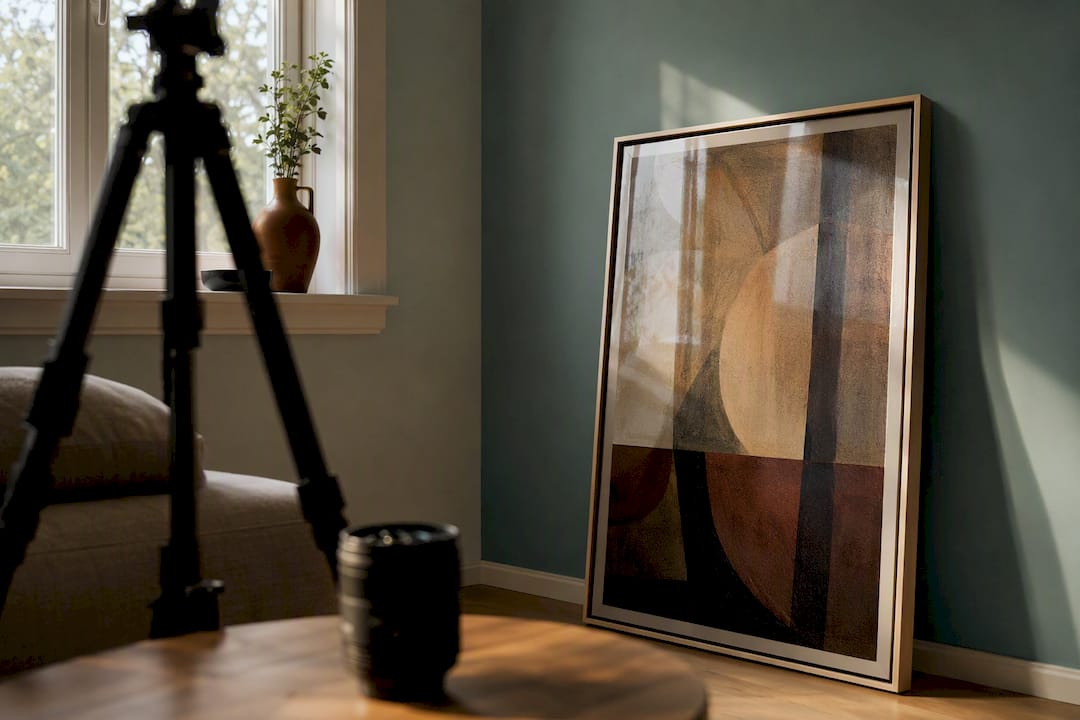
- Consider framing and the surrounding wall colour, since a board built on a white background can mislead you about how a piece will read against terracotta or deep teal walls.
- Annotate the board with a single sentence describing the intended vibe, so anyone briefing a commission or an installer isn’t guessing.
Practical guides on artist practice often suggest starting with a written phrase or word map before collecting a single image, which keeps the board reflecting your own intent rather than just whatever’s trending. Frametheworld builds bespoke commissions directly from client mood boards, translating a texture-led board into a hand-painted piece, or a bold colour story into something closer to pop art. If your board leans tactile and abstract, browsing wabi-sabi wall art shows roughly where that direction lands once painted.
Pro Tip: Photograph your mood board in the actual room’s lighting before finalising a commission brief. Studio light and living-room light disagree more often than you’d expect.
Mistakes that quietly ruin a mood board
Too many styles on one board is the most common fault. Fix it by cutting to one dominant aesthetic and treating anything else as a maybe-later note elsewhere. An unclear palette is the second: if you can’t name your five colours out loud, the board isn’t finished. Add explicit swatches rather than letting colour hide inside busy images.
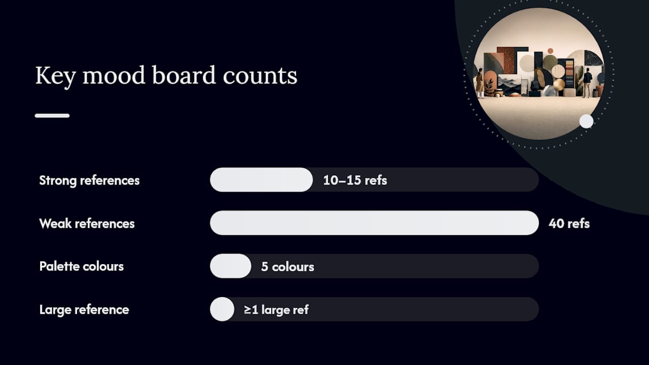
Ignoring scale trips up more portfolios than it should. A board full of tiny thumbnails hides whether a composition actually works at size, so include at least one large reference.
Before sharing, check the board against this:
- 10 to 15 strong references, not 40 weak ones
- A single sentence describing the overall vibe
- Visible palette swatches, not colour buried in photographs
For assessors, keep the board tight and let the annotation carry the narrative. For clients, add more context images and a slightly larger reference set, since they’re less familiar with your shorthand.
What the research actually tells us about mood boards
Most advice on this topic treats mood boards as a purely aesthetic exercise, a scrapbook with better lighting. That undersells them. The boards that actually change outcomes, whether that’s a portfolio mark or a client sign-off, are the ones that function as decisions already half made: palette fixed, scale considered, one sentence of intent attached.
The conventional wisdom oversells volume. Piling in forty reference images feels productive, but assessors and clients read confidence into restraint. Ten sharp, deliberately chosen images beat forty scraped from a Pinterest scroll, every time.
If you take one thing from this, prioritise the palette swatch and the single-sentence description over the picture-hunting. Most people default to collecting images first and figuring out what they mean later. Flip that order. Decide the vibe in a sentence, then hunt for images that prove it, and the board practically assembles itself. The rule of thirds and the grid templates matter, but only once you know what you’re actually trying to say.
— Lennard
Sources
- Be inspired by these mood board ideas | Adobe Express
- Visual Art Moodboard Template
- Rule of thirds — Wikipedia
- 15 Mood Board Examples in Film, Art, and Design

Leave a comment
This site is protected by hCaptcha and the hCaptcha Privacy Policy and Terms of Service apply.