
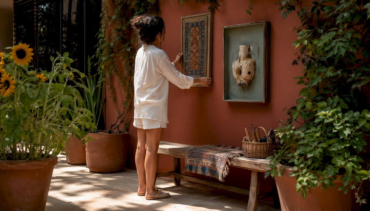
Mixing art themes works best when you treat contrast and cohesion as partners rather than opposites. The goal is not to match everything perfectly but to find the threads that connect pieces across different styles, periods, and formats. Get that balance right and a wall of seemingly unrelated artworks reads as deliberate and characterful rather than chaotic.
How to mix art themes: the core principles
A few principles do most of the work when you are combining art styles across a display.
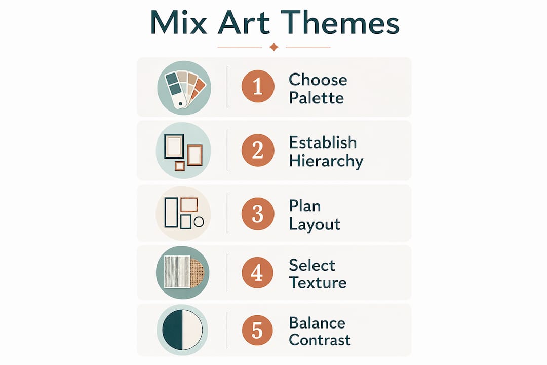
- Limit your colour palette. Restricting shared tones to two or three across all pieces is the single most reliable way to unify a diverse collection. It does not matter if one work is abstract and another figurative; shared colour pulls them into the same conversation.
- Cap the number of major styles. A small number of dominant styles tends to produce clearer visual cohesion, while too many may reduce clarity. Two styles blend; three can work with care; beyond that, the display loses clarity.
- Assign dominance and accent roles. One style should lead, with others playing supporting parts. Think of it as a hierarchy: a primary visual language sets the tone, and secondary pieces add texture or contrast without competing for attention.
- Separate structure from surface. Composition, scale, and geometry are structural. Colour, texture, and brushwork are surface. You can mix these independently, which gives you far more control than treating each artwork as a fixed, unchangeable object.
- Use shared mood or motif as a binding thread. Pieces that share a feeling, a recurring subject, or a cultural reference hold together effectively even when their styles differ markedly.
- Embrace deliberate imperfection. Successful mixed collections feel curated rather than coordinated. A slight tension between pieces adds character; the aim is a layered narrative, not a showroom.
How do you curate and position wall art across multiple themes?
Selection and placement are where principles become practice. Choosing the right pieces is only half the task; where and how you hang them shapes whether the mix reads as intentional.
- Look for complementary motifs, not matching styles. A botanical print and an abstract landscape share a reference to the natural world even if their techniques are entirely different. That shared subject is enough to justify placing them together.
- Use consistent framing to create visual order. Uniform frame colours or materials act as a quiet grid that holds eclectic pieces in place. Black frames on works from three different genres will read as a considered collection rather than a jumble.
- Apply scale and proportion deliberately. Anchor a mixed display with one larger, dominant piece, then build around it with smaller works at varying heights. Balanced focal points and varied scale guide the eye naturally from one piece to the next.
- Create a visual pathway. Leading lines within individual works, or the arrangement of pieces across a wall, can direct attention in a specific sequence. A diagonal arrangement often feels more dynamic than a rigid grid.
- Integrate sentimental pieces without breaking the theme. A personal photograph or inherited print does not have to disrupt a carefully considered display. Reframe it to match the dominant frame style, or position it at the edge of the arrangement where it reads as a personal accent rather than a focal point.
Pro Tip: Lay your planned arrangement on the floor before committing to wall fixings. You will spot proportion problems and awkward gaps far more easily at ground level than by eye on the wall.
The art selection process itself benefits from a structured approach. Frametheworld’s art selection checklist is a practical starting point for homeowners building a mixed display from scratch.
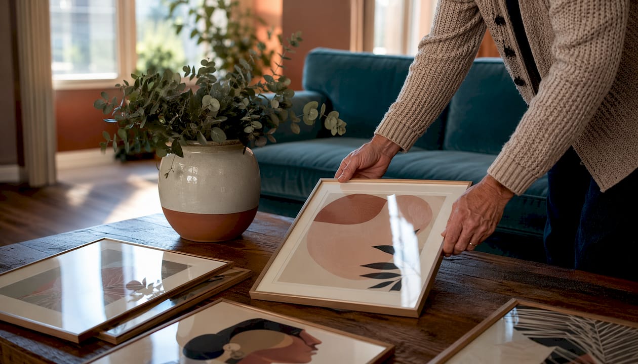
Strategies for blending varied art styles and formats
Paintings, prints, and sculptural wall pieces each bring different qualities to a display. Mixing formats adds genuine depth, but only when the combination is guided by a clear unifying logic.
- Balance bold with subtle. A large, high-contrast Pop Art print needs quieter neighbours. Pair it with pieces that share one of its colours but carry less visual weight, so the bold work anchors the display without overwhelming it.
- Use texture and material contrasts thoughtfully. A hand-painted canvas alongside a photographic print creates an interesting surface tension. The key is that both should share at least one colour or tonal quality, otherwise the contrast tips from interesting into jarring.
- Unify diverse media through colour or thematic links. A ceramic wall piece, a framed print, and an oil painting can coexist when they share an earthy palette or a recurring motif such as geometric forms or organic shapes.
- Avoid overloading a single wall. Three or four well-chosen pieces with clear relationships will always outperform eight pieces crammed together. Negative space is not wasted space; it gives each work room to register.
- Think about visual contrast in wall art as a tool, not a problem. The tension between a rough-textured abstract and a clean-lined geometric print is what makes a display interesting. Managed contrast creates energy; unmanaged contrast creates noise.
For homeowners looking to push their displays further, Frametheworld’s guide to wall art ideas for urban interiors covers mixed-media arrangements in detail.
What does a successful art theme combination actually look like?
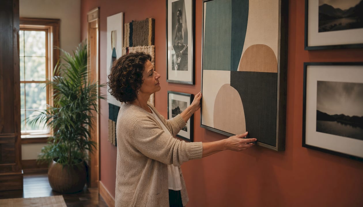
Practical examples make the principles concrete. These pairings work consistently well in home settings.
| Combination | What unifies them | Best placement |
|---|---|---|
| Wabi Sabi + Pop Art | Shared bold colour accents against neutral grounds | Living room feature wall |
| Abstract expressionism + botanical prints | Organic forms and natural colour palettes | Hallway or study |
| Monochrome photography + geometric prints | Tonal restraint and strong line work | Bedroom or home office |
| Cultural or folk motifs + contemporary abstracts | Shared pattern language and earthy tones | Dining room or kitchen |
| Vintage illustration + modern typography | Flat colour fields and graphic clarity | Kitchen or utility space |
Wabi Sabi and Pop Art is the combination that surprises people most. Wabi Sabi’s textured imperfection and muted, organic surfaces sit alongside Pop Art’s bold, graphic energy in a way that feels genuinely dynamic. The trick is colour: pull one accent tone from the Pop Art piece and echo it in the Wabi Sabi work, whether through a warm terracotta, a dusty sage, or a deep ochre. That single shared colour is enough to make the pairing feel considered rather than accidental.
A limited palette does the heavy lifting in most successful combinations. Two pieces from entirely different periods and traditions will read as a pair when they share a warm grey or a particular shade of blue. Cultural and historical motifs add another layer of richness: a work referencing Japanese aesthetics alongside a piece with European folk patterns creates a dialogue that rewards closer attention.
Scent can reinforce the atmosphere a mixed art display creates. Choosing room-specific fragrances that echo the mood of your art, earthy and woody for a Wabi Sabi scheme, bright and citrus for a Pop Art-led space, deepens the overall sensory experience of a room.
Frametheworld’s approach to mixing art themes
Frametheworld’s curatorial philosophy starts from the idea that a home’s art collection should tell a story, not just fill wall space. That means thinking about thematic narrative from the outset: what mood does this room need to carry, and which combination of styles, textures, and formats will build it?
The platform’s collections are organised by style and theme precisely to make this kind of intentional selection easier. Browsing by mood or colour family rather than by individual piece helps homeowners identify which works share enough DNA to sit together. Frametheworld’s customisation options take this further, allowing buyers to request bespoke pieces that match a specific palette or motif already present in a room, so a new work arrives ready to integrate rather than compete.
Lennard, whose expertise informs much of Frametheworld’s editorial content, consistently emphasises one point: the most successful mixed displays are built around two or three clear decisions made early, a dominant colour, a shared format, a recurring motif, and then executed with restraint. The temptation to keep adding pieces is where most displays go wrong. Fewer, better-chosen works, with clear relationships between them, produce a result that feels genuinely curated.
Frametheworld’s Wabi Sabi collection and Pop Art range are both strong starting points for homeowners wanting to experiment with contrasting styles. Both collections include pieces at a range of scales, making it straightforward to build a balanced, mixed display without commissioning bespoke work.
Key takeaways
Mixing art themes successfully comes down to three early decisions: a shared colour palette, a clear style hierarchy, and a unifying motif or mood that connects pieces across different genres and formats.
| Point | Details |
|---|---|
| Limit your colour palette | Two or three shared tones across all pieces reliably unify diverse styles. |
| Cap major style influences | Limit major style influences to two or three for clarity. More than three risks muddiness. |
| Use consistent framing | Uniform frame colours hold eclectic pieces together and signal a deliberate collection. |
| Assign dominance and accent roles | One style should lead; secondary pieces add texture or contrast without competing. |
| Anchor with scale | One larger focal piece, supported by smaller works at varied heights, creates natural visual flow. |

Laat een reactie achter
Deze site wordt beschermd door hCaptcha en het privacybeleid en de servicevoorwaarden van hCaptcha zijn van toepassing.