
TL;DR:
- Choosing large artworks with light backgrounds and slim frames instantly brightens a dim room. Reflective surfaces, appropriate lighting, and scale enhance perceived space and luminosity. Custom art from Frametheworld allows precise tailoring to optimize dark spaces effectively.
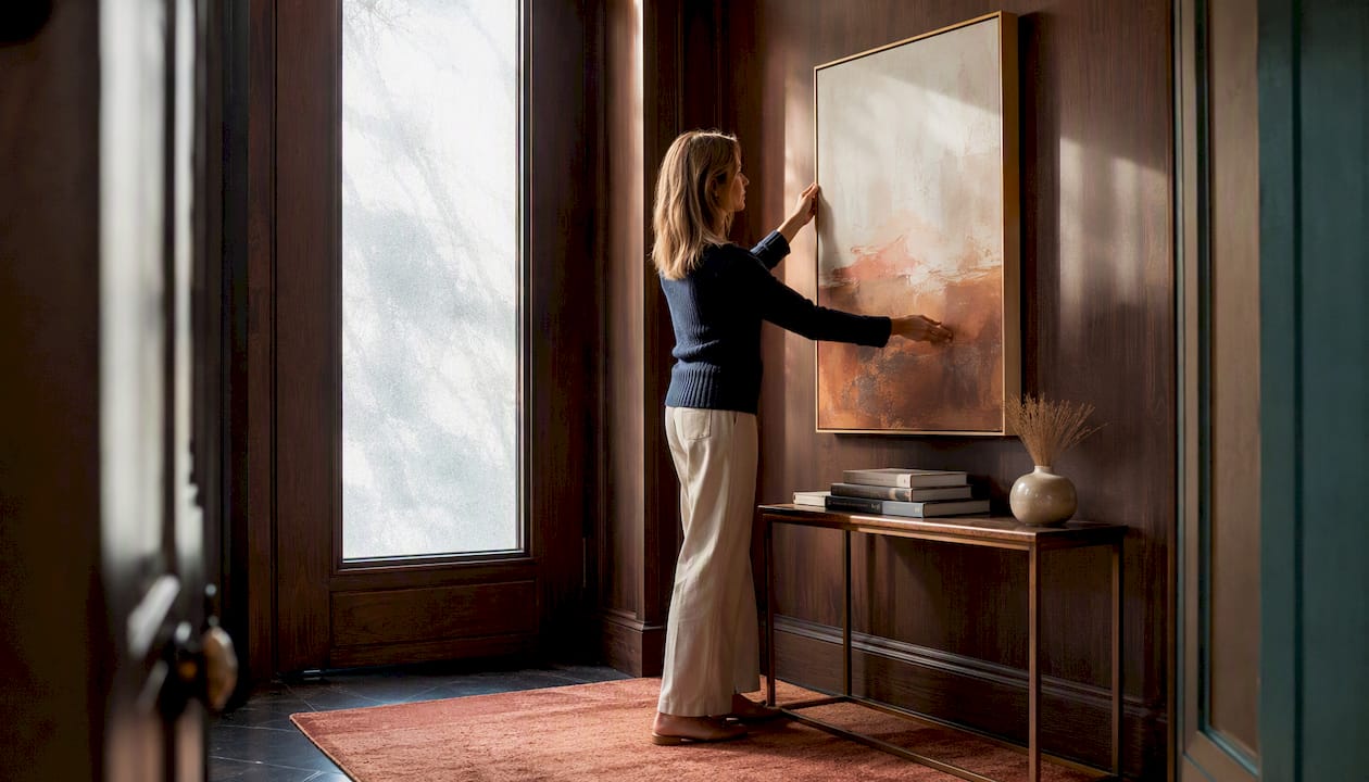
The single most effective move in a dimly lit room is a large canvas with a predominantly light or warm-neutral background, ideally with soft metallic or gloss accents that bounce available light back into the space. Everything else builds from that starting point.
Quick actions that make an immediate difference:
- Choose light backgrounds. Off-white, warm cream, pale sage, or soft gold grounds reflect ambient light rather than absorbing it.
- Go bigger, not busier. One large piece reads better at a distance and opens up the wall; a cluster of small dark-framed prints does the opposite.
- Add controlled sheen. Varnished canvases, metallic leaf accents, or gloss-finish prints scatter light across the surface.
- Swap heavy frames. Replace wide dark mouldings with slim white, pale wood, or brushed aluminium profiles.
- Integrate targeted lighting. A picture light or directional LED spot aimed at the artwork doubles as functional accent lighting for the whole room.
- Consider backlit or LED-integrated panels for rooms with no natural light at all, such as internal hallways or basement studies.
Frametheworld.co.uk offers hand-painted canvases that can be commissioned in any palette and scale, making it straightforward to specify exactly the light-background tones your room needs. For broader inspiration on how art choices shape a room’s atmosphere, Elle Decor’s room-brightening guide and IKEA’s practical advice on windowless rooms both confirm the same fundamentals: reflective surfaces, lighter tones, and deliberate scale.
TL;DR: Large, light-background art with a slim pale frame and a dedicated picture light is the fastest route to a brighter-feeling room.
Table of Contents
- Why does art change a room’s perceived brightness?
- Which art types and styles work best in low-light rooms?
- What colours and tones actually work in a dim space?
- What size and placement rules maximise the brightening effect?
- Which frames, materials and finishes help most?
- How do you pair art with lighting and other decor?
- Room-by-room art ideas for hallways, living rooms, bedrooms, kitchens and bathrooms
- What should you ask before buying or commissioning art?
- How Frametheworld solves the dim-room art problem
- Key takeaways
- The thing most people get wrong about art in dark rooms
- Frametheworld: custom art made for your room’s light
- Useful sources
Why does art change a room’s perceived brightness?
Art affects how bright a room feels through three overlapping mechanisms: light reflection, focal hierarchy, and perceived depth.
A canvas with a predominantly pale or warm ground reflects ambient light back into the room rather than absorbing it. High-gloss surfaces and mirrored elements bounce light in the same way; conversely, heavy dark fabrics and clustered dark art absorb it and make the room feel smaller. The difference between a varnished pale canvas and a matte dark print on the same wall can be striking.
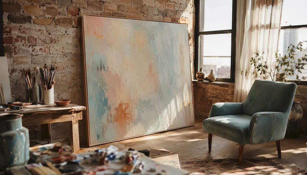
Focal hierarchy matters too. When a room has no strong focal point, the eye reads the whole space as uniformly dim. A single large, well-lit artwork gives the eye somewhere to land, which psychologically lifts the room. Designers describe this as “reducing visual weight” — fewer competing dark elements means the lighter ones register more strongly.
Perceived depth is the third factor. Larger, simpler compositions with light grounds read better at a distance and make a room feel more open. A landscape with a pale sky, or an abstract with generous negative space, pushes the wall back visually. Tight clusters of small, heavily framed pieces do the reverse, pulling the wall forward and compressing the space.
Three principles worth keeping in mind:
- Bounce light with reflective surfaces: varnish, metallic leaf, gloss glazing.
- Reduce heavy dark clusters by limiting the number of dark-framed pieces grouped together.
- Create perceived space with scale: one large composition beats five small ones in a dim room.
Which art types and styles work best in low-light rooms?
Hand-painted canvases with light or mid-tone backgrounds are the most reliable choice for dim spaces. The texture of the paint itself catches light at different angles, adding a subtle dynamism that flat prints cannot replicate. For selecting art styles that genuinely transform a room’s feel, the format and finish matter as much as the subject.
The strongest options for decor in low light:
- Wabi-sabi and minimalist abstracts — Spare compositions with textured pale grounds sit well in low light without demanding attention.
| Art category | Reflective effect | Maintenance | Cost range | Best placement |
|---|---|---|---|---|
| Hand-painted canvas (light ground) | High — paint texture scatters light | Dust occasionally; re-varnish every few years | Mid to high | Living room, bedroom, hallway |
| Photographic print (gloss finish) | Moderate — gloss surface reflects directly | Wipe with soft cloth | Low to mid | Kitchen, bathroom (glazed), office |
| Mixed-media with metallics | High — metallic leaf and foil scatter light | Avoid direct moisture; dust gently | Mid to high | Living room, dining room |
| Backlit / LED panel | Very high — self-illuminating | Check LED strip annually | Mid to high | Hallway, basement, windowless study |
| Matte fine-art print (dark tones) | Low — absorbs rather than reflects | Minimal | Low | Avoid in dim rooms |
What colours and tones actually work in a dim space?
Favour light backgrounds, pale neutrals, warm pastels, and measured contrast. That is the short answer. The longer one involves understanding which light tones do the most work and where the common mistakes happen.
Warm tones — cream, soft terracotta, warm white, pale gold — tend to read as luminous under incandescent or warm-white LED lighting, which most dim rooms rely on. Cooler tones like pale blue or soft grey work well under neutral or daylight-temperature bulbs (around 4000K), but can look flat and cold under warm light. Matching the art’s palette to the room’s light temperature is a step most buyers skip and then wonder why the piece looks duller in situ than it did on screen.
Colours to favour:
- Off-white and warm cream grounds
- Pale sage, dusty rose, or soft lavender as secondary tones
- Warm gold, bronze, or champagne metallic accents
- Pale blue-grey for rooms with neutral or cool-temperature lighting
Colours to avoid:
- Dense charcoal or near-black as the dominant background tone
- Saturated, high-chroma darks (deep navy, forest green, burgundy) covering most of the canvas
- Multiple pieces with dark grounds grouped together on the same wall
- Cool grey grounds under warm-white lighting (they read as flat and dingy)
Contrast itself is not the enemy. A pale canvas with a single bold dark mark can be striking and still feel light. The problem is overall tonal weight: if the majority of the canvas surface is dark, the piece absorbs more light than it returns. Aim for at least two-thirds of the visible surface in a light or mid-tone value.
Subject matter carries psychological weight too. Nature scenes with open skies, abstract compositions with generous negative space, and light-themed imagery (dawn, mist, water) all read as brighter than their tonal values alone would suggest. The brain interprets the subject and adjusts perceived brightness accordingly.
What size and placement rules maximise the brightening effect?
A single larger piece almost always brightens more effectively than several small, dark-framed pieces clustered together. The reason is simple: one large light-ground canvas gives the eye a single luminous focal point; a grid of small dark-framed prints creates a pattern of dark borders that the eye reads as shadow.
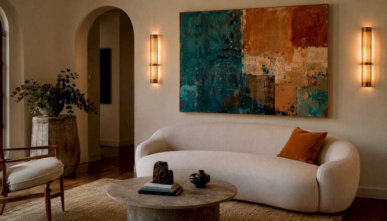
For proportion, a canvas should typically cover 60–75% of the wall width above a piece of furniture. On an empty wall, filling roughly two-thirds of the available width reads as intentional and spacious rather than undersized. Practical guidance on living room wall composition consistently points to this ratio as the sweet spot between presence and breathing room.
Placement checklist:
- Measure the wall and furniture width before ordering. Note ceiling height and any architectural features that affect the available hanging zone.
- Choose scale first. Decide on the canvas dimensions based on the proportion rule above, then select the image.
- Hang at eye level. The centre of the artwork should be hung at a height comfortable for viewing, generally around eye level for standing rooms and slightly lower when viewed from a seated position.
- Test with paper templates. Cut newspaper or brown paper to the exact canvas dimensions and tape it to the wall before ordering. Step back, live with it for a day, and adjust.
- Position relative to the light source. Hang the piece where a picture light or spot can reach it from above or at a slight angle; avoid placing it directly opposite a window where glare will obscure it.
- Step back and assess. View from the room’s main entry point and from the seating position. The piece should read clearly from both.
Pro Tip: Before commissioning a bespoke piece, use a digital mockup tool or simply photograph your wall and drop a scaled image into it using your phone’s photo editor. Frametheworld can also supply a digital preview of a custom piece in your specified dimensions before production begins.
Which frames, materials and finishes help most?
Slim, light-toned frames and finishes with controlled sheen are the practical answer. Small changes — replacing dark frames with lighter alternatives — can make a room feel noticeably brighter without any structural work.
Recommended frame choices:
- Pale or natural wood (ash, oak, whitewashed pine)
- White or off-white painted frames, slim profile
- Brushed aluminium or thin metal floater frames
- Float-frame mounting for canvases (creates a shadow gap that adds depth without visual weight)
Frames to avoid:
- Wide, heavily gilded or ornate mouldings in dark finishes
- Thick black borders, especially when grouped in multiples
- Deep box frames with dark interiors that create shadow pockets
Glazing deserves a specific note. Plain glass reflects strongly under spotlights, which can obscure the artwork and create glare hotspots. Anti-reflective (AR) glazing, sometimes called museum glass, eliminates most of that glare while still protecting the piece. For art that will be spot-lit or picture-lit, AR glazing is worth the additional cost. Acrylic (Perspex) is lighter and shatter-resistant, making it a practical choice for larger pieces or rooms where safety matters (children’s bedrooms, for instance).
For varnished canvases and metallic leaf, maintenance is straightforward but matters. Dust with a soft, dry brush every few months. Avoid damp cloths on metallic leaf or varnished surfaces, as moisture can lift the finish over time. A light application of conservation wax every two to three years keeps varnished surfaces bright and prevents the yellowing that dulls reflective qualities. Keep pieces away from direct sunlight to preserve both the varnish and the pigments beneath.
How do you pair art with lighting and other decor?
Layered lighting aimed to complement artwork is as important as the artwork itself. A beautiful pale canvas in a room lit only by a single overhead bulb will underperform; the same piece under a well-angled picture light becomes a focal point that lifts the whole room.
Lighting checklist for art in dim rooms:
- Picture lights: mounted directly above the frame, angled at roughly 30 degrees to illuminate the surface evenly without glare.
- Directional spotlights or track lighting: flexible and effective; aim the beam at the centre of the canvas and adjust the spread to avoid hotspots at the edges.
- Uplighting: floor-standing uplights positioned near the art create a warm ambient glow that complements the piece.
- Integrated LED/backlit panels: self-contained; no additional fixture needed.
- Bulb temperature: warm white (2700–3000K) suits cream and warm-toned art; neutral white (3500–4000K) works better with cooler palettes and photographic prints.
- Dimmers: always worth fitting; the ability to reduce intensity in the evening prevents the art from becoming the room’s only light source and looking harsh.
Mirrors placed adjacent to or opposite artwork amplify the effect considerably. Decorative wall mirrors add light, depth and style by reflecting both the artwork and its light source back into the room. Position a mirror so it catches the picture light’s reflection, not the artwork’s direct face (which creates glare). Metallic accessories — a brass side table, a copper lamp base — work on the same principle at a smaller scale.
Light-coloured textiles (pale linen curtains, cream upholstery) prevent the room’s soft furnishings from absorbing the light the art is working to reflect. The whole system works together: art, lighting, mirrors, and textiles are each doing a share of the work.
Implementing lighting with an art installation:
- Choose the fixture type (picture light, track spot, uplight) based on the room’s ceiling height and existing wiring.
- Set the angle before fixing permanently: use a clip-on temporary light to test beam direction and spread.
- Check for hotspots by viewing the lit piece from the main seating position; adjust the beam angle until the illumination is even.
- Set brightness with a dimmer and note the level that makes the piece read well without overpowering the room’s ambient light.
Room-by-room art ideas for hallways, living rooms, bedrooms, kitchens and bathrooms
Hallway: An oversized light-background panel or a large mirror with a slim pale frame is the most effective choice for a narrow, windowless hallway. For rooms without windows, mirrors and strategic lighting are highly effective; a single statement canvas above a console table, lit by a wall-mounted picture light, creates the illusion of depth. Avoid gallery walls here: the corridor’s limited width means clustered frames read as clutter.
Living room: A single large abstract or landscape canvas in warm neutrals above the sofa, sized to 60–75% of the sofa’s width, anchors the room and reflects ambient light from floor lamps and ceiling fixtures. Pair with a warm-white picture light and a mirror on the adjacent wall. For art’s specific role in living rooms with limited natural light, a pale wabi-sabi or minimalist abstract tends to outperform busier compositions.
Bedroom: Soft-toned landscapes or gentle abstracts in warm cream and blush work well above the bed. Use a low-glare finish (matte varnish or AR glazing) to prevent reflections disturbing sleep. A warm-white picture light on a dimmer gives flexibility between evening ambience and reading light.
Kitchen: Photographic prints or hand-painted botanicals in pale, clean tones suit kitchen walls. Keep art at least 60 cm from hobs and sinks to avoid steam and grease damage; gloss-glazed prints are easier to wipe clean than unglazed canvases. Avoid large dark-toned pieces above worktops where task lighting is needed.
Bathroom: Moisture-resistant glazing (acrylic rather than glass) is non-negotiable for bathrooms. Pale coastal scenes, abstract watercolours, or simple botanical prints in light tones work well. Seal the back of the frame with a moisture barrier and hang with rust-resistant fixings. Avoid metallic leaf in high-humidity bathrooms unless the piece is fully glazed and sealed.
What should you ask before buying or commissioning art?
The right questions at the point of purchase save significant time and money later. Start with these before committing to any piece.
- What are the available sizes? Confirm exact canvas or print dimensions, not just “small/medium/large” labels. Measure your wall first.
- What is the substrate? Stretched canvas, board, paper, or aluminium panel each behave differently in terms of weight, durability, and how they interact with light.
- Is the surface varnished or glazed? Ask specifically about finish type (matte, satin, gloss) and whether anti-reflective glazing is available.
- What is the lead time for a custom piece? Hand-painted commissions typically take two to six weeks depending on complexity and the maker’s schedule.
- What is the return or exchange policy? Particularly relevant for bespoke commissions where a colour match is involved.
- Can you provide a digital mockup or sample swatch? Reputable sellers, including Frametheworld, can supply a scaled digital preview or a small colour sample before production begins.
- How is the piece delivered and hung? Ask whether hanging hardware is included and whether the piece arrives ready to hang.
- What is the budget? Hand-painted originals and custom commissions sit at a higher price point than print-on-demand, but the ability to specify exact dimensions, palette, and finish is worth the premium for a dim room where the wrong choice is immediately obvious.
For bespoke pieces, a colour match request is straightforward: photograph the room’s dominant tones (wall colour, upholstery, flooring) and share them with the seller. Frametheworld’s commissioning process accommodates palette specifications, so you can request, for example, a canvas with a warm cream ground and soft gold metallic accents to match an existing interior scheme.
How Frametheworld solves the dim-room art problem
Frametheworld’s hand-painted canvases and custom-sizing options make it straightforward to commission art that is genuinely optimised for a low-light room, rather than adapting a standard piece that was never designed with dim conditions in mind.
The process is direct:
- Browse the collections by style, theme, and size at frametheworld.co.uk to identify the palette and format that suits your room.
- Request a custom size or colour palette at the point of enquiry. Frametheworld accommodates specific background tones, metallic accents, and canvas dimensions tailored to your wall measurements.
- Approve a digital mockup before production begins. This is the step most buyers skip and then regret; seeing the scaled piece against your actual wall colour resolves most uncertainty before any paint is applied.
- Receive a framed or ready-to-hang artwork, typically within two to six weeks for a custom commission.
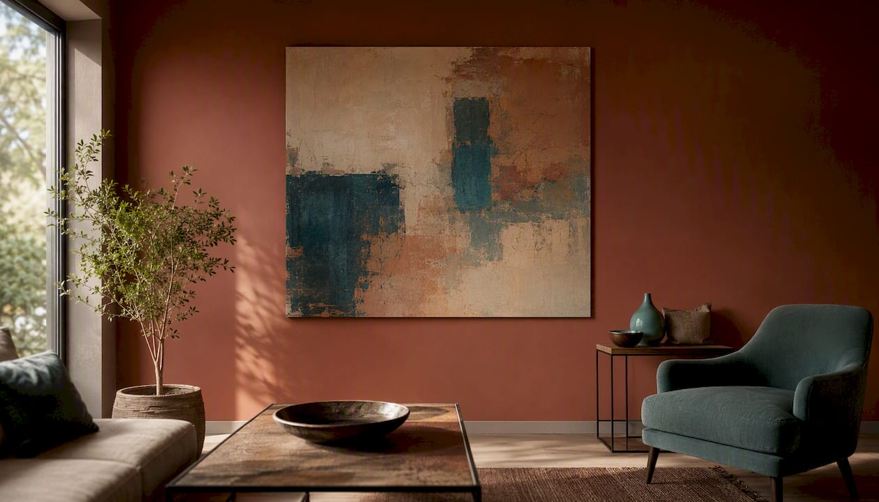
Practical benefits for dim rooms specifically include the option to specify light-background palettes (warm cream, pale sage, off-white), integrated metallic leaf for controlled light scatter, and the choice of satin or gloss varnish finishes that add sheen without glare. The Balance of Light and Dark Wabi Sabi Abstract is a good example of how a curated palette and textured surface can be used deliberately to lift a dark space.
Pro Tip: Request a small painted colour sample on canvas board before committing to a full commission. Viewing the actual pigments and varnish finish under your room’s specific lighting conditions is far more reliable than judging from a screen.
Key takeaways
The single most effective approach to brightening a dim room with art is a large, light-background canvas with a slim pale frame, targeted picture lighting, and at least one reflective surface nearby.
| Point | Details |
|---|---|
| Choose light backgrounds | Pale, warm-neutral, or pastel grounds reflect ambient light; avoid dark-dominant canvases in dim rooms. |
| Scale up, not out | One large piece brightens more effectively than multiple small, dark-framed prints clustered together. |
| Frame and finish matter | Slim pale or metallic frames and satin/gloss varnish finishes add reflected light; wide dark mouldings absorb it. |
| Layer your lighting | A picture light or directional spot aimed at the artwork doubles as functional accent lighting for the whole room. |
| Commission with Frametheworld | Frametheworld’s custom-palette and bespoke-sizing options let you specify exactly the tones and finish your dim room needs. |
The thing most people get wrong about art in dark rooms
Most advice on brightening dim rooms focuses on paint colours and mirrors, and treats art as an afterthought. That is the wrong order of priorities. A well-chosen, well-lit piece of art does more work than a fresh coat of off-white paint, because it gives the eye a specific, luminous focal point rather than simply raising the background tone.
The mistake I see repeatedly is choosing art based on how it looks in a gallery or on a screen, then hanging it in a dim room under a single overhead bulb and wondering why it looks flat. The art has not changed; the light has. A pale, varnished canvas under a warm picture light is a completely different object from the same canvas under a cool overhead fluorescent. Commissioning or buying with your room’s actual lighting conditions in mind, rather than adjusting the lighting to suit whatever art you already own, is the more effective approach.
The other underrated move is scale. People consistently choose pieces that are too small for the wall, then compensate by adding more pieces, which creates visual clutter and a pattern of dark frames that the eye reads as shadow. One large, confident piece on a pale ground, hung at the right height with a dedicated light, will do more for a dim room than any gallery wall.
Frametheworld: custom art made for your room’s light
If you have been working through this guide and realising that the right piece for your dim room probably does not exist in a standard size or palette, that is exactly the problem Frametheworld is built to solve. Rather than settling for a print that is close but not quite right, you can commission a hand-painted canvas in the precise dimensions, background tone, and finish your room needs.
The Wabi Sabi wall art collection is a strong starting point for dim rooms: textured pale grounds, warm neutrals, and compositions with generous negative space that read as luminous even under low ambient light. For something bolder, the Pop Art collection offers high-contrast, graphic pieces in multiple sizes that inject energy into a dark space without relying on pale tones alone.
To start a commission, browse the collections, note the palette and scale that suits your wall, and contact Frametheworld with your dimensions and colour preferences. A digital mockup is available before production begins.
Useful sources
The following sources informed the advice in this article and are worth reading for further detail:
- How to make a dark room brighter (Willow and Hall) — practical, room-by-room tips on frames, fabrics, and light-reflecting surfaces; useful for anyone starting from scratch.
- Genius tricks for lightening a dark room (Elle Decor) — designer-led advice on gloss finishes, mirrors, and metallic accents; good for understanding the reflective-surface principle.
- Brightening a room without natural light (Birmingham Design Studio) — focused specifically on layered lighting strategies; the most detailed source on fixture types and placement.
- Tips for bright and cosy rooms without windows (IKEA) — accessible, practical guidance on mirrors, light-coloured textiles, and strategic lighting for windowless rooms.
- Best plants for low-light conditions (Aqualogi) — useful for understanding genuine low-light lux ranges and for complementary plant choices (ZZ plant, snake plant) that work alongside art in dim rooms.
- How to select art styles for your home (Frametheworld blog) — Frametheworld’s own guide to matching art styles, palettes, and formats to different room conditions; the natural next step after this article.

Laat een reactie achter
Deze site wordt beschermd door hCaptcha en het privacybeleid en de servicevoorwaarden van hCaptcha zijn van toepassing.