

Mid-century modern art, made roughly between 1940 and 1970, is immediately recognisable: bold geometric shapes, warm muted palettes punctuated by pops of primary colour, and a restless energy that sits somewhere between fine art and graphic design. Here are five examples you can search right now to get your bearings:
- Jackson Pollock, Number 31 (1950) — drip-painted Abstract Expressionism; search “Pollock drip painting MoMA”
- Mark Rothko, No. 61 (Rust and Blue) (1953) — two floating rectangles of colour; search “Rothko colour field”
- Andy Warhol, Campbell’s Soup Cans (1962) — silkscreened grid of consumer imagery; search “Warhol soup cans MoMA”
- Ellsworth Kelly, Spectrum IV (1967) — thirteen hard-edged colour panels; search “Kelly Spectrum IV MoMA”
- Alexander Calder, mobiles (1940s–1960s) — suspended biomorphic shapes; search “Calder mobile Tate”
These five alone cover the main visual territory. The sections below explain what to look for, how each style differs, and how to bring any of them into a UK home.
Table of Contents
- How to recognise mid-century art at a glance
- The main mid-century styles and what they look like
- Iconic artists and signature works, and where to see them in the UK
- Five practical mid-century art examples for a UK home
- Originals, authorised prints, or reproductions: what to buy and how
- How Frametheworld recreates mid-century looks
- Key takeaways
- Why mid-century art rewards a closer look than most people give it
- Commission a mid-century piece made for your wall
- Where to look next: authoritative resources
How to recognise mid-century art at a glance
The mid-century label covers several movements, but the visual cues cluster reliably. Train your eye on these:
- Geometric or biomorphic forms — circles, boomerangs, starbursts, and amoeba-like curves appear constantly, often as the entire composition.
- Flat planes of colour — rather than blended tones, colours sit in clean, distinct zones. Kelly’s Spectrum IV is the purest example.
- Warm, muted base palettes with colour pops — terracotta, mustard, olive, and teal as the ground; a single vivid red or cobalt as the accent.
- Atomic Age and starburst motifs — a direct visual response to the space race and nuclear age; look for radiating lines and orbital shapes.
- Gestural mark-making — Pollock’s drips, Franz Kline’s broad brushstrokes; the physical act of painting made visible.
- Graphic repetition — Warhol’s grids and Roy Lichtenstein’s Ben-Day dots turn mass-media imagery into fine art.
- Organic silhouettes — Henri Matisse’s late cut-outs and Calder’s mobiles share a vocabulary of leaf and petal shapes that feels simultaneously natural and abstract.
- Minimal negative space — compositions tend to fill the canvas; there is rarely a lot of empty white ground.
Pro Tip: When checking a label or auction listing, look for dates in the 1940s–1960s and movement names such as Abstract Expressionism, Colour Field, or Pop Art. Works described as “mid-century inspired” or “MCM style” are later pieces made in the spirit of the era — perfectly valid for décor, but priced and provenanced differently.
For home use, these cues translate directly into buying decisions. A large flat-colour canvas reads as Colour Field; a gestural drip piece reads as Abstract Expressionism. Knowing which you are looking at helps you match the work to the room’s mood rather than just its colour scheme.
The main mid-century styles and what they look like
Mid-century modern art is not one unified style but an umbrella covering at least five distinct movements. Each has its own visual logic.

Abstract Expressionism
The first major American art movement, centred in New York from the mid-1940s. Two branches: Action Painting (Pollock, Kline) where the gesture is the subject, and Colour Field (Rothko, Newman) where large areas of pure colour carry the emotional weight. Techniques include poured and drip paint on unprimed canvas, broad gestural brushwork, and staining. Works tend to be large, physically commanding, and deliberately non-representational.
- Pollock → Number 31 (1950) — the definitive drip painting; a web of poured enamel on a canvas laid flat on the floor.
- Rothko → No. 61 (Rust and Blue) (1953) — two soft-edged rectangles that appear to glow from within.
Colour Field
A quieter branch of Abstract Expressionism that strips away gesture entirely. Rothko’s stated aim was to communicate “basic human emotions — tragedy, ecstasy, doom” through colour alone. Kelly pushed it further into hard-edged geometry: his Spectrum IV uses thirteen precisely painted panels, each a single hue, progressing around the colour wheel with no visible brushwork.
- Kelly → Spectrum IV (1967) — hard-edged, high-finish, purely chromatic.
Pop Art
Pop Art arrived in the late 1950s, first in Britain (Richard Hamilton, Eduardo Paolozzi) and then explosively in the US. It used silkscreen, photographic transfer, and commercial printing techniques to reproduce consumer imagery at gallery scale. Warhol’s Campbell’s Soup Cans (1962) are 32 individual canvases, each depicting a different soup variety, displayed in a row like supermarket shelves. The mechanical process was the point: it challenged the idea of the unique, hand-made masterpiece.
- Warhol → Campbell’s Soup Cans (1962) — silkscreen; search “Warhol soup cans MoMA”.
- Lichtenstein → Girl with Ball (1961) — Ben-Day dots and bold outlines lifted from a hotel advertisement.
Scandinavian and graphic design
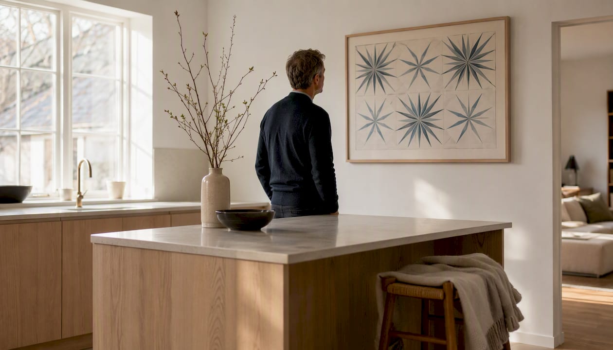
Parallel to the American movements, Scandinavian designers produced a graphic, print-based aesthetic: clean sans-serif typography, flat botanical and geometric motifs, and a palette of forest greens, slate blues, and warm neutrals. Think Marimekko’s bold repeat patterns or the poster work of Olle Eksell. Less emotionally charged than Abstract Expressionism, but immediately legible and very well suited to domestic interiors.
Atomic Age and organic sculpture
David Smith welded industrial steel into monumental abstract sculptures. Alexander Calder invented the mobile: suspended, balanced, biomorphic shapes that move with air currents. Charles and Ray Eames brought the same organic vocabulary into furniture design, with moulded plywood and fibreglass forms that echo the rounded shapes in Calder’s work. The visual language — curves, balance, lightness — runs from sculpture into product design and back into painting.
Iconic artists and signature works, and where to see them in the UK
Jackson Pollock, Mark Rothko, Andy Warhol, and David Smith are among the central figures who reshaped mid-20th-century art. The table below gives a quick reference for each artist, their signature work, and where UK visitors can see comparable holdings.
| Artist | Dates | Signature work | UK venue |
|---|---|---|---|
| Jackson Pollock | — | Number 31 (1950) | Tate Modern (related holdings; MoMA online) |
| Mark Rothko | — | Seagram Murals (1958–59) | Tate Modern, Bankside, London |
| Andy Warhol | — | Campbell’s Soup Cans (1962) | Tate Modern; Whitney Museum online |
| Ellsworth Kelly | — | Spectrum IV (1967) | MoMA online; V&A research collections |
| Alexander Calder | — | Mobiles (1940s–1960s) | Tate Modern; occasional RA touring shows |
| Henri Matisse | — | The Snail (1953) | Tate Modern, permanent collection |
| David Smith | — | Cubi series (1961–1965) | Tate Modern; National Galleries of Scotland |
| Roy Lichtenstein | — | Girl with Ball (1961) | Tate Modern; MoMA online |
| Charles & Ray Eames | — | Lounge Chair; films and graphics | V&A permanent collection |
Tate Modern is the single most useful starting point for UK visitors: the permanent collection holds Rothko’s Seagram Murals in a dedicated room, Matisse’s The Snail, and rotating Pollock and Warhol works. The V&A holds significant Eames material and Scandinavian design archives. For online research, the National Gallery of Art’s mid-century survey is a thorough free resource.
Five practical mid-century art examples for a UK home
Knowing the artists is one thing; knowing where to hang what is another. These five scenarios cover the most common rooms and briefs.
1. Bold Pop print above a sofa
A large Warhol-style grid print — think repeated faces or consumer objects in flat, contrasting colours — works well above a low-profile sofa in a living room. Scale matters: the artwork should span about the majority of the sofa’s width. Pair with a walnut-veneer sideboard and a mustard or burnt-orange cushion to pull the palette together. A simple black or natural-oak floating frame keeps the focus on the image.
Pro Tip: For a Pop Art piece in a rented flat, a canvas wrap (no frame required) is easier to hang and re-hang without damaging walls. Frametheworld’s Pop Art collection includes hand-painted options you can size to your exact wall.
2. Colour Field canvas as a dining-room anchor
A Rothko-inspired canvas — two or three soft horizontal bands of warm colour — turns a dining room wall into something genuinely atmospheric. The soft edges absorb candlelight well. Choose colours that echo the table’s materials: a terracotta-and-burgundy piece against a pale plaster wall with a dark-stained oak table is a combination that photographs well and ages even better. Go large for dining rooms to feel intentional rather than decorative.
3. Graphic Scandinavian print for a hallway
Hallways reward graphic clarity over emotional depth. A bold botanical repeat or a geometric starburst in two or three flat colours reads instantly and holds up to repeated glancing. Keep the palette tight: forest green and cream, or slate blue and off-white. A thin black frame in a standard size (50 × 70 cm is a sweet spot for most UK hallways) makes it easy to swap prints without rehanging.
4. Abstract Expressionist piece in a home office
A gestural, drip-textured canvas brings energy to a workspace without the visual noise of figurative imagery. Pollock-inspired works in black, white, and raw umber are particularly versatile: they read as neutral from a distance but reward close attention. Pair with mid-century furniture cues — an Eames-style desk chair, warm wood tones — and the combination feels considered rather than accidental. For abstract expressionist wall art, hand-painted texture makes a real difference at close range.
5. Calder-inspired mobile or organic sculpture print
Not all mid-century art is flat. A framed print of Calder’s mobiles, or a sculptural reproduction, adds a three-dimensional quality that paintings cannot. In a bedroom or reading corner, a small framed lithograph of biomorphic shapes in primary colours on white brings lightness without weight. The architectural details of the room matter here: period interior doors and original cornicing make an ideal backdrop for this kind of organic, mid-century graphic work.
Originals, authorised prints, or reproductions: what to buy and how
Mid-century artists like Warhol deliberately challenged the idea of the unique original — his mechanical silkscreen process was a philosophical statement as much as a technique. That history makes authorised prints and high-quality reproductions not just acceptable but historically coherent for mid-century interiors. Here is how to navigate the options.
-
Establish what you are buying. An original period work (made 1940–1970 by the named artist) commands auction-house prices and requires full provenance documentation. An authorised estate print is made with the artist’s estate’s permission, usually in a numbered edition. A giclée reproduction is a high-resolution inkjet print on archival paper or canvas. A hand-painted reproduction is made by a skilled artist working from the original.
-
Check edition size and numbering. Authorised prints are typically numbered (e.g. 12/50). Smaller editions hold value better. Ask for the certificate of authenticity and the publisher’s name.
-
Verify provenance for originals. Request a full exhibition history and any auction records. UK buyers can cross-reference with the Art Loss Register and check dealer credentials through the British Art Market Federation.
-
Assess print quality for reproductions. For giclée prints, ask for the DPI resolution (300 DPI minimum for display quality) and whether archival inks were used. For hand-painted reproductions, inspect the canvas weight and paint type: professional-grade linen canvas and oil or acrylic paints outlast cheaper alternatives by decades.
-
Consider framing as part of the budget. A museum-quality UV-protective glazing adds cost but protects colour from fading. For canvas works, a simple gallery wrap or a floating frame is both period-appropriate and practical.
-
For commissions, clarify lead times and sizing upfront. Bespoke hand-painted pieces typically require a deposit, a brief, and a mockup stage before production begins. UK-based providers can usually deliver within four to eight weeks depending on size and complexity.
How Frametheworld recreates mid-century looks
Frametheworld produces hand-painted wall art to order, which means the process starts with your brief rather than a fixed catalogue. Here is how a typical commission works:
- Brief and mockup — you describe the style, palette, and dimensions; Frametheworld produces a digital mockup for approval before any paint touches canvas.
- Canvas and materials — works are painted on professional-grade stretched canvas using high-quality acrylic or oil paints, chosen for colour fastness and surface texture.
- Hand-painting — each piece is made by hand, which means gestural marks, layered texture, and organic variation that digital prints cannot replicate. For mid-century styles, this matters most in Abstract Expressionist and Colour Field work, where surface quality is part of the meaning.
- Framing options — gallery wrap, floating frame, or unframed canvas; all standard and custom sizes available.
- Delivery — pieces are shipped flat or rolled (for larger canvases) with protective packaging; custom sizing is available for non-standard walls.
The wabi-sabi and textured abstract collections show the kind of surface quality achievable in hand-painted work. For mid-century commissions specifically, the abstract expressionist collection gives a clear sense of the palette and texture range on offer.
Key takeaways
Mid-century modern art spans Abstract Expressionism, Colour Field, Pop Art, and Scandinavian graphic design, and the most reliable way to shop or style it is by visual cue rather than by the broad “mid-century” label alone.
| Point | Details |
|---|---|
| Visual cues beat labels | Search by style (drip, colour field, graphic repeat) rather than “mid-century” to find the right image faster. |
| Five artists cover the range | Pollock, Rothko, Warhol, Kelly, and Calder between them represent every major mid-century visual style. |
| Tate Modern is the UK anchor | The Rothko Seagram Murals room and Matisse’s The Snail are permanent; worth visiting before buying. |
| Reproductions are historically valid | Warhol’s silkscreen process deliberately questioned uniqueness; authorised prints and hand-painted reproductions suit mid-century interiors both practically and philosophically. |
| Frametheworld for custom pieces | Bespoke hand-painted mid-century commissions, sized to your wall, with mockup approval before production begins. |
Why mid-century art rewards a closer look than most people give it
There is a tendency to treat mid-century modern as a decorating shortcut: slap up a Warhol print, add a walnut sideboard, done. The problem is that approach produces rooms that look like a mood board rather than a home. The artists who defined this era were not making décor. Rothko wanted people to cry. Pollock was working out something physical and almost violent on the canvas floor. Warhol was making a point about consumer culture that was genuinely uncomfortable in 1962.
None of that means you cannot use their work in a living room. It means the work repays attention. A Rothko canvas changes depending on the light, the time of day, and how long you stand in front of it. A Pollock drip painting has a rhythm and a density that you only start to read after a few minutes. Buying a reproduction of either is a perfectly reasonable choice, but knowing what you are looking at changes how you live with it.
The clients who get the most from a mid-century commission are the ones who come with a specific reference rather than a vague mood. “I want something that feels like the Rothko room at Tate Modern but in terracotta and sand” is a brief that produces something genuinely good. “Something mid-century” produces something generic. The visual vocabulary of this era is specific enough that specificity pays off.
Commission a mid-century piece made for your wall
Frametheworld makes hand-painted wall art to order, sized precisely to your space. Whether you want a Colour Field canvas for a dining room, a gestural abstract for a home office, or a bold Pop-inspired piece for a living room. Every commission starts with a digital mockup so you can see the scale and palette before production begins.
The Pop Art collection and the hand-painted abstract range give a clear sense of what is possible. Custom colour matching, non-standard sizing, and framing options are all available. Lead times are typically four to eight weeks. To start a commission or browse ready-made mid-century style pieces, visit frametheworld.co.uk.
Where to look next: authoritative resources
- Tate Modern — Rothko Seagram Murals and permanent collection — the best single UK destination for original mid-century works; free permanent collection entry.
- MoMA — Campbell’s Soup Cans collection record — full curatorial notes on Warhol’s process and the significance of mechanical reproduction.
- MoMA — Mark Rothko artist page — includes Rothko’s own statements on colour and emotion; useful for understanding Colour Field intent.
- MoMA — Ellsworth Kelly, Spectrum IV — detailed description of Kelly’s hard-edge technique and colour sequencing.
- Whitney Museum — Andy Warhol artist page — exhibition history, image archive, and provenance context.
- National Gallery of Art — American Art at Mid-Century — canonical survey of the period with curatorial essays; free online access.
- Guggenheim — Colour Field movement — concise movement overview with representative works.


Leave a comment
This site is protected by hCaptcha and the hCaptcha Privacy Policy and Terms of Service apply.