
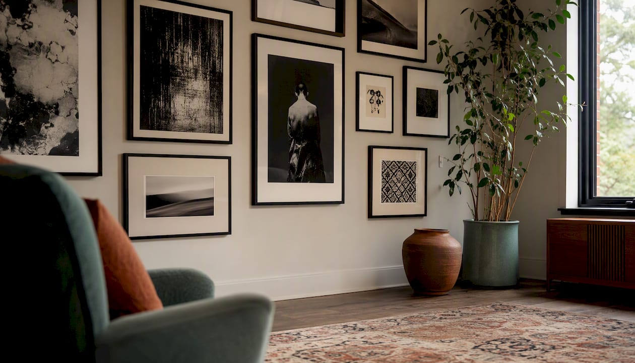
A successful monochrome art collection comes down to three things: a single unifying hue, a deliberate mix of scale and medium, and a tonal range that keeps the eye moving. Get those right and the result looks considered rather than accidental.
Before you buy or commission a single piece, run through this quick checklist:
- Choose a focal piece first (the largest or most tonally complex work).
- Vary mediums across the collection (photography, charcoal, oil, ceramics)
- Plan a tonal spread: aim for roughly 60–70% full-range or medium-contrast works, with some high-contrast pieces as punctuation and a few low-contrast works for balance
- Decide on a frame strategy before you hang anything
- Test the layout on the floor before committing to the wall
GalleryPlanner recommends that roughly 60–70% of a monochrome wall should carry full-range or medium-contrast images, with high-contrast pieces used as punctuation. This single ratio does more for a wall than any amount of careful matching.
Table of Contents
- 30+ monochrome art collection ideas you can copy today
- How do you build a cohesive monochrome collection from scratch?
- Styling and display techniques that keep a monochrome wall lively
- Which colours work best for monochrome collections at home?
- Why does monochrome work? What experts say about buying and commissioning
- Practical hanging, spacing, and lighting for a gallery-quality result
- Key takeaways
- The case for restraint
- Frametheworld: bespoke monochrome canvases made to your brief
- Useful sources and further reading
30+ monochrome art collection ideas you can copy today
These ideas are grouped by colour family and room. Each entry gives you a visual prompt, a suggested scale, a medium, and a placement tag.
Black and white (living room and hallway)
- Ink linework series — Three small framed works (20×30 cm), ink on paper, shelf or staircase wall. Strong line and negative space deliver real presence without colour — ink is one of the most economical media in a monochrome collection
Unconventional and textural ideas
- Eggshell mosaic panel — Medium (40×40 cm), mixed media, entrance hall or bathroom. Contemporary artists use found materials such as eggshells to add texture when hue is restricted
How do you build a cohesive monochrome collection from scratch?
Follow this sequence and you will avoid the most common mistake: buying pieces you love individually that refuse to work together on a wall.
- Define the hue and mood. Decide whether you want cool (blue-black, slate), warm (terracotta, sand), or neutral (pure black and white). The hue sets the room’s emotional register before a single piece goes up.
- Choose an anchor piece. This is your largest or most tonally complex work, typically 80×100 cm or bigger. Everything else is selected in relation to it.
- Select supporting pieces for tonal contrast. Aim for the majority mid-range rule from GalleryPlanner, then add one or two high-contrast works as visual punctuation and one or two low-contrast pieces to give the eye somewhere to rest.
- Vary mediums and formats. A wall of identical photographic prints reads as wallpaper. Pair a large oil with smaller photographs, a charcoal sketch, and a ceramic object. Monochrome art spans oil, charcoal, ink, photography, sculpture and mixed media, with surface and light becoming the primary expressive tools.
- Decide on a frame strategy. Two frame textures (say, matte black and natural oak) with one mat style adds warmth without introducing colour. Read more on why frame selection matters before you buy.
- Mock up the layout. Lay everything on the floor first. Photograph it from standing height. Only then mark the wall.
Curation checklist:
- Focal piece confirmed
- Tonal range covers high, mid, and low contrast
- At least two different mediums
- Frame textures decided
- Layout tested on the floor
- Lighting position planned
Pro Tip: Test each piece under both natural daylight and your room’s artificial light before committing. A charcoal that reads warm and soft in morning light can look flat and grey under a cool LED. Knowing this in advance saves you a return.
Styling and display techniques that keep a monochrome wall lively
The risk with a single-hue collection is that it becomes visually inert. The fix is contrast, not colour.
Tonal range guide
| Tonal type | Description | Best use |
|---|---|---|
| High contrast | Strong blacks against bright whites | Punctuation pieces; portraits; graphic works |
| Medium contrast (full range) | Full tonal scale from near-black to near-white | 60–70% of the wall; landscapes; abstracts |
| Low contrast | Soft mid-tones with little black or white | Breathing space; backgrounds; large canvases |
Layout options
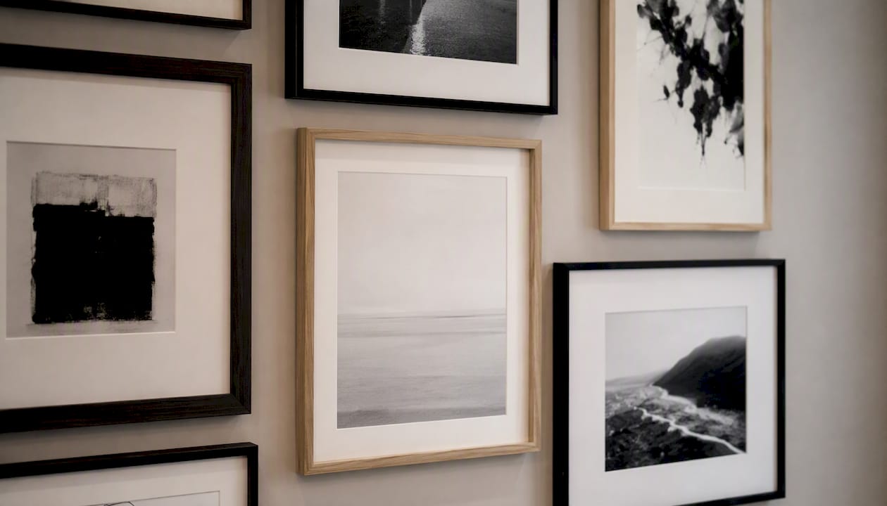
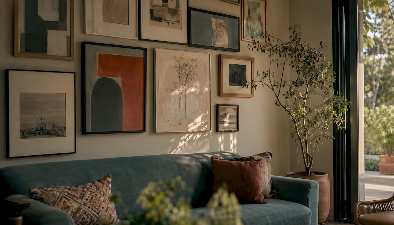
Salon wall works well for monochrome collections because the shared hue reduces visual conflict among diverse subjects and formats. Pack pieces tightly (5–8 cm gaps) and mix portrait and landscape orientations. A salon-style dense hang still works well for monochrome collections precisely because the unified palette holds everything together.
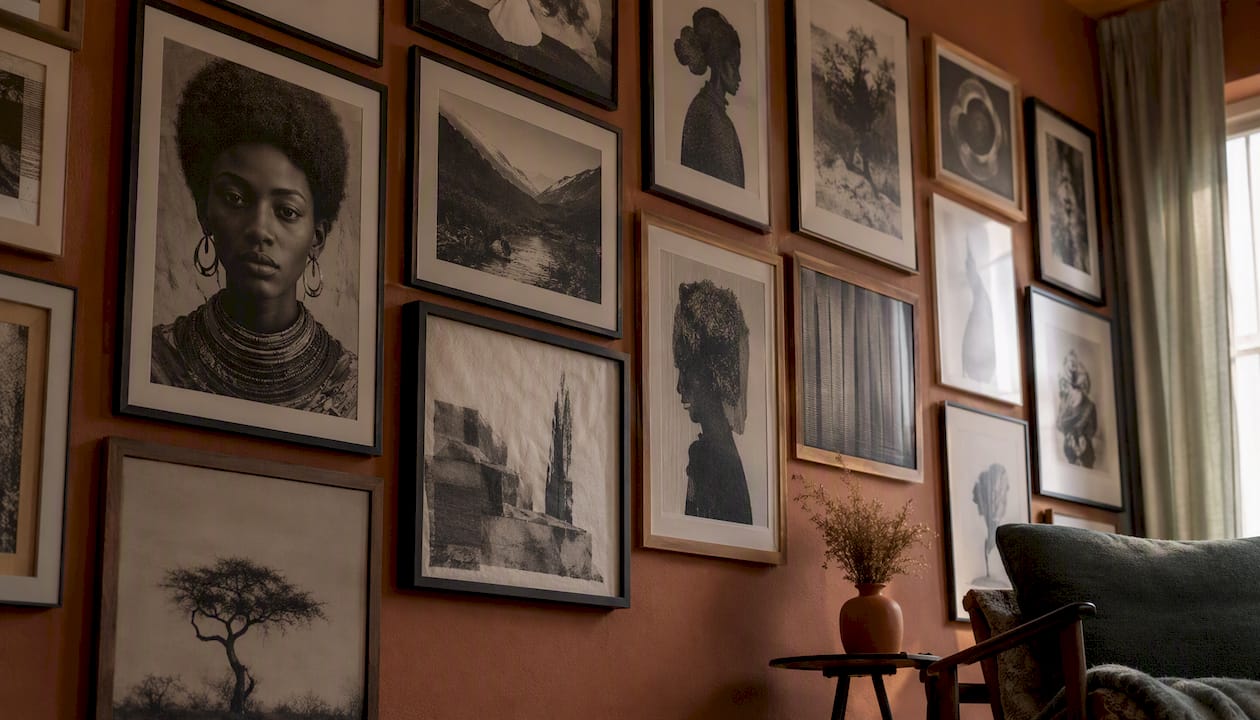
Clean grid suits photography-led collections. Use identical frames and consistent spacing (8–10 cm) for a gallery-quality result. Works best when tonal values across the prints are deliberately varied.
Linear row is the simplest option for a narrow hallway or above a sofa. Three to five pieces at the same centre height, with the largest in the middle.
Triptych centrepiece anchors a chimney breast or large wall. Flank it with smaller works at different heights to avoid a symmetrical, static feel.
Frame strategy: mixing two textures (matte black with natural wood, or brushed brass with white) prevents a monochrome wall from reading as a single flat object. One mat style across all works ties the group together without making it rigid.
Which colours work best for monochrome collections at home?
Hue choice affects mood, furniture pairing, and how much light the wall needs.
- Black and white suits minimal or gallery-style spaces. It pairs with almost any furniture and reads well under both warm and cool lighting. The easiest to source: black-and-white photography and charcoal drawings are widely available and straightforward to commission. For deeper guidance on choosing prints, see why black and white prints work in domestic interiors.
- Blues and cool greys calm a bedroom or bathroom. They pair well with linen, pale wood, and concrete. Under warm tungsten light they shift slightly warmer, which can be a useful effect in a north-facing room.
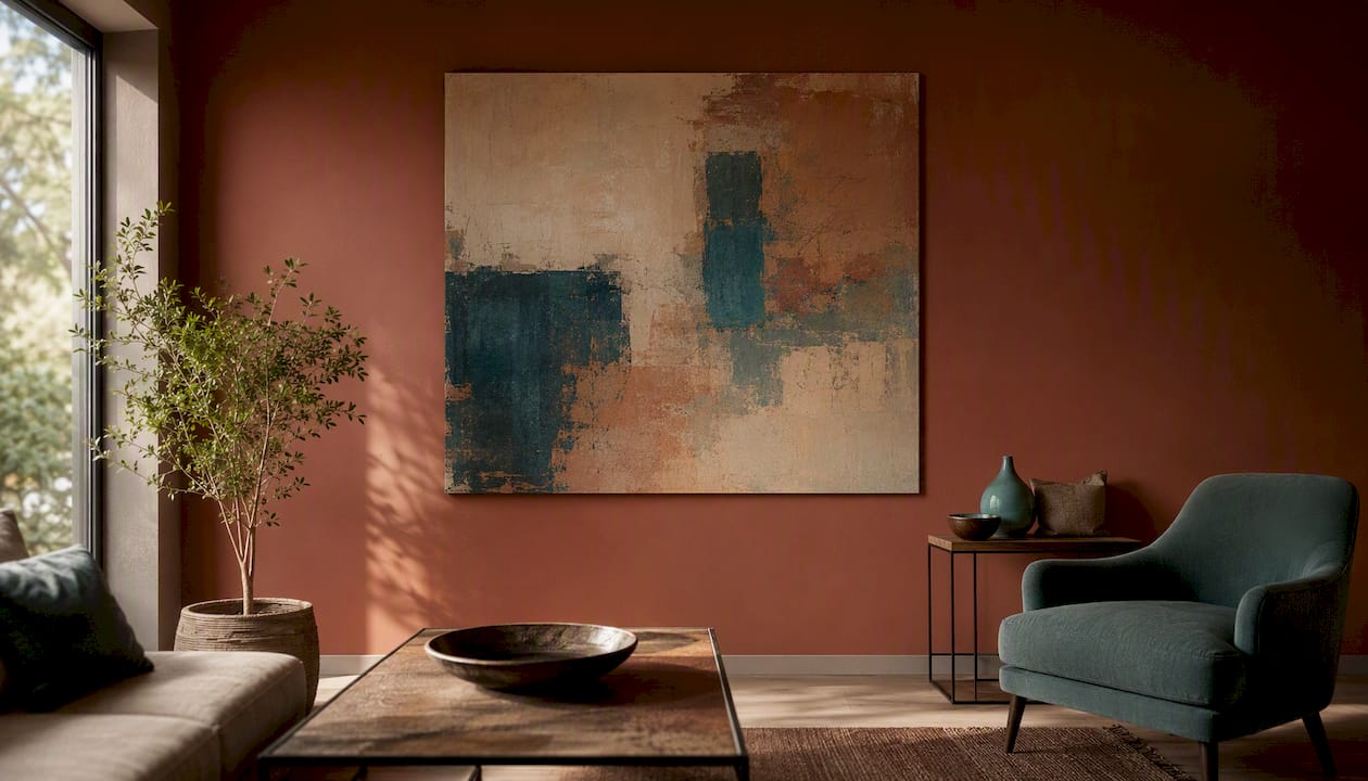
- Warm neutrals (terracotta, ochre, sand) add warmth to living rooms and dining rooms without competing with wood tones or warm-coloured upholstery. Bespoke oil paintings are the most practical route here, since pigment-matched works in these tones are harder to source off the shelf.
- Greens work particularly well in kitchens, studies, and garden rooms. Sage and olive tones pair with natural materials. Darker forest greens need strong directional light to read well on a wall.
Pro Tip: Warm-toned monochrome collections (terracotta, sand, ochre) are harder to source as ready-made prints. If you want a specific hue, a bespoke commission brief with a paint swatch reference gives a studio the clearest possible starting point.
Why does monochrome work? What experts say about buying and commissioning
Tate describes monochrome as a practice that shifts emphasis from colour to form, surface and material, with historical precedents including grisaille painting, where artists used grey tones to simulate sculpture. That tradition runs directly into contemporary practice.
Artsper traces the genre through Malevich’s Black Square, Yves Klein’s monochromes in International Klein Blue, and the Korean Dansaekhwa movement, all of which use the restriction of colour to focus attention on surface, material, and meditative presence. When you collect monochrome work, you are buying into that lineage whether you know it or not.
Monochrome art is designed to slow the viewer’s perception and invite meditative looking. These works use surface and form to hold attention in ways that colour-led painting rarely needs to.
Buyer’s checklist before purchasing or commissioning:
- Check the tonal range: does the work carry darks, mids, and lights, or is it flat?
- Examine the surface under different light angles — raking light reveals texture that matters
- Look for evidence of material layering: impasto, collage, or mixed media add long-term interest
- Ask about framing options before you buy: the wrong frame flattens a textured work
- Request an artist statement or provenance note for original works
Contemporary photographers like Zac Henderson demonstrate how deep tonal control creates spatial drama in monochrome images. That same principle applies to painting and drawing: the works that hold attention over years are those with a full tonal range and a surface that rewards close looking.
Practical hanging, spacing, and lighting for a gallery-quality result
Getting the hang right is where most home collections fall short. The art is fine; the execution lets it down.
Spacing and eye-line rules:
- Centre your anchor piece at approximately 145–150 cm from the floor to the centre of the work. This is the average standing eye-line for UK adults.
- Space frames 5–10 cm apart for a salon hang; 8–12 cm for a grid or linear arrangement.
- Work outward from the anchor piece when positioning supporting works, not inward from the edges of the wall.
- For a triptych, treat the three pieces as a single unit and centre the group as one.
Hardware:
- D-rings and mirror plates suit most medium-weight framed works (up to around 5 kg).
- French cleats are the right choice for heavy canvases (over 5 kg) or any work you expect to reposition. They distribute weight across a wider wall area and allow horizontal adjustment without re-drilling.
- Picture rails (common in older UK properties) allow hanging without wall fixings. Use proper picture-rail hooks and adjustable cord or rod hangers.
Lighting checklist:
- Use directional wall washers or track lighting angled at 30° from the wall to reveal texture and tonal depth
- Avoid hanging a collection directly opposite a large window: daytime glare washes out tonal contrast
- Warm-white LEDs (2700–3000K) suit warm-toned collections; neutral white (3500–4000K) suits black-and-white or cool-toned work
- Test the lighting before final hanging: a piece that reads beautifully in the shop can disappear under the wrong lamp
Pro Tip: Photograph the wall under your room’s actual lighting before you hang anything. Compare it with the photo you took of the floor mock-up. The two images together will show you immediately if the tonal balance works or if you need to swap a piece.
Key takeaways
A monochrome art collection succeeds when a single hue anchors the scheme, tonal range creates movement, and varied mediums prevent the wall from reading as flat.
| Point | Details |
|---|---|
| Start with an anchor piece | Choose your largest or most tonally complex work first; build the rest of the collection around it. |
| Follow the 60–70% rule | Roughly 60–70% of the wall should carry full-range or medium-contrast images; use high-contrast pieces as punctuation. |
| Vary mediums and surfaces | Mix photography, charcoal, oil, and ceramics to add texture and tonal interest without introducing colour. |
| Plan lighting before you hang | Directional wall washers at 30° reveal surface texture; test under both natural and artificial light first. |
| Frametheworld for bespoke work | Frametheworld offers hand-painted canvases and custom commissions sized and coloured to your exact brief. |
The case for restraint
There is a tendency to treat monochrome collecting as a safe, neutral choice. A black-and-white wall above the sofa, a few charcoal prints, done. That reading undersells what a well-built collection can do.
The artists who shaped this genre — Klein, Malevich, the Dansaekhwa painters — were not playing it safe. They were making an argument: that surface, material, and tonal range are expressive enough on their own. A collection built on that logic asks more of the viewer than a colourful one. It rewards attention rather than grabbing it.
The practical implication is that quality of surface matters more in a monochrome collection than in almost any other context. A flat, textureless print in a cheap frame will look exactly like what it is. A hand-painted canvas with visible mark-making, hung under directional light, will look different every time the light changes. That is the difference worth paying for.
If you are commissioning rather than buying off the shelf, give the studio a specific brief: the hue, the tonal mood, the scale, and a photograph of the wall. Vague briefs produce generic results. Specific ones produce work that looks as though it was made for the room, because it was.
Frametheworld: bespoke monochrome canvases made to your brief
If you know the hue and the wall but cannot find the right piece ready-made, a custom commission is the most direct route. Frametheworld produces hand-painted wall art in any size, colour, and finish, including bespoke monochrome canvases built around your exact brief.
For a tactile, textured collection, the Wabi Sabi collection offers hand-painted abstract works with the kind of surface depth that rewards directional lighting. For something bolder, the Pop Art collection includes graphic, high-contrast pieces that work as punctuation in a black-and-white scheme.
To commission a bespoke piece, send Frametheworld a photo of the wall, your chosen hue or a paint swatch reference, the intended scale, your preferred medium, and any finish preferences. That brief is enough to start.
Useful sources and further reading
The sources below informed this article and are worth reading in full for deeper guidance.
- The Monochrome Masterclass: Designing a Black & White Gallery Wall — GalleryPlanner
- Monochrome — Tate
- How to style monochromatic art in 6 inspiring ways — Picture Hang Solutions
- What is monochrome art? Origins, meaning, and collector insights — Eman’s Gallery
- Monochrome art: why do artists create it? — Artsper
- Zac Henderson — Devil’s Tower photographs — This is Colossal
- Black and white ink illustrations — Melissa Whitaker
- Unlocking creativity: techniques for monochromatic painting — Signature Fine Art
- FrameTheWorld landing page
View any work you are considering under different lighting conditions before you buy, and use the commission pages for bespoke requests where a ready-made piece does not quite fit.

Leave a comment
This site is protected by hCaptcha and the hCaptcha Privacy Policy and Terms of Service apply.