
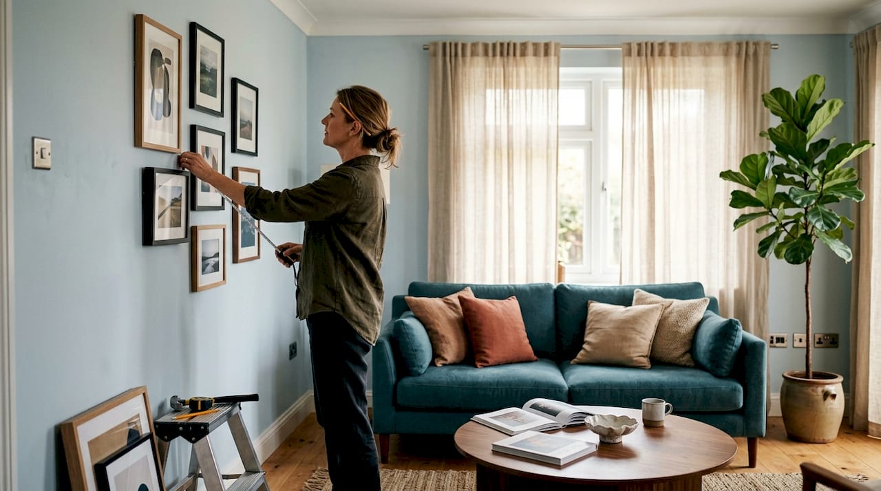
TL;DR:
- Effective art display arrangements enhance room aesthetics by using deliberate positioning and scale. Proper placement at eye level and proportionate sizing create cohesive, personalized wall displays that reflect intentional choices. Renter-friendly methods like leaning artwork and using templates allow easy, damage-free customization over time.
Art display arrangement is the practice of thoughtfully selecting and positioning artworks to enhance your home’s aesthetic and atmosphere. Done well, it transforms blank walls into a personal narrative. Done poorly, it leaves rooms feeling either cluttered or cold. The principles behind effective arrangement draw from museum curation: eye level placement, scale relationships, and intentional spacing. This guide gives you the practical rules and flexible techniques to build displays that feel considered, personal, and genuinely alive in your space.
What is an art display arrangement guide and why does it matter?
Art display arrangement, known in interior design as art placement or wall art curation, is the structured approach to hanging, grouping, and styling artworks within a room. The goal is visual balance: art that feels connected to its surroundings rather than stuck on a wall as an afterthought.
The most common mistake homeowners make is treating art as decoration added last, after everything else is settled. Art placed with intention shapes how a room feels from the moment you walk in. A single oversized canvas above a sofa reads as confident and deliberate. Three small prints scattered across a large wall read as uncertain. Scale, spacing, and placement height are the three variables that determine which outcome you get.
Interior designers consistently point to the museum eye level standard of 57–60 inches from the floor to the centre of the artwork as the baseline for comfortable viewing. That figure comes from the average standing eye level across adults. It applies whether you are hanging a single piece or anchoring a gallery wall.
How do you choose art that suits your space and style?
Choosing art with intention rather than purely to fill space creates displays that feel authentic. Interior designers are consistent on this point: buying art simply because it matches your sofa colour leads to uninspired, showroom-style results. The connection you feel to a piece matters far more than whether it echoes your cushion palette.
That said, practical considerations still apply. Scale is the most overlooked factor. A piece that is too small for its wall gets lost, regardless of how beautiful it is. As a rule, art should feel proportionate to the wall and the furniture beneath it. A large, empty wall calls for a statement piece or a grouped arrangement, not a single A3 print.
When building a collection, consider these principles:
- Mix frame sizes and styles. A uniform set of identical frames reads as flat. Combining slim black frames with natural wood or ornate gilt creates depth and personality.
- Curate around a loose theme or colour palette. You do not need every piece to match, but a shared tone, subject matter, or mood creates cohesion. Botanical prints, abstract textures, and landscape photography can coexist when they share a colour family.
- Avoid buying art purely to match décor. Art selected for personal connection outlasts trends and feels genuine to guests.
- Consider format variety. Mixing portrait, landscape, and square formats within a grouping adds visual rhythm.
Pro Tip: Before buying, photograph your wall and use a free phone app to overlay the artwork at scale. It takes two minutes and prevents expensive sizing mistakes.
For a structured approach to selecting pieces, Frametheworld’s art selection checklist walks you through the key decisions from size to style to finish.
What are the best practices for hanging art above furniture?
Placement relative to furniture is where most homeowners go wrong. The proportional relationship between art and furniture is the single biggest factor in whether a display looks composed or accidental.
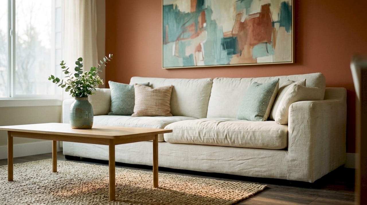
Art above furniture should span roughly two-thirds to three-quarters of the furniture’s width. For a 60-inch sofa, that means artwork between 40 and 45 inches wide. That ratio keeps the art anchored to the furniture without overwhelming it.
The vertical gap between the top of the furniture and the bottom of the frame matters equally. The standard range is 4–12 inches. A gap smaller than 4 inches makes the art feel glued to the furniture. A gap larger than 12 inches creates the “floating” effect where art and furniture appear unrelated.
| Furniture width | Recommended art width | Vertical gap |
|---|---|---|
| 48 inches (sofa) | 32–36 inches | 6–10 inches |
| 60 inches (sofa) | 40–45 inches | 6–12 inches |
| 36 inches (sideboard) | 24–27 inches | 4–8 inches |
| 72 inches (bed headboard) | 48–54 inches | 4–6 inches |
For gallery wall spacing, tight clusters work best with 2–4 inches between frames. Looser, more relaxed arrangements suit 6–10 inches of spacing. Consistent spacing throughout the arrangement is what separates a composed gallery wall from a random collection of frames.
Pro Tip: Centre the entire arrangement at 57–60 inches from the floor, not each individual piece. Treat the grouping as one unit.
For detailed guidance on art placement techniques in relation to architectural features, Frametheworld’s placement guide covers room-specific scenarios in depth.
How do you create a gallery wall with style and cohesion?
A gallery wall is the most expressive form of art arrangement, and the most technically demanding. The difference between a gallery wall that looks curated and one that looks chaotic comes down to planning and proportion.
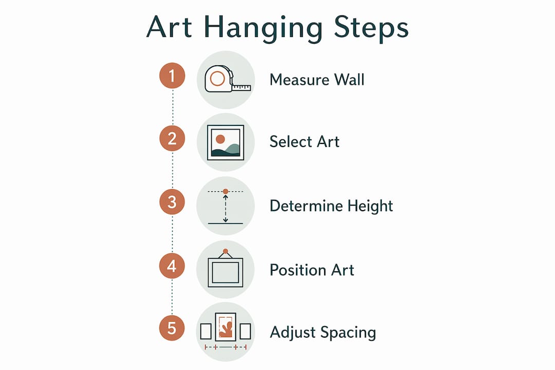
Follow this sequence for a gallery wall that holds together:
- Choose an anchor piece. Start with your largest or most visually dominant work. Everything else builds around it. Place this piece slightly left of centre or at the visual heart of the wall.
- Mix at least three frame sizes. Using small, medium, and large frames avoids the repetitive, wallpaper effect that uniform sizing creates. The variation adds movement and draws the eye across the wall.
- Map the layout before hanging. Trace each frame onto paper, cut out the shapes, and tape them to the wall with painter’s tape. This technique lets you rearrange endlessly without making unnecessary holes.
- Mix orientations. Alternate portrait and landscape pieces to create flow. A wall of only portrait frames reads as static.
- Maintain consistent spacing. Decide on your spacing (tight or loose) and apply it uniformly. Inconsistent gaps are the most common reason gallery walls look unfinished.
- Define a narrative or theme. The strongest gallery walls tell a story: a travel collection, a family archive, an abstract colour study. A shared theme gives viewers something to read across the wall.
Pro Tip: Photograph your paper template layout before removing it. You will have a reference map when it comes time to hang the actual frames.
For more expert advice on styling a gallery wall, Frametheworld’s dedicated guide covers layout strategies and frame pairing in detail.
What are renter-friendly options for art display?
Renters face a genuine constraint: most tenancy agreements restrict wall damage, which rules out the standard nail-and-hook approach for larger collections. The good news is that the most flexible art display methods also produce some of the most interesting results.
Leaning artwork on shelves, mantels, or consoles is a fully legitimate display strategy, not a compromise. It creates a layered, casual aesthetic that feels lived-in and personal. Picture ledges allow you to stack frames at different depths, mixing sizes and swapping pieces without any tools.
Practical renter-friendly options include:
- Picture ledges and shelves. These allow stacking and layering without permanent fixings. You can rotate pieces seasonally with no wall damage.
- Mantelpieces and sideboards. Leaning large canvases against a wall above a console table creates an intentional, editorial look.
- Adhesive hooks. Products like Command strips hold lightweight prints and frames without leaving marks. Check the weight limit before hanging.
- Freestanding frames and easels. Floor-standing frames work particularly well for oversized pieces in corners or beside furniture.
Pro Tip: When you do use nails, fill holes with white toothpaste or a small amount of filler before you leave. It takes seconds and saves your deposit.
Rearranging art regularly refreshes a room’s character without spending a penny. Moving a piece from the bedroom to the hallway, or rotating seasonal prints, keeps your home feeling current and personal.
How do you care for your art displays over time?
Art display care is straightforward but often overlooked. A few consistent habits protect both the artwork and the wall.
- Avoid direct sunlight. UV light fades pigments in prints and paintings over time. Position art away from south-facing windows, or use UV-filtering glass in frames for pieces that cannot be moved.
- Clean frames and glass regularly. Dust builds up on frame edges and glass surfaces. A soft, dry cloth on frames and a glass-safe cleaner on glazing keeps displays looking fresh.
- Check hanging hardware annually. Picture hooks and wall fixings loosen over time, particularly in older plaster walls. A quick check prevents accidents.
- Rotate displays periodically. Rotating art between rooms preserves pieces from prolonged light exposure and keeps your interiors feeling dynamic.
- Repair wall marks promptly. Small nail holes and scuffs are easy to fill with ready-mixed filler and touch-up paint. Addressing them early prevents larger repairs later.
Key takeaways
Effective art display arrangement depends on three fundamentals: correct scale relative to furniture, consistent spacing, and intentional selection rooted in personal connection rather than décor matching.
| Point | Details |
|---|---|
| Eye level placement | Hang art so the centre sits 57–60 inches from the floor for comfortable viewing. |
| Scale relative to furniture | Art width should span two-thirds to three-quarters of the furniture below it. |
| Gallery wall planning | Map layouts with paper templates before hanging to avoid unnecessary wall damage. |
| Renter-friendly display | Lean art on ledges, mantels, and consoles for flexible, damage-free arrangements. |
| Personal selection | Choose art for emotional connection, not solely to match existing décor colours. |
Why I think most people hang art too small and too safe
The single most common error I see in home art displays is timidity. Homeowners choose a piece they love, then buy it two sizes too small because a larger canvas feels like a commitment. The result is a beautiful piece that disappears on the wall and does the room no favours.
The second error is treating art as the last decision. Art placed after every other furnishing choice has been made tends to feel like a filler, because it is. The rooms that feel genuinely considered are the ones where art shaped the direction of the space, not the other way around.
Renter-friendly approaches deserve far more credit than they receive. Leaning art on a picture ledge or mantel is not a workaround. It is a legitimate display method used in some of the best-styled interiors I have seen. The ability to rotate, swap, and rearrange without tools is an advantage, not a limitation.
The most rewarding thing about art arrangement is that it is never finished. Rearranging and moving art between rooms adds dynamism and helps build a cohesive narrative throughout your home. Treat your walls as a living collection, not a fixed installation, and the whole exercise becomes far more enjoyable.
— Lennard
Art collections worth building your walls around
Frametheworld offers a range of hand-painted original artworks that give homeowners genuine alternatives to mass-produced prints. The collections are browsable by style, size, and format, which makes finding the right scale for a specific wall straightforward. The Wabi Sabi wall art collection is particularly well suited to layered, textural displays where imperfection and depth are the point. For homeowners who want colour and energy, the colourful paintings collection offers bold, hand-painted canvases that anchor a room with confidence. Frametheworld also supports bespoke commissions for homeowners who need a specific size or subject to complete a display.
FAQ
What height should art be hung at?
The centre of a piece or gallery wall should sit 57–60 inches from the floor. This follows the museum eye level standard used across professional interior installations.
How wide should art be above a sofa?
Art above a sofa should span roughly two-thirds to three-quarters of the sofa’s width. For a 60-inch sofa, that means artwork between 40 and 45 inches wide.
How much space should be left between frames on a gallery wall?
Leave 2–4 inches between frames for a tight, cohesive cluster. Use 6–10 inches for a looser, more relaxed arrangement. Consistent spacing throughout is what makes a gallery wall look intentional.
Can renters display art without damaging walls?
Yes. Leaning art on picture ledges, mantels, and consoles requires no fixings at all. Adhesive hooks handle lightweight prints safely, and painter’s tape templates let you plan layouts without making holes.
How often should you rearrange your art displays?
There is no fixed rule, but rotating displays seasonally or when you acquire new pieces keeps your home feeling fresh. Moving art between rooms is one of the most effective ways to refresh a space without buying anything new.

Leave a comment
This site is protected by hCaptcha and the hCaptcha Privacy Policy and Terms of Service apply.