
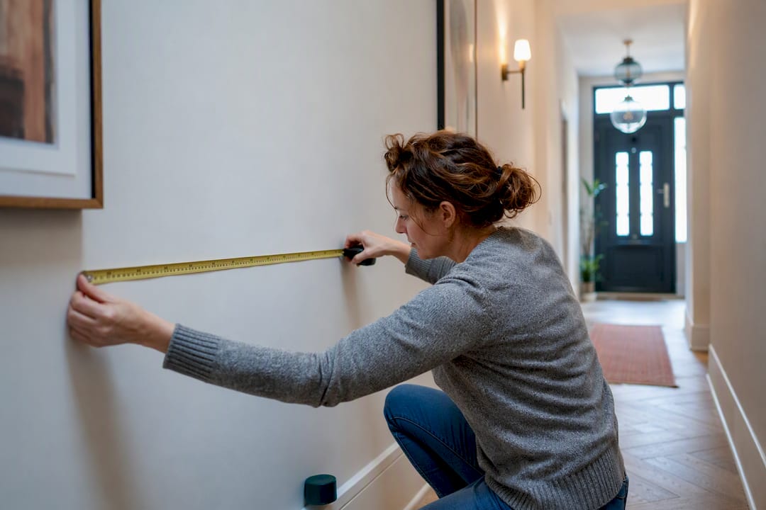
For most hallways, a single horizontal gallery row or one oversized anchor piece gives the strongest result, and mirrors earn their place in anything narrower than a metre. The rest comes down to measurement, not taste: centre height, spacing, and matching frame finish to your architecture. This guide gives three layout templates, exact hanging numbers, and a route to bespoke sizing through Frametheworld when off-the-shelf dimensions don’t fit.
TL;DR:
- Narrow hallways under 110cm wide benefit from vertical art and mirrors that expand perceived space rather than wide horizontal frames.
- Most hallway art should be hung with the center at 145cm from the floor, with side-by-side frames spaced 6 to 8cm apart and stacked rows 10 to 12cm apart for ceilings above 2.4 meters.
- Custom-sized art is recommended when standard frames do not match the wall dimensions, requiring precise measurement and lighting considerations.
- Oversized statement pieces should cover most of the unbroken wall width and be paired with complementary furniture, with canvas often preferred for low-glare and texture.
- Effective lighting includes picture lights or sconces with bulbs at 2700K to 3000K, aimed downward at about 30 degrees to reduce glare.
Table of Contents
- Gallery wall layouts: linear rows, stacks and length-specific templates
- Statement art: choosing and placing one oversized anchor piece
- Small and narrow hallway ideas that don’t make the space feel tighter
- How to hang hallway art: centre heights, spacing and a simple method
- Frame finishes and materials that suit your hallway’s light and architecture
- Lighting for hallway art: picture lights, sconces and bulb temperature
- Styling the finishing touches: consoles, runners and plants
- Getting hallway art sizing right: what commissioning a custom piece involves
- Seasonal and thematic wall art rotation ideas
- Mixing textures and materials for visual interest
- Selecting colours and patterns to complement your hallway’s dimensions
- Why measurement beats trend in hallway art
- A practical next step for hallways that need custom sizing
- Sources
- FAQ
Gallery wall layouts: linear rows, stacks and length-specific templates
A single horizontal row of same-height frames, centred at eye level, is the most dependable layout for a narrow corridor. Stacked two-row arrangements only work once your ceiling clears about 2.4 metres, otherwise the top row disappears into shadow or crowds the cornice, according to guidance from Fab Art on decorating hallways with art. Treating a long corridor as a sequence, rather than one static display, also gives the eye somewhere to travel, and a limited palette or consistent framing helps that sequence read cleanly as you walk past it, per Havenly’s hallway styling advice.
Three templates cover most UK hallways:
- Short hallway: a small number of frames in a single row, spaced moderately apart, centred at about eye level.
- Medium hallway: a moderate number of frames with uniform spacing in a single row, or a loose stacked pair if ceilings allow.
- Long hallway: a sequence broken into two or three clusters with resting gaps between clusters to create focal points.
Whichever template you choose, keep the frame finish and mount colour consistent across every piece. Mixing black metal with pale oak in the same row reads as clutter rather than curation. If your hallway has an odd run, asymmetrical gallery wall layouts solve the problem without abandoning cohesion.
Statement art: choosing and placing one oversized anchor piece
Some hallways don’t need seven small frames. They need one. Designers routinely recommend a single dramatic, oversized piece as the focal point of a hallway, particularly when it’s paired with a console table or bench beneath it, according to Martha Stewart’s hallway décor guide.
The sizing rule that keeps this from looking arbitrary:
- The artwork should span a majority of the unbroken wall width, leaving breathing room around it.
- Leave sufficient space above the piece and below it before any furniture.
- If a console or lamp sits underneath, ensure the art’s bottom edge is clearly above the lamp shade.
- Canvas often outperforms glazed prints here. Less glare down a corridor that gets side-lit from doorways, and the texture reads better at close range than a flat framed print.
For guidance on scaling composition around a single large piece, styling large wall art covers furniture pairing in more depth than most hallway articles bother to.
Small and narrow hallway ideas that don’t make the space feel tighter
Anything under about 110cm wide punishes the wrong choices fast. Wide horizontal pieces make a narrow hall feel like a tunnel; vertical formats and repeated small frames do the opposite; they lengthen the sightline instead of squeezing it.
- Choose vertical over horizontal whenever your corridor width drops below 110cm. A tall, narrow canvas draws the eye up rather than across.
- Use mirrors instead of art on the wall directly opposite a light source. They bounce daylight down the corridor and make the width feel more generous, which plain art can’t do.
- Pick mirrors over framed prints specifically at the point where a hallway turns a corner. That’s where extra perceived light matters most.
- Install floating ledges or picture hooks rather than deep shelving. A shelf that protrudes more than a few centimetres becomes a hazard in a tight walkway.
- Repeat one small frame size in a tight vertical column rather than mixing sizes. Consistency reads as intentional in a space with no room for visual noise.
DIY canvas transformations and simple murals can shift the whole character of a long, narrow corridor when paired with modest lighting, as shown in practical examples from La Casa Almodóvar’s hallway projects. For more on why vertical compositions specifically solve the narrow-wall problem, see why vertical art works in rooms.
How to hang hallway art: centre heights, spacing and a simple method
Get the centre height wrong and nothing else matters. For most corridors, 145 to 150cm from the floor to the centre of the artwork works reliably, because that’s roughly eye level for someone walking rather than standing still and staring.
- Measure the wall run first. Note any door swings; keep art at least 8 to 10cm clear of a door’s arc.
- Mark the centre height. Use 145cm for single-row layouts, dropping to 140cm if your household is on the shorter side on average.
- Space side-by-side frames 6 to 8cm apart. Tighter gaps look cluttered; wider gaps break the sense of a set.
- Space stacked rows 10 to 12cm apart vertically, and only attempt this where ceilings clear 2.4 metres.
- Cut paper templates matching each frame’s dimensions, tape them to the wall, and live with them for a day before committing to a single hole.
- Match hardware to weight. A 30x40cm frame usually needs one picture hook; anything over 5kg wants two hooks or a French cleat.
Pro Tip: Photograph your paper template arrangement before removing the tape. It’s the fastest way to double-check spacing against your original plan once the frames are actually up.
Guides built around exact templates and measured hanging advice consistently produce better results than free-styling it, largely because most sizing mistakes only become obvious once the holes are already drilled, according to House & Garden’s hallway ideas.
Frame finishes and materials that suit your hallway’s light and architecture
Frame colour isn’t a cosmetic afterthought in a hallway; it’s the thing that either matches your skirting boards and door frames or fights them every time you walk past.
- Black frames suit period properties with dark woodwork or contemporary new-builds with clean sightlines.
- Natural oak works in Scandinavian-leaning interiors and anywhere the hallway floor is timber, tying the art visually to the floor beneath it.
- White frames disappear against pale walls, which suits collectors who want the print itself to dominate, not the frame.
- Brass finishes flatter warmer, jewel-toned walls and period cornicing, but read cheap fast if the metal tone doesn’t match nearby door furniture.
- Acrylic glazing over glass cuts reflection substantially in hallways lit from a side window, where glass throws back glare at an angle you can’t avoid.
- Matte papers reduce reflection further still and suit north-facing corridors with flat, low light.
Frame and print-type decisions should follow your hallway’s architecture and light level rather than trend, a point covered in detail by Il Bordura’s corridor wall art guide. Canvas remains the better call for renters, since it typically hangs on lighter hardware and shows less wall damage on removal than a heavy framed piece.
Lighting for hallway art: picture lights, sconces and bulb temperature
Most hallway art is under-lit, not badly chosen. A piece that photographs beautifully in a shop can vanish into a dim corridor within a week of hanging.
- Picture lights mount directly above a frame and suit single anchor pieces or short galleries where you want light on the art specifically, not the whole wall.
- Battery-operated picture lights solve the no-nearby-socket problem without an electrician, and they’ve become a genuinely low-effort fix for renters who can’t rewire.
- Wall sconces suit longer runs where you want ambient corridor light and art illumination combined, rather than a spotlight effect.
- Aim for 2700K to 3000K bulbs. Anything cooler reads clinical against warm frame tones and skin-toned prints.
- Angle picture lights slightly downward, roughly 30 degrees, to avoid throwing glare back off glazed prints straight into your eyeline.
Styling the finishing touches: consoles, runners and plants
Art on its own reads as decoration. Art with a console, a runner, and something growing reads as a room someone actually thought about.
- Keep roughly 18cm of clear space between the top of a console table and the bottom edge of the art above it.
- A slim bench or console anchors a statement piece visually, giving the eye a stopping point rather than just wall and frame.
- A runner underfoot echoes tones from the art above it, pulling the whole vignette together without adding another decision to make.
- On long hallways, break the run into zones: something small near the entrance, an anchor piece roughly two thirds of the way along, then a deliberate stop. This progression prevents the flat, one-note feeling that long unbroken runs of identical frames tend to produce.
- A single plant at a turn or doorway does more work than a second piece of art in tight spaces, adding texture without competing for wall space.
Getting hallway art sizing right: what commissioning a custom piece involves
Standard frame sizes rarely match real hallway dimensions exactly, which is where a lot of the templates above start to strain. Frametheworld’s how-to content, including guides on gallery wall styling and staircase wall art layouts, works through the same measurement problems covered here in more specific detail for stairside and awkward-shaped walls.
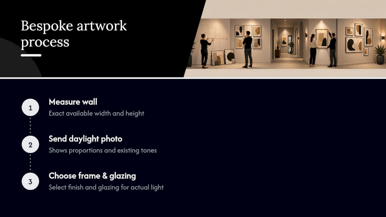
Commissioning a bespoke piece for an odd wall run follows a simple sequence: measure the exact available width and height, send a photo of the wall in daylight so proportions and existing tones are visible, then choose the frame finish and glazing based on the light conditions you’re actually working with. This removes the guesswork of forcing a standard 40x50cm print into a space that’s really 43x52cm, which is the single most common reason gallery walls end up looking slightly wrong without anyone being able to say why.
Seasonal and thematic wall art rotation ideas
Hallway art doesn’t need to be permanent. A corridor is one of the easiest spaces in the house to rotate, precisely because it’s usually a handful of similarly sized frames rather than one enormous fixed piece.
Swapping two or three prints seasonally, botanical tones in spring, warmer abstract palettes in autumn, keeps a hallway feeling maintained rather than static. This works particularly well with a mounting system built for easy swaps: French cleats or a simple picture rail let you change the art without repatching wall holes every time.
Thematic rotation works differently. Rather than swapping by season, some households rotate by occasion: travel photography after a trip, children’s artwork during school terms, or a set of monochrome prints during a redecoration phase elsewhere in the house. The key constraint is keeping the frame sizes and centre height fixed even as the prints themselves change, so the wall doesn’t need re-measuring every time. Buy or commission frames slightly larger than your current prints if you plan to rotate mounts within them, since a fixed frame footprint with swappable mounts is far less disruptive than rehanging entirely different-sized pieces twice a year.
Mixing textures and materials for visual interest
A hallway lined entirely with glossy framed prints can look flat under artificial light, even when the compositions themselves are strong. Texture is what breaks that monotony.
Pairing a canvas piece with two or three framed prints in the same sequence adds depth without breaking the palette, provided the frame finish stays consistent across the framed pieces. Canvas has a matte, slightly raised surface that catches light differently to glass or acrylic glazing, which matters more in hallways than almost any other room because most hallway light comes from a low angle through a front door or side window rather than straight overhead.
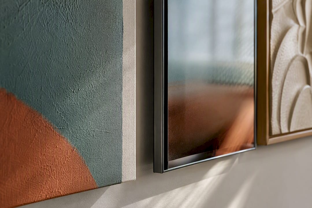
Beyond canvas versus glazed prints, consider mixing in one dimensional element: a small sculptural relief, a woven textile panel, or a shallow box frame with layered elements. These don’t need to dominate the wall; one such piece among four or five flat prints is usually enough to stop the whole run from reading as uniform. The trade-off is maintenance. Textured and three-dimensional pieces collect dust differently to a sealed framed print, so they suit hallways that get cleaned regularly more than ones that don’t.
Materials beyond the art itself count too. A woven runner underfoot, a wooden console, and a metal-framed mirror together create more textural range than three pieces of flat art ever could on their own.
Selecting colours and patterns to complement your hallway’s dimensions
Colour choice in a hallway isn’t really about matching your sofa. It’s about correcting or reinforcing the proportions of a space that’s usually longer than it is wide, and often darker than the rooms it connects.
In a narrow, dim corridor, art with pale backgrounds and higher contrast reads more clearly at a glance than muted, low-contrast palettes, simply because there’s less ambient light to reveal subtlety. Save the tonal, muted abstracts for hallways with genuine natural light from a front door with glazing or a skylight.
Pattern density matters more than most homeowners expect. Busy, detailed patterns in a series of small frames along a narrow wall can feel chaotic at walking pace, because the eye doesn’t get enough time to resolve the detail before moving past it. Bolder, simpler compositions with fewer competing elements are more legible when someone’s walking through rather than standing still to study them, a point that echoes the broader design principle that hallway art needs to work at speed, not just up close.
Warm-toned frames and prints suit hallways with limited daylight, since cooler blues and greys can make an already dim corridor feel colder still. Where a hallway is genuinely bright, cooler palettes and higher-contrast monochrome work well precisely because there’s enough light to stop them reading as flat.
Why measurement beats trend in hallway art
The conventional advice on hallway decorating leans heavily on mood boards and trend lists, and most of it skips the one variable that actually determines whether a gallery wall works: your hallway’s actual width, ceiling height, and light direction. A layout that looks stunning in a wide Victorian hall photographed for a magazine can look cramped and over-busy in a 90cm new-build corridor, and no amount of styling advice fixes that mismatch.
What I’d prioritise first, before choosing a single print, is measuring the wall properly: width, ceiling height, nearest light source, and door swing clearances. Everything else, frame finish, palette, whether you go gallery row or statement piece, follows from those four numbers. The homeowners who get frustrated with their hallway art usually didn’t choose badly. They chose a layout designed for a different set of dimensions than the one they actually have.
Custom sizing solves this more reliably than hunting through standard print ranges hoping something happens to fit. It’s a slower route, but it stops you compromising on proportion just because the nearest available size wasn’t quite right.
— Lennard
A practical next step for hallways that need custom sizing
Standard print sizes rarely match the exact wall run you’re working with, and that gap is where made-to-size hand-painted art becomes valuable. Rather than forcing a 40x50cm canvas into a 43cm gap, specifying the exact dimensions your hallway actually has can be beneficial.
For contemporary hallways wanting a textured, tonal anchor piece, the Wabi Sabi wall art collection offers hand-painted abstracts with the kind of surface texture that reads well under low corridor light, exactly the quality that flat glazed prints struggle to match. For entryways wanting something bolder and more immediately legible at walking pace, the Pop Art collection delivers colour and personality that a muted print won’t.
If your hallway’s dimensions don’t match anything off the shelf, measure the wall, photograph it in daylight, and request a custom quote from a bespoke art provider to get a piece sized to that exact run rather than the nearest standard option.
Sources
- 21 Hallway décor ideas for this often overlooked space
- 99 hallway ideas to make a great first impression
FAQ
What kind of art looks good in a hallway?
Bold, high-contrast pieces that read clearly at walking pace tend to work best, along with gallery rows of same-height frames or a single oversized statement piece paired with a console.
What is the best wall art for a hallway?
For narrow corridors, a single horizontal row of matching frames centred around 145cm works most reliably; for wider halls, one large canvas anchor piece over a console often has more impact.
What are the trends for decorating hallways in 2026?
Seasonal or thematic art rotation using swappable mounts, textured canvas pieces mixed with framed prints, and custom-sized bespoke art from platforms like Frametheworld are all gaining ground over fixed, one-off gallery walls.
How do I decorate my hallway wall?
Measure the wall width and ceiling height first, choose between a gallery row or one statement piece based on that measurement, hang at a 145cm centre height, and add a console or runner to finish the vignette.

Laat een reactie achter
Deze site wordt beschermd door hCaptcha en het privacybeleid en de servicevoorwaarden van hCaptcha zijn van toepassing.