
TL;DR:
- Effective commercial art displays transform empty walls into engaging environments that reinforce brand identity and shape visitor experience. Using consistent framing, accurate lighting, and modular rotation systems, business owners can create environments that captivate visitors and maintain freshness over time. Prioritizing presence over perfection and employing professional installation ensures that art truly enhances the commercial space.
The best commercial art display ideas transform empty walls into deliberate, engaging environments that shape how visitors feel about your business. In professional settings, art is not decoration. It is a tool for brand communication, atmosphere building, and visitor experience. This article covers the most effective approaches to displaying artwork in commercial spaces, from modular systems and lighting standards to framing choices and interactive formats. Whether you manage a hotel lobby, a corporate office, or a retail environment, the right display strategy makes a measurable difference.
1. What are the best commercial art display ideas for business owners?
Commercial art display ideas are structured approaches to presenting artwork in business environments with the goal of enhancing atmosphere, reinforcing brand identity, and engaging visitors. The industry term for this discipline is visual merchandising for art, and it draws on principles from both gallery curation and retail design. The most effective displays treat art as a curated experience rather than a static wall, using placement, lighting, and rotation to guide the viewer’s attention and create emotional impact.
The core principle is presence, not perfection. Balancing artwork, space, and viewer comfort creates more impact than filling every available surface. Business owners who understand this distinction make smarter decisions about scale, spacing, and selection.
2. Modular and moveable art displays
Modular systems facilitate seasonal rotation and maintain freshness in commercial displays while reducing the cost of full reinstallations. A modular display uses interchangeable panels, freestanding units, or track systems that allow you to reconfigure the layout without specialist labour. This is particularly valuable in retail environments, hotel lobbies, and co-working spaces where the atmosphere needs to shift with seasons, campaigns, or tenant changes.
The practical benefits are significant:
- Wall panel systems allow you to swap individual pieces without disturbing the surrounding arrangement
- Freestanding units create temporary focal points in open-plan spaces and can be repositioned for events
- Track hanging systems (such as those used in commercial gallery setups) let you adjust height and spacing without drilling new fixings
- Themed seasonal collections give repeat visitors a reason to look again and create a sense of ongoing curation
Pro Tip: Build a small rotating collection of six to eight pieces and cycle three or four into display at any one time. This keeps your space feeling current without requiring new purchases every season.
The key to making modular displays work is consistency in framing and scale. Mixing frame styles across a rotating collection creates visual noise. Standardise your frame profile and colour palette so that any piece from your collection reads as part of the same curated whole.
3. How lighting shapes the impact of your art display
Lighting is the single most underestimated factor in commercial art presentation. LED lighting with CRI 90 or higher is the standard recommendation for accurate colour rendering. CRI stands for Colour Rendering Index, and a score of 90 or above means the light source reproduces colours very close to how they appear in natural daylight. This matters because artwork with warm reds, deep blues, or subtle neutrals will look flat or distorted under lower-quality lighting.
Effective commercial lighting for art uses a layered approach:
- Ambient lighting provides the base level of illumination across the space
- Accent lighting (directional spotlights or picture lights) draws the eye to individual works
- Glare reduction is achieved by angling spotlights at 30 degrees from vertical, preventing reflections on glass or varnished surfaces
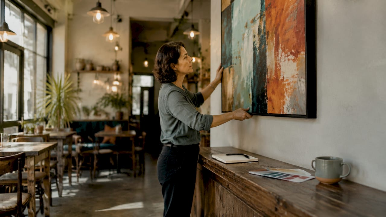
Beyond bulb quality, placement matters. Hanging artwork at 58–60 inches from the floor to the centre of the piece is the standard for standing viewers. In seated environments such as restaurants or waiting rooms, drop this to 58 inches to align with seated eye level.
Pro Tip: Maintain a 6–10 inch gap between the top of furniture and the bottom edge of the artwork. This creates a visual connection between the two elements without making the piece feel anchored to the furniture below it.
LED lighting also protects your investment. Unlike halogen or fluorescent sources, quality LEDs emit minimal UV radiation and generate very little heat. Both UV exposure and heat accelerate fading and canvas degradation, so switching to LED is both an aesthetic and a conservation decision.
4. Creative display solutions that maximise engagement
The most memorable commercial spaces use art to guide movement, create focal points, and tell a story. A retail art display system should incorporate a three-part visual hierarchy: a clear brand or title element, a concise benefit statement, and intuitive browsing cues. This framework applies equally to a hotel corridor, a corporate reception, or a boutique retail floor.
Here is a comparison of the most common creative display formats and their best-fit settings:
| Display format | Best setting | Key advantage |
|---|---|---|
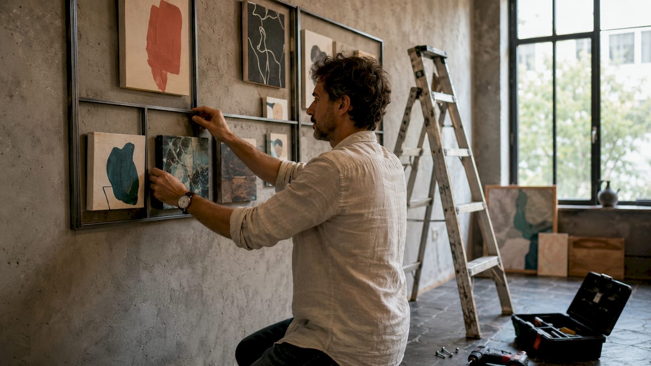
| Gallery wall (salon style) | Reception areas, hospitality | Creates visual richness and depth |
| Grid arrangement | Corporate offices, retail | Conveys order and professionalism |
| Freestanding sculpture | Lobbies, open-plan spaces | Adds three-dimensional interest |
| Digital screen integration | Retail, events, co-working | Allows dynamic content rotation |
| Mixed media installation | Hospitality, creative agencies | Generates conversation and memorability |
Salon-style and grid gallery walls use specific arrangement and spacing rules to prevent clutter. The standard recommendation is a 2–3 inch gap between frames in a gallery wall arrangement. Tighter spacing creates a dense, immersive feel. Wider spacing reads as more considered and formal.
Interactive art displays are growing in commercial use. Touchscreen panels that allow visitors to explore the story behind a piece, QR codes linking to artist profiles, or augmented reality overlays all extend the engagement beyond the physical object. These approaches work particularly well in hospitality and retail environments where dwell time is a commercial priority.
5. Art styles and framing choices for commercial interiors
The art style you choose communicates something about your business before a single word is spoken. Abstract works with bold colour palettes signal creativity and confidence. Minimalist pieces in neutral tones suggest precision and calm. Large-scale photography conveys ambition and a sense of place. Matching the style to your business type and your audience’s expectations is the foundation of a coherent display strategy. You can explore art styles for commercial spaces to find the right fit for your environment.
Framing choices are equally important. Consider the following:
- Consistent frame profiles across a multi-piece display create visual unity, even when the artworks themselves vary in subject or colour
- Wide mats of at least 2 inches increase the perceived gallery presence of smaller works, particularly those under 11x14 inches, without overcrowding the image
- Float mounting (where the artwork appears to hover within the frame) works well for contemporary and abstract pieces in modern commercial interiors
- Deep box frames suit three-dimensional or mixed media works and add a sense of craft and materiality
The framing process deserves as much attention as the artwork itself. A poorly framed piece undermines even the strongest composition. In commercial settings, where first impressions carry significant weight, professional framing is not optional.
6. How art transforms commercial spaces for client engagement
Art in commercial environments transforms how clients engage with a space. The right display strategy signals investment, taste, and attention to detail. These are qualities that transfer, in the visitor’s mind, to the business itself.
The most effective approach combines a clear display concept with practical execution standards: correct hanging height, appropriate lighting, consistent framing, and a rotation plan. Each of these elements is manageable independently. Together, they create an environment that feels considered rather than assembled.
Key takeaways
The most effective commercial art displays combine consistent framing, accurate lighting, and a modular rotation plan to create environments that engage visitors and reinforce brand identity.
| Point | Details |
|---|---|
| Lighting quality is non-negotiable | Use LED sources with CRI 90 or above to render artwork colours accurately and protect against UV damage. |
| Hanging height follows a standard | Centre artwork at 58–60 inches from the floor, dropping to 58 inches in seated environments for optimal visibility. |
| Modular systems reduce long-term costs | Interchangeable panels and track systems allow seasonal rotation without specialist reinstallation. |
| Framing unifies a diverse collection | Consistent frame profiles and mats of at least 2 inches create gallery presence across varied artworks. |
| Visual hierarchy drives engagement | Structure displays with a clear focal point, supporting works, and intuitive browsing cues to guide visitor attention. |
Why presence matters more than perfection in commercial art
I have spent years advising on art placement in commercial settings, and the single most common mistake I see is over-curation. Business owners fill every wall, match every frame to the brand colour, and then wonder why the space feels like a catalogue rather than an environment.
The principle I return to consistently is presence. A single large-scale abstract piece on a well-lit wall does more for a reception area than twelve smaller works competing for attention. Restraint is a display decision, not a failure of ambition.
The second lesson is that rotation matters more than most people expect. Visitors who return to your space regularly notice when nothing changes. A simple swap of two or three pieces every quarter signals that the space is alive and that someone is paying attention. It does not require a large budget. It requires a plan.
I also think the role of professional installation is underestimated. Incorrect hanging height, poor lighting angles, and mismatched framing are all visible to visitors, even if they cannot articulate why the space feels slightly off. Getting the technical execution right is what separates a display that impresses from one that simply exists. If you are working with an interior designer, collaborating on art placement from the outset produces far better results than retrofitting art into a finished scheme.
— Lennard
Explore hand-painted art collections for your commercial space
Frametheworld offers a curated selection of hand-painted original artworks suited to commercial interiors, from bold abstract canvases to textured pieces with genuine material presence. Each work is available with professional framing options and can be tailored in size for specific wall dimensions. For spaces that need a strong focal point, the Wabi Sabi collection delivers hand-painted abstract texture with a calm, considered aesthetic that works across hospitality, corporate, and retail environments. If your space calls for something with more visual energy, the colourful canvas range offers bold, vibrant works that command attention without overwhelming a room. Bespoke commissions are available for larger projects.
FAQ
What is the standard hanging height for commercial art displays?
The standard is to centre artwork at 58–60 inches from the floor. In seated environments such as restaurants or waiting rooms, adjust to 58 inches to align with seated eye level.
What type of lighting is best for displaying artwork in commercial spaces?
LED lighting with a Colour Rendering Index of 90 or above is the recommended standard. It renders artwork colours accurately and produces minimal UV radiation, which protects pieces from fading over time.
How do modular art display systems benefit commercial properties?
Modular systems allow seasonal rotation and layout changes without specialist labour or new fixings. This keeps commercial spaces feeling current and reduces the long-term cost of maintaining an engaging environment.
What frame width is recommended for smaller artworks in commercial settings?
Mat widths of at least 2 inches are recommended for works under 11x14 inches. Wider mats increase the perceived gallery presence of smaller pieces without overcrowding the image itself.
Which art styles work best in corporate or hospitality environments?
Abstract works with bold colour palettes suit creative and hospitality settings. Minimalist pieces in neutral tones work well in corporate environments. Matching style to audience expectations is more important than following a single trend. Explore office art placement tips for workspace-specific guidance.

Laat een reactie achter
Deze site wordt beschermd door hCaptcha en het privacybeleid en de servicevoorwaarden van hCaptcha zijn van toepassing.