
TL;DR:
- Choosing art first helps create a cohesive color scheme and establishes a room’s mood before selecting paint and textiles.
- Extracting two or three dominant hues from the artwork guides furniture and accent choices, ensuring balance and harmony.
Art is the practical anchor that creates a room’s colour story. Before you choose a paint shade or order a sofa fabric, the artwork on your wall already contains a dominant tone, two or three supporting hues, and a mood that can do all the heavy lifting for you. The single most useful thing you can do is test or choose your art before you commit to paint and textiles.
Two actions get you started immediately:
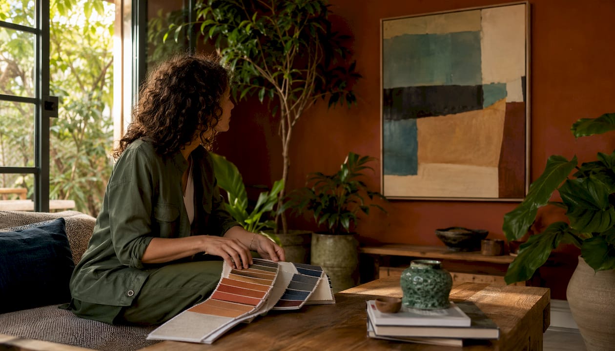
- Pick the art first, or hold an existing piece against your textiles and natural light to see which colours it pulls forward.
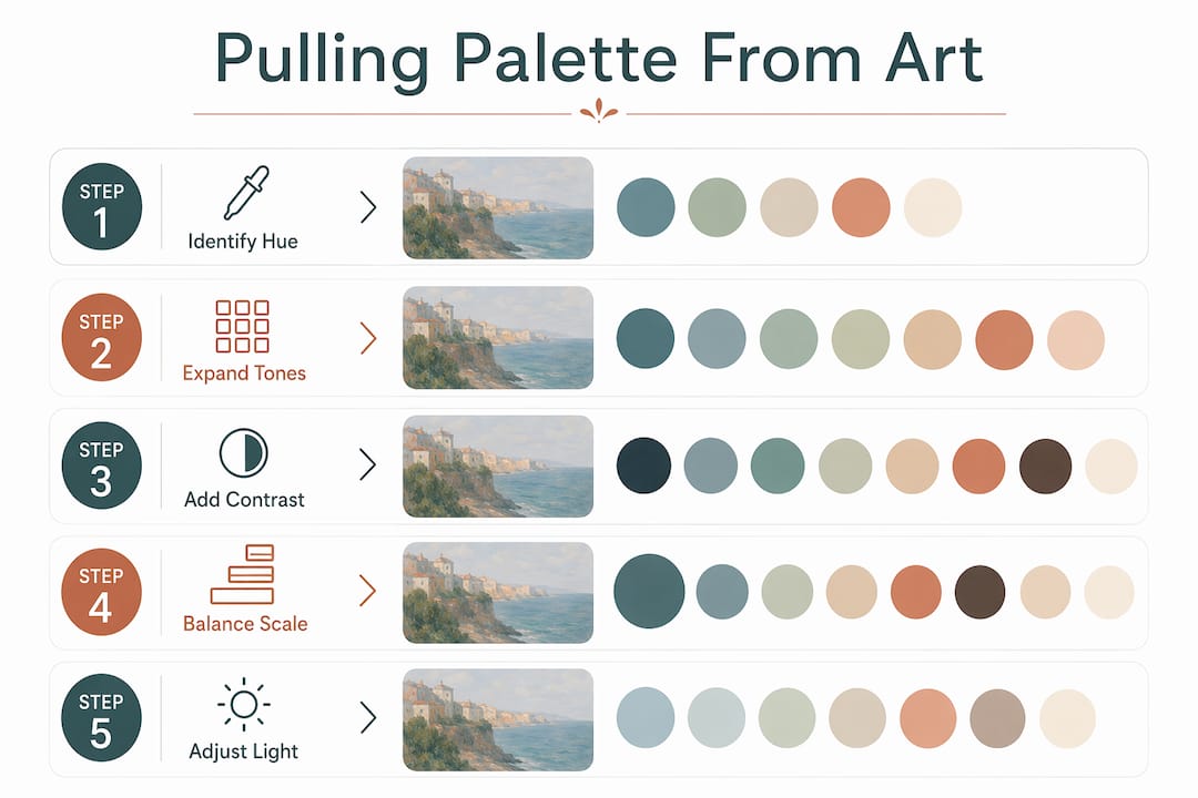
- Extract two or three colours from it: assign the dominant hue to walls, the secondary to large upholstery, and the quietest accent to cushions, throws or decorative objects.
Quick recipe: one artwork → one wall colour + one sofa fabric + one accent detail.
- Creates an instant focal point that stops a room feeling flat
- Gives every purchase decision a reference point, reducing guesswork
- Ties mood and colour together so the scheme feels considered rather than assembled
Table of Contents
- Why artwork functions as a design anchor
- Three ways to pull a palette from one artwork
- How scale and placement change a colour’s impact
- Why light and finish change the colours you see
- Common palette mistakes when using art, and how to fix them
- Integrate art early and commission with intent
- Key takeaways
- Art-led palettes are worth living with
- Frametheworld: hand-painted art built around your palette
- Further reading and useful sources
Why artwork functions as a design anchor
Art gives a room a focal point and prevents the space from feeling flat; when it aligns with palette, scale and mood, the whole room feels balanced. That is not a stylistic preference — it is perceptual mechanics at work.
A piece of art carries a built-in colour hierarchy. The dominant hue commands the most canvas area and naturally reads as the room’s primary tone. Secondary hues sit in mid-ground passages and suggest what large textiles — a sofa, curtains, a rug — might echo. Accent colours appear in small, high-contrast passages and point directly to where decorative objects and cushions should land. Follow that hierarchy and you have a palette roadmap without opening a single paint chart.
The perceptual principle behind this is simultaneous contrast, documented by Michel Eugène Chevreul: colours look different depending on what surrounds them. A warm terracotta pulled from a painting will read more orange against a cool grey wall than it does on the canvas itself. Designers use this deliberately, intensifying or softening perceived warmth without repainting.
Colour temperature adds another layer. Warm colours — ochres, reds, burnt oranges — read closer and feel more attention-grabbing. Cool colours recede. A painting dominated by warm tones will make a large room feel more intimate; a cool-toned abstract will push the walls back in a tight space.
A few practical implications:
- A muted landscape with warm ochres and dusty greens naturally suggests warm neutrals for walls and linen-toned upholstery.
- A bold abstract with cobalt, crimson and white calls for a saturated accent wall or statement cushions, not a cautious beige sofa.
- A monochrome photograph works as a tonal anchor: pull its mid-grey for walls and its near-black for a single piece of furniture.
Three ways to pull a palette from one artwork
Method 1: direct extraction
This is the most straightforward approach and suits most homeowners.
- Identify the dominant hue — the colour that covers the most surface area in the piece.
- Identify the secondary hue — the next most present colour, often in mid-tones or background passages.
- Identify the accent — a small, high-contrast detail colour that catches the eye.
- Assign dominant → walls (or the largest textile if you prefer a neutral wall), secondary → main upholstery, accent → cushions, vases, lampshades.
Method 2: tonal expansion
When a painting uses a single colour family, expand it into usable shades rather than repeating the same tone everywhere.
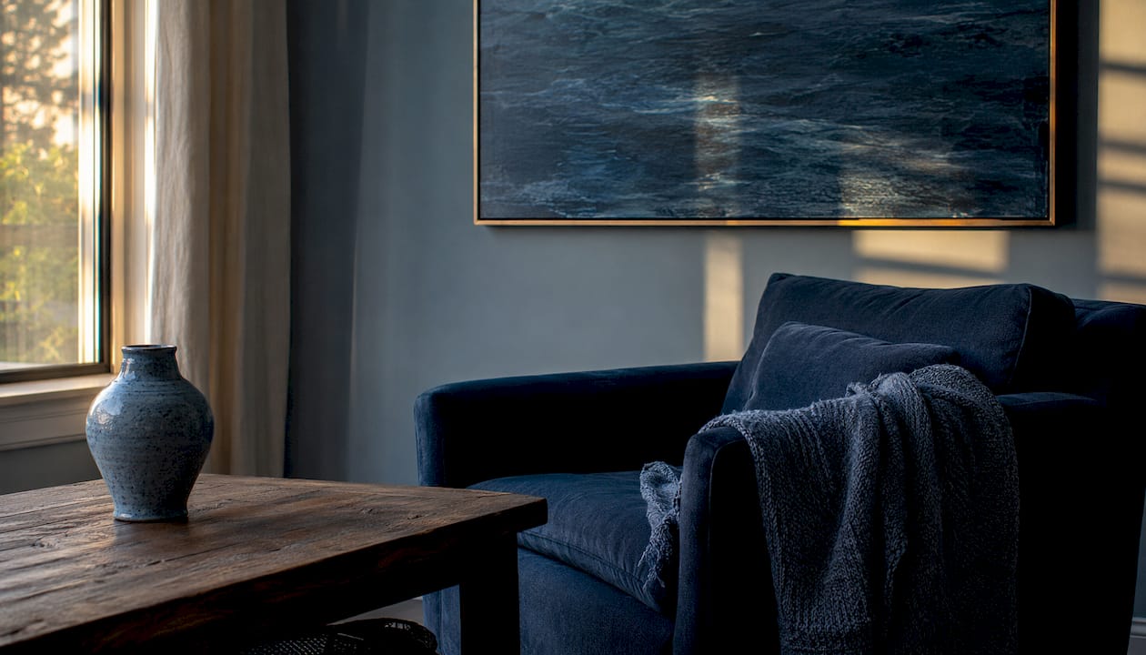
Take a deep forest-green painting: use a pale sage tint for walls, the mid-green for curtains, and the deepest shade as a painted cabinet or skirting board. You stay within one hue but create depth and movement. This works especially well with abstract pieces that use limited palettes.
Method 3: contrast and complement
A muted or near-monochrome piece can feel flat if you only pull its existing colours. Instead, identify its dominant hue on a colour wheel and introduce its complementary opposite as a small accent. A dusty blue painting gains life from a warm amber cushion; a sage-green abstract wakes up with a terracotta pot on the shelf beside it.
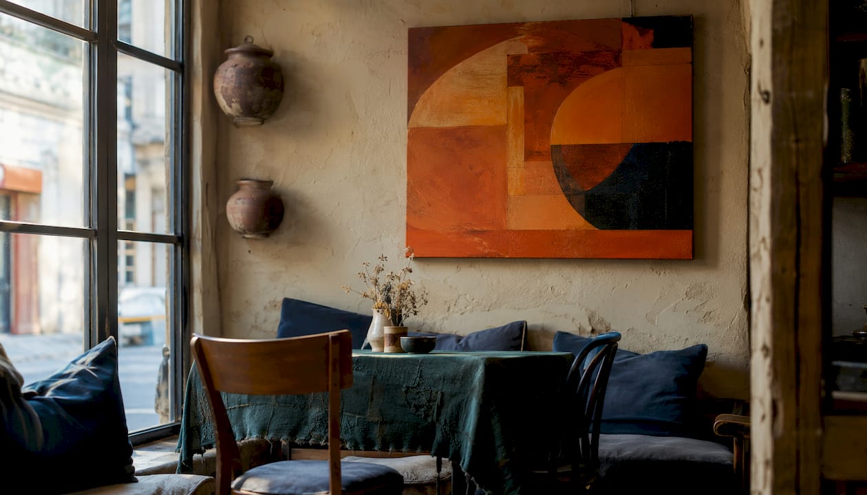
The 60–30–10 rule in practice describes how to proportion dominant, secondary, and accent colours in a room.
| Room element | Proportion | Example from a warm abstract |
|---|---|---|
| Walls + floor | 60% | Warm off-white / pale ochre |
| Main upholstery + curtains | 30% | Dusty terracotta |
| Cushions, objects, art frame | 10% | Deep burnt sienna or teal accent |
Pro Tip: Once you have your three colours, cut paint swatches and fabric samples to A5 size and pin them directly beside the artwork for 48 hours before ordering anything. Colours shift between morning and evening light, and what reads as a match at noon can clash by lamplight.
Swatch-testing checklist:
- Pin swatches and fabric samples next to the artwork on the intended wall.
- View at three times of day: morning daylight, midday, and evening under artificial light.
- Compare at arm’s length and from across the room — saturation reads differently at distance.
- Photograph each viewing and compare images side by side.
- Only proceed when all three light conditions feel harmonious.
How scale and placement change a colour’s impact
Size changes everything. A small print on a large wall whispers its colours; a canvas that fills two-thirds of the wall behind a sofa shouts them. The same painting can anchor a palette or disappear into it depending on how it is hung.
A practical rule of thumb: the artwork’s width should sit between one-half and two-thirds of the width of the furniture it hangs above. For a 200 cm sofa, that means a canvas or grouping between 100 cm and 130 cm wide. Below that range, the art floats; above it, the piece starts to compete with the furniture rather than complement it.
Scale also changes how dominant a hue feels. A terracotta that reads as a warm accent in a 40 cm print becomes the room’s defining tone at 120 cm. Before you commit to a large canvas, test the effect by taping paper to the wall at the intended dimensions and living with it for a day.
Room-by-room guidance:
- Living room: colour-match the art’s secondary hue to the sofa or a large rug. The dominant hue can then appear on a feature wall or in curtains.
- Bedroom: pull the art’s quietest, most muted tone for bedlinen. Saturated accent colours from the piece work better on a single cushion than on a headboard.
- Hallway: a narrow space benefits from a vertically oriented piece; use its dominant hue on the wall opposite the front door to draw the eye through.
Quick fixes:
- Art feels lost: increase the frame width, add picture lighting, or group with a smaller companion piece.
- Art feels overpowering: reduce surrounding colour saturation, switch to a neutral wall, or move the piece to a smaller wall.
- Colours clash with the room: check colour temperature — the art and the room’s dominant tones are likely pulling in opposite warm/cool directions.
Why light and finish change the colours you see
The same paint colour can look three different shades depending on whether the light source is north-facing daylight, a warm halogen bulb, or an LED with a high colour-rendering index. This is not a minor variation — it can be the difference between a terracotta that glows and one that looks muddy.
Daylight is the most honest test. North-facing rooms receive cool, consistent light all day; colours read truer but can feel flat. South-facing rooms shift from warm morning gold to bright midday white, which can make the same wall colour look entirely different across the day. Always test paint swatches in the room’s actual light, not in a shop.
Surface finish matters just as much. A matt paint absorbs light and makes a colour feel deeper and more saturated. A satin or eggshell finish reflects light back and can make the same pigment appear lighter and cooler. Velvet upholstery absorbs light and intensifies colour; a linen weave scatters it and reads paler. When you pull a colour from an artwork, factor in the finish of the surface it will land on.
Sample-testing protocol:
- Apply paint swatches at least 30 cm × 30 cm — small chips are unreliable.
- Place fabric samples flat on the floor and draped vertically to see how the weave changes the tone.
- View everything at the same time as the artwork, in the same room.
- Check at morning, midday and evening.
Pro Tip: Photograph your swatches and the artwork together on your phone at different times of day, then view the images on a screen rather than in the room. The camera flattens the light and makes colour shifts far easier to spot.
Reflective surfaces — interior door finishes, glossy tiles, mirrored furniture — bounce colour around a room and can amplify a hue you intended as a subtle accent. If your artwork has a strong warm tone, a high-gloss door in the same hue will intensify it considerably.
Common palette mistakes when using art, and how to fix them
Most colour problems in art-led rooms come down to a handful of repeating errors.
- Pulling too many colours from the artwork. A complex painting might contain eight distinct hues, but using all of them creates visual noise. Limit yourself to three. The 60–30–10 rule exists precisely to prevent this.
- Choosing only neutrals from a colourful piece. Designers call this “playing it safe” and it produces flat, forgettable rooms. If the art contains a strong cobalt or burnt orange, use it somewhere — even a single cushion is enough.
- Ignoring colour temperature. Mixing warm and cool tones without intention creates a room that feels unsettled. If your artwork is warm-toned, keep the room’s dominant palette warm and introduce cool tones only as deliberate contrast.
- Mismatched tonal variation. A room where every surface sits at the same mid-tone value — neither light nor dark — reads as monotonous. Pull both a light tint and a deep shade from the artwork, not just the mid-range.
- Treating art as the last decision. Art chosen last becomes irrelevant because other choices have already locked in the palette. The artwork ends up matching rather than leading, and the room loses its focal point.
- Ignoring scale when assessing colour impact. A colour that reads as a subtle accent in a small print will dominate at large scale. Always test at the intended size before committing.
Red flags that the art is fighting the room:
- The piece looks duller or more garish in situ than it did in the shop or online.
- Your eye keeps skipping past it rather than resting on it.
- The room feels complete without it — which means it was never integrated, only added.
The one-line remedy for most of these: introduce a neutral that shares the artwork’s undertone. A warm-toned painting needs a warm white or greige wall, not a cool bright white.
Integrate art early and commission with intent
Professional designers place art at the start of the process, not the end. When the artwork comes first, every subsequent decision — paint colour, upholstery fabric, flooring finish, even the use of architectural elements as focal points — has a reference point. Rooms come together faster and the result feels more coherent because nothing was chosen in isolation.
For large homes and significant projects, art can even shape architecture and circulation: wall proportions, ceiling heights and room flow designed around a key piece. That is an extreme case, but the principle scales down to a single living room.
Commissioning checklist:
- Wall dimensions: measure the target wall and note the maximum and minimum canvas sizes that work with the furniture below.
- Dominant and secondary colour registers: note the specific hues you need, ideally with paint code references or fabric swatches.
- Texture and media: decide between oil, acrylic or mixed media — texture affects how light reads across the surface.
- Framing style: a thin metal float frame reads differently from a deep oak box frame; specify which suits the room’s finish palette.
- Aspect ratio: portrait, landscape or square — this affects both the wall proportion and how the colour fields distribute across the canvas.
- Lead time: bespoke hand-painted commissions typically require several weeks; factor this into any room project timeline.
For standard rooms, a moderately sized canvas covers most living room and bedroom walls without overwhelming them. Hallways suit narrower portrait formats, typically tall and narrow pieces.
Frametheworld’s art selection checklist covers sizing, framing and colour briefing in detail and is worth working through before placing any commission.
Key takeaways
Art is the most reliable anchor for a room’s colour palette because it supplies a dominant tone, supporting hues and a mood reference before a single paint pot is opened.
| Point | Details |
|---|---|
| Pick art before paint | Choosing art first gives every subsequent decision a colour and mood reference, reducing costly rework. |
| Extract two or three colours | Use the dominant hue for walls, the secondary for large textiles, and the quietest accent for small details. |
| Apply the 60–30–10 rule | Assign 60% of the room to the dominant tone, 30% to the secondary, and 10% to the accent colour. |
| Test in real light | View swatches and fabric samples beside the artwork at morning, midday and evening before ordering. |
| Frametheworld for bespoke work | Frametheworld offers hand-painted commissions sized and coloured to your brief, removing the guesswork from art-first decorating. |
Art-led palettes are worth living with
There is a tendency in home decorating to treat art as the reward at the end of a project — the thing you hang once everything else is finished. Every room I have seen built that way has the same quality: the art looks placed rather than belonging. The palette is coherent, the furniture is well chosen, and then there is a picture on the wall that happens to share a colour with the cushions.
The rooms that stay interesting over years are the ones where the art came first and everything else grew from it. Not because the colours match perfectly, but because the artwork carries a point of view, and the room was built to support it rather than contain it.
One practical tip worth trying: when seasons change, swap out the small accent pieces — cushions, throws, a ceramic or two — using a different secondary colour from the same artwork. You get a fresh feel without touching the walls or the main upholstery, and the room still reads as coherent because everything still traces back to the same piece.
Frametheworld: hand-painted art built around your palette
Choosing art first is straightforward when the art can be made to your exact colour brief. Frametheworld offers hand-painted wall art and bespoke commissions where you specify the dominant and secondary colours, the canvas size, the texture and the framing style before a brushstroke is laid. That means no compromising on a near-match from a generic catalogue.
The process is simple: browse the Wabi Sabi collection for muted, textured pieces that anchor natural palettes, or the Pop Art range for bold, high-contrast canvases that pull strong complementary schemes. For a fully bespoke piece, submit your wall dimensions, colour references and preferred media, and Frametheworld’s artists work to your brief. Every piece arrives ready to hang, with framing options chosen to suit your room’s finish palette. Visit frametheworld.co.uk to start your commission or explore the curated collections.
Further reading and useful sources
- Art and Science of Color — Getty Publications: The authoritative text on simultaneous contrast and colour perception; essential background for understanding why colours behave differently in different contexts.
- The role of art in interior design — Flooring Surgeons: A practical overview of how art creates focal points and ties a room’s palette; good starting point for homeowners new to art-led decorating.
- Why wall art should be the first design choice — FineHomeKeeping: Practitioner accounts of why art chosen last becomes irrelevant; useful for understanding the art-first argument.
- How to incorporate art into an interior — Vogue Adria: Designer tips on intentional integration and the importance of personal connection over colour matching.
- Mixing and matching art in interior décor — Greg Girby Gallery: Guidance on intentionality versus exact matching; helpful for readers working with existing art collections.
- How to match art with interiors — Frametheworld: Step-by-step advice on pulling colour inspiration from artwork for textiles, rugs and cushions, with practical room examples.

Laat een reactie achter
Deze site wordt beschermd door hCaptcha en het privacybeleid en de servicevoorwaarden van hCaptcha zijn van toepassing.