
The quickest way to transform a kitchen is considered wall art, not another cabinet refit. This piece runs through 10 practical ideas, explains how to pick the right one for your space, and how to hang and protect it once it’s up, with a note from Frametheworld on when bespoke or hand-painted pieces beat an off-the-shelf print.
TL;DR:
- Choose a focal wall with unobstructed sightlines and appropriate scale to ensure your art complements the kitchen’s size and layout.
- Use acrylic-faced prints, sealed frames, or canvas for near heat sources to prevent damage from moisture and splashes.
- Opt for larger statement pieces over multiple small ones in minimalist kitchens, and consider grid or relaxed gallery arrangements based on your style.
- Prioritize hanging art at eye level, maintaining clear space above worktops and away from steam and grease-prone areas for longevity.
- Decide between bespoke art for unique spaces and standard prints for lower-risk spots, with custom options fitting awkward wall shapes and color schemes.
Table of Contents
- 10 kitchen wall art ideas worth copying
- How to choose the right art for your kitchen
- Hanging and caring for kitchen wall art
- When bespoke art earns its price tag
- DIY and thrifted-art options
- Gallery wall approaches and layout tips
- Ideas for different kitchen styles
- Using wall art to shape kitchen light and mood
- Budget-friendly ways to source kitchen art
- The list everyone skips is the one that matters most
- Get a kitchen wall piece made to fit your space, not the other way round
- Sources
10 kitchen wall art ideas worth copying
Some of these cost nothing beyond a frame and an afternoon. Others are worth commissioning properly. Either way, the goal is the same: personality on the wall, not just paint.
-
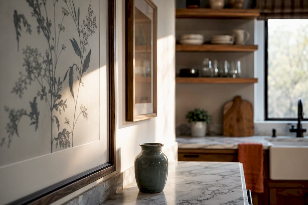
Botanical prints. Loose, watercolour-style leaf or herb studies suit almost any kitchen and read as calm rather than clinical. Hang a trio at consistent spacing above a run of worktop, and keep them well clear of the hob.
-
Vintage or retro posters. Old travel adverts, food packaging reproductions, or classic diner-style typography add warmth without trying too hard. These work particularly well as a single large piece rather than scattered small ones, since retro graphics tend to lose impact at a small scale.
-
Decorative plate collections. A cluster of mismatched china plates on a wall is one of the oldest kitchen decorating tricks, and it still works because it’s tactile and personal. Editorial round-ups consistently flag plates as a recurring favourite precisely because they mix pattern and colour without needing a frame at all.
-
Framed family recipes. A handwritten recipe card from a grandparent, scanned and framed, turns a blank wall into something nobody else has. Keep it behind glass or acrylic, since ink fades fast near any heat source.
-
Black-and-white photography. Food markets, hands kneading dough, or a simple still life in monochrome give a kitchen a slightly gallery-like feel. This idea earns its keep in modern and minimalist kitchens especially, where colour is already restrained.
-
A large statement canvas. One oversized piece above an island or on a blank run of wall does more work than five small ones. Canvas handles humidity better than paper, though it should still sit away from direct steam.
-
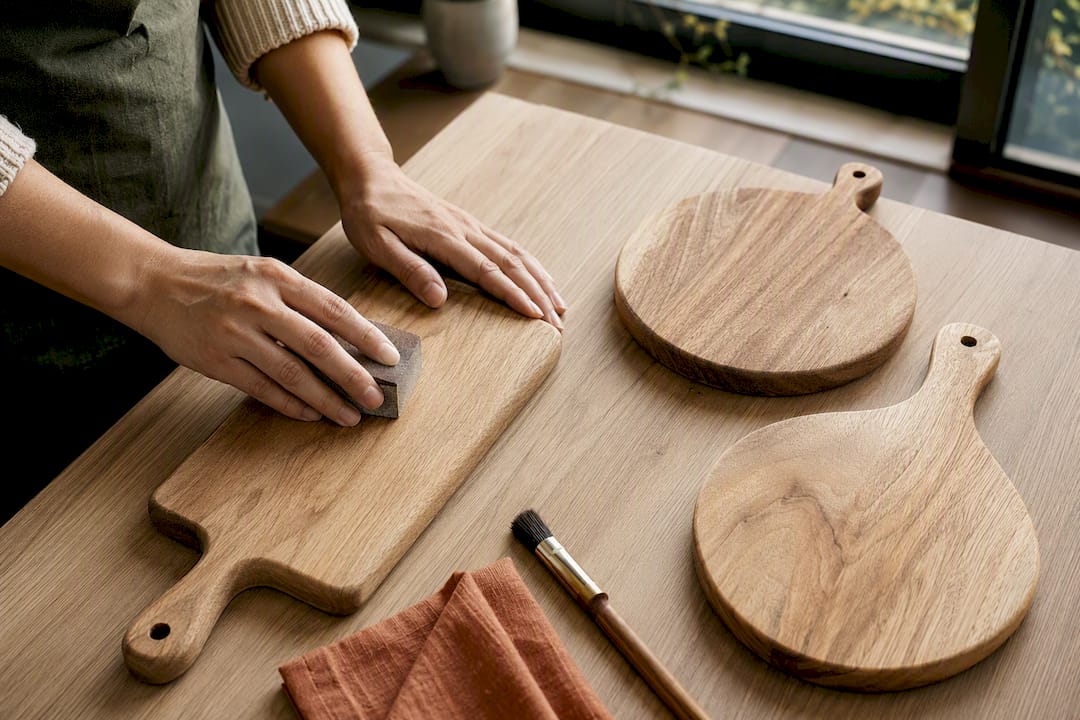
A cutting-board gallery. Old wooden boards, some painted, some left bare, grouped on a wall bring texture that flat prints can’t match. This is one of the few ideas that’s genuinely improved by a slightly imperfect, well-used finish.
-
Leaning artwork on a picture ledge. Instead of fixing everything to the wall, lean a few framed pieces on a narrow shelf and let them overlap slightly. It’s the easiest idea on this list to change your mind about later, and it’s popular precisely because it lets you rotate pieces without new nail holes.
-
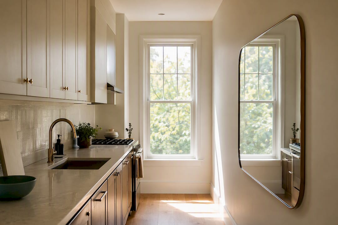
Mirrors. A well-placed mirror bounces light around a kitchen and makes a tight galley feel wider than it is, which is why reflective surfaces show up repeatedly in editorial lists of small-kitchen fixes. Choose a frame material that won’t corrode near sink splashback zones.
-
Neon or word art. A short phrase in a soft neon tube or printed typography, kept small and specific rather than a generic slogan, works best in kitchens with an industrial or contemporary lean. Designer features tend to pair this kind of statement piece with something functional nearby, like open shelving or hanging pans, so the wall doesn’t feel like a showroom.
A rotating mini-print grid deserves an honourable mention too: four or six small identical frames holding prints you swap seasonally. It’s cheap, low-commitment, and gives you a reason to actually look at your kitchen walls again come spring.
How to choose the right art for your kitchen
Before buying anything, walk the room and look at what the eye actually lands on first when you enter. That’s your focal wall, and it’s where the biggest or boldest piece should go, not wherever there happens to be empty space.
- Measure the wall and check sightlines from the doorway, the table, and the hob, since art that only looks good from one angle isn’t earning its place.
- Match the scale of the piece to the kitchen’s style; a farmhouse kitchen can carry a large, textured canvas that would swamp a small minimalist galley.
- Tie art into your existing colour scheme through one or two shared tones rather than hunting for an exact match, which almost never exists anyway.
- Choose acrylic-faced prints, sealed frames, or canvas for anything within a few feet of cooking, since heat and splashes degrade unprotected paper fast.
- Consider a bespoke commission when a wall is an awkward size, or when you want a colour palette that no print run happens to stock.
- Save thrifted finds and printed posters for lower-risk spots away from steam, where a change of mind costs you nothing.
If you’re coordinating art with woodwork or cabinetry, it’s worth checking how the wall colour and trim interact first. Guidance on choosing interior door and trim colours is a useful starting point if you’re repainting alongside the new art.
Hanging and caring for kitchen wall art
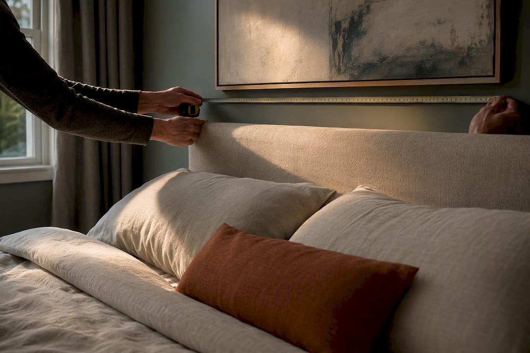
Standard gallery height puts the centre of a piece at roughly 57 to 60 inches from the floor, though in a kitchen it’s worth dropping that slightly if the art sits above a worktop rather than open floor. Leave 6 to 8 inches of clearance between a hung piece and any worktop or island edge below it.
- Keep art well away from the hob and sink, since steam and grease settle on surfaces long before you’d notice visible damage.
- Favour acrylic-faced prints or sealed, gasket-backed frames in any spot that gets ambient humidity, not just direct splashes.
- If you rent, picture ledges, leaning frames, and removable adhesive hooks avoid wall damage entirely and let you take everything with you.
- Wipe acrylic and glass with a dry microfibre cloth; avoid glass cleaner on canvas, and never use anything abrasive on a hand-painted surface.
Pro Tip: In a kitchen without an extractor fan, run a dehumidifier check once a season, since trapped moisture behind a frame causes far more damage than anything landing on the front of it.
When bespoke art earns its price tag
A print run gives you consistency. A bespoke or hand-painted piece gives you a size and palette that doesn’t exist anywhere else, which matters most on an awkward feature wall or above an island with unusual proportions. Some providers offer customisation by size, style, and theme rather than a fixed catalogue of stock sizes, which is the difference between finding something close enough and having something made to fit.
Commissioning makes sense when you’ve got a wall that standard print sizes simply don’t cover, or when you want a colour that ties precisely into cabinetry rather than approximately. It’s a genuinely different proposition from buying a print, closer to buying a piece of furniture than buying decor.
If you want a deeper look at composition before committing, our guides on styling a gallery wall and dining room art placement cover the adjoining rooms your kitchen art needs to sit comfortably next to.
DIY and thrifted-art options
Charity shops and car boot sales are still the best source of cheap frames worth reusing, even when the print inside them is destined for the bin. Strip out the glass, clean the frame, and drop in a printed botanical study or a photograph you’ve taken yourself.
Old chopping boards, reclaimed timber offcuts, and even flattened tin advertising signs make surprisingly good kitchen art with almost no spend involved. A cutting-board gallery, mentioned earlier, is the clearest example: buy a few unfinished boards, sand and stain them differently, and hang them as a set.
Fabric remnants stretched over a cheap canvas frame from a craft shop give you a textile wall piece for a fraction of what a framed textile print costs retail. If you’ve got a family photograph worth enlarging, most high street print shops will output it on canvas or acrylic for a reasonable fee, so check reviews on platforms like Trustpilot before committing to one.
The only real rule with thrifted art is to treat it as low-risk by design. Hang it somewhere you wouldn’t mind losing to steam or a spill, and save the protected, well-lit spots for pieces you’d actually be upset to damage.
Gallery wall approaches and layout tips
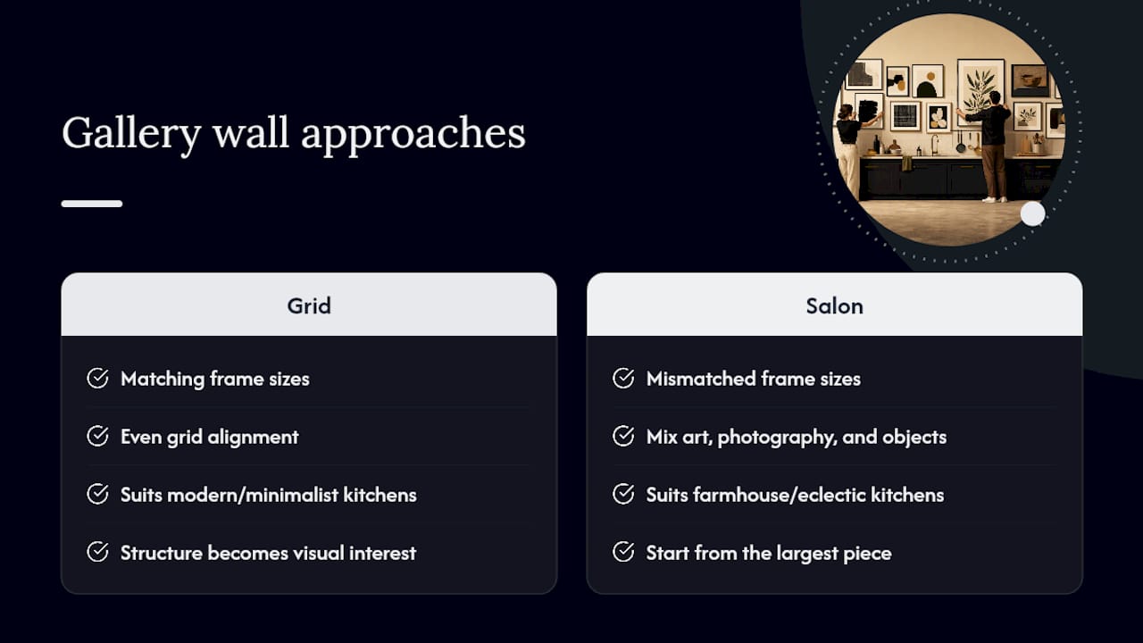
A grid layout, where every frame matches in size and sits on an even grid, suits a modern or minimalist kitchen because the structure itself becomes the visual interest. Anything more relaxed than that risks looking chaotic against clean cabinetry.
A salon-style cluster, with mismatched frame sizes and a mix of art, photography, and objects like plates or mirrors, suits farmhouse and eclectic kitchens far better. Start from the largest piece, place it slightly off-centre from the true middle of the wall, and build outward with smaller pieces filling the gaps.
Lay the whole arrangement out on the floor first using paper cut-outs taped to the wall before a single nail goes in, since gallery walls are the one idea on this list that’s genuinely hard to undo cleanly once hung. Keep the gaps between frames consistent, roughly 2 to 3 inches, and resist the urge to fill every inch of the wall. A step-by-step guide to gallery wall layouts covers spacing templates in more detail if you want to plan it precisely before committing to holes in the plaster.
Ideas for different kitchen styles
Modern kitchens with handleless cabinetry and a restrained palette carry black-and-white photography and grid-format gallery walls best, since the structure of the art mirrors the structure of the room. Anything too busy fights the cabinetry rather than complementing it.
Rustic and farmhouse kitchens can take on far more texture: a cutting-board gallery, a cluster of mismatched plates, or a large botanical canvas in earthy tones all suit exposed beams and open shelving. This is also the style where framed family recipes feel most at home, since the whole aesthetic leans on warmth and history rather than polish.
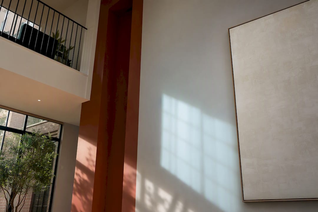
Minimalist kitchens do best with one statement piece rather than several smaller ones. A single oversized canvas, or a mirror if the room is tight on natural light, does more for a minimalist scheme than a gallery wall ever could.
Industrial and contemporary kitchens are where neon or word art, retro packaging posters, and metal-framed prints work hardest, since the room already has an edge that softer botanical prints would undercut. Trend-focused inspiration on urban interior wall art is worth a look if this is your direction.
Using wall art to shape kitchen light and mood
Colour on a wall changes how a room feels before you’ve switched on a single light. Warm ochres, terracottas, and soft greens in a print or canvas make a north-facing kitchen feel less cold, while cooler blues and greys can calm down a kitchen that gets harsh afternoon sun.
Mirrors do the most literal work here, bouncing existing light around a room and making a galley kitchen feel noticeably less closed in, particularly opposite a window rather than beside it. A large pale canvas near a light source has a similar, gentler effect.
Glossy or acrylic-faced prints reflect ambient light and can make a piece feel almost lit from within under kitchen spotlights, while matte canvas absorbs light and reads as calmer, more grounded. Choosing between the two is really a choice about whether you want the wall to feel active or restful, and it’s worth testing under your actual kitchen lighting, not a shop’s, before you commit.
Budget-friendly ways to source kitchen art
Local artists selling through markets, small galleries, or Instagram often price original work more reasonably than you’d expect, and buying directly means the money goes further than it would through a large retailer’s margin. It’s also the fastest way to end up with something nobody else on your street has on their wall.
Digital downloads from independent print shops let you buy a high-resolution file once and print it locally in whatever size a specific wall needs, which sidesteps the awkward moment of falling in love with a print that’s the wrong dimensions for your space. Framing it yourself from a ready-made frame kit cuts the cost further still.
Print marketplaces that let you adjust size, paper type, and frame before checkout are worth comparing directly, since getting the dimensions right at the point of ordering avoids an expensive resize or reprint later. Charity shops, as covered earlier, remain the cheapest source of usable frames, even when the art inside them isn’t a keeper.
The list everyone skips is the one that matters most
Most kitchen decorating advice front-loads the ideas and treats execution as an afterthought, a single line about “hanging at eye level” tacked on at the end. That’s backwards. A mediocre print, hung at the right height, kept clear of the hob, and protected behind acrylic, will outlast and outperform a beautiful piece that’s fading behind glass six inches from a steaming pan.
The conventional wisdom also underrates commitment. People buy a cheap print because it feels low risk, then never replace it because swapping art feels like a project rather than a five-minute job. A picture ledge or a leaning arrangement removes that friction entirely, and it’s the single change I’d prioritise before any idea on this list.
Where I’d push back hardest is on treating all kitchen art as disposable. A hand-painted or bespoke piece costs more upfront, but it solves the awkward-wall problem that a standard print size never will, and it tends to be the piece a household actually keeps through a kitchen refit or a house move.
— Lennard
Get a kitchen wall piece made to fit your space, not the other way round
Standard print sizes solve most walls. They don’t solve the awkward ones, the oversized island run, the narrow strip beside a window, or the palette that needs to match cabinetry exactly rather than approximately. That’s where customisation options do the actual work a catalogue can’t: size, style, theme, and colour built around your wall rather than the reverse.
The Wabi Sabi hand-painted collection suits kitchens leaning toward texture and imperfection over glossy print finishes, and it’s a good starting point if you’re weighing a statement canvas against a gallery wall. Browse the collection, check it against your wall’s dimensions, and request a bespoke size if nothing on the shelf fits exactly.
Sources
Editorial round-ups of kitchen wall decor ideas and designer-approved kitchen wall decor cover the recurring idea types referenced throughout this piece, from plates to gallery walls. For placement and material advice specific to kitchens, Lumas’s kitchen art guidance sets out sensible distances from heat and moisture, while Frametheworld outlines what bespoke and custom framing actually involves.

Laat een reactie achter
Deze site wordt beschermd door hCaptcha en het privacybeleid en de servicevoorwaarden van hCaptcha zijn van toepassing.