
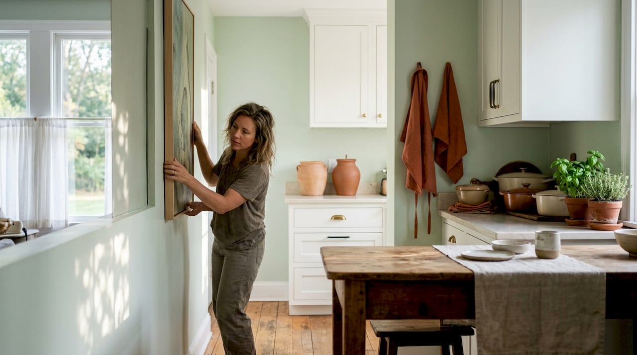
TL;DR:
- Vertical art draws the eye upward, creating the illusion of greater height and openness in rooms. Proper placement, proportion, and scale are essential for maximum visual impact and harmony. Lighting and style choices further enhance the mood, making vertical art a practical and impactful design tool.
Vertical art is defined as any upright artwork whose height significantly exceeds its width, and it works in rooms by directing the eye upward to create the perception of greater height and spatial openness. This effect is not accidental. It draws on well-established principles of visual psychology, where the human eye naturally follows vertical lines toward the ceiling, countering the flattening effect of horizontal furniture and flooring. Understanding why vertical art works in rooms gives you a practical design tool that costs far less than structural renovation and delivers results you can see immediately. The global wall art market is valued at US$66.89 billion in 2025, driven in large part by demand for large vertical paintings and artisan originals. That scale reflects how seriously homeowners now treat art as a spatial design decision, not merely decoration.
Why vertical art works in rooms: the psychology behind it
Vertical compositions create an illusion of greater room height by drawing the gaze upward. This happens because the human eye moves differently along vertical lines than horizontal ones. Horizontal lines encourage the eye to scan left and right, reinforcing the sense of width and, in low-ceilinged rooms, compression. Vertical lines pull the gaze up and hold it there, which the brain interprets as height.
Modern interiors are dominated by horizontal elements: sofas, sideboards, kitchen worktops, bed frames, and flooring. Each one adds to what designers call horizontal monotony, a visual flattening that makes rooms feel smaller and less dynamic. Vertical art breaks that pattern directly. It acts as a structural counterpoint, giving the eye somewhere to travel beyond the furniture line.
“Vertical art is not just decoration. It is a structural design solution that counteracts the flattening effect of horizontal elements in modern interiors. One tall piece can do more for a room’s perceived height than repainting the ceiling.”
Interior designers consistently favour fewer, larger pieces over cluttered arrangements. Vertical canvases fulfil this preference by creating dramatic focal points that improve spatial harmony without overwhelming a room. The effect is amplified when the artwork has strong internal lines, such as a tall tree, an architectural column, or an abstract composition with upward brushwork.
Pro Tip: Place a directional uplight on the floor beneath a tall vertical piece. The light travels upward, accentuating the artwork’s vertical lines and adding textural depth to the wall behind it. This technique is rarely mentioned in standard decorating guides, but it meaningfully increases the sense of height.
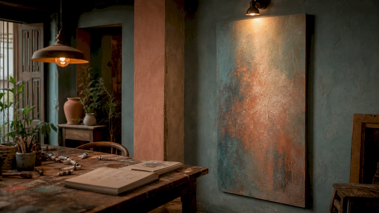
How to hang vertical art: placement and sizing rules
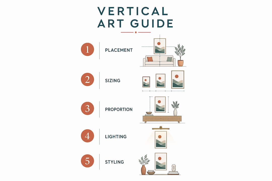
Placement determines whether vertical art enhances a room or simply occupies wall space. The industry standard is to hang art at eye level, with the centre of the piece sitting 57–60 inches (145–152 cm) from the floor. This measurement applies regardless of ceiling height and keeps the artwork in the natural sightline of a standing adult.
Proportion matters as much as height. A vertical artwork’s width should be approximately two-thirds the width of the furniture it hangs above. A piece that is too narrow looks lost above a wide sofa. A piece that is too wide overwhelms the furniture and breaks the visual connection between the two. Getting this ratio right is what separates a professional-looking installation from one that feels slightly off.
For rooms with standard 8-foot ceilings, vertical art sized 48–72 inches tall delivers the best proportion and spatial effect. Anything shorter risks looking like a small picture in a large frame of empty wall. Anything taller can crowd the ceiling and undermine the height illusion you are trying to create.
Large vertical artworks that cover 60–70% of wall width behind furniture anchor a space without cluttering it. This is the sweet spot between presence and breathing room. For practical guidance on balancing art around furniture, Frametheworld’s art placement guide covers the full range of proportion and positioning principles.
| Room type | Placement tip | Ideal size range |
|---|---|---|
| Living room | Centre above sofa, 57–60 inches to mid-point | 48–72 inches tall |
| Hallway | Hang at eye level, spaced evenly along the wall | 36–60 inches tall |
| Bedroom | Above headboard, leaving 6–8 inches of clearance | 24–48 inches tall |
| Entryway | Single statement piece on the facing wall | 48–72 inches tall |
| Staircase | Follow the stair angle, staggered at consistent intervals | Mixed heights, 24–60 inches |
The most common mistake homeowners make is hanging art too high. Placing a piece near the ceiling does not make the room feel taller. It disconnects the artwork from the furniture and creates an awkward gap in the middle of the wall. Keep the centre at 57–60 inches and let the vertical format do the work of drawing the eye upward from that anchor point.
Pro Tip: On a staircase wall, use a staggered arrangement of vertical pieces that follows the angle of the stairs. Space each piece so the centre sits at consistent eye level relative to each step. This creates rhythm and guides the eye upward along the entire staircase.
How to style vertical art for mood and atmosphere
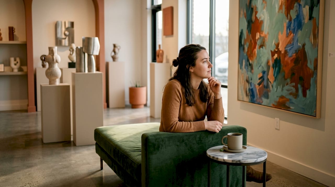
Choosing the right vertical artwork goes beyond size. The style, colour, and composition of the piece shape the mood of the room it occupies. Art shapes the mood of a space in ways that furniture and paint alone cannot replicate.
Abstract vertical paintings account for 48% of designer preferences, making them the dominant choice in contemporary interiors. Their appeal lies in versatility. An abstract piece does not lock a room into a specific narrative or theme. It adds energy and movement without dictating mood, which means it works across living rooms, bedrooms, and home offices equally well.
Original paintings offer something prints cannot. The brush texture and dynamic surface of an original change with light throughout the day, creating a richer spatial experience. A print appears static at 9AM and at 9PM. An original painting catches morning light differently from evening lamplight, giving the room a quality that shifts with time.
Colour harmony between the artwork and the room’s existing palette is the foundation of successful styling. A vertical piece in warm ochres and terracottas will draw warmth into a neutral room. A cool, monochromatic abstract will add calm to a busy space. The artwork does not need to match the room’s colours exactly. It needs to respond to them.
Style considerations when selecting vertical art:
- Composition with internal upward movement. Look for pieces where the eye naturally travels from the bottom to the top of the canvas, reinforcing the height effect.
- Colour temperature alignment. Warm tones advance visually and add intimacy. Cool tones recede and open a space.
- Scale relative to the wall. A piece that is too small reads as an afterthought. Err toward larger rather than smaller.
- Texture and medium. Original oil or acrylic paintings add physical depth. Photography and digital prints suit minimal, graphic interiors.
- Subject matter and room function. Energetic abstracts suit living rooms and studios. Calmer, tonal works suit bedrooms and reading corners.
For homeowners considering how to display photography as vertical art, expert advice on vertical photography display covers framing, proportion, and placement in detail.
Common mistakes and professional tips for vertical art
The most damaging mistake is choosing a piece that is too small for the wall. A narrow vertical print on a wide, empty wall does not create height. It creates the impression of a room that has not been finished. When in doubt, go larger. A single statement piece at the right scale is always more effective than several small pieces grouped together on a large wall.
Lighting is the most underused tool in vertical art display. Directional uplighting beneath tall art not only enhances height perception but creates subtle shadowing that adds textural depth, elevating both the painting and the room’s overall atmosphere. A simple floor-standing uplight or a recessed ceiling spotlight angled at the piece achieves this effect without significant cost.
Low-profile modern furniture presents a specific challenge. Sofas and beds with minimal legs and low frames push the visual weight of a room downward. A tall vertical piece directly above them counteracts this by pulling the eye back up. The contrast between a low sofa and a tall canvas is not a problem. It is the design principle working exactly as intended.
Practical points to keep in mind:
- Avoid hanging original paintings in direct sunlight. UV exposure fades pigment over time, regardless of medium.
- In humid rooms such as kitchens or bathrooms, choose materials rated for moisture resistance, or use framed prints with sealed backing.
- Rotate artworks seasonally if you want to refresh a room without redecorating. Vertical pieces in different colour palettes can shift a room’s mood entirely.
- Use a spirit level every time. A slightly tilted piece draws the eye to the tilt, not the artwork.
The wall art selection guide from Frametheworld covers material choices, framing options, and sizing in detail for homeowners who want to get every decision right before they buy.
Key takeaways
Vertical art works in rooms because it directs the eye upward, counteracts horizontal compression from furniture, and creates the perception of greater height through visual psychology and correct proportion.
| Point | Details |
|---|---|
| Eye-level hanging rule | Centre artwork at 57–60 inches from the floor for comfort and visual balance. |
| Two-thirds proportion rule | Art width should be roughly two-thirds the width of the furniture beneath it. |
| Ideal size for standard ceilings | Pieces 48–72 inches tall suit 8-foot ceilings and maximise the height illusion. |
| Abstract art leads designer choices | Abstract vertical pieces account for 48% of designer preferences due to their versatility. |
| Uplighting amplifies the effect | A floor-level uplight beneath tall art enhances verticality and adds textural depth. |
Vertical art changed how I think about room design
I used to approach wall art the way most homeowners do: find something I liked, hang it where there was space, and call it done. The room never quite felt right, and I could not explain why. The furniture was good, the colours worked, but something felt flat. The answer, as it turned out, was entirely about orientation and scale.
The first time I replaced a wide horizontal print above a sofa with a single tall vertical canvas, the room changed immediately. The ceiling felt higher. The sofa looked more intentional. The whole space had a quality it had lacked before, and I had not moved a single piece of furniture. That experience made me take the design principles behind vertical art seriously, rather than treating them as theory.
What I find most compelling is the cost-to-impact ratio. A well-chosen vertical piece at the right scale does more for a room than a new sofa or a fresh coat of paint. It is also reversible. You can rehang it, replace it, or rotate it with the seasons. No other design decision gives you that combination of impact and flexibility.
My honest advice: do not start with a small piece and hope it works. Commit to scale from the beginning. Buy larger than feels comfortable, hang it at eye level, and trust the proportion rules. The room will tell you immediately whether you got it right.
— Lennard
Vertical wall art from Frametheworld
Frametheworld offers a curated range of hand-painted vertical art across styles that suit every room type and interior mood. The Wabi Sabi collection features original abstract pieces with tactile texture and tonal depth, ideal for living rooms and bedrooms where a calm, considered atmosphere matters. For homeowners who want a bolder focal point, the Pop Art collection delivers high-impact vertical canvases with graphic energy and strong upward composition. Each piece is available in multiple sizes, making it straightforward to apply the proportion and placement principles covered in this article. Bespoke commissions are also available for spaces that need a specific scale or colour palette.
FAQ
Why does vertical art make a room feel taller?
Vertical art directs the eye upward along its height, which the brain interprets as increased ceiling height. This effect counteracts the visual compression caused by horizontal furniture lines and low-profile flooring.
What height should I hang vertical art?
The centre of the artwork should sit 57–60 inches from the floor. This places the piece at natural eye level for a standing adult and maintains visual balance with the room.
What size vertical art suits a standard room?
For rooms with 8-foot ceilings, vertical pieces between 48 and 72 inches tall provide the best proportion. Pieces outside this range either look too small or crowd the ceiling.
Does vertical art work in small rooms?
Vertical art is particularly effective in small rooms and narrow spaces such as hallways and entryways. A tall, narrow piece adds depth and draws the eye along the room’s length, making the space feel larger than it is.
Should vertical art match the room’s colour scheme?
The artwork does not need to match the room’s colours exactly. It should respond to the colour temperature of the space, with warm tones adding intimacy and cool tones creating openness. Contrast between the artwork and the wall colour increases visual impact.

Laat een reactie achter
Deze site wordt beschermd door hCaptcha en het privacybeleid en de servicevoorwaarden van hCaptcha zijn van toepassing.