
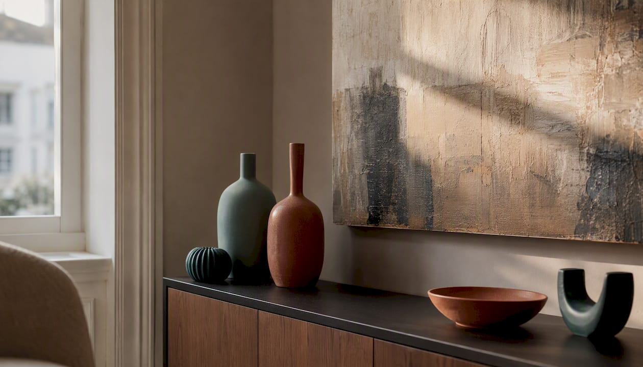
Soft tonal abstracts, subtle botanicals, delicate line art, and restrained monochrome pieces are the neutral art choices that work best for broad appeal. They share three qualities that matter: low personal reference (nothing that reads as someone else’s story), easy compatibility with most interior finishes, and a colour temperature flexible enough to sit alongside warm oak or cool grey without fighting either. If you are staging a property, decorating a rental, or briefing a designer, these four genres are where to start.
Practical actions you can take right now:
- Choose a tonal palette first. Decide whether the room reads warm (cream, sand, terracotta undertones) or cool (stone, slate, soft white) and match the artwork’s dominant tone to that.
- Check undertone against a fixed finish. Hold a print or swatch next to the flooring or cabinetry before committing. A warm-beige abstract next to a cool-grey floor can look muddy rather than calm.
- Pick scale relative to the furniture, not the wall. Artwork width should sit between two-thirds and three-quarters of the sofa or console it hangs above.
- Favour single large pieces or simple triptychs over busy gallery walls when the goal is broad appeal.
Pro Tip: When commissioning or buying for staging, choose a piece with at least two tonal values in the same family (light sand and mid-stone, for example) rather than a flat single colour. That layering reads as considered rather than generic, without introducing anything divisive.
Key takeaways
Neutral art with broad appeal comes down to style, scale, undertone, and format: get those four right and the piece works across almost any room and any audience.
| Point | Details |
|---|---|
| Lead with tonal abstracts or line art | These styles carry the lowest personal reference and suit the widest range of buyers and interior periods. |
| Match undertone to fixed finishes | Check artwork against flooring or cabinetry before purchasing; clashing undertones reduce appeal even in neutral pieces. |
| Scale to furniture, not the wall | Artwork width should be 60–75% of the sofa or console it relates to; too-small art is the most common staging error. |
| Choose transitional pieces for staging | Art that feels current without being trend-specific works across multiple listings and attracts the widest buyer pool. |
| Frametheworld for bespoke or ready-made | Frametheworld offers hand-painted neutral canvases and bespoke commissions for UK homeowners, stagers, and designers. |
Table of Contents
- Which neutral art styles reliably appeal across tastes?
- How to pick neutral art by room, objective, and audience
- What formats and finishes work best for neutral art?
- How to use neutral art for staging and resale appeal
- Where to buy or commission neutral art in the UK
- Common mistakes to avoid when choosing neutral art
- Why minimalism tends to appeal to the widest audiences
- How I approach neutral commissions
- Frametheworld: ready-made neutrals and bespoke commissions
- Sources
Which neutral art styles reliably appeal across tastes?
Neutral does not mean beige and boring. The styles below each achieve broad appeal in a different way, and knowing the distinction helps you choose the right one for the room and the audience.
Soft tonal abstracts
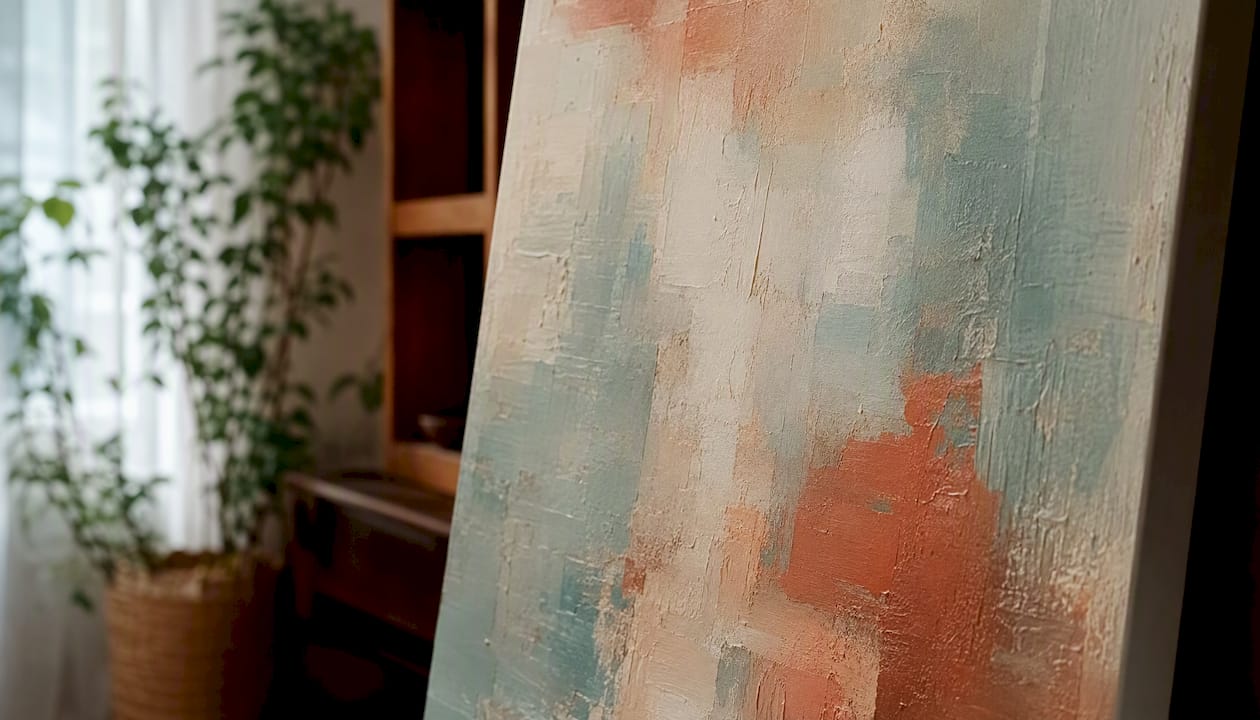
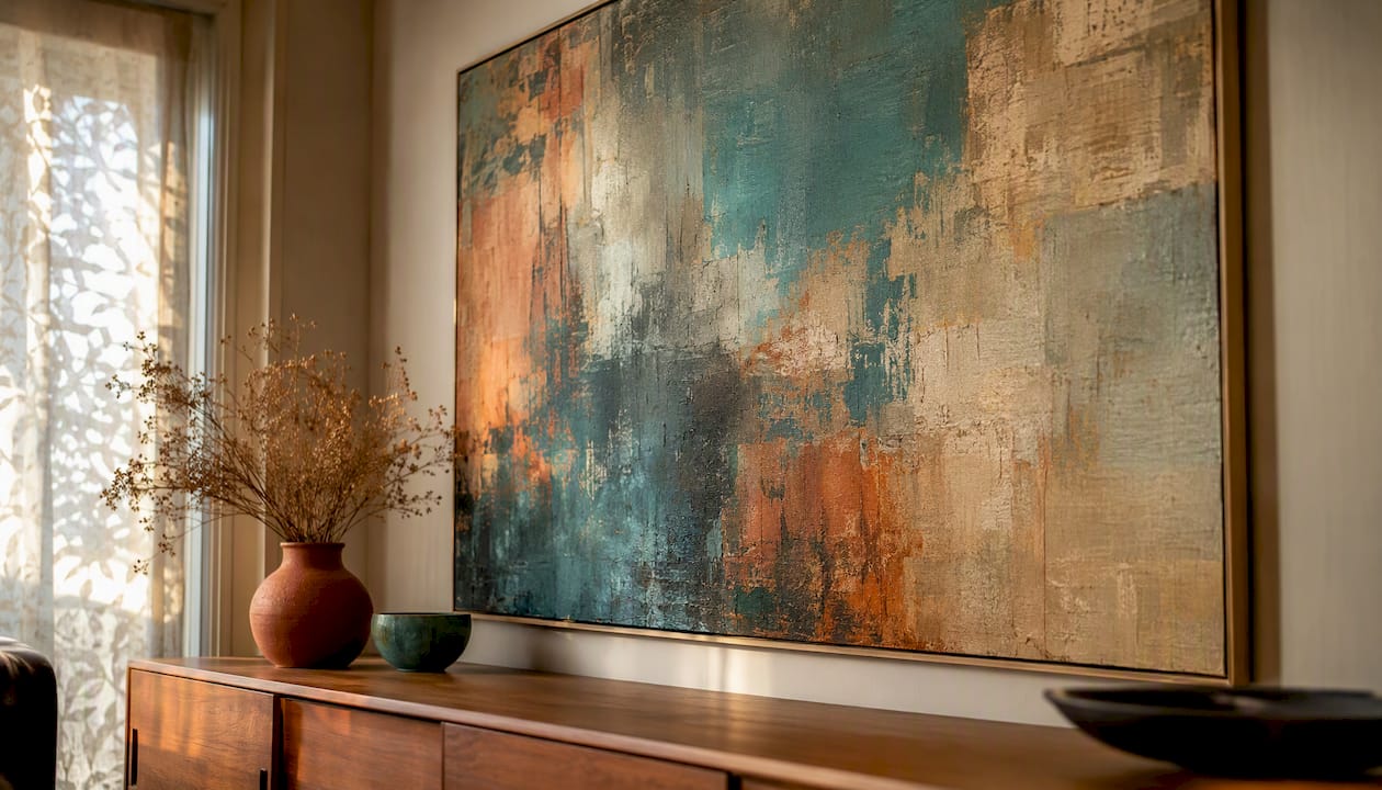
These are layered, non-representational works built from two to four tones within the same colour family: sand and stone, warm white and linen, slate and mist. Because there is no recognisable subject, viewers project their own reading onto the piece. That openness is precisely why they work in staging and rental contexts. A layered sand-and-stone abstract reads as calm and considered in a period terrace as it does in a new-build open-plan kitchen. Warm-toned versions suit homes with honey oak floors or brass fixtures; cool-toned versions complement concrete, white-painted brick, or pale Scandi-style cabinetry.
Line art
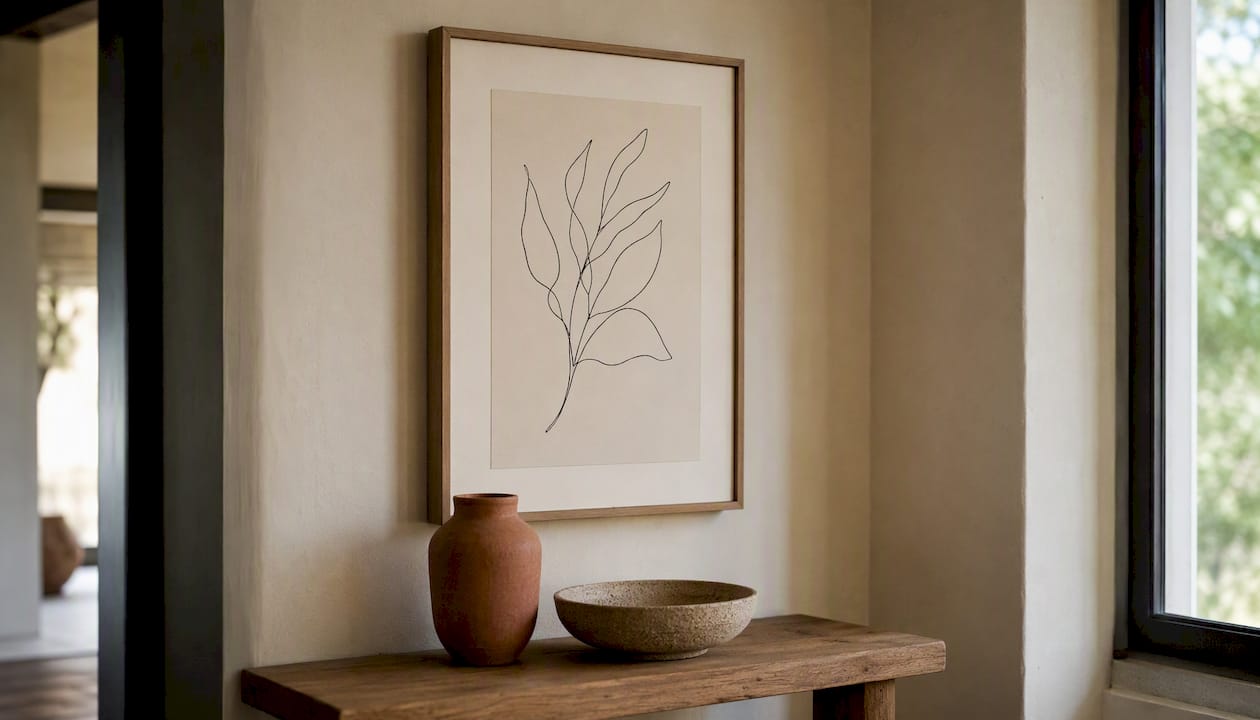
Single-line or continuous-line drawings, often of figures, botanicals, or architectural forms, carry a lightness that almost no other format matches. The white space does the work. Because the line is minimal and the subject is usually universal (a leaf, a face in profile, a simple vessel), line art rarely triggers the “that’s not my taste” response. It suits modern flats, hallways, and bedrooms particularly well, and it scales gracefully from A3 prints to large-format canvases. Pair warm-toned cream paper with a simple oak frame for period homes; white or natural linen mounts with a thin black frame for contemporary spaces.
Botanicals and tonal landscapes
Botanical prints have been a staple of British interiors for centuries, and their staying power is not accidental. A single stem, a pressed-leaf study, or a soft-focus landscape in muted green and ochre carries enough natural reference to feel grounded without being personal. Tonal landscapes, particularly those rendered in a limited palette of three or four values, work well in bedrooms and dining rooms where something slightly more evocative than pure abstraction is welcome. Professional stagers recommend green and blue as the least polarising accent colours when introducing any hue into a neutral scheme, which makes soft botanical greens a reliable choice.
Monochrome and minimalist works
Charcoal, graphite, and black-and-white photography or drawing sit comfortably in almost any interior because they carry no colour temperature at all. They are the safest choice for rooms where the existing palette is already complex or where the finishes are still undecided. Minimalist pieces, particularly those using simple geometric forms or serial repetition, draw on a visual language that MoMA describes as determined by rational processes rather than expressive gesture, which is part of why they read as calm rather than confrontational.
Textured wabi-sabi abstracts
Hand-applied texture, raw linen, layered plaster effects, and imperfect mark-making fall under the wabi-sabi aesthetic. These pieces introduce tactile interest without colour complexity. A cream-on-cream textured canvas, for example, changes character entirely depending on the light, which makes it particularly effective in rooms with varied natural light throughout the day. They suit family homes and owner-occupied properties where a sense of warmth and craft is more important than the clinical neutrality needed for staging.
How to pick neutral art by room, objective, and audience
Scale is the variable most often ignored, and it is the one that most reliably makes or breaks a room. Museum commentary on artists such as Frank Stella and Donald Judd highlights how scale and physical presence change the viewer’s experience of otherwise neutral works, and the same principle applies in domestic interiors.
Placement ratios to follow:
- Above a sofa: artwork width should be about two-thirds to three-quarters of the sofa’s width, hung a moderate distance above the back cushions.
- Above a mantelpiece: width should not exceed the mantel shelf width; allow some clearance above the shelf.
- Above a console or sideboard: roughly half to two-thirds of the furniture width; centre the piece at approximately eye level.
- Hallways: tall, narrow formats work well; a single portrait-orientation piece or a vertical pair keeps the sightline clear.
| Room | Best for | Recommended style | Scale guidance | Format | Budget shape |
|---|---|---|---|---|---|
| Living room | Staging, owner-occupied | Soft tonal abstract or monochrome | Large single piece, sized proportionally to the space and furniture | Canvas or framed print | Mid to invest |
| Bedroom | Owner-occupied, rental | Botanical, line art, tonal landscape | Medium-sized piece, scaled appropriately to the room and furniture | Framed print or canvas | Affordable to mid |
| Hallway | Staging, rental | Line art, monochrome | Tall narrow format, sized to fit the hallway space | Framed print | Affordable |
| Kitchen/dining | Family home, staging | Botanical, soft abstract | Medium-sized piece proportionate to kitchen or dining area furniture | Framed print | Affordable to mid |
| Bathroom | Rental, staging | Line art, botanical | Small to medium piece appropriate for bathroom or similar smaller spaces | Framed print | Affordable |
Reading the buyer or audience profile quickly:
For staging to sell, prioritise pieces with the lowest personal reference. A buyer needs to picture themselves in the space, not feel they are looking at someone else’s home. Tonal abstracts and monochrome line art are the safest choices. For owner-occupied homes, you can introduce slightly more character: a textured wabi-sabi canvas or a botanical with a touch of warm ochre. For rental properties, durability and ease of replacement matter as much as style, so framed prints in standard sizes (A2, A1, 50×70 cm) are practical because they can be reframed or swapped without redecorating.
Pro Tip: For gallery groupings, use a consistent frame finish across all pieces rather than matching the artwork styles. A set of three botanicals, two line drawings, and a small abstract in identical thin black frames reads as curated rather than collected-by-accident.
What formats and finishes work best for neutral art?
The format you choose affects perceived value, longevity, and how the piece reads in the room, sometimes more than the image itself.
Fine art giclée prints on paper are the most affordable route to high-quality reproduction. Printed on acid-free cotton rag or fine art paper with archival inks, they are lightfast for decades under normal indoor conditions. The limitation is fragility: paper prints need glazing (glass or acrylic) to protect them, which adds weight and can introduce glare. Matte anti-reflective glazing is worth the extra cost in rooms with strong directional light.
Giclée canvas prints remove the glazing requirement and feel more substantial on the wall. Stretched over a wooden frame, they suit larger formats where glass would be impractical. The trade-off is that canvas texture can slightly soften fine detail, which matters less for abstracts and botanicals than for photography or precise line work.
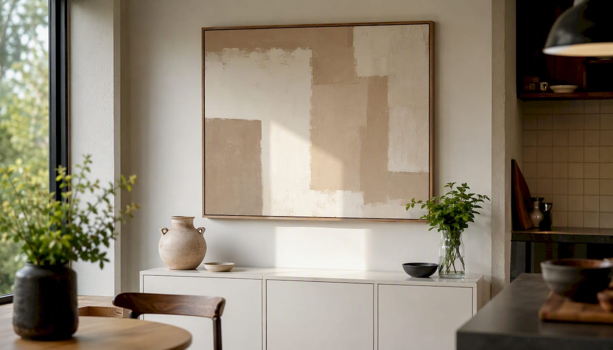
Framed paper prints remain the most versatile format for staging and rental. Standard sizing (A1, A2, 50×70 cm, 70×100 cm) means frames are interchangeable, which keeps costs down across multiple listings. A simple white or natural wood float frame adds breathing room around the image and reads as contemporary without being trend-dependent.
Hand-painted canvases and textured finishes carry a perceived value that prints cannot replicate. The surface variation, visible brushwork, and physical depth of a hand-applied piece read differently in a room, particularly under raking light. For owner-occupied homes and high-end staging, a hand-painted textured canvas is worth the investment. Lead times for bespoke commissions typically run four to eight weeks depending on the complexity and the supplier.
On finish: a matte or satin varnish on canvas keeps the surface looking considered rather than commercial. High-gloss varnish can make neutral tones look synthetic under artificial light, which is the opposite of the effect you want. For framed prints, a float frame (where the print sits slightly proud of the frame rebate with a visible gap) reads as more contemporary than a conventional close-fitting frame, and it suits minimalist and line art particularly well.
When to commission bespoke versus buying a print comes down to three questions: Does the space have an unusual scale or proportion that standard sizes do not address? Is the brief specific enough (a particular palette, a particular texture) that an off-the-shelf piece will not satisfy it? And does the budget allow for it? If the answer to all three is yes, a bespoke hand-painted commission is the right route. If one or more is no, a high-quality giclée print in a well-chosen frame will serve the purpose.
Pairing artwork with the right window treatment also affects how neutral pieces read. As Shutterworld notes, shutters and minimalist interiors work particularly well together because both control light without adding visual noise, which lets neutral artwork hold its own on the wall rather than competing with a busy window treatment.
How to use neutral art for staging and resale appeal
The goal in staging is to make a space feel styled but not personal. Neutral art is one of the most effective tools for that, but only when it is chosen and placed correctly.
Staging checklist:
- Remove all personal photographs, children’s artwork, and anything with strong religious, political, or sports-related content.
- Check that every piece of art is proportionate to the wall and furniture it relates to. Too-small art is the single most common staging mistake.
- Ensure sightlines from the front door and from the main seating area land on something considered, not a blank wall or a cluttered surface.
- Neutralise any strong colour accents in existing art before adding new pieces. A single piece with a vivid red or orange will pull focus from everything else in the room.
- Prefer tonal abstracts for living spaces and soft botanicals for bedrooms and bathrooms.
Top staging tactics:
- Choose transitional art: pieces that feel current without being obviously trend-driven. A buyer viewing a property in 2026 should not be able to date the art to a specific season.
- Use green or blue accents sparingly and only in botanical or landscape pieces. These are the least polarising colour introductions in a neutral scheme.
- Stick to a palette of white, cream, beige, grey, or warm brown for the dominant tones in any staging art selection.
- For budget staging, buy prints in standard sizes and use simple frames that can be reused across multiple listings. A set of three A2 framed prints in matching frames costs a fraction of bespoke work and photographs well.
- Group art in odd numbers (one, three, or five pieces) when creating a gallery arrangement. Even-numbered groupings tend to feel static.
The practical advantage of neutral art in staging is reusability. A well-chosen tonal abstract or a set of botanical prints can move from a two-bedroom flat in Leeds to a four-bedroom house in Bristol without looking out of place, which makes the cost-per-use very low over multiple listings.
Where to buy or commission neutral art in the UK
The sourcing route you choose depends on budget, timeline, and how specific the brief is.
Mass-market prints from high-street retailers and online print-on-demand platforms are the fastest and cheapest route. Quality varies considerably. Look for acid-free paper and archival inks if longevity matters; many mass-market options use dye-based inks that fade within a few years under direct light.
Gallery prints and limited editions from independent printmakers and small studios sit in the mid-range. These are typically giclée prints on quality paper, often signed and numbered, and they carry more perceived value than mass-market options. Lead times are usually one to two weeks including framing.
Independent printmakers on platforms such as Etsy or through direct studio websites offer a middle ground: original designs, often in limited runs, at accessible prices. The advantage is variety; the risk is inconsistency in print quality and framing standards.
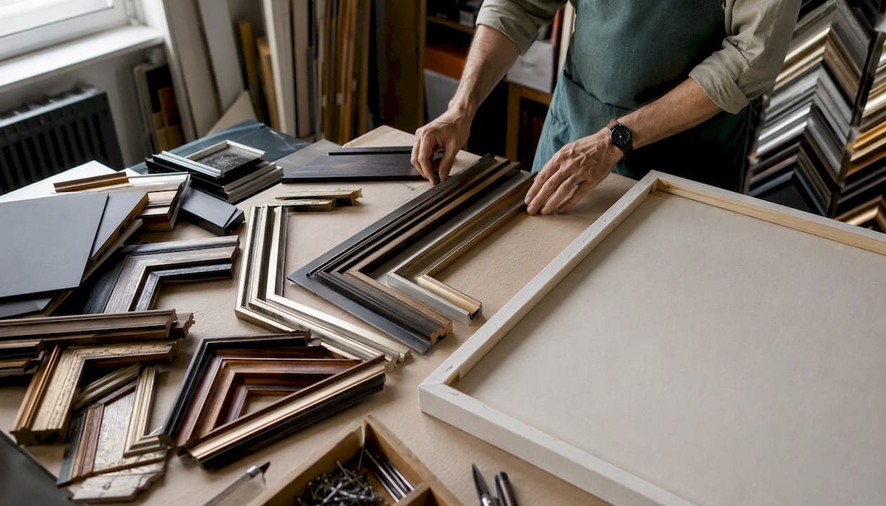
Bespoke commissioned hand-painted canvases are the highest-investment route and the one that gives the most control over palette, scale, and texture. For a designer or homeowner with a specific brief, commissioning directly from a studio removes the compromise of choosing from existing stock. When briefing an artist, specify: the dominant palette (with reference colours or finish samples if possible), the preferred scale and orientation, whether you want a single piece or a set, the desired texture level (flat, lightly textured, or heavily impastoed), and the finish (matte, satin, or unvarnished). Request a proof photograph before the final varnish is applied so you can assess undertone in context.
Frametheworld offers both ready-made neutral collections and bespoke commissioned hand-painted canvases for UK buyers, with options across sizes, palettes, and finishes. For staging professionals who need prints quickly, the ready-made collections are the practical starting point. For homeowners and designers with a specific brief, the bespoke commissioning route gives full control over the result.
Common mistakes to avoid when choosing neutral art
Art that is too small is the most frequent error. A single A4 print above a king-size bed or a small canvas on a large chimney breast looks tentative rather than considered. When in doubt, go larger.
Pieces with strong personal or political content have no place in staging and limited place in rental properties. A portrait of a specific person, a piece with obvious religious symbolism, or anything with text that carries a strong viewpoint will narrow the audience immediately.
Clashing undertones are subtle but damaging. A cool-grey abstract in a room with warm honey-oak floors and terracotta accessories will look wrong without the viewer necessarily knowing why. Always check the artwork’s undertone against the room’s fixed finishes before purchasing.
Heavily trend-driven pieces age quickly. A style that reads as very current in one season can look dated within two or three years, which is a problem for staging art that needs to work across multiple listings. Opt for pieces that reference a movement or aesthetic rather than a specific trend.
Lighting mistakes are easy to overlook. Neutral art can look washed out under strong overhead lighting or disappear entirely in a dark corner. Warm-toned pieces benefit from warm-white bulbs (2700–3000K); cool-toned pieces read better under daylight-balanced light (4000K). If a room has limited natural light, choose artwork with higher tonal contrast so the piece holds its presence. Coordinating art with other interior layers, including rugs and textiles, also affects the overall reading of a neutral scheme. Textured floor coverings in natural materials can ground a neutral art selection and add warmth without introducing competing colour.
Why minimalism tends to appeal to the widest audiences
Minimalism emerged in New York in the early 1960s as a deliberate reaction against expressive painting. Artists including Donald Judd, Frank Stella, and Sol LeWitt promoted geometric, often monochrome works that stripped out personal expression and narrative content. The movement favoured industrial materials, serial repetition, and anonymity of authorship.
Tate describes Minimalism as emphasising pared-back form, neutral surfaces, and an avoidance of overt representational content. That description maps almost exactly onto what makes art broadly palatable in a domestic interior: nothing to disagree with, nothing to decode, nothing that belongs to someone else’s story.
The practical translation for interior use is straightforward. Minimal structure and restrained palette reduce what designers sometimes call “emotional baggage.” A viewer does not need to decide how they feel about the subject because there is no subject in the conventional sense. The piece offers order, proportion, and material quality instead. Britannica’s overview of Minimalism identifies the movement’s emphasis on neutrality, repetition, and the removal of biographical cues as central to its character, which is precisely why minimalist and near-minimalist pieces continue to perform well in staging research and buyer-preference studies.
Designers apply these principles practically by choosing pieces with clear geometry, limited palette, and visible material quality: a linen-textured canvas in two tones, a single-line botanical on cream paper, a monochrome photographic study of an architectural detail. Each of these carries the minimalist visual logic without requiring the viewer to know anything about the movement’s history.
For a deeper look at how minimalist art styles translate into specific interior choices, Frametheworld’s guide covers nine styles that work across UK home types.
How I approach neutral commissions
When a client briefs a neutral commission, the first question is always about the fixed finishes: flooring, cabinetry, and the dominant wall colour. Those three elements set the undertone constraint more reliably than any mood board. A warm-white wall with oak floors calls for artwork in the sand-to-linen range; a cool-white wall with concrete or pale stone calls for slate, mist, or soft graphite.
The briefs that produce the best results are the ones that specify two things clearly: the palette range (with a reference sample or finish name if possible) and the preferred scale. Everything else, texture level, mark-making style, composition, is worth leaving open to the artist’s judgement within those constraints. Clients who over-specify every element of a commission tend to get technically correct work that lacks the quality that makes a piece worth looking at every day.
For most UK homes, a single large piece in the 80–120 cm range outperforms a gallery grouping for broad appeal. It is easier to place, easier to photograph, and easier for a buyer or visitor to process. Triptychs work well when a wall is very wide or when the brief calls for something that feels more considered than a single canvas.
The proof stage matters. Seeing a photograph of the piece in progress, ideally in the actual room or against a sample of the key finish, catches undertone problems before they are fixed by varnish. That one step removes most of the rework risk in bespoke commissions.
Frametheworld: ready-made neutrals and bespoke commissions
For staging professionals, homeowners, and designers who want neutral art without the compromise of choosing from limited stock, Frametheworld offers a practical alternative. The Wabi Sabi wall art collection brings hand-painted textured pieces in neutral palettes, available in multiple sizes, with the tactile quality that prints cannot replicate. For those with a specific brief, bespoke commissions are available with a proof stage included, typically completing within four to eight weeks.
Staging professionals can browse ready-made neutral collections for quick turnaround. Homeowners and designers with a specific palette or scale requirement can request a custom commission directly. The process is straightforward: share your palette reference, preferred dimensions, and any finish notes, and Frametheworld’s studio handles the rest. Visit Frametheworld to explore the collections or get in touch about a bespoke project.
Sources
- Minimalism | Tate
- Minimalism Movement Overview | TheArtStory
- Minimalism | MoMA
- Our Favorite Wall Art for Staging | Larimar Home Staging
- Minimalism (entry) | Britannica

Laat een reactie achter
Deze site wordt beschermd door hCaptcha en het privacybeleid en de servicevoorwaarden van hCaptcha zijn van toepassing.